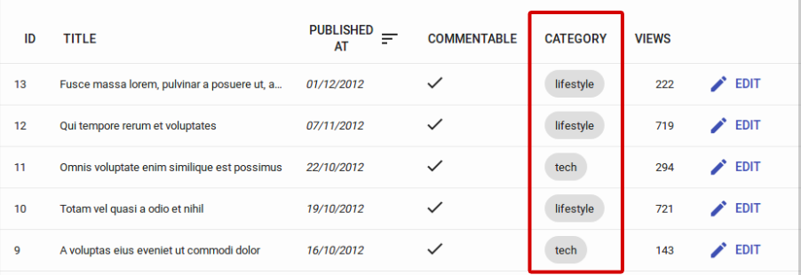
<ChipField>
Displays a value inside a “Chip”, which is Material UI’s term for a label.
Usage
import { ChipField } from 'react-admin';

<ChipField source="category" />

This field type is especially useful for one to many relationships, e.g. to display a list of books for a given author:
import { ChipField, SingleFieldList, ReferenceManyField } from 'react-admin';

<ReferenceManyField reference="books" target="author_id">
    <SingleFieldList>
        <ChipField source="title" />
    </SingleFieldList>
</ReferenceManyField>
Additional props are passed down to Material UI’s <Chip> element. Check The Material UI <Chip> documentation for details.
sx: CSS API
The <ChipField> component accepts the usual className prop. You can also override many styles of the inner components thanks to the sx property (see the sx documentation for syntax and examples). This property accepts the following subclasses:
| Rule name | Description |
|---|---|
&.RaChipField-chip |
Applied to the underlying Material UI’s Chip component |
To override the style of all instances of <ChipField> using the application-wide style overrides, use the RaChipField key.

