
<BooleanField>
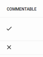
Displays a boolean value as a check.
import { BooleanField } from 'react-admin';

<BooleanField source="commentable" />
Properties
| Prop | Required | Type | Default | Description |
|---|---|---|---|---|
valueLabelTrue |
Optional | string |
‘true’ | Aria label for the truthy value |
valueLabelFalse |
Optional | string |
‘false’ | Aria label for the falsy value |
TrueIcon |
Optional | SvgIconComponent or null |
@mui/icons-material/Done |
Icon to show for the truthy value |
FalseIcon |
Optional | SvgIconComponent or null |
@mui/icons-material/Clear |
Icon to show for the falsy value |
looseValue |
Optional | boolean |
false |
If true the field’s value is not evaluated strictly as a boolean |
<BooleanField> also accepts the common field props.
sx: CSS API
The <BooleanField> component accepts the usual className prop. You can also override many styles of the inner components thanks to the sx property (see the sx documentation for syntax and examples).
To override the style of all instances of <BooleanField> using the application-wide style overrides, use the RaBooleanField key.
Usage
The <BooleanField> includes a tooltip text for accessibility (or to query in “end to end” tests). By default, it is the translated value (‘true’ or ‘false’ in English).
If you need to override it, you can use the valueLabelTrue and valueLabelFalse props, which both accept a string. These strings may be translation keys:
// English labels
<BooleanField source="published" valueLabelTrue="Has been published" valueLabelFalse="Has not been published yet" />

// Translation keys
<BooleanField source="published" valueLabelTrue="myapp.published.true" valueLabelFalse="myapp.published.false" />
TrueIcon and FalseIcon
You can customize the icons to show by setting the TrueIcon and FalseIcon props which accept a SvgIcon type.
import AlarmOnIcon from '@mui/icons-material/AlarmOn';
import AlarmOffIcon from '@mui/icons-material/AlarmOff';

<BooleanField source="alarm" TrueIcon={AlarmOnIcon} FalseIcon={AlarmOffIcon} />
Tip: You can also use null to hide one of the icons.
import AlarmOnIcon from '@mui/icons-material/AlarmOn';

<BooleanField source="alarm" TrueIcon={AlarmOnIcon} FalseIcon={null} />