<JsonSchemaForm>
This Enterprise Edition component allows to render a form from a JSON Schema description based on react-jsonschema-form.
Usage
First, install the @react-admin/ra-json-schema-form package:
npm install --save @react-admin/ra-json-schema-form
# or
yarn add @react-admin/ra-json-schema-form
If you have a JSON Schema description of your form based on react-jsonschema-form, you can use the <JsonSchemaForm> component to render it.
For instance, to generate the following form:
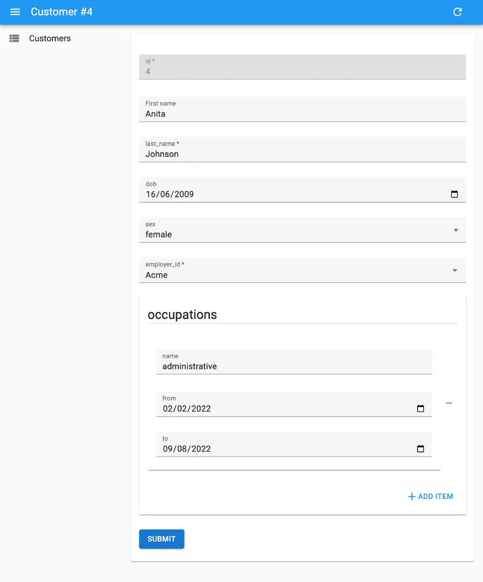
Configure the <Edit> view with a <JsonSchemaForm> child as follows:
import { Edit } from 'react-admin';
import { JsonSchemaForm } from '@react-admin/ra-json-schema-form';

const CustomerEdit = () => (
    <Edit>
        <JsonSchemaForm
            schema={{
                type: 'object',
                properties: {
                    id: { type: 'number' },
                    first_name: { type: 'string', title: 'First name' },
                    last_name: { type: 'string', minLength: 3 },
                    dob: { type: 'string', format: 'date' },
                    sex: { type: 'string', enum: ['male', 'female'] },
                    employer_id: { type: 'number' },
                    occupations: {
                        type: 'array',
                        items: {
                            type: 'object',
                            properties: {
                                name: { type: 'string' },
                                from: { type: 'string', format: 'date' },
                                to: { type: 'string', format: 'date' },
                            },
                        },
                    },
                },
                required: ['id', 'last_name', 'employer_id'],
            }}
            uiSchema={{
                id: { 'ui:disabled': true },
                employer_id: {
                    'ui:widget': 'reference',
                    'ui:options': {
                        reference: 'employers',
                        optionText: 'name',
                    },
                },
            }}
            onChange={change =>
                process.env.NODE_ENV !== 'test' &&
                console.log('changed', change)
            }
            onError={error =>
                process.env.NODE_ENV !== 'test' && console.log('error', error)
            }
        />
    </Edit>
);
<JsonSchemaForm> initializes the form with the current record, and renders it like <SimpleForm> does.
It expects a schema prop describing the expected data shape, and a uiSchema prop describing the UI.
<JsonSchemaForm> is a wrapper around JsonSchema Form’s <Form> component, so please refer to JsonSchema Form’s documentation for detailed usage.
UI Widgets
<JsonSchemaForm> comes with the following UI widgets:
For boolean fields:
checkbox(default)radioselect
For string fields:
text(default)textareapasswordcolor
The built-in string field also supports the format property, and will render an appropriate widget depending on its value:
email: renders aninput[type=email]element;uri: renders aninput[type=url]element;data-url: Renders aninput[type=file]element (if the string is part of an array, multiple files will be handled automatically);date: Renders aninput[type=date]element;date-time: Renders aninput[type=datetime-local]element.
For number and integer fields, you can also specify the format to render an alternative widget:
text(default)updownrangeradio
ra-json-schema-form comes with an additional UI widget for string fields: reference. It’s the equivalent of react-admin’s <ReferenceInput> component. It fetches the foreign key, and uses a relationship to populate the list of options.
Specify the reference, optionText, and other options through the ui:options UI schema directive:
import { Edit } from 'react-admin';
import { JsonSchemaForm } from '@react-admin/ra-json-schema-form';

const CustomerEdit = () => (
    <Edit>
        <JsonSchemaForm
            schema={{
                type: 'object',
                properties: {
                    id: { type: 'number' },
                    employer_id: { type: 'number' },
                },
            }}
            uiSchema={{
                employer_id: {
                    'ui:widget': 'reference',
                    'ui:options': {
                        reference: 'employers',
                        optionText: 'name',
                    },
                },
            }}
        />
    </Edit>
);
I18N
<JsonSchemaForm> passes all labels, descriptions and errors to react-admin’s translate function. You can translate the form by providing custom translations via your i18nProvider.