Quick Start
In this tutorial, you will learn to create a web application with shadcn-admin-kit based on an existing REST API.
Setting Up
Section titled “Setting Up”Follow the installation instructions to install shadcn-admin-kit in your project with Next.js, Vite.js, Remix, Tanstack Start, or any other framework of your choice.
You should end up with a welcome screen like this:

Using an API as the Data Source
Section titled “Using an API as the Data Source”shadcn-admin-kit apps are single-page applications (SPA) that run in the browser and fetch data from an API. Since there is no single standard for data exchanges between systems, shadcn-admin-kit uses an adapter to communicate with your API—this adapter is called a Data Provider.
For this tutorial, we’ll use JSONPlaceholder, a fake REST API designed for prototyping and testing. Here is a sample response:
curl https://jsonplaceholder.typicode.com/users/2{ "id": 2, "name": "Ervin Howell", "username": "Antonette", "email": "Shanna@melissa.tv", "address": { "street": "Victor Plains", "suite": "Suite 879", "city": "Wisokyburgh", "zipcode": "90566-7771", "geo": { "lat": "-43.9509", "lng": "-34.4618" } }, "phone": "010-692-6593 x09125", "website": "anastasia.net", "company": { "name": "Deckow-Crist", "catchPhrase": "Proactive didactic contingency", "bs": "synergize scalable supply-chains" }}JSONPlaceholder provides endpoints for users, posts, and comments. The admin app we’ll build will allow you to Create, Retrieve, Update, and Delete (CRUD) these resources.
We’ll use a third-party package, ra-data-json-server to map the JSONPlaceholder API to the shadcn-admin-kit CRUD API. There are dozens of data provider packages for various APIs and databases. You can also create your own if necessary. For now, let’s make sure the app connects to JSONPlaceholder.
npm install ra-data-json-server# oryarn add ra-data-json-serverCreate dataProvider.ts next to App.tsx, where you can define your data provider using JSONPlaceholder.
import jsonServerProvider from "ra-data-json-server";
export const dataProvider = jsonServerProvider(    process.env.NEXT_PUBLIC_JSON_SERVER_URL);
The process.env.NEXT_PUBLIC_JSON_SERVER_URL expression is an environment variable that must be set in the .env file located at the project root.
NEXT_PUBLIC_JSON_SERVER_URL="https://jsonplaceholder.typicode.com"Now, you can use this data provider in your admin app.
import { Admin } from "@/components/admin";import { dataProvider } from "./dataProvider";
const App = () => <Admin dataProvider={dataProvider}></Admin>;
export default App;import jsonServerProvider from 'ra-data-json-server';
export const dataProvider = jsonServerProvider( import.meta.env.VITE_JSON_SERVER_URL);The import.meta.env.VITE_JSON_SERVER_URL expression is a Vite environment variable that must be set in the .env file located at the project root.
VITE_JSON_SERVER_URL="https://jsonplaceholder.typicode.com"Now, you can use this data provider in your admin app.
import { Admin } from "~/components/admin";import { dataProvider } from "./dataProvider";
const App = () => <Admin basename="/admin" dataProvider={dataProvider}></Admin>;
export default App;import jsonServerProvider from 'ra-data-json-server';
export const dataProvider = jsonServerProvider( import.meta.env.VITE_JSON_SERVER_URL);The import.meta.env.VITE_JSON_SERVER_URL expression is a Vite environment variable that must be set in the .env file located at the project root.
VITE_JSON_SERVER_URL="https://jsonplaceholder.typicode.com"Now, you can use this data provider in your admin app.
import { tanStackRouterProvider } from "ra-router-tanstack";import { createFileRoute } from "@tanstack/react-router";import { Admin } from "@/components/admin";import { dataProvider } from "@/dataProvider.ts";
export const Route = createFileRoute("/")({ component: App });
export function App() {  return (    <Admin      routerProvider={tanStackRouterProvider}      dataProvider={dataProvider}    ></Admin>  );}
Mapping API Endpoints with Resources
Section titled “Mapping API Endpoints with Resources”Let’s add a list of users.
The <Admin> component expects one or more <Resource> child components. Each resource maps a name to an API endpoint. To add a resource named users, edit the App.tsx file as follows:
import { Resource } from "ra-core";import { Admin } from "@/components/admin";import { Admin, ListGuesser } from "@/components/admin";import { dataProvider } from "./dataProvider";
const App = () => (    <Admin dataProvider={dataProvider}>       <Resource name="users" list={ListGuesser} />    </Admin>);
export default App;import { Resource } from "ra-core";import { Admin } from "@/components/admin";import { Admin, ListGuesser } from "@/components/admin";import { dataProvider } from "./dataProvider";
const App = () => ( <Admin dataProvider={dataProvider}> <Resource name="users" list={ListGuesser} /> </Admin>);
export default App;import { Resource } from "ra-core";import { Admin } from "~/components/admin";import { Admin, ListGuesser } from "~/components/admin";import { dataProvider } from "./dataProvider";
const App = () => ( <Admin basename="/admin" dataProvider={dataProvider}> <Resource name="users" list={ListGuesser} /> </Admin>);
export default App;import { Resource } from "ra-core";import { tanStackRouterProvider } from "ra-router-tanstack";import { createFileRoute } from "@tanstack/react-router";import { Admin } from "@/components/admin";import { Admin, ListGuesser } from "@/components/admin";import { dataProvider } from "@/dataProvider.ts";
export const Route = createFileRoute("/")({ component: App });
export function App() { return ( <Admin routerProvider={tanStackRouterProvider} dataProvider={dataProvider}> <Resource name={"users"} list={ListGuesser} /> </Admin> );}The <Resource name="users" /> line instructs shadcn-admin-kit to fetch “users” from the https://jsonplaceholder.typicode.com/users URL. The <Resource> component also defines which React components to use for each CRUD operation (list, create, edit, and show).
list={ListGuesser} tells shadcn-admin-kit to use the <ListGuesser> component to display the list of users. This component guesses the configuration for the list, including column names and types, based on the data fetched from the API.
Now, your app can display a list of users:
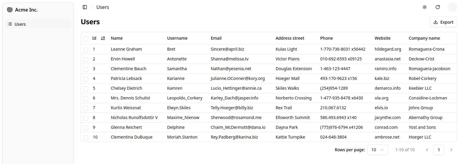
The list is already functional: you can sort it by clicking on the column headers or navigate through pages using the pagination controls. If you open the network tab in your browser’s developer tools, you’ll see that every user action on the list triggers a corresponding HTTP request to https://jsonplaceholder.typicode.com/users with updated parameters. The data provider handles these requests, translating user actions into API calls that the backend understands.
Writing a Page Component
Section titled “Writing a Page Component”The <ListGuesser> component isn’t meant for production use—it’s just there to help you quickly set up an admin interface. Eventually, you’ll need to replace the ListGuesser in the users resource with a custom React component. Fortunately, ListGuesser provides the guessed list code right in the console:
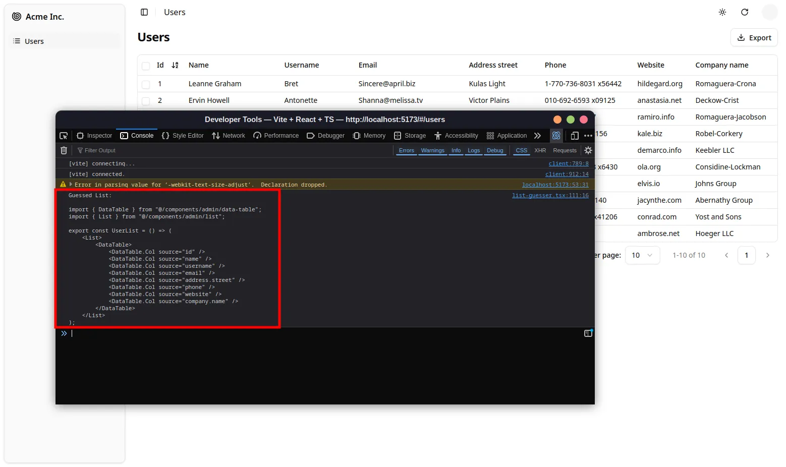
Copy this code and create a new UserList component in a new file called users.tsx:
import { DataTable, List } from "@/components/admin";
export const UserList = () => (    <List>        <DataTable>            <DataTable.Col source="id" />            <DataTable.Col source="name" />            <DataTable.Col source="username" />            <DataTable.Col source="email" />            <DataTable.Col source="address.street" />            <DataTable.Col source="phone" />            <DataTable.Col source="website" />            <DataTable.Col source="company.name" />        </DataTable>    </List>);
Next, update App.tsx to use this new component instead of ListGuesser:
import { Resource } from "ra-core";import { Admin, ListGuesser } from "@/components/admin";import { dataProvider } from "./dataProvider";import { UserList } from "./users";
const App = () => (    <Admin dataProvider={dataProvider}>        <Resource name="users" list={ListGuesser} />        <Resource name="users" list={UserList} />    </Admin>);
export default App;import { DataTable, List } from "@/components/admin";
export const UserList = () => ( <List> <DataTable> <DataTable.Col source="id" /> <DataTable.Col source="name" /> <DataTable.Col source="username" /> <DataTable.Col source="email" /> <DataTable.Col source="address.street" /> <DataTable.Col source="phone" /> <DataTable.Col source="website" /> <DataTable.Col source="company.name" /> </DataTable> </List>);Next, update App.tsx to use this new component instead of ListGuesser:
import { Resource } from "ra-core";import { Admin, ListGuesser } from "@/components/admin";import { dataProvider } from "./dataProvider";import { UserList } from "./users";
const App = () => ( <Admin dataProvider={dataProvider}> <Resource name="users" list={ListGuesser} /> <Resource name="users" list={UserList} /> </Admin>);
export default App;import { DataTable, List } from "~/components/admin";
export const UserList = () => ( <List> <DataTable> <DataTable.Col source="id" /> <DataTable.Col source="name" /> <DataTable.Col source="username" /> <DataTable.Col source="email" /> <DataTable.Col source="address.street" /> <DataTable.Col source="phone" /> <DataTable.Col source="website" /> <DataTable.Col source="company.name" /> </DataTable> </List>);Next, update App.tsx to use this new component instead of ListGuesser:
import { Resource } from "ra-core";import { Admin, ListGuesser } from "~/components/admin";import { dataProvider } from "./dataProvider";import { UserList } from "./users";
const App = () => ( <Admin basename="/admin" dataProvider={dataProvider}> <Resource name="users" list={ListGuesser} /> <Resource name="users" list={UserList} /> </Admin>);
export default App;import { DataTable, List } from "@/components/admin";
export const UserList = () => ( <List> <DataTable> <DataTable.Col source="id" /> <DataTable.Col source="name" /> <DataTable.Col source="username" /> <DataTable.Col source="email" /> <DataTable.Col source="address.street" /> <DataTable.Col source="phone" /> <DataTable.Col source="website" /> <DataTable.Col source="company.name" /> </DataTable> </List>);Next, update index.tsx to use this new component instead of ListGuesser:
import { Resource } from "ra-core";import { tanStackRouterProvider } from "ra-router-tanstack";import { createFileRoute } from "@tanstack/react-router";import { Admin, ListGuesser } from "@/components/admin";import { Admin } from "@/components/admin";import { dataProvider } from "@/dataProvider.ts";import { UserList } from "@/components/app/users.tsx";
export const Route = createFileRoute("/")({ component: App });
export function App() { return ( <Admin routerProvider={tanStackRouterProvider} dataProvider={dataProvider}> <Resource name={"users"} list={ListGuesser} /> <Resource name={"users"} list={UserList} /> </Admin> );}
Visually, nothing changes in the browser, but now the app uses a component that you can fully customize.
Composing Components
Section titled “Composing Components”Let’s take a closer look at the <UserList> component:
import { DataTable, List } from "@/components/admin";
export const UserList = () => ( <List> <DataTable> <DataTable.Col source="id" /> <DataTable.Col source="name" /> <DataTable.Col source="username" /> <DataTable.Col source="email" /> <DataTable.Col source="address.street" /> <DataTable.Col source="phone" /> <DataTable.Col source="website" /> <DataTable.Col source="company.name" /> </DataTable> </List>);The root component, <List>, reads the query parameters, fetches data from the API, and places the data in a React context. It also provides callbacks for filtering, pagination, and sorting, allowing child components to access and modify the list parameters. <List> performs many tasks, but its syntax remains straightforward:
<List> {/* children */}</List>This demonstrates the goal of shadcn-admin-kit: helping developers build sophisticated applications with simple syntax.
In most frameworks, “simple” often implies limited capabilities, making it challenging to extend beyond basic features. shadcn-admin-kit addresses this through composition. <List> handles data fetching, while rendering is delegated to its child—in this case, <DataTable>. Essentially, the code composes the functionalities of <List> and <DataTable> functionalities.
Selecting Columns
Section titled “Selecting Columns”<ListGuesser> created one column for every field in the API response.
That’s a bit too much for a usable grid, so let’s remove a couple of <DataTable.Col> components from the DataTable and see the effect:
<DataTable> <DataTable.Col source="id" /> <DataTable.Col source="name" /> <DataTable.Col source="username" /> <DataTable.Col source="email" /> <DataTable.Col source="address.street" /> <DataTable.Col source="phone" /> <DataTable.Col source="website" /> <DataTable.Col source="company.name" /></DataTable>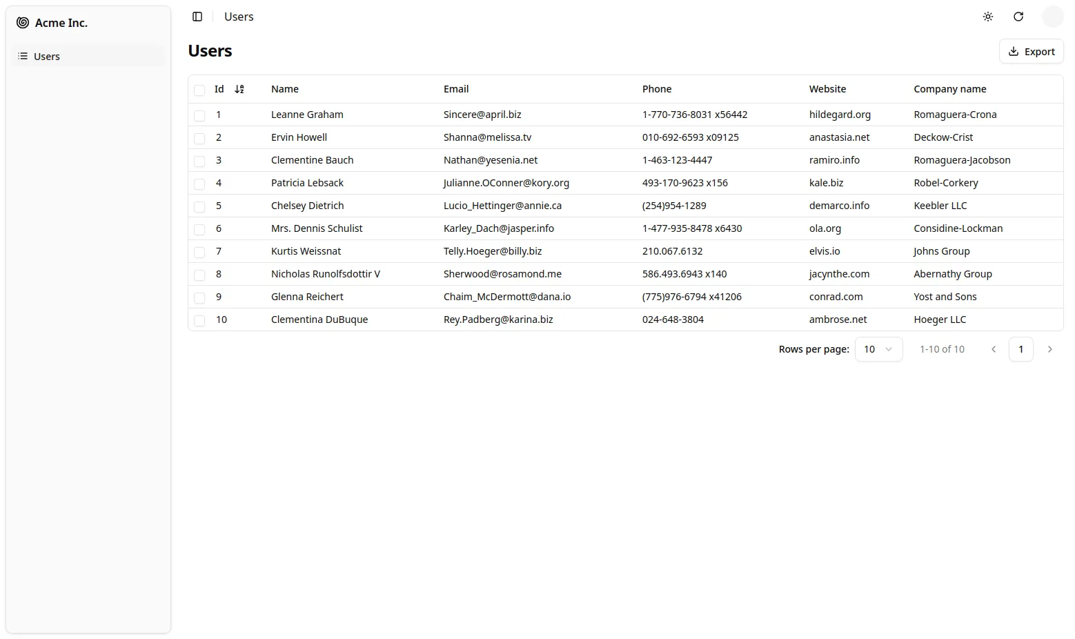
In shadcn-admin-kit, most configuration is done through components. Instead of using a columns prop for configuration, shadcn-admin-kit leverages the children prop for flexibility, enabling you to add custom logic or change column types as needed.
Writing A Custom Field
Section titled “Writing A Custom Field”The columns are rendered by the <DataTable.Col> component. By default, it renders the value as a simple string. You can customize how each column is rendered by passing a custom React component as the field prop.
Field components can read the record fetched from the API (e.g. { "id": 2, "name": "Ervin Howell", "website": "anastasia.net", ... }) using a custom context, and use the source prop (e.g. website) to get the value they should display (e.g. “anastasia.net”).
Let’s see that in practice by writing a custom field. For instance, this <UrlField> renders an URL as a clickable link:
import { useRecordContext } from "ra-core";
export function UrlField({ source }: { source: string }) {    const record = useRecordContext();    if (!record) return null;    return (        <a className="text-indigo-600" href={`https://${record[source]}`}>            {record[source]}        </a>    );}
For each row, <DataTable> creates a RecordContext and stores the current record in it. useRecordContext allows you to read that record. It’s one of the 50+ headless hooks that shadcn-admin-kit exposes to let you build your own components without forcing a particular UI.
You can then use the <UrlField> component in <UserList>.
import { DataTable, List } from "@/components/admin";import { UrlField } from "@/components/url-field";
export const UserList = () => (    <List>        <DataTable>            <DataTable.Col source="id" />            <DataTable.Col source="name" />            <DataTable.Col source="email" />            <DataTable.Col source="phone" />            <DataTable.Col source="website" />            <DataTable.Col source="website" field={UrlField} />            <DataTable.Col source="company.name" />        </DataTable>    </List>);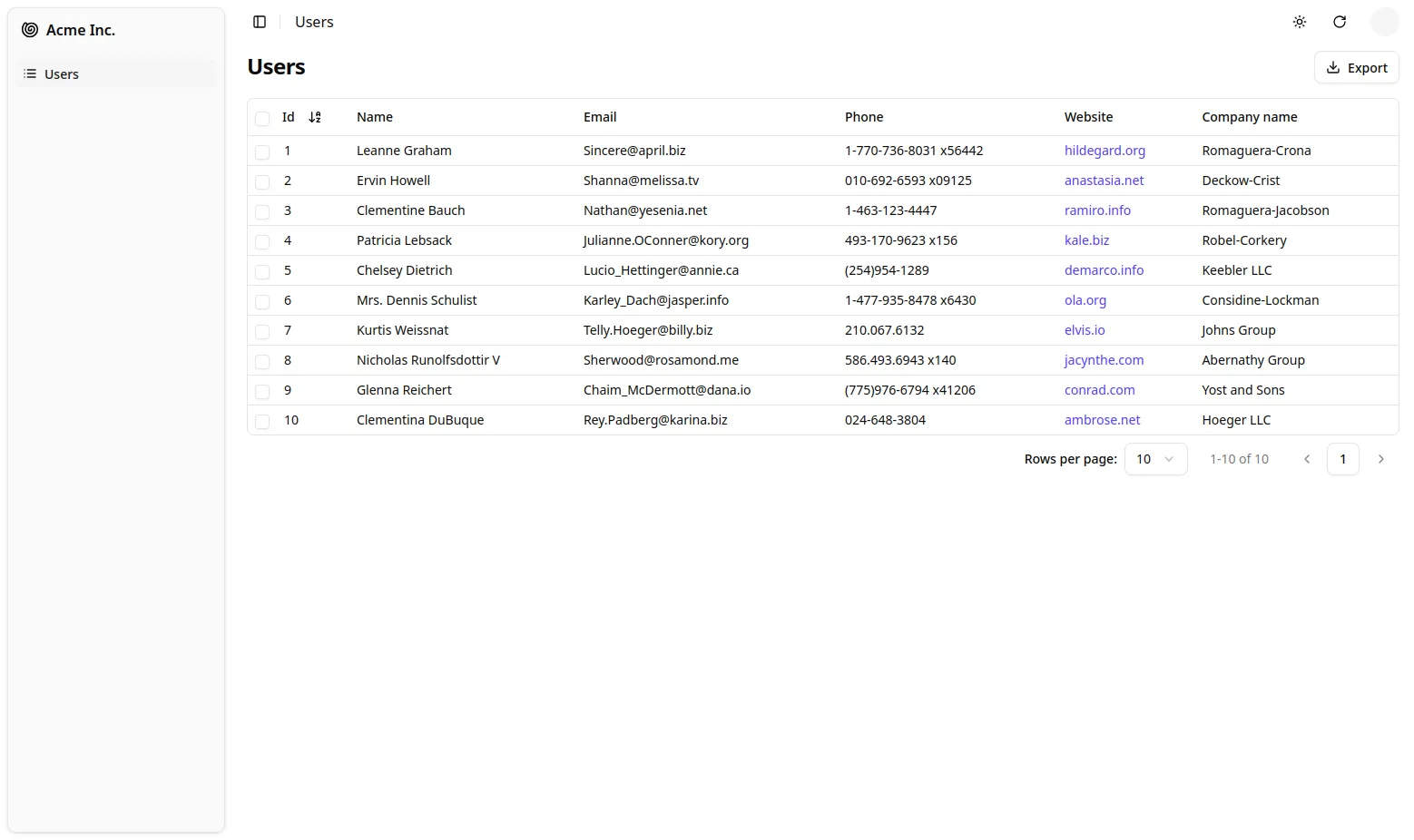
Handling Relationships
Section titled “Handling Relationships”In JSONPlaceholder, each post record includes a userId field, which points to a user:
{ "id": 1, "title": "sunt aut facere repellat provident occaecati excepturi optio reprehenderit", "body": "quia et suscipit\nsuscipit recusandae consequuntur expedita et cum\nreprehenderit molestiae ut ut quas totam\nnostrum rerum est autem sunt rem eveniet architecto", "userId": 1}shadcn-admin-kit knows how to take advantage of these foreign keys to fetch references. Let’s see how the ListGuesser manages them by creating a new <Resource> for the /posts API endpoint:
import { Resource } from "ra-core";import { Admin, ListGuesser } from "@/components/admin";import { dataProvider } from "./dataProvider";import { UserList } from "./users";
const App = () => (    <Admin dataProvider={dataProvider}>        <Resource name="posts" list={ListGuesser} />        <Resource name="users" list={UserList} />    </Admin>);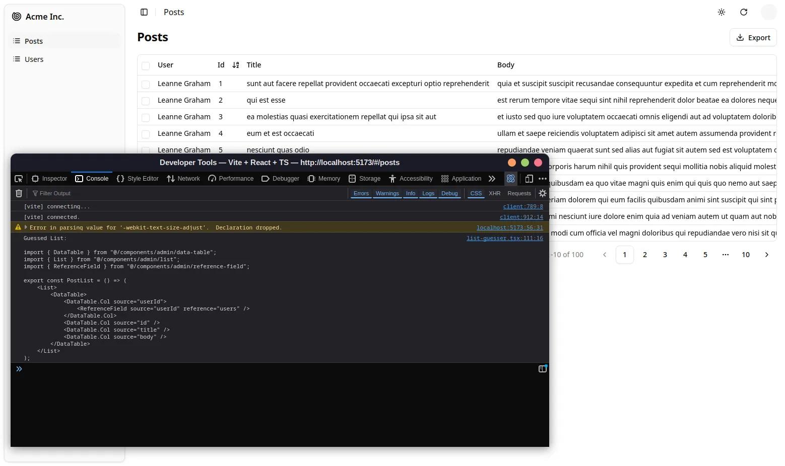
The ListGuesser suggests using a <ReferenceField> for the userId field.
Let’s play with this new field by creating the PostList component based on the code dumped by the guesser:
import {    DataTable,    List,    ReferenceField,} from "@/components/admin";

export const PostList = () => ( <List> <DataTable> <DataTable.Col source="userId"> <ReferenceField source="userId" reference="users" /> </DataTable.Col> <DataTable.Col source="id" /> <DataTable.Col source="title" /> <DataTable.Col source="body" /> </DataTable> </List>);import { Resource } from "ra-core";import { Admin, ListGuesser } from "@/components/admin";import { Admin } from "@/components/admin";import { dataProvider } from "./dataProvider";import { PostList } from "./posts";import { UserList } from "./users";
function App() { return ( <Admin dataProvider={dataProvider}> <Resource name="posts" list={ListGuesser} /> <Resource name="posts" list={PostList} /> <Resource name="users" list={UserList} /> </Admin> );}
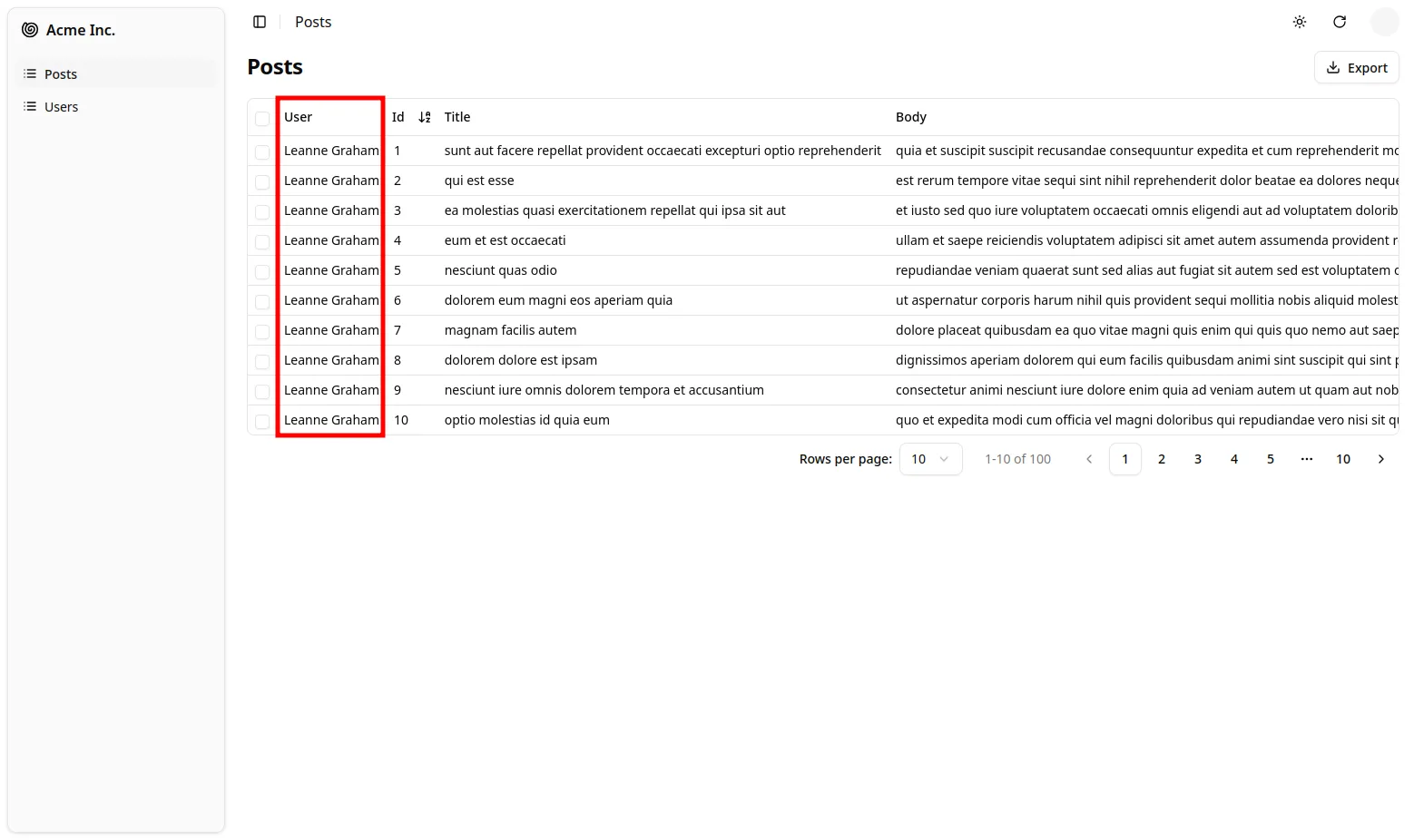
export default App;When displaying the posts list, shadcn-admin-kit is smart enough to display the name of the post author:
Tip: To customize how to represent a record, set the recordRepresentation prop of the <Resource>.
The <ReferenceField> component fetches the reference data, creates a RecordContext with the result, and renders the record representation (or its children).
Tip: Look at the network tab of your browser again: shadcn-admin-kit deduplicates requests for users and aggregates them in order to make only one HTTP request to the /users endpoint for the whole DataTable. That’s one of many optimizations that keep the UI fast and responsive.
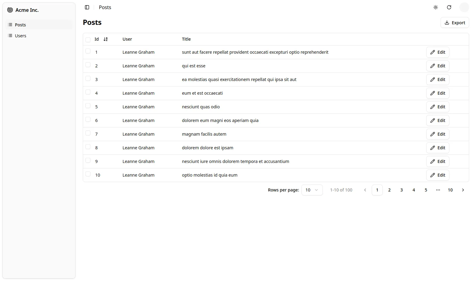
To finish the post list, place the post id field as the first column, and remove the body field.
From a UX point of view, fields containing large chunks of text should not appear in a DataTable, only in detail views.
Also, to make the Edit action stand out, let’s replace the default rowClick action with an explicit action button.
import {    DataTable,    List,    ReferenceField,    EditButton,} from "@/components/admin";
export const PostList = () => (    <List>        <DataTable rowClick={false}>            <DataTable.Col source="id" />            <DataTable.Col source="userId">                <ReferenceField source="userId" reference="users" />            </DataTable.Col>            <DataTable.Col source="id" />            <DataTable.Col source="title" />            <DataTable.Col source="body" />            <DataTable.Col>                <EditButton />            </DataTable.Col>        </DataTable>    </List>);
The Edit Button will lead to the post edit page, which we will create later.
Adding A Detail View
Section titled “Adding A Detail View”So far, the admin only has list pages. Additionally, the user list doesn’t render all columns, so you need to add a detail view to see all the user fields. The <Resource> component accepts a show component prop to define a detail view. Let’s use the <ShowGuesser> to help bootstrap it:
import { Resource } from "ra-core";import { Admin } from "@/components/admin";import { Admin, ShowGuesser } from "@/components/admin";import { dataProvider } from "./dataProvider";import { PostList } from "./posts";import { UserList } from "./users";
const App = () => (    <Admin dataProvider={dataProvider}>        <Resource name="posts" list={PostList} />        <Resource name="users" list={UserList} />        <Resource name="users" list={UserList} show={ShowGuesser} />    </Admin>);
export default App;
Now you can click on a user in the list to see their details:
Just like for other guessed components, you can customize the show view by copying the code logged to the console by the <ShowGuesser> and modifying it to suit your needs.
Now that the users resource has a show view, the ReferenceField in the userId column of the posts list links to it by default. Reference components let users navigate from one resource to another naturally. They are a key feature of shadcn-admin-kit.
Adding Editing Capabilities
Section titled “Adding Editing Capabilities”An admin interface isn’t just about displaying remote data; it should also allow editing records. shadcn-admin-kit provides an <Edit> component for this purpose. Let’s use the <EditGuesser> to help bootstrap it.
import { Resource } from "ra-core";import { Admin, ShowGuesser } from "@/components/admin";import { Admin, EditGuesser, ShowGuesser } from "@/components/admin";import { dataProvider } from "./dataProvider";import { PostList } from "./posts";import { UserList } from "./users";
const App = () => (    <Admin dataProvider={dataProvider}>        <Resource name="posts" list={PostList} />        <Resource name="posts" list={PostList} edit={EditGuesser} />        <Resource name="users" list={UserList} show={ShowGuesser} />    </Admin>);
Users can display the edit page by clicking on the Edit button in the posts list.
The form is already functional. It issues PUT requests to the REST API upon submission. The userId is editable in an autocomplete input, and Shadcn Admin Kit automatically fetches the possible values.
Copy the <PostEdit> code dumped by the guesser in the console to the posts.tsx file so that you can customize the view:
import {    DataTable,    List,    ReferenceField,    AutocompleteInput,    Edit,    ReferenceInput,    SimpleForm,    TextInput,    EditButton,} from "@/components/admin";
export const PostList = () => (    /* ... */);
export const PostEdit = () => (    <Edit>        <SimpleForm>            <ReferenceInput source="userId" reference="users">                <AutocompleteInput />            </ReferenceInput>            <TextInput source="id" />            <TextInput source="title" />            <TextInput source="body" />        </SimpleForm>    </Edit>);
Use that component as the edit prop of the “posts” resource instead of the guesser:
import { Resource } from "ra-core";import { Admin, EditGuesser, ShowGuesser } from "@/components/admin";import { Admin, ShowGuesser } from "@/components/admin";import { dataProvider } from "./dataProvider";import { PostList } from "./posts";import { PostEdit, PostList } from "./posts";import { UserList } from "./users";
const App = () => (    <Admin dataProvider={dataProvider}>        <Resource name="posts" list={PostList} edit={EditGuesser} />        <Resource name="posts" list={PostList} edit={PostEdit} />        <Resource name="users" list={UserList} show={ShowGuesser} />    </Admin>);
You can now adjust the <PostEdit> component to disable editing of the primary key (id), place it first, as follows:
export const PostEdit = () => ( <Edit> <SimpleForm> <TextInput source="id" disabled /> <ReferenceInput source="userId" reference="users"> <AutocompleteInput /> </ReferenceInput> <TextInput source="id" /> <TextInput source="title" /> <TextInput source="body" /> </SimpleForm> </Edit>);If you’ve understood the <List> component, the <Edit> component will be no surprise. It’s responsible for fetching the record and displaying the page title. It passes the record down to the <SimpleForm> component, which is responsible for the form layout, default values, and validation. Just like <DataTable>, <SimpleForm> uses its children to determine the form inputs to display. It expects input components as children. <TextInput> and <ReferenceInput> are such inputs.
The <ReferenceInput> takes the same props as the <ReferenceField> (used earlier in the <PostList> page). <ReferenceInput> uses these props to fetch the API for possible references related to the current record (in this case, possible users for the current post). It then creates a context with the possible choices and renders an <AutocompleteInput>, which is responsible for displaying the choices and letting the user select one.
Adding Creation Capabilities
Section titled “Adding Creation Capabilities”Let’s allow users to create posts, too. Copy the <PostEdit> component into a <PostCreate>, and replace <Edit> with <Create>:
import {    Create,    DataTable,    List,    ReferenceField,    AutocompleteInput,    Edit,    ReferenceInput,    SimpleForm,    TextInput,    EditButton,} from "@/components/admin";
export const PostList = () => (    /* ... */);
export const PostEdit = () => (    /* ... */);
export const PostCreate = () => ( <Create> <SimpleForm> <ReferenceInput source="userId" reference="users"> <AutocompleteInput /> </ReferenceInput> <TextInput source="title" /> <TextInput source="body" /> </SimpleForm> </Create>);Tip: The <PostEdit> and the <PostCreate> components use almost the same child form, except for the additional id input in <PostEdit>. In most cases, the forms for creating and editing a record are a bit different, because most APIs create primary keys server-side. But if the forms are the same, you can share a common form component in <PostEdit> and <PostCreate>.
To use the new <PostCreate> component in the posts resource, just add it as the create attribute in the <Resource name="posts"> component:
import { Resource } from "ra-core";import { Admin, ShowGuesser } from "@/components/admin";import { dataProvider } from "./dataProvider";import { PostEdit, PostList } from "./posts";import { PostCreate, PostEdit, PostList } from "./posts";import { UserList } from "./users";
const App = () => (    <Admin dataProvider={dataProvider}>        <Resource name="posts" list={PostList} edit={PostEdit} />        <Resource            name="posts"            list={PostList}            edit={PostEdit}            create={PostCreate}        />        <Resource name="users" list={UserList} show={ShowGuesser} />    </Admin>);
shadcn-admin-kit automatically adds a “create” button on top of the posts list to give access to the post create page. And the creation form works; it issues a POST request to the REST API upon submission.
Optimistic Rendering And Undo
Section titled “Optimistic Rendering And Undo”Unfortunately, JSONPlaceholder is a read-only API; although it seems to accept POST and PUT requests, it doesn’t take into account the creations and edits - that’s why, in this particular case, you will see errors after creation, and you won’t see your edits after you save them. It’s just an artifact of JSONPlaceholder.
But then, how come the newly created post appears in the list just after creation in the screencast above?
That’s because shadcn-admin-kit uses optimistic updates. When a user edits a record and hits the “Save” button, the UI shows a confirmation and displays the updated data before sending the update query to the server. The main benefit is that UI changes are immediate—no need to wait for the server response. It’s a great comfort for users.
But there is an additional benefit: it also allows the “Undo” feature. Undo is already functional in the admin at this point. Try editing a record, then hit the “Undo” link in the black confirmation box before it slides out. You’ll see that the app does not send the UPDATE query to the API and displays the non-modified data.
Even though updates appear immediately due to optimistic rendering, shadcn-admin-kit only sends them to the server after a short delay (about 5 seconds). During this delay, the user can undo the action, and shadcn-admin-kit will never send the update.
Optimistic updates and undo require no specific code on the API side—shadcn-admin-kit handles them purely on the client side. That means you’ll get them for free with your own API!
Adding Search And Filters To The List
Section titled “Adding Search And Filters To The List”Let’s get back to the post list for a minute. It offers sorting and pagination, but one feature is missing: the ability to search content.
shadcn-admin-kit can use input components to create a multi-criteria search engine in the list view. Pass an array of such input components to the List filters prop to enable filtering:
const postFilters = [    <TextInput source="q" label="Search" key="q" />,    <ReferenceInput source="userId" reference="users" key="userId">        <AutocompleteInput label="User" />    </ReferenceInput>,];
export const PostList = () => (    <List filters={postFilters}>        /* ... */    </List>);
This displays a Filter button on top of the posts list. When clicked, it reveals the filter form:
The first filter, ‘q’, takes advantage of a full-text functionality offered by JSONPlaceholder. The second filter on userId is already populated with possible users since it’s a <ReferenceInput>.
Filters are “search-as-you-type”, meaning that when the user enters new values in the filter form, the list refreshes (via an API request) immediately.
Tip: The label property can be used on any input to customize its label.
Customizing the Menu Icons
Section titled “Customizing the Menu Icons”The sidebar menu shows the same icon for both posts and users. Customizing the menu icon is just a matter of passing an icon attribute to each <Resource>:
import { Resource } from "ra-core";import { StickyNoteIcon, UsersIcon } from "lucide-react";import { Admin, ShowGuesser } from "@/components/admin";import { dataProvider } from "./dataProvider";import { PostCreate, PostEdit, PostList } from "./posts";import { UserList } from "./users";
const App = () => ( <Admin dataProvider={dataProvider}> <Resource name="posts" icon={StickyNoteIcon} list={PostList} edit={PostEdit} create={PostCreate} /> <Resource name="users" icon={UsersIcon} list={UserList} show={ShowGuesser} /> </Admin>);Using a Custom Home Page
Section titled “Using a Custom Home Page”By default, shadcn-admin-kit displays the list page of the first Resource element as the home page. If you want to display a custom component instead, pass it in the dashboard prop of the <Admin> component.
import {    Card,    CardContent,    CardHeader,    CardTitle,} from "@/components/ui/card";
export const Dashboard = () => ( <Card> <CardHeader> <CardTitle>Welcome to the administration</CardTitle> </CardHeader> <CardContent>Lorem ipsum dolor sit amet...</CardContent> </Card>);import { Dashboard } from './dashboard';
const App = () => ( <Admin dataProvider={dataProvider}> <Admin dataProvider={dataProvider} dashboard={Dashboard}> /* ... */ </Admin>);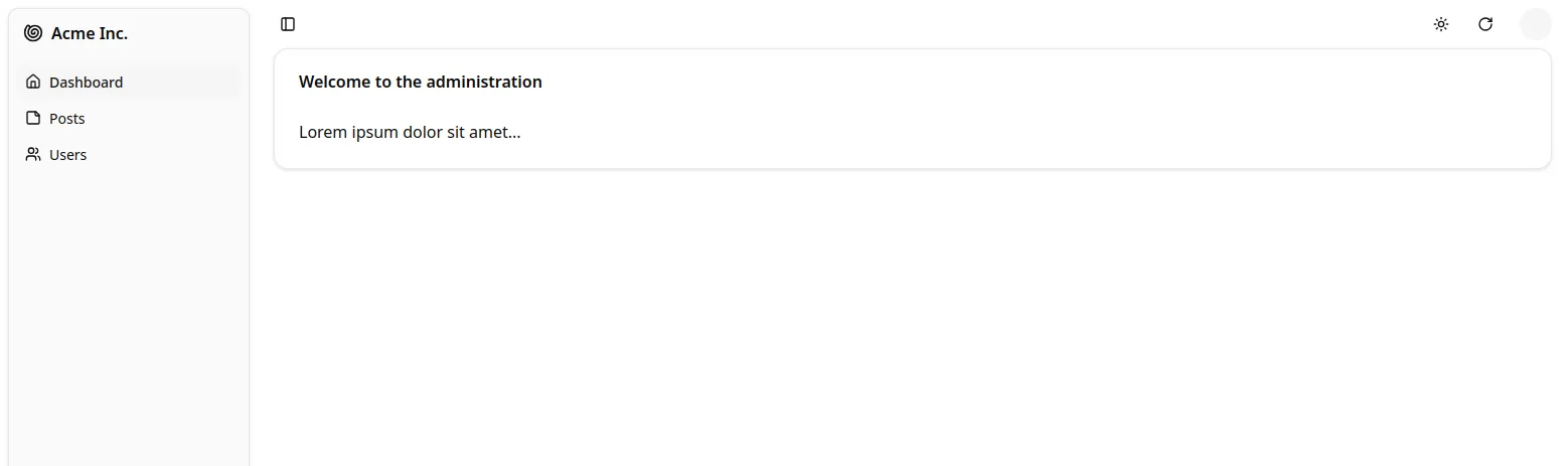
Adding Authentication
Section titled “Adding Authentication”Most admin apps require authentication. shadcn-admin-kit can check user credentials before displaying a page and redirect to a login page when the REST API returns a 403 error code.
shadcn-admin-kit makes no assumption about your authentication strategy (basic auth, OAuth, custom route, etc.), but gives you the ability to add the auth logic at the right place - using the authProvider object.
For this tutorial, since there is no public authentication API, we can use a fake authentication provider that accepts every login request and stores the username in localStorage. Each page change will require that localStorage contains a username item.
The authProvider must expose 4 async methods:
import { AuthProvider } from "ra-core";
export const authProvider: AuthProvider = {    // called when the user attempts to log in    async login({ username, password }) {        // accept all username/password combinations        if (false) {            throw new Error("Invalid credentials, please try again");        }        localStorage.setItem("username", username);    },    // called when the user clicks on the logout button    async logout() {        localStorage.removeItem("username");    },    // called when the API returns an error    async checkError({ status }: { status: number }) {        if (status === 401 || status === 403) {            localStorage.removeItem("username");            throw new Error("Session expired");        }    },    // called when the user navigates to a new location, to check for authentication    async checkAuth() {        if (!localStorage.getItem("username")) {            throw new Error("Authentication required");        }    },};
To enable this authentication strategy, pass the authProvider to the <Admin> component:
import { authProvider } from "./authProvider";
const App = () => (    <Admin        authProvider={authProvider}        dataProvider={dataProvider}        dashboard={Dashboard}    >        /* ... */    </Admin>);
Once the app reloads, it’s now behind a login form that accepts everyone.

Connecting To A Real API
Section titled “Connecting To A Real API”Here is the elephant in the room of this tutorial. In real-world projects, the dialect of your API (REST? GraphQL? Something else?) won’t match the JSONPlaceholder dialect. Writing a Data Provider is probably the first thing you’ll have to do to make shadcn-admin-kit work, unless your API backend is already supported (see the list here). Depending on your API, this can require a few hours of additional work.
shadcn-admin-kit delegates every data query to a Data Provider object, which acts as an adapter to your API. This makes shadcn-admin-kit capable of mapping any API dialect, using endpoints from several domains, etc.
For instance, let’s imagine you have to use the my.api.url REST API, which expects the following parameters:
| Action | Expected API request |
|---|---|
| Get list | GET http://my.api.url/posts?sort=["title","ASC"]&range=[0, 24]&filter={"title":"bar"} |
| Get one record | GET http://my.api.url/posts/123 |
| Get several records | GET http://my.api.url/posts?filter={"id":[123,456,789]} |
| Get related records | GET http://my.api.url/posts?filter={"author_id":345} |
| Create a record | POST http://my.api.url/posts |
| Update a record | PUT http://my.api.url/posts/123 |
| Update records | PUT http://my.api.url/posts?filter={"id":[123,124,125]} |
| Delete a record | DELETE http://my.api.url/posts/123 |
| Delete records | DELETE http://my.api.url/posts?filter={"id":[123,124,125]} |
shadcn-admin-kit calls the Data Provider with one method for each of the actions on this list and expects a Promise in return. These methods are called getList, getOne, getMany, getManyReference, create, update, updateMany, delete, and deleteMany. It’s the Data Provider’s job to emit HTTP requests and transform the response into the format expected by shadcn-admin-kit.
The code for a Data Provider for the my.api.url API is as follows:
import { DataProvider, fetchUtils } from "ra-core";import { stringify } from "query-string";
const apiUrl = 'https://my.api.url/';const httpClient = fetchUtils.fetchJson;
export const dataProvider: DataProvider = {    getList: (resource, params) => {        const { page, perPage } = params.pagination;        const { field, order } = params.sort;        const query = {            sort: JSON.stringify([field, order]),            range: JSON.stringify([(page - 1) * perPage, page * perPage - 1]),            filter: JSON.stringify(params.filter),        };        const url = `${apiUrl}/${resource}?${stringify(query)}`;
        return httpClient(url).then(({ headers, json }) => ({            data: json,            total: parseInt((headers.get('content-range') || "0").split('/').pop() || '0', 10),        }));    },
    getOne: (resource, params) =>        httpClient(`${apiUrl}/${resource}/${params.id}`).then(({ json }) => ({            data: json,        })),
    getMany: (resource, params) => {        const query = {            filter: JSON.stringify({ id: params.ids }),        };        const url = `${apiUrl}/${resource}?${stringify(query)}`;        return httpClient(url).then(({ json }) => ({ data: json }));    },
    getManyReference: (resource, params) => {        const { page, perPage } = params.pagination;        const { field, order } = params.sort;        const query = {            sort: JSON.stringify([field, order]),            range: JSON.stringify([(page - 1) * perPage, page * perPage - 1]),            filter: JSON.stringify({                ...params.filter,                [params.target]: params.id,            }),        };        const url = `${apiUrl}/${resource}?${stringify(query)}`;
        return httpClient(url).then(({ headers, json }) => ({            data: json,            total: parseInt((headers.get('content-range') || "0").split('/').pop() || '0', 10),        }));    },
    update: (resource, params) =>        httpClient(`${apiUrl}/${resource}/${params.id}`, {            method: 'PUT',            body: JSON.stringify(params.data),        }).then(({ json }) => ({ data: json })),
    updateMany: (resource, params) => {        const query = {            filter: JSON.stringify({ id: params.ids}),        };        return httpClient(`${apiUrl}/${resource}?${stringify(query)}`, {            method: 'PUT',            body: JSON.stringify(params.data),        }).then(({ json }) => ({ data: json }));    },
    create: (resource, params) =>        httpClient(`${apiUrl}/${resource}`, {            method: 'POST',            body: JSON.stringify(params.data),        }).then(({ json }) => ({            data: { ...params.data, id: json.id } as any,        })),
    delete: (resource, params) =>        httpClient(`${apiUrl}/${resource}/${params.id}`, {            method: 'DELETE',        }).then(({ json }) => ({ data: json })),
deleteMany: (resource, params) => { const query = { filter: JSON.stringify({ id: params.ids}), }; return httpClient(`${apiUrl}/${resource}?${stringify(query)}`, { method: 'DELETE', }).then(({ json }) => ({ data: json })); }};Tip: fetchUtils.fetchJson() is just a shortcut for fetch().then(r => r.json()), plus control of the HTTP response code to throw an HTTPError in case of a 4xx or 5xx response. Feel free to use fetch() directly if it doesn’t suit your needs.
Using this provider instead of the previous jsonServerProvider is just a matter of switching a function:
import { dataProvider } from './dataProvider';
const App = () => (  <Admin dataProvider={dataProvider}>    // ...  </Admin>);
Conclusion
Section titled “Conclusion”shadcn-admin-kit was built with customization in mind. You can replace any shadcn-admin-kit component with a component of your own, for instance, to display a custom list layout or a different edit form for a given resource.
Now that you’ve completed the tutorial, continue your journey with the Guides and Concepts section.