React Admin June 2023 Update

Since our last update back in March this year, we published three new minor versions of react-admin, our open-source frontend framework for building B2B applications on top of REST/GraphQL APIs: 4.9, 4.10, and 4.11. We’ve also added new features to our Enterprise packages. Let’s see the highlights of these three months of work.
-
Features
-
Data and Auth Providers
-
TypeScript
-
Documentation
That’s a lot of new features! Let’s dive in.
Infinite Pagination
Many end-users prefer an Excel-like experience when browsing a list of records. They want to see the first records, then scroll down to see more, and so on. This is called infinite pagination, and it’s now available in react-admin.
The <InfiniteList> component, introduced in react-admin 4.10, is an alternative to the <List> component that allows users to load more records when they scroll to the bottom of the list. It’s useful when you have a large number of records, or when users are using a mobile device.
import { InfiniteList, Datagrid, TextField, DateField } from "react-admin";
export const BookList = () => (  <InfiniteList>    <Datagrid>      <TextField source="id" />      <TextField source="title" />      <DateField source="author" />    </Datagrid>  </InfiniteList>);
Note that <Datagrid> has a sticky header by default, so the user can always see the column names when they scroll down.
Check the <InfiniteList> documentation for more details.
Dark Mode
Beyond letting you customize the theme, react-admin now allows you to provide two themes (a light and a dark theme), and let the user choose which one they prefer.
Pass a darkTheme prop to the <Admin> component, and the AppBar will automatically show a theme switcher. In addition, the app will use the dark theme by default for users who prefer dark mode at the OS level.
import { Admin, Layout } from "react-admin";import { darkTheme, lightTheme } from "./themes";
const App = () => (  <Admin dataProvider={dataProvider} theme={lightTheme} darkTheme={darkTheme}>    ...  </Admin>);
You can also force a default theme to ignore the OS preference, using the <Admin defaultTheme> prop.
Dark mode support used to be an Enterprise Edition feature. We’ve made it available in the open-source Edition of react-admin.
Check the <Admin> documentation for more details.
ReferenceOneInput
Users often want to edit a piece of data in a single form. But APIs often use a relational model, splitting data into multiple tables. For instance, a bookshop admin may have a book and a book_details table, linked via a one-to-one relationship. How can you edit both records in a single form?
<ReferenceOneInput> lets you add a sub-form for a referenced input in a parent form.
Here is how to setup this sub-form for book_details in a book form:
import { Edit, SimpleForm, TextInput, NumberInput } from "react-admin";import { ReferenceOneInput } from "@react-admin/ra-relationships";
const BookEdit = () => (  <Edit mutationMode="optimistic">    <SimpleForm>      <TextInput source="title" />      <ReferenceOneInput reference="book_details" target="book_id">        <NumberInput source="year" />        <TextInput source="author" />        <TextInput source="country" />        <TextInput source="genre" />        <NumberInput source="pages" />      </ReferenceOneInput>    </SimpleForm>  </Edit>);
<ReferenceOneInput> renders the inputs provided as its children, and fetches the related record to populate them. When users change the related record fields, the <ReferenceOneInput> component stores these changes locally. Then, when users actually submit the form, <ReferenceOneInput> will update both the base record and the related record.
<ReferenceOneInput> persists the changes in the referenced record (book details in the above example) after persisting the changes in the main resource (book in the above example). This means that you can also use <ReferenceOneInput> in <Create> views. <ReferenceOneInput> works for one-to-one and many-to-one relationships.
<ReferenceOneInput> is an Enterprise Edition component, part of the ra-relationships package. You can learn more about it in the <ReferenceOneInput> documentation.
Zero-Config Server-Side Validation
In <Edit> and <Create> views, you often need to let the server validate the form data before proceeding to the next step. To support server-side validation, you used to have to set up a custom save() function and write a bunch of complex form-handling code.
Well, react-admin 4.9 makes it a lot simpler. When a server validation occurs during a call to dataProvider.update() or dataProvider.create(), the form submission is canceled, and react-admin displays the errors right in the form.
Server-side validation is supported out of the box for pessimistic mutation mode only. It requires that the dataProvider throws an error with the following shape:
{ body: { errors: { title: 'An article with this title already exists. The title must be unique.', date: 'The date is required', tags: { message: "The tag 'agrriculture' doesn't exist" }, } }}You can learn more about server-side validation in the validation documentation.
Auto-Saving Forms
When users edit a complex form, the risk of data loss increases with the number of fields. All their changes can be lost if they forget to click on the “Save” button before closing the tab.
The solution is to save the form automatically, at regular intervals. This is what the new <AutoSave> component does.
To use it, put <AutoSave> inside a react-admin form (<SimpleForm>, <TabbedForm>, <LongForm>, etc.), for instance in a custom toolbar. The component renders nothing by default. It will save the current form values 3 seconds after the last change, and render a message when the save succeeds or fails.
import { AutoSave } from "@react-admin/ra-form-layout";import {  Edit,  SimpleForm,  TextInput,  DateInput,  SelectInput,  Toolbar,} from "react-admin";
const AutoSaveToolbar = () => (  <Toolbar>    <AutoSave />  </Toolbar>);
const PersonEdit = () => (  <Edit mutationMode="optimistic">    <SimpleForm      resetOptions={{ keepDirtyValues: true }}      toolbar={<AutoSaveToolbar />}    >      <TextInput source="first_name" />      <TextInput source="last_name" />      <DateInput source="dob" />      <SelectInput        source="sex"        choices={[          { id: "male", name: "Male" },          { id: "female", name: "Female" },        ]}      />    </SimpleForm>  </Edit>);
Note that you must set the <Form resetOptions> prop to { keepDirtyValues: true }. If you forget that prop, any change entered by the end user after the autosave but before its acknowledgment by the server will be lost. If you’re using it in an <Edit> page, you must also use a pessimistic or optimistic mutationMode - <AutoSave> doesn’t work with the default mutationMode="undoable".
<AutoSave> is reserved for Enterprise Edition customers. You can learn more about it in the <AutoSave> documentation.
TreeInput and ReferenceNodeInput
<SelectInput> serves well for simple choices, but it’s not adapted to tree structures, like a tree of categories, or a list of tags with a parent tag. For these cases, you can now use the new <TreeInput>, which allows selecting one or several nodes from a tree.
Use <TreeInput> in a react-admin form, and pass the possible choices as the treeData prop. It must be an array of nodes with a children field.
import { Edit, SimpleForm, TextInput } from "react-admin";import { TreeInput } from "@react-admin/ra-tree";
export const ProductEdit = () => (  <Edit>    <SimpleForm>      <TextInput source="id" disabled />      <TextInput source="name" />      <TreeInput        source="category"        treeData={[          {            id: 1,            title: "Clothing",            isRoot: true,            children: [2, 6],          },          { id: 2, title: "Men", children: [3] },          { id: 3, title: "Suits", children: [4, 5] },          { id: 4, title: "Slacks", children: [] },          { id: 5, title: "Jackets", children: [] },          { id: 6, title: "Women", children: [7, 10, 11] },          { id: 7, title: "Dresses", children: [8, 9] },          { id: 8, title: "Evening Gowns", children: [] },          { id: 9, title: "Sun Dresses", children: [] },          { id: 10, title: "Skirts", children: [] },          { id: 11, title: "Blouses", children: [] },        ]}      />    </SimpleForm>  </Edit>);
In many cases, you will want to use <TreeInput> to select a node from a list of nodes fetched from an API. In this case, you can use the <ReferenceNodeInput> component, just like you can use a <ReferenceInput> to fetch the choices of a <SelectInput>.
import { Edit, SimpleForm, TextInput } from "react-admin";import { ReferenceNodeInput } from "@react-admin/ra-tree";
const ProductEdit = () => (  <Edit>    <SimpleForm>      <TextInput source="name" />      <ReferenceNodeInput source="category_id" reference="categories" />    </SimpleForm>  </Edit>);
<TreeInput> and <ReferenceNodeInput> are part of ra-tree, an Enterprise Edition package specialized in tree structures. You can learn more about it in the <TreeInput> documentation.
WithListContext
Did you ever want to build a custom List view, but struggled to get the current list data, total, or callbacks?
<WithListContext>, introduced in react-admin 4.11, executes its render function using the current ListContext as a parameter. It’s the render prop version of the useListContext hook.
For instance, The following code shows a custom list view for the list of book tags fetched via <ReferenceArrayField>:
import {  List,  Datagrid,  TextField,  ReferenceArrayField,  WithListContext,} from "react-admin";import { Chip, Stack } from "@mui/material";
const BookList = () => (  <List>    <Datagrid>      <TextField source="id" />      <TextField source="title" />      <ReferenceArrayField label="Tags" reference="tags" source="tag_ids">        <WithListContext          render={({ isLoading, data }) =>            !isLoading && (              <Stack direction="row" spacing={1}>                {data.map((tag) => (                  <Chip key={tag.id} label={tag.name} />                ))}              </Stack>            )          }        />      </ReferenceArrayField>    </Datagrid>  </List>);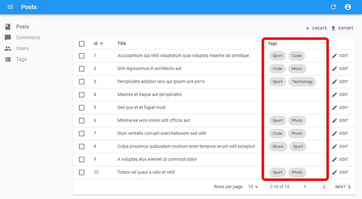
Depending on your context, you may prefer to use the hook version of this component, useListContext. It’s up to you.
Check the <WithListContext> documentation for more details.
create-react-admin
If you start new react-admin projects regularly, you will find the new create-react-admin package, introduced in react-admin 4.10, very useful. It’s a CLI tool that generates a new react-admin project, with a few options.
Use it by running the following command:
npx create-react-admin@latest your-admin-name# oryarn create react-admin your-admin-nameThe terminal will then ask you to choose:
- a data provider
- a auth provider
- the names of the resources to add
- the package manager to use to install the dependencies
And that’s it! You have a new react-admin project, ready to be customized.
We’ll continue adding more features to this CLI tool in the future. In the meantime, you can also fork the package to update the templates to your needs.
Cumulative Filters in <FilterList>
By default, selecting a filter item in a <FilterList> sidebar replaces the current filter value. But for some filter types, like categories, you may want to allow users to select more than one item.
Starting from react-admin 4.9, you can implement such cumulative filters by specifying how each <FilterListItem> sets and gets the current filter, using the toggleFilter and isSelected props:
import { FilterList, FilterListItem } from "react-admin";import CategoryIcon from "@mui/icons-material/LocalOffer";
export const CategoriesFilter = () => {  const isSelected = (value, filters) => {    const categories = filters.categories || [];    return categories.includes(value.category);  };
  const toggleFilter = (value, filters) => {    const categories = filters.categories || [];    return {      ...filters,      categories: categories.includes(value.category)        ? // Remove the category if it was already present          categories.filter((v) => v !== value.category)        : // Add the category if it wasn't already present          [...categories, value.category],    };  };
  return (    <FilterList label="Categories" icon={<CategoryIcon />}>      <FilterListItem        label="Tests"        value={{ category: "tests" }}        isSelected={isSelected}        toggleFilter={toggleFilter}      />      <FilterListItem        label="News"        value={{ category: "news" }}        isSelected={isSelected}        toggleFilter={toggleFilter}      />      <FilterListItem        label="Deals"        value={{ category: "deals" }}        isSelected={isSelected}        toggleFilter={toggleFilter}      />      <FilterListItem        label="Tutorials"        value={{ category: "tutorials" }}        isSelected={isSelected}        toggleFilter={toggleFilter}      />    </FilterList>  );};
Check out the <ListFilter> documentation for more details.
Improve Third-Party Auth Provider Integration
React-admin v4.9 facilitates the handling of Refresh tokens, a security feature that allows third-party auth providers to issue a new access token when the current one expires. This is useful for long-lived sessions and for mobile apps.
Thanks to two new decorators, addRefreshAuthToAuthProvider and addRefreshAuthToDataProvider, you can now add refresh token handling to any auth provider or data provider.
// in src/refreshAuth.jsimport { getAuthTokensFromLocalStorage } from "./getAuthTokensFromLocalStorage";import { refreshAuthTokens } from "./refreshAuthTokens";
export const refreshAuth = () => {  const { accessToken, refreshToken } = getAuthTokensFromLocalStorage();  if (accessToken.exp < Date.now().getTime() / 1000) {    // This function will fetch the new tokens from the authentication service and update them in localStorage    return refreshAuthTokens(refreshToken);  }  return Promise.resolve();};
// in src/authProvider.jsimport { addRefreshAuthToAuthProvider } from "react-admin";import { refreshAuth } from "refreshAuth";const myAuthProvider = {  // ...Usual AuthProvider methods};export const authProvider = addRefreshAuthToAuthProvider(  myAuthProvider,  refreshAuth,);
// in src/dataProvider.jsimport { addRefreshAuthToDataProvider } from "react-admin";import simpleRestProvider from "ra-data-simple-rest";import { refreshAuth } from "refreshAuth";const baseDataProvider = simpleRestProvider("http://path.to.my.api/");export const dataProvider = addRefreshAuthToDataProvider(  baseDataProvider,  refreshAuth,);
You can learn more about the integration of Refresh Tokens in react-admin apps in the Security Introduction chapter of the react-admin documentation.
Supabase Realtime Adapter
We’re big fans of the Supabase Backend-as-a-service. It’s a great way to build a backend for your react-admin app without having to write a single line of code.
Supabase supports various realtime scenarios, including live updates of changes in the underlying Postgres database.
React-admin also supports live updates, publish/subscribe, menu badges, and locks via ra-realtime, an Enterprise Edition package. So it was only natural to add a Supabase adapter.
To create a Supabase real-time data provider, use the addRealTimeMethodsBasedOnSupabase function:
import { addRealTimeMethodsBasedOnSupabase } from "@react-admin/ra-realtime";import { supabaseDataProvider } from "ra-supabase";import { createClient } from "@supabase/supabase-js";import { Admin, Resource, Datagrid, TextField, EmailField } from "react-admin";
const supabaseClient = createClient(  process.env.SUPABASE_URL,  process.env.SUPABASE_ANON_KEY,);
const restDataProvider = supabaseDataProvider({  instanceUrl: process.env.SUPABASE_URL,  apiKey: process.env.SUPABASE_ANON_KEY,  supabaseClient,});
export const dataProvider = addRealTimeMethodsBasedOnSupabase({  restDataProvider,  supabaseClient,});
You can learn more about the real-time features of react-admin in the Realtime chapter.
Strapi and Directus Adapters
We’re happy to add plug-and-play support for two new headless CMS: Strapi and Directus.

The following packages allow you to use react-admin with these two backends:
Casdoor Auth Provider
If you’re using the popular Casdoor backend for authentication, you can now use it with react-admin, thanks to the new NMB-Lab/reactadmin-casdoor-authprovider package.

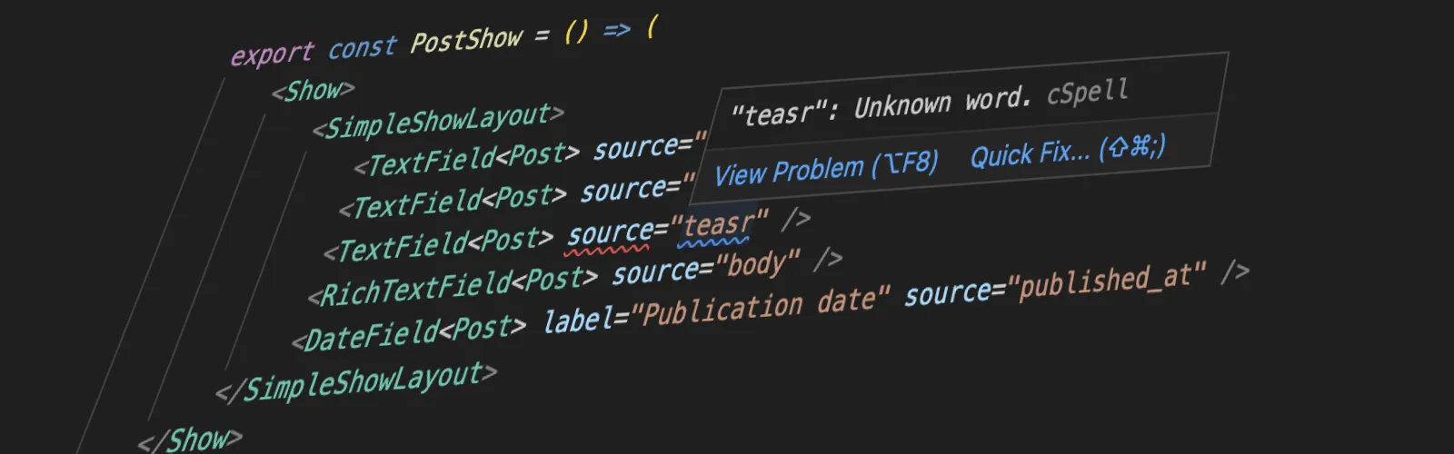
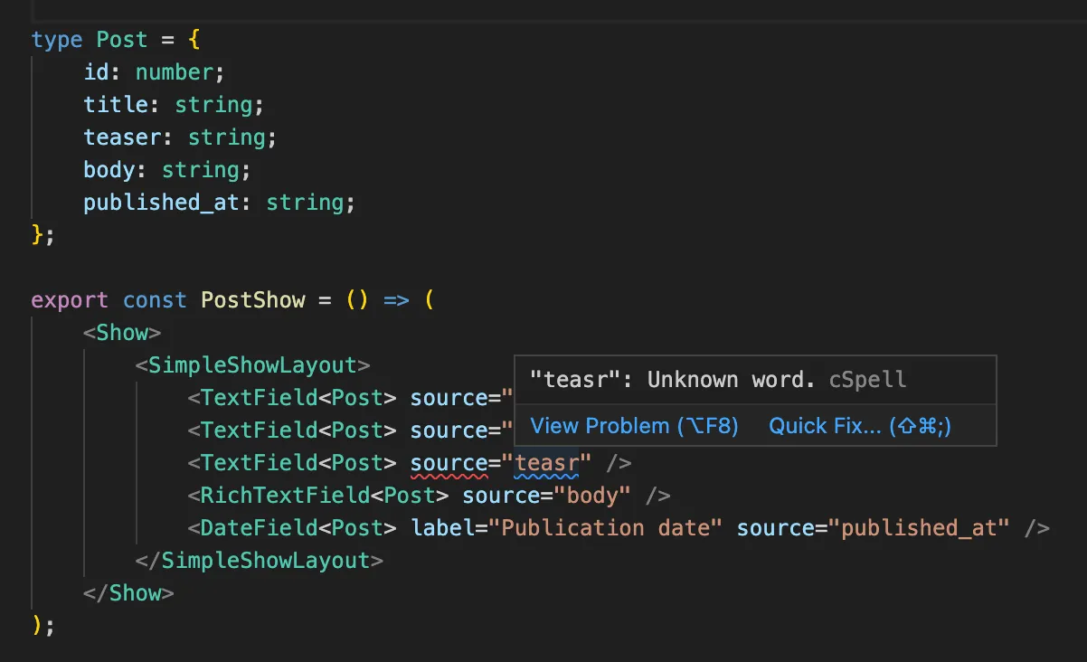
Generic Field Components
starting with react-admin 4.11, all Field components accept a type parameter that describes the record. This lets TypeScript validate that the source prop targets an actual field of the record, and will also allow your IDE to provide auto-completion for both the source and sortBy props.
For some components, the benefit is even greater. Take <FunctionField>, for instance. It accepts a render prop that takes the record as a parameter. With the new type parameter, TypeScript can infer the type of the record, and provide auto-completion for the record fields:
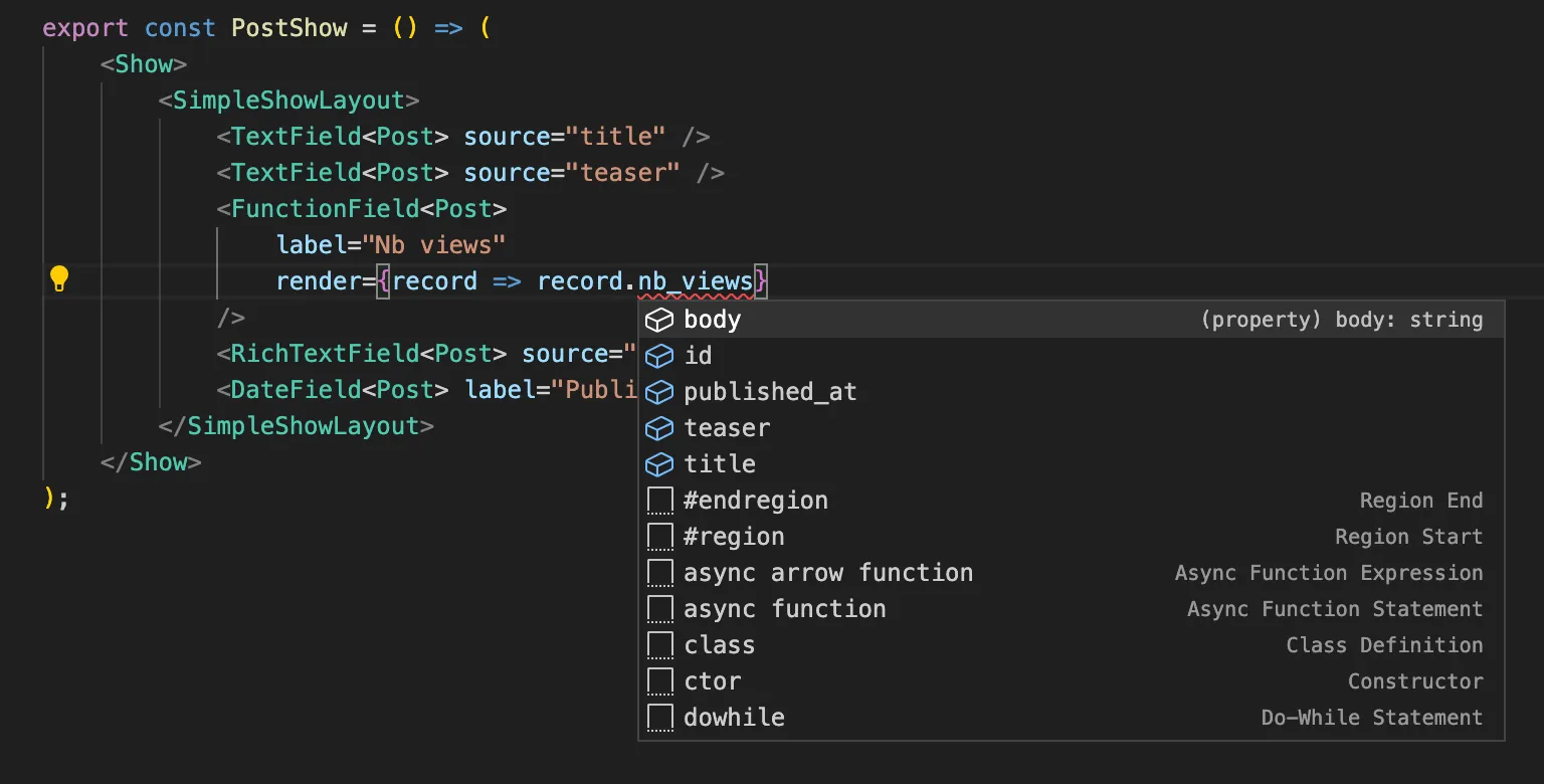
We’ve added a TypeScript section to the Fields documentation, to explain how to use the type parameter in each component. Check it out!
Better Documentation For Generics
Field components are not the only ones that benefit from a type parameter. Many existing components already accept a generic type, and this lets you catch errors at build time, and get better auto-completion in your IDE.
The only problem was that these types weren’t documented. We’ve (partially) fixed that in react-admin 4.10.
The documentation for the following hooks and components now features a TypeScript section, that explains how to use the type parameter:
useAuthProvideruseCreateuseDataProvideruseDeleteuseDeleteManyuseEditContextuseGetListuseGetListLiveuseGetManyuseGetManyReferenceuseGetOneuseGetOneLiveuseListContextuseRecordContextuseShowContextuseUpdateuseUpdateManyWithRecord
New Landing Pages
Did you notice? We’ve updated the react-admin landing page and the Enterprise Edition landing page. We hope you like them!


The purpose of the redesign is to help you convince your boss to use react-admin. These landing pages look more professional and provide more information about the benefits of react-admin.
Improved Form & Inputs Documentation
In my opinion, we spend too much time on forms - but that’s what customers want. To make your experience with react-admin forms and inputs more enjoyable, we’ve improved the documentation of these components.
We’ve added more screenshots, more cross-references between chapters, and more examples. If you haven’t read the form documentation in a while, you should give it a try.
Revamped Installation Tutorials
The landscape of frameworks and boilerplates for React is constantly evolving. As a consequence, we’ve revamped the installation tutorials for react-admin, to make sure they are up-to-date. The changes include:
- The “Getting Started” tutorial uses the new
create-react-adminCLI installer - Vite.js is advised instead of Webpack
- The Next.js installation tutorial was updated to explain installation on Next 13.4 and the App router
- The Remix tutorial has also been updated
create-react-appis still supported, but we recommend usingcreate-react-admininstead
You can install react-admin with any framework you want, it will work - we work hard to make sure of that!
Convert GIF Files to WebM
We use screencasts a lot in the documentation to show how react-admin works. So far, all these animations were using the GIF format. It’s convenient because it doesn’t require a <video> tag, and it plays on every device.
But it also has a major drawback: its low compression ratio compared to modern standards. The consequence is that react-admin documentation pages are heavy and that browsing the documentation uses more time and resources than necessary. And since there are more than 50,000+ visitors who visit the documentation every month, this is a problem.
We’ve converted all the GIF files to WebM, a modern video format that is supported by all modern browsers. The result is a 62% reduction in video size and a much faster browsing experience.
You can learn more about the process (and the tools) that we used in this blog post: Convert GIF to WebM Files to Reduce the Carbon Footprint of Your Website.
Miscellaneous Changes
There were more changes in the last 3 months, but this post is already long enough. Here is a quick list of the other changes:
- Add ability to change the sort, filter and selection of
<ArrayField> - Add
purifyOptionsprop to<RichTextField> - Add
queryOptionsprop to<ReferenceField> - Simplify
<AppBar>customization - Add ability to change
<SelectArrayInput size>prop and fix outlined variant - Add ability to pass null to TrueIcon or FalseIcon in
<BooleanField> - Custom form layouts now take RBAC into account
- Add ability to configure the remove icon of
<FileInputPreview> - Expose
setNotificationscallback in<NotificationContext>to allow for a custom notifications center - Simplify form reset on record change, and forward supported props from
useAugmentedFormtouseForm
Conclusion
And that was just for the past 3 months. React-admin is constantly improving, helping developers around the world to build awesome web applications, faster.
The huge changelog above is the result of the hard work of the marmelab team and of the react-admin community. We’d like to thank all the contributors who helped us make react-admin better.
Come to our Discord server to get daily updates, tips & tricks, and a friendly community to help you with your react-admin projects.

Authors
Marmelab founder and CEO, passionate about web technologies, agile, sustainability, leadership, and open-source. Lead developer of react-admin, founder of GreenFrame.io, and regular speaker at tech conferences.