React-Admin: May 2025 Update


Time flies! We’ve published two minor versions (5.7 and 5.8) since our last blog post about react-admin updates. We’ve also released new features in the Enterprise Edition.
So, what’s new in React-Admin, the open-source React framework powering everything from simple CRUD apps to business management systems?
In a Nutshell
-
New hooks and components
-
- Override default props globally using the application theme
<Create>now supports optimistic and undoable mutation modes- In-dialog editors now have built-in access control
<TreeWithDetails>improvements<DatagridAG>now usesag-gridv33
-
- Material UI v7 support
- Better Postgrest and Supabase integrations
-
- Home page: A new tips section
- New demo: Kanban board
- Improved create-react-admin documentation
- Improved API Platform Admin documentation
DataTable: The New and Improved Datagrid
React-admin 5.8 introduces a brand new <DataTable> component — a modern, drop-in replacement for <Datagrid>. Instead of using Field components for each column, you define columns with <DataTable.Col>:
import { List, DataTable, ReferenceField, EditButton, CanAccess } from 'react-admin';
export const PostList = () => (    <List>        <DataTable>            <DataTable.Col source="id" />            <DataTable.Col label="User">                <ReferenceField source="user_id" reference="users" />            </DataTable.Col>            <CanAccess action="read" resource="posts.title">                <DataTable.Col source="title" />            </CanAccess>            <DataTable.Col>                <EditButton />            </DataTable.Col>        </DataTable>    </List>);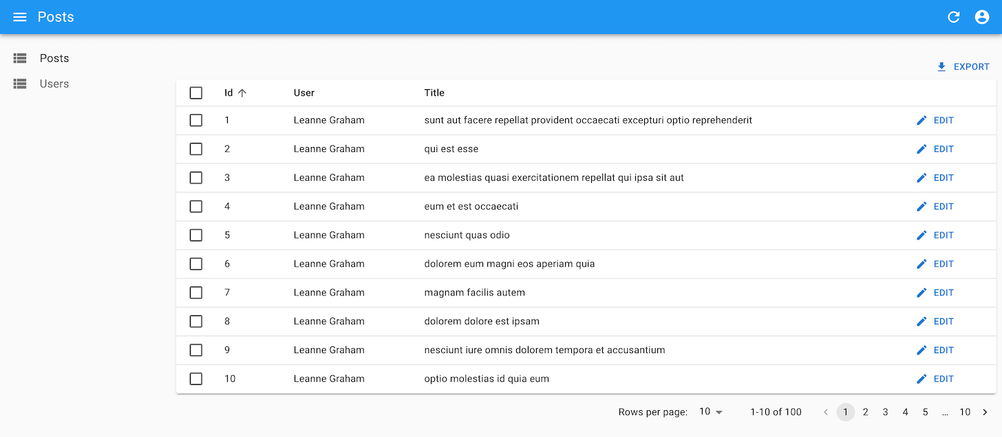
So why introduce a new component? <Datagrid> is one of the most used components in React-Admin, but it has limitations: you can’t easily wrap field components, and there’s no strong typing for column names. Fixing these issues would require breaking changes, so we built a new component instead.
With <DataTable.Col>, you can fully control how each column renders via children or a render prop. No need for FunctionField anymore:
<DataTable.Col label="Name" source="last_name" render={record => `${record.first_name} ${record.last_name}`}/>Need to display numbers with formatting and right alignment? Use <DataTable.NumberCol>:
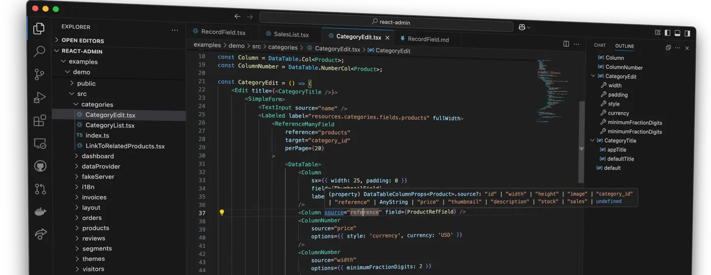
<DataTable.NumberCol source="price" options={{ style: 'currency', currency: 'USD' }} /><DataTable.Col> is also generic, so you can add strong typing and get autocompletion in your IDE:
import { List, DataTable, ReferenceField } from 'react-admin';import { type Review } from '../types';
const Column = DataTable.Col<Review>;
const ReviewList = () => (    <List>        <DataTable>            <Column source="date" field={DateField} />            <Column source="customer_id">                <ReferenceField source="customer_id" reference="customers"/>            </Column>            <Column source="product_id">                <ReferenceField source="product_id" reference="products" />            </Column>            <Column source="rating" field={StarRatingField} />            <Column                source="comment"                render={record => record.comment.substr(0, 10) + '...'}            />            <Column source="status" />        </DataTable>    </List>);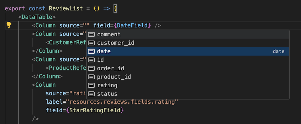
<DataTable> includes everything you love from <Datagrid> — sorting, row selection, collapsible rows, conditional styling — and adds more: wrapped columns, dynamic styles, built-in column reordering and hiding (no need for <ConfigurableDatagrid>), better performance, and smooth animations.
Want more? Check out the full <DataTable> documentation.
While <Datagrid> will still be available, it won’t get new features. For new List pages, we recommend using <DataTable>. A codemod to help you migrate from <Datagrid> is coming soon.
AutoPersistInStore: Never Lose Your Form Data Again
A popular demand from our users was to prevent data loss in forms when navigating away from the page. React-admin already provides two solutions for that problem, but they both have shortcomings:
warnWhenUnsavedChangesdisplays a confirmation dialog when users try to navigate away from the page. It can annoy users as it interrupts their workflow, especially if they want to leave the page without saving their changes.<AutoSave>fails to capture recent changes and may create too many requests to the dataProvider, especially when the form is large.
To address this, we built a new Enterprise Edition component named <AutoPersistInStore>. This component automatically saves form data in the local store when users navigate away from the page. When they return, it reapplies the saved data to the form.
To enable this feature, add <AutoPersistInStore> as a child of your form:
import { AutoPersistInStore } from '@react-admin/ra-form-layout';import { Edit, TabbedForm, TextInput, DateInput, SelectInput } from 'react-admin';
const CustomerEdit = () => (    <Edit>        <TabbedForm>            <AutoPersistInStore />            <TabbedForm.Tab label="Identity">                <TextInput source="first_name" />                <TextInput source="last_name" />                <DateInput source="born" />                <SelectInput source="sex" options={[                    { id: 'male', name: 'Male' },                    { id: 'female', name: 'Female' },                ]} />            </TabbedForm.Tab>            <TabbedForm.Tab label="Work">                // ...            </TabbedForm.Tab>        </TabbedForm>    </Edit>);
The temporary form data is removed when the user submits the form or closes the tab. Users can opt out of the prefill by clicking the “Cancel” button in the notification.
Early feedback from our users has been overwhelmingly positive. They appreciate the convenience of not losing their data, and they love the solution’s nonintrusive nature.
You can learn more about this component in the AutoPersistInStore documentation.
InPlaceEditor: Edit in Place
Users often find forms cumbersome. In-place editors offer a more intuitive alternative, allowing direct data editing within the UI rather than through separate forms, making the experience faster and less error-prone.
React-admin Enterprise Edition introduces a new <InPlaceEditor> component to make it easy to implement in-place editing in your application. On click, it switches to an editable state, allowing the user to change the value directly.
Use <InPlaceEditor> inside a RecordContext (e.g., under <List> or <Show>) and pass it a source prop to specify which field to edit. The component will render the field with a <TextField> and let the user edit it with a <TextInput>
import { Show, InPlaceEditor } from 'react-admin';import { Stack, Box, Typography } from '@mui/material';import { AvatarField, CustomerActions } from './components';
const CustomerShow = () => (    <Show>        <Stack direction="row" spacing={2}>            <AvatarField />            <CustomerActions />            <Box sx={{ display: 'flex', justifyContent: 'center' }}>                <Typography>Phone</Typography>                <InPlaceEditor source="phone" />            </Box>            <Box sx={{ display: 'flex', justifyContent: 'center' }}>                <Typography>Email</Typography>                <InPlaceEditor source="email" />            </Box>            ...        </Stack>    </Show>);
<InPlaceEditor> benefits from the extensive library of react-admin Fields and Inputs, including for editing references. It is highly customizable and adapts to the UI of your application. To learn more about it, check out the InPlaceEditor documentation.
Translate: Localized Text With Less Code
React-admin components use translation keys to display text in the user’s language. In your own components, you previously had to use the useTranslate hook to access the translation function. Starting with react-admin 5.7, you can use the new <Translate> component to simplify this process.
import { useTranslate, useRecord, useUpdate } from 'react-admin';import { Translate, useRecord, useUpdate } from 'react-admin';
const MarkAsUnreadButton = () => {    const record = useRecord();    const update = useUpdate();   const translate = useTranslate();    const handleClick = () => {        update('messages', { id: record.id, data: { isRead: false } });    };    return (        <button onClick={handleClick}>           {translate(               'my.messages.actions.mark_as_unread',               { _: 'Mark as Unread' }           )}           <Translate i18nKey="my.messages.actions.mark_as_unread">               Mark as Unread           </Translate>        </button>;    );}
<Translate> uses its child component for the default translation, making text more apparent in IDEs. You can also pass variables used for interpolation in the translation string, just like you would with useTranslate.
const messages = {    custom: {        hello_world: 'Hello, %{name}!',    },};
<Translate i18nKey="custom.hello_world" options={{ name: 'John' }} />// Hello, John!
Check out the Translate documentation for more details.
AuthLayout: Common Style For Auth Pages
Many non-connected pages (user registration, password recovery, define password, etc.) in your admin share the same layout. Until recently, you had to reproduce the <Login> page layout by hand to reproduce the same look and feel.
Starting with react-admin 5.8, these pages can now use the <AuthLayout> component to render content in a centered div with the same background as the login page.
You can use this <AuthLayout> in your admin to easily style your own login page, reset password page, or any page you want.
import { AuthLayout, TextInput } from 'react-admin';
const ResetPasswordPage = () => (    <AuthLayout>        <CardContent>            <Stack alignItems="center" gap={2}>                <Avatar>                    <LockIcon color="inherit" />                </Avatar>                <Typography>                    Please enter your username to reset your password                </Typography>                <Form onSubmit={handleResetPassword}>                    <TextInput                        autoFocus                        source="username"                        autoComplete="username"                        validate={required()}                    />                    <Button                        variant="contained"                        type="submit"                        color="primary"                        fullWidth                    >                        Reset my password                    </Button>                </Form>            </Stack>        </CardContent>    </AuthLayout>);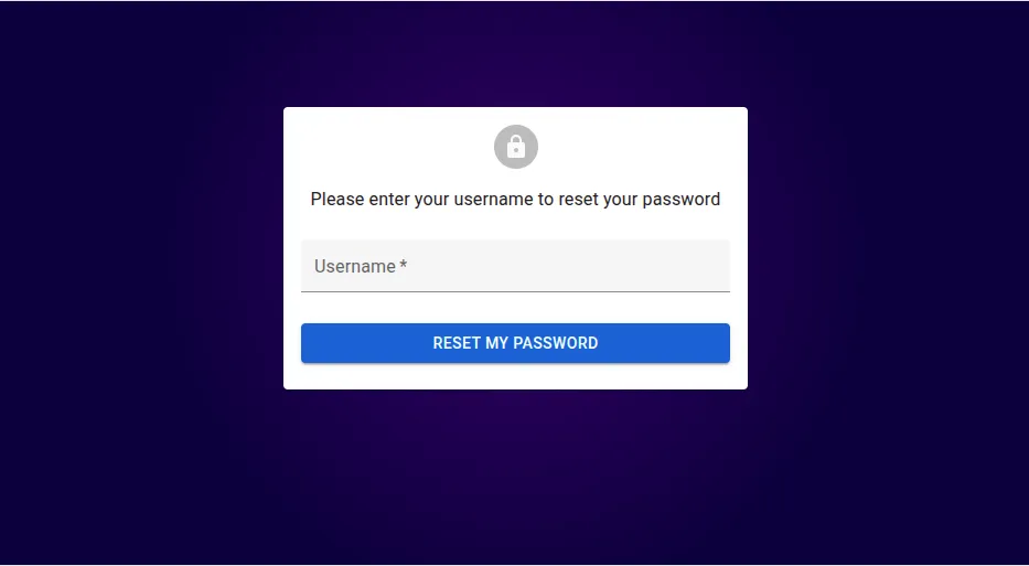
useCloseNotification: Programmatically Close Notifications
React-admin’s useNotify accepts a React component for the notification. This allows for including buttons in the snackbar (e.g., the “Undo” button). However, clicking the button must close the notification, which was impossible with the useNotify hook.
React-admin 5.7 introduces a new hook called useCloseNotification. It returns a callback that you can call to close the notification. A common use case is a notification that doesn’t auto-hide, and that you want to close when the user clicks a button.
import { useCheckForApplicationUpdate, useCloseNotification, useNotify } from 'react-admin';import { Button, SnackbarContent } from '@mui/material';
export const CheckForApplicationUpdate = () => {    const notify = useNotify();
    const onNewVersionAvailable = () => {        // autoHideDuration is set to null to disable the auto hide feature        notify(<ApplicationUpdateNotification />, { autoHideDuration: null });    };
    useCheckForApplicationUpdate({ onNewVersionAvailable, ...rest });    return null;};
const ApplicationUpdateNotification = ({ reset }: { reset:() => void }) => {    const closeNotification = useCloseNotification();
    return (        <SnackbarContent            message="A new application version is available. Refresh your browser tab to update"            action={                <Button                    onClick={() => {                        closeNotification();                    }}                    label="Dismiss"                />            }        />    );};
You can learn more about this hook in the useNotify documentation.
Updated Components
The application theme already allows you to customize the default style of react-admin components. Now, you can also override the default props of many components using the theme.
You can use this feature to replace the default icons of react-admin buttons. For instance, here’s how to change the icon for all <SaveButton>:
import { defaultTheme } from 'react-admin';import { deepmerge } from '@mui/utils';import CheckIcon from '@mui/icons-material/Check';
const theme = deepmerge(defaultTheme, {    components: {        RaSaveButton: {            defaultProps: {                icon: <CheckIcon />,            },        },    }});
const App = () => (    <Admin theme={theme}>        // ...    </Admin>);
This feature is available for most buttons, fields, inputs, list, and layout components. We’re expanding the list of components that support this feature, so that most react-admin components will support it in the future.
<Create>, <CreateBase>, and useCreate only supported pessimistic mutations, until react-admin 5.7. Now, your application can support optimistic and undoable creations, if you can provide a unique ID for the new record.
const PostCreate = () => ( <Create mutationMode="optimistic" transform={data => ({ id: generateId(), ...data })} > // ... </Create>);With faster visual feedback, including with slow backends, this enhancement is a great addition to the user experience, and a first step towards better support for the offline mode.
React-Admin 5.3 introduced access control in core components. We’re expanding the support for access control in Enterprise Edition components.
The <CreateInDialogButton>, <EditInDialogButton>, and <ShowInDialogButton> components now automatically leverage the authProvider.canAccess() method. Consequently, these buttons will only be rendered if the current user has the necessary authorization.
Tree components have received some love, too: <Tree>, <TreeWithDetails>, and <TreeInput> now use the recordRepresentation to display the node label. Besides, clicking on a tree node in <TreeWithDetails> will open the Show or the Edit view, depending on permissions.
Finally, <DatagridAG>, our powerful data grid component based on AG Grid supporting edit-in-place, grouping, and pivoting, now uses AG Grid v33. This new version brings several improvements, including:
- Row Pinning
- Row Height Resizing
- Grand Total Row Pinning
- Scroll Column Into View
- Performance Improvements
Check the AG Grid v33 release notes for more details.
To get these new features, you’ll need to bump the version of <DatagridAG> to 6.0 and follow the Upgrade instructions.
Ecosystem Compatibility
The MUI team has released Material UI v7, which supports CSS variables, improves ESM support, standardizes the slot pattern across all components, and removes deprecated APIs.
React-admin v5.8 is fully compatible with MUI v7. When you create a new react-admin application, it will use MUI v7 by default. To upgrade an existing application, follow the upgrade to v7 guide. It should be fast: there aren’t many breaking changes. The most notable change is the replacement of the Grid component with a better alternative using a slightly different syntax.
The look-and-feel is unchanged.
We’ve also improved the support for Postgrest and Supabase via our contributions to the ra-data-postgrest and ra-supabase packages. Notable changes include:
- Support for
embeddingandprefetching - Support for the
nullslastandnullsfirstsort modifiers - Improved support for the
inoperator - Improved UX on authentication pages
- Better ReferenceInput guessers
Documentation
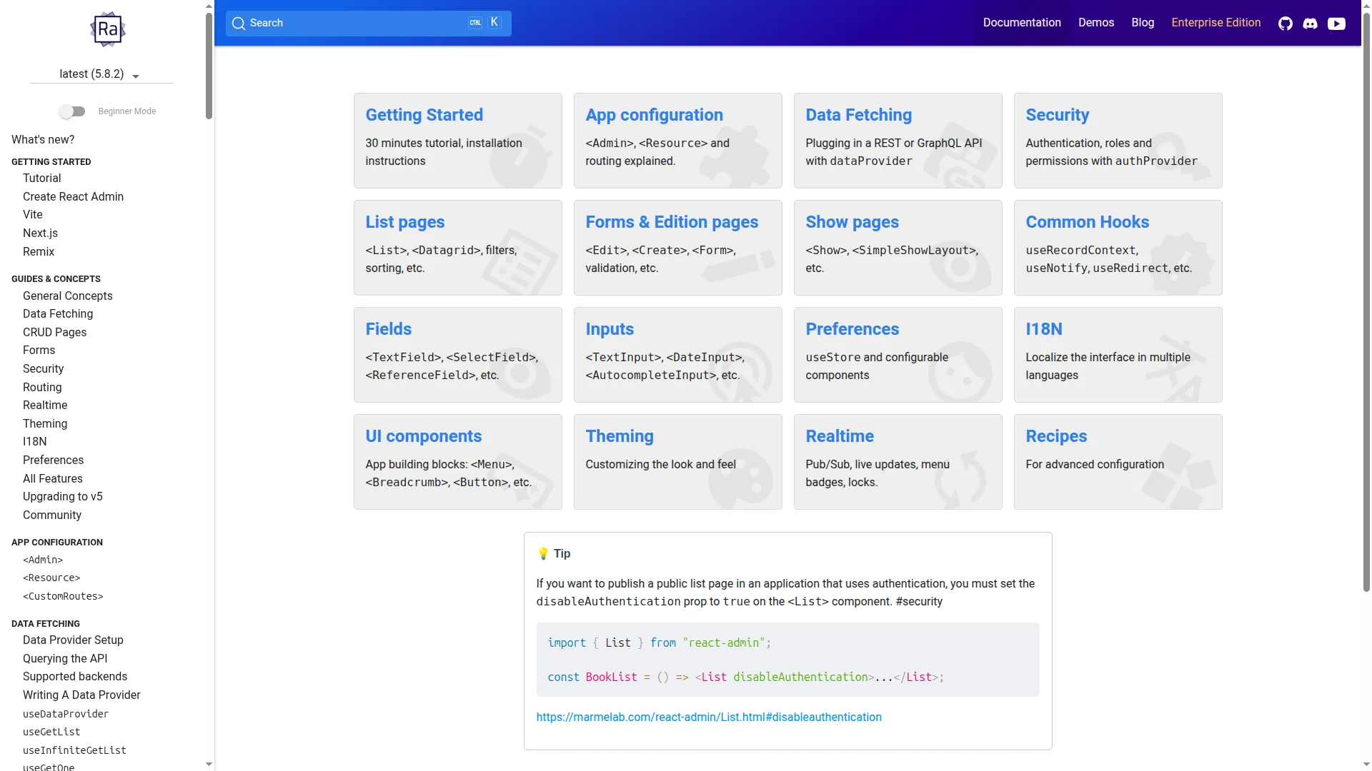
We’ve included usage tips on the main table of contents page. A new tip appears on each page refresh, so you’ll have a good reason to visit this page more often.
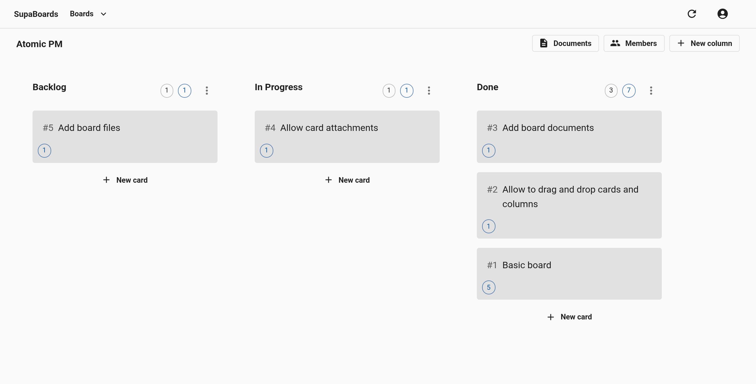
We also added a new demo: A full-featured Trello clone called Atomic PM. The code is open-source, so you can get inspiration for building your own Kanban boards.
The create-react-admin doc page has been rewritten to provide a clearer overview of the available options.
Finally, we’ve contributed to the API Platform Admin documentation to help newcomers get started and seasoned developers find the most powerful options. We’ve also updated the screenshots and added new sections. Whether using a Symfony or a Laravel backend, API Platform Admin is a great way to build your admin interface.
Conclusion
If you haven’t already done so, we encourage you to try the new features in react-admin 5.7 and 5.8. The upgrade should be smooth, as we haven’t introduced any breaking changes.
You can find more details about the changes in the changelogs:
We’d like to sincerely thank all the amazing contributors who dedicate their time and effort. The React-Admin community thrives on contributions, so please don’t hesitate to get involved!
For more React-Admin content, check out our Discord and our YouTube channel.

Authors
Full-stack web developer currently intern at marmelab, Erwan works with us on Greenframe. He likes to walk, run, climb, and many root sports.
Marmelab founder and CEO, passionate about web technologies, agile, sustainability, leadership, and open-source. Lead developer of react-admin, founder of GreenFrame.io, and regular speaker at tech conferences.