React-admin: March 2025 Update


What’s new in React-admin, the open-source React framework for single-page applications? Since our last article, react-admin had two releases with new features (5.5 and 5.6), and the Enterprise Edition packages got lots of new features too. Here’s a summary of the most important changes.
In A Nutshell
-
- Support for React 19, Material-UI 6, and React-Router 7
-
<SelectAllButton>: Selecting rows regardless of pagination in<Datagrid><Tree>: Render hierarchical data, now with native data format<ListLiveUpdate>: Real-time lists everywhere
-
<TextArrayInput>: Edit arrays of strings<EditButton state>: Prefilling an edition form with modifications<FormFillerButton>: Fill forms with an image using AI<AutoSave>: Now supports warning users about unsaved changes
-
- B&W: A new modern black and white theme
<LoginWithEmail>: Easier Login page customizationra-navigation: Built-in access control in menu components<HorizontalMenu>: Now supports submenus
-
- New Guides & Concepts section
- New demo: Todo App
- New tutorial: Handling relationships
-
create-react-admin: Faster and easier setup- GraphQL: Advanced customization leveraging introspection
- Partnerships: Supabase, Prisma, AppWrite, and Strapi
Ecosystem Compatibility
Despite being only a minor version, React-admin v5.5 actually marks a big milestone: it is now compatible with React 19, Material-UI v6, and React-Router v7, the latest versions of the main libraries it relies on. This means you can now take advantage of new features and performance improvements from the React ecosystem.
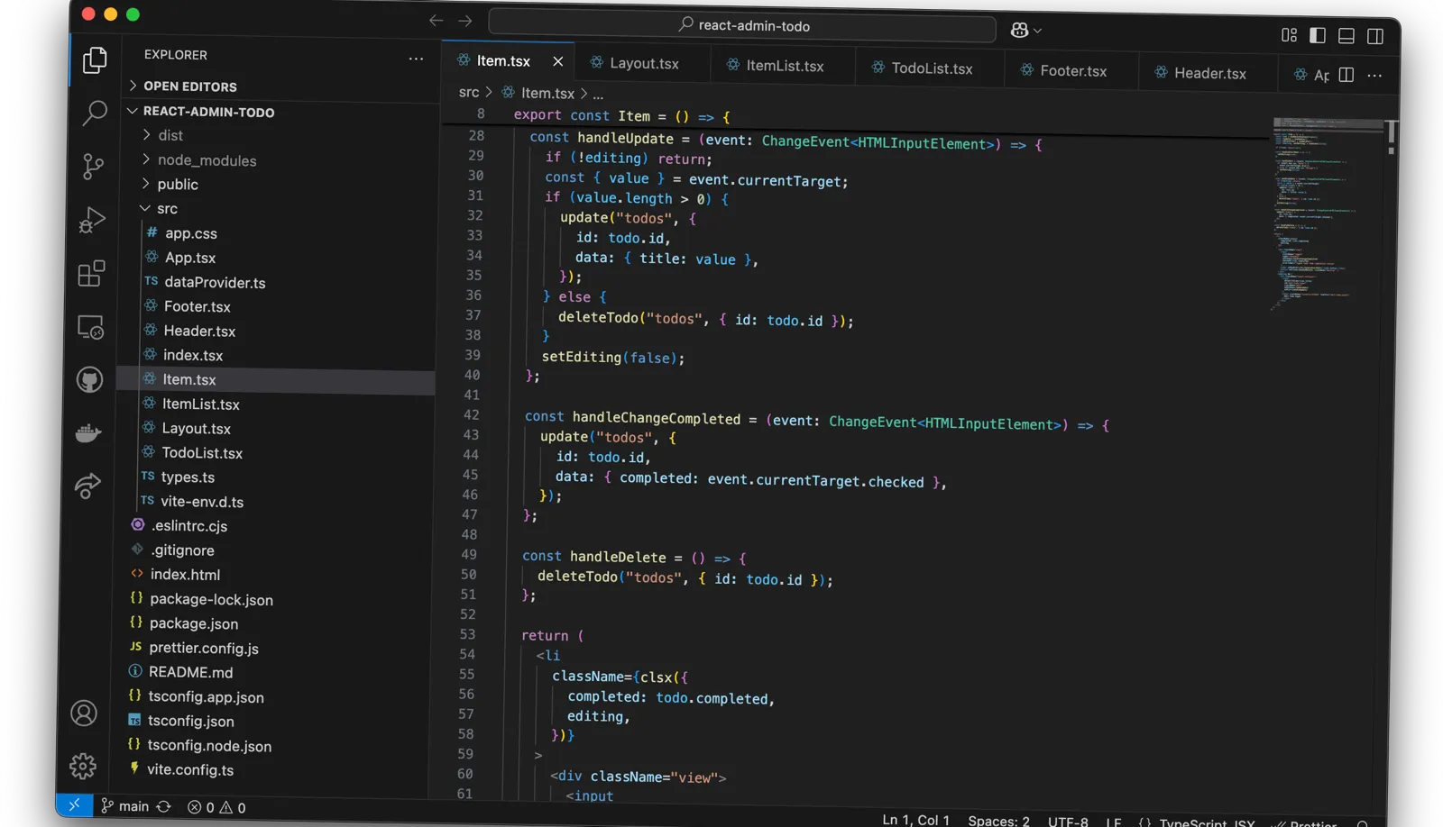
For instance, with React 19, you can now include a <title> component to set the page title. Here’s an example with an edit page:
import { Edit } from 'react-admin';
const PostEdit = () => (    <Edit title={<PostEditTitle />}>        // ...    </Edit>);
const PostEditTitle = () => {  const record = useRecordContext();  return (    <>      {/** This will appear in the top AppBar */}      <span>Post {record ? `"${record.title}"` : ''}</span>      {/** This will appear in the browser tab */}      <title>{record ? `Post "${record.title}"` : ''}</title>    </>  );}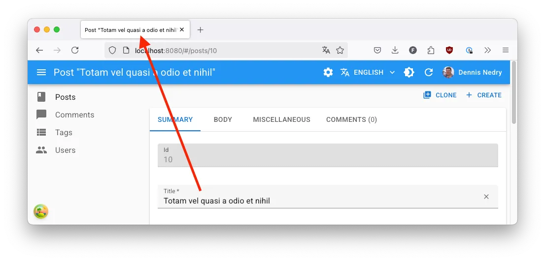
Material UI v6 was released mid-2024. Upgrading will provide optimized runtime performance. If you have a custom design, MUI v6 also comes with support for CSS variables and a better developer experience regarding color schemes (dark/light mode).
Finally, the ability to use React-router v7 is important for applications built on React-router that also include React-admin. Indeed, this version brings:
- Server rendering
- Bundle splitting and optimization
- Improved type safety
React-admin still maintains compatibility with React 18, Material-UI v5, and React-Router v6 for those who are not ready to upgrade yet.
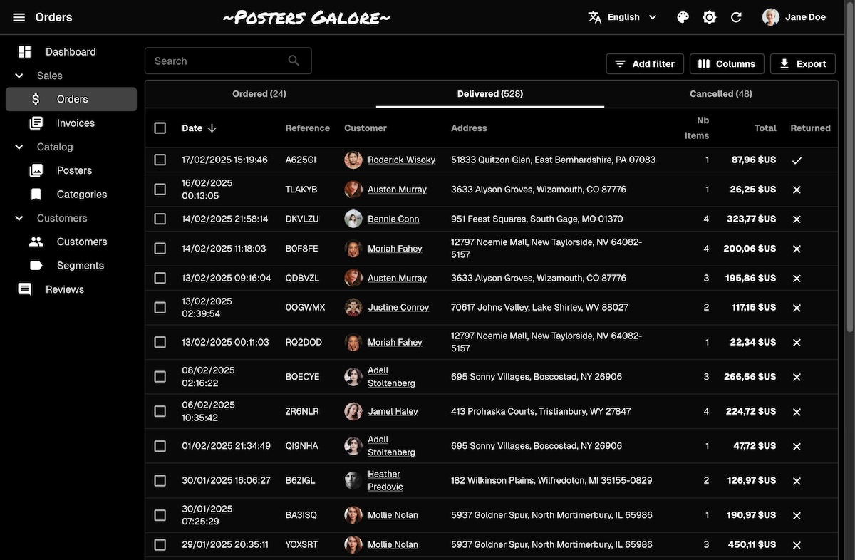
List View
Let’s start the overview of list view improvements with bulk actions. Users can trigger actions on multiple datagrid rows by selecting them. They can also select all the rows of the current page by checking the checkbox located in the datagrid header. However, for actions that must be applied to all records, selecting rows page-by-page is cumbersome.
Starting with React-admin v5.5, <Datagrid> displays a “Select All” button when all the rows of the current page are selected, allowing users to expand the selection to all pages:
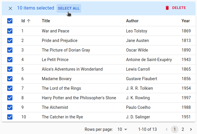
This feature is also supported in <EditableDatagrid> and <DatagridAG>. You can learn more about it in the <SelectAllButton> documentation.
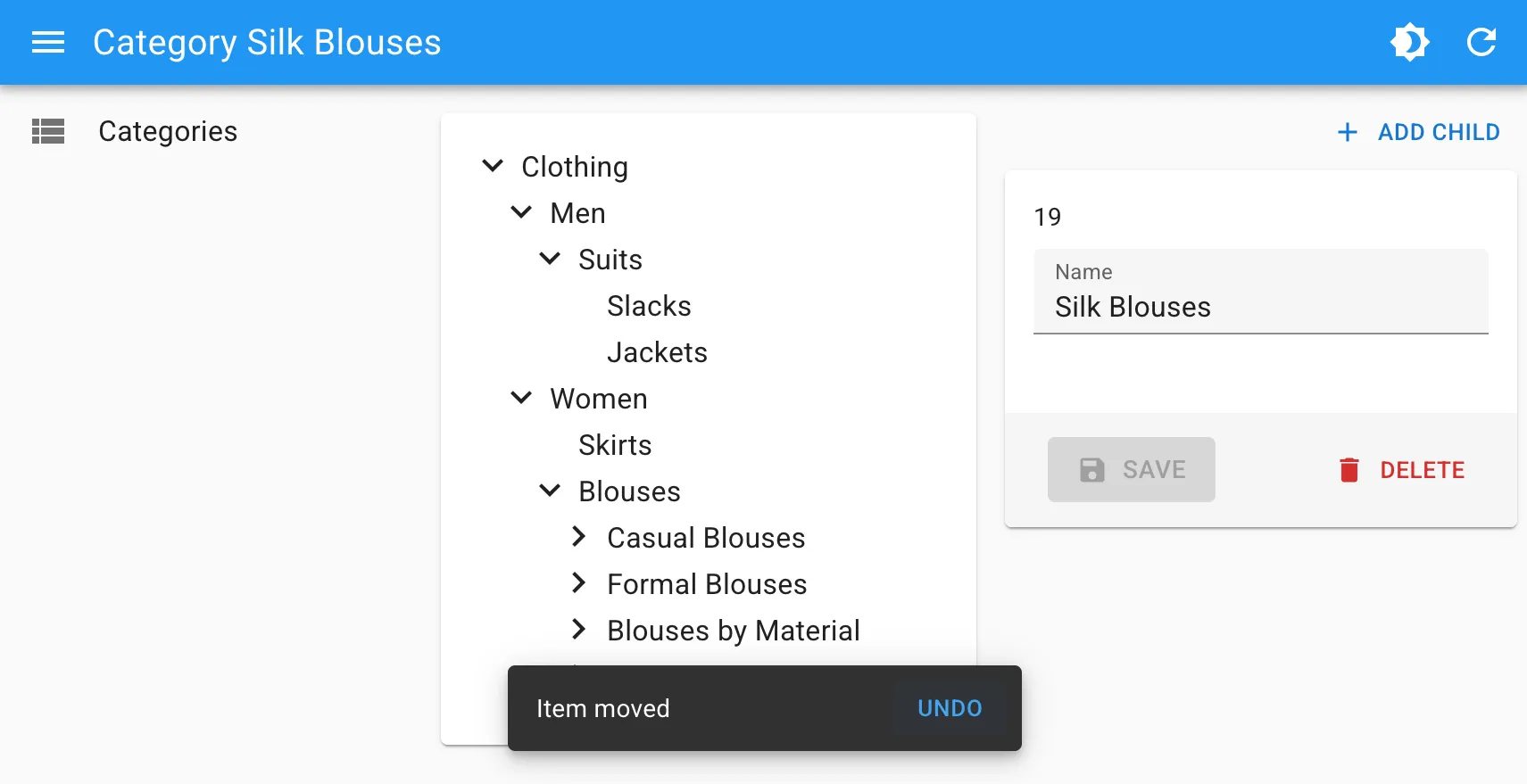
Components for visualizing and editing trees have also received numerous updates. First, the <Tree> component now uses hierarchical data straight from dataProvider.getTree(), without manual conversion.
import { Tree } from '@react-admin/ra-tree';
// tree data formatconst data = [    { id: 1, name: 'Clothing', children: [2, 6] },    { id: 2, name: 'Men', children: [3] },    { id: 3, name: 'Suits', children: [4, 5] },    { id: 4, name: 'Slacks', children: [] },    { id: 5, name: 'Jackets', children: [] },    { id: 6, name: 'Women', children: [7, 10, 11] },    { id: 7, name: 'Dresses', children: [8, 9] },    { id: 8, name: 'Evening Gowns', children: [] },    { id: 9, name: 'Sun Dresses', children: [] },    { id: 10, name: 'Skirts', children: [] },    { id: 11, name: 'Blouses', children: [] },];
// example usageexport const SimpleTree = () => <Tree data={data} titleField="name" />;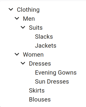
We’ve also fixed various bugs in this component regarding drag & drop operations. In addition, the <TreeWithDetail> component now supports the mutationMode, allowing you to make drag & drop operations optimistic or undoable.
Tree components are reserved for Enterprise Edition customers, part of the ra-tree package.
Let’s talk about live updates. The <ListLive> component is a <List> that refreshes when a record is created, updated, or deleted by another user. It’s been available for quite some time already. But how to refresh lists in <ReferenceManyField> or <ReferenceArrayField>?
We’ve extracted the live update behavior from <ListLive> to a new component called <ListLiveUpdate>, that can be added as a child of any component that supports the ListContext. That way, it can be used with <List>, <ReferenceManyField>, <ReferenceArrayField>, and more:
import { Show, SimpleShowLayout, ReferenceManyField, Datagrid, TextField, DateField } from 'react-admin';import { ListLiveUpdate } from '@react-admin/ra-realtime';const AuthorShow = () => ( <Show> <SimpleShowLayout> <TextField source="first_name" /> <TextField source="last_name" /> <ReferenceManyField reference="books" target="author_id" label="Books"> <Datagrid> <TextField source="title" /> <DateField source="published_at" /> </Datagrid> <ListLiveUpdate /> </ReferenceManyField> </SimpleShowLayout> </Show>);<ListLiveUpdate> is an Enterprise Edition component, part of the ra-realtime package.
Forms
React-admin v5.5 introduces a new input component for editing arrays of strings. <TextArrayInput> is an alternative to <ArrayInput> for scalar values. It makes editing a list of email addresses or a list of tags a breeze.
React-admin v5.5 allows you to link to a prefilled edition form using a query string or a route state in the <EditButton>. This is useful to prepare a modification, letting end users review and possibly modify the record before submitting it. This feature was previously only available in the <Create> component.
import { EditButton, Datagrid, List } from 'react-admin';
const ApproveButton = () => (    <EditButton state={{ record: { status: 'approved' } }} />);
export default PostList = () => (    <List>        <Datagrid>            ...            <ApproveButton />        </Datagrid>    </List>)
React-admin Enterprise Edition now provides a new AI-powered component that facilitates data entry. <FormFillerButton> allows users to fill a form based on an image uploaded or taken from the camera. It uses a vision-enabled model under the hood (and is agnostic to the LLM provider).
Lastly, let’s mention changes to the “warn when unsaved changes” feature. Preventing data loss on forms is an important feature and most React-admin forms support it thanks to the warnWhenUnsavedChanges prop.
However, this feature was not compatible with a few advanced components:
In the latest version of ra-form-layout, the Enterprise Edition package offering these components, we introduced an alternative <WarnWhenUnsavedChangesInDialog> component for <CreateInDialogButton> and <EditInDialogButton>.
Also, we modified <AutoSave> to block navigation while a save is pending, and to display a dialog message if a user attempts to close the window before the current changes are saved. This new feature is enabled by default.
UI & Navigation
We receive more and more feedback about React-admin’s default look. Its “google-y” style looks dated, while the trend promotes denser and more contrasted UI libraries like ShadCN. The popularity of Atomic CRM increased the demand for a more modern theme.
React-admin 5.6 now provides a new theme called B&W, a high-contrast theme with a black and white palette. Its modern-looking style, reminiscent of ShadCN, is suitable for desktop apps and for visually-impaired users. It’s a drop-in replacement for the default theme, and it only requires two lines of code to set up.
By default, the react-admin login form asks for a username and password. But many applications require users to sign in with an email instead. Until version 5.6, changing the login page for that purpose used to imply a lot of code. React-admin now provides the <LoginWithEmail> component for this common case:
import { Admin, LoginWithEmail } from 'react-admin';import authProvider from './authProvider';
const App = () => (    <Admin loginPage={LoginWithEmail} authProvider={authProvider}>        ...    </Admin>);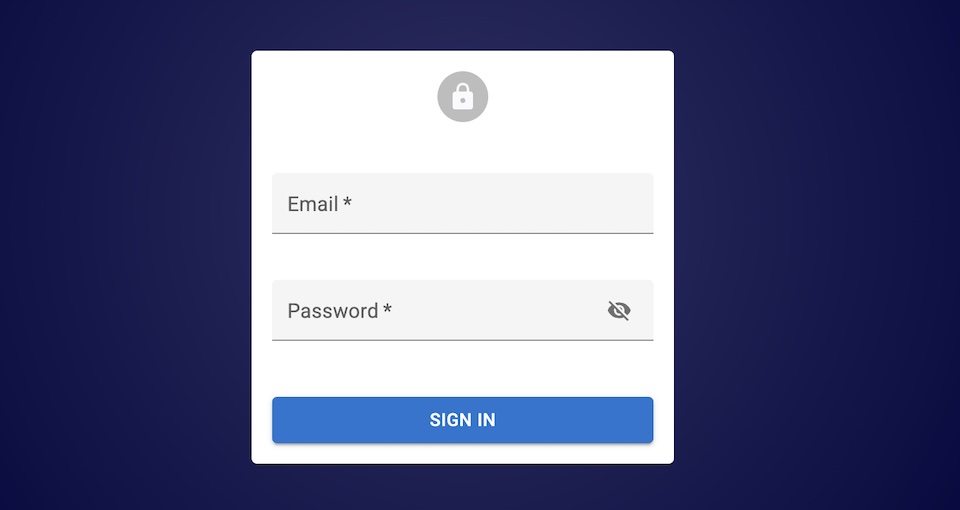
We also made it easier to further customize the login page so that you can add a reset password or a subscription link more easily:
import { Box, Link } from '@mui/material';import { Link as RouterLink } from 'react-router-dom';import { Login, LoginForm } from 'react-admin';
const MyLogin = () => (    <Login>        <LoginForm />        <Box textAlign="center" mb={1}>            <Link component={RouterLink} to="/forgot-password">                Forgot password?            </Link>        </Box>    </Login>);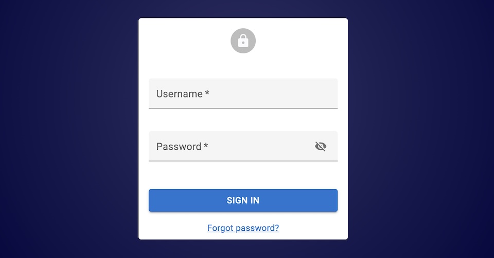
As we already mentioned in a previous article, React-admin 5.3 introduced access control mechanisms to hide content and remove features when users don’t have the authorization to use them. With the recent updates to the ra-navigation package, advanced menu components support access control by default. This means components like <SolarMenu>, <HorizontalMenu>, <MultilevelMenu>, and <IconMenu> will only render a menu item if the authProvider.canAccess() method returns true for the list action on the menu resource.
Speaking of the ra-navigation package, it recently introduced submenus for the <HorizontalMenu>, making this horizontal navigation suitable for larger applications.
Just pass children to <HorizontalMenu.Item> to create a submenu:
import { HorizontalMenu } from '@react-admin/ra-navigation';
const Menu = () => (  <HorizontalMenu>    <HorizontalMenu.DashboardItem label="Home" />    <HorizontalMenu.ResourceItem resource="artists" />    <HorizontalMenu.Item label="Business" value="business">        <HorizontalMenu.ResourceItem resource="producers" />        <HorizontalMenu.ResourceItem resource="label" />    </HorizontalMenu.Item>    <HorizontalMenu.ResourceItem resource="songs" />  </HorizontalMenu>);
Documentation
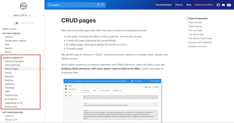
React-admin is almost ten years old. It provides so many features and components that it may be hard for newcomers to grasp all the underlying concepts. We introduced a new Guides & Concepts section in our documentation to explain the basics of react-admin. Even seasoned users may learn a thing or two about data fetching, forms, security, real-time, or internationalization.
We also added a new demo: behold the Todo App, built with react-admin… and without Material Design.
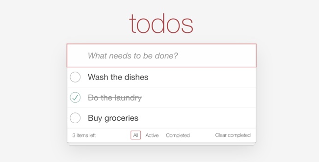
This deceptively simple application is actually a PWA you can install on your device that stores your data locally. It is open-source and showcases many react-admin features such as:
- Headless Components
- Custom Layout
- Custom List iterator
- Edit-in-place
- Inline Create form
- Custom filter UI
React-admin was designed to work better with relational data models. Components like <ReferenceField> and <ReferenceManyField> are good examples of these capabilities. But we never took the time to document features for relationships in a centralized way. The recent publication of the Handling Relationships in React Admin tutorial provides a comprehensive overview of how to effectively manage relationships in your applications. It’s a must-read!
Miscellaneous
We create new react-admin apps all the time, so we needed to make create-react-admin faster and easier to use. First, it is now non-interactive by default and will generate a bare-bones react-admin application if not provided with any parameters. This makes the setup explanation in tutorials way more terse.
The CLI now also automatically detects the package manager that ran it and will use it to install the dependencies. This means that you can now run npm create react-admin my-app and it will use npm, yarn create react-admin my-app and it will use yarn. Bun is also supported!
Finally, we made starting a new Supabase-based react-admin application super easy:
npm create react-admin my-supabase-app --dataProvider=supabaseFor people that have GraphQL backends, we also added the ability to support functionalities that extend beyond the default Data Provider methods. You may now leverage the GraphQL introspection mechanisms to implement things such as GraphQL subscriptions with ra-realtime. To allow this, ra-data-graphql dataProvider now has a getIntrospection method that returns an object with the following format:
{ // The original schema as returned by the Apollo client schema: {}, // An array of objects describing the types that are compatible with react-admin resources // and the methods they support. Note that not all methods may be supported. resources: [ { type: { name: 'name-of-the-type' }, // e.g. Post GET_LIST: { name: 'name-of-the-query' }, // e.g. allPosts GET_MANY: { name: 'name-of-the-query' }, // e.g. allPosts GET_MANY_REFERENCE: { name: 'name-of-the-query' }, // e.g. allPosts GET_ONE: { name: 'name-of-the-query' }, // e.g. Post CREATE: { name: 'name-of-the-query' }, // e.g. createPost UPDATE: { name: 'name-of-the-query' }, // e.g. updatePost DELETE: { name: 'name-of-the-query' }, // e.g. deletePost }, ],}With this, it becomes easier to implement custom methods based on the actual resources. You can learn more about it in the ra-data-graphql documentation.
We’re happy to announce partnerships with Supabase, Prisma, AppWrite, and Strapi, showing our commitment to fully support popular backends. We’re working with them to provide the best possible integration with React-admin and to make it easier to learn this integration.
For Supabase, the ra-supabase package provides sophisticated guesser components to generate an entire app with one line of code. In addition, you can expect an official quickstart guide in the Supabase documentation very soon. Stay tuned!
We also released ra-strapi and ra-appwrite, two new packages that will make it easier to get started with Strapi and AppWrite.
Finally, the Prisma team made a video showcasing how to use Prisma with React-admin:
YouTube might track you and we would rather have your consent before loading this video.
Conclusion
During the past months, we’ve made progress in every direction: new features for the open-source and enterprise customers, better docs, more tutorials, improved integrations. In addition to that, we still publish a bugfix release every week. Listing all the changes of the past couple of months would be too long, so if you’re interested in the details, check the Changelog for react-admin and the what’s new page for the Enterprise Edition.
We recommend that you upgrade your applications to react-admin 5.6 as the new features come free of breaking changes.
To conclude, we’d like to give you a teaser of what we’re currently working on. We’re in the process of rewriting the most-used react-admin component, <Datagrid>, to make it more powerful, more performant, and easier to use. Stay tuned for more updates!

Authors
Full-stack web developer at marmelab, Gildas has a strong appetite for emerging technologies. If you want an informed opinion on a new library, ask him, he's probably used it on a real project already.
Marmelab founder and CEO, passionate about web technologies, agile, sustainability, leadership, and open-source. Lead developer of react-admin, founder of GreenFrame.io, and regular speaker at tech conferences.