The Create and Edit Views
<Resource> maps URLs to components - it takes care of routing. When you set a component as the create prop for a Resource, react-admin renders that component when users go to the /[resource]/create URL. When you set a component as the edit prop for a resource, react-admin renders that component when users go to the /[resource]/:id URL.
<Resource name="posts" create={PostCreate} edit={PostEdit} />
                               ----------        --------
                                    |               |
    displayed when browsing to /posts/create        |
                                                    |
                    displayed when browsing to /posts/123
You can pass any component you want as create of edit props of a <Resource>. But you’ll probably want to fetch a record based on the URL, and display a form to edit that record. That’s what the <Create> and <Edit> components do. So in most cases, the component passed as create view uses the react-admin <Create> component, and the component passed as edit view uses the react-admin <Edit> component. Here is an example:
// in src/App.js
import * as React from "react";
import { Admin, Resource } from 'react-admin';
import jsonServerProvider from 'ra-data-json-server';

import { PostCreate, PostEdit } from './posts';

const App = () => (
    <Admin dataProvider={jsonServerProvider('https://jsonplaceholder.typicode.com')}>
        <Resource name="posts" create={PostCreate} edit={PostEdit} />
    </Admin>
);

export default App;

// in src/posts.js
import * as React from "react";
import { Create, Edit, SimpleForm, TextInput, DateInput, ReferenceManyField, Datagrid, TextField, DateField, EditButton, required } from 'react-admin';
import RichTextInput from 'ra-input-rich-text';

export const PostCreate = (props) => (
    <Create {...props}>
        <SimpleForm>
            <TextInput source="title" />
            <TextInput source="teaser" options={{ multiLine: true }} />
            <RichTextInput source="body" />
            <DateInput label="Publication date" source="published_at" defaultValue={new Date()} />
        </SimpleForm>
    </Create>
);

export const PostEdit = (props) => (
    <Edit {...props}>
        <SimpleForm>
            <TextInput disabled label="Id" source="id" />
            <TextInput source="title" validate={required()} />
            <TextInput multiline source="teaser" validate={required()} />
            <RichTextInput source="body" validate={required()} />
            <DateInput label="Publication date" source="published_at" />
            <ReferenceManyField label="Comments" reference="comments" target="post_id">
                <Datagrid>
                    <TextField source="body" />
                    <DateField source="created_at" />
                    <EditButton />
                </Datagrid>
            </ReferenceManyField>
        </SimpleForm>
    </Edit>
);
That’s enough to display the post edit form:
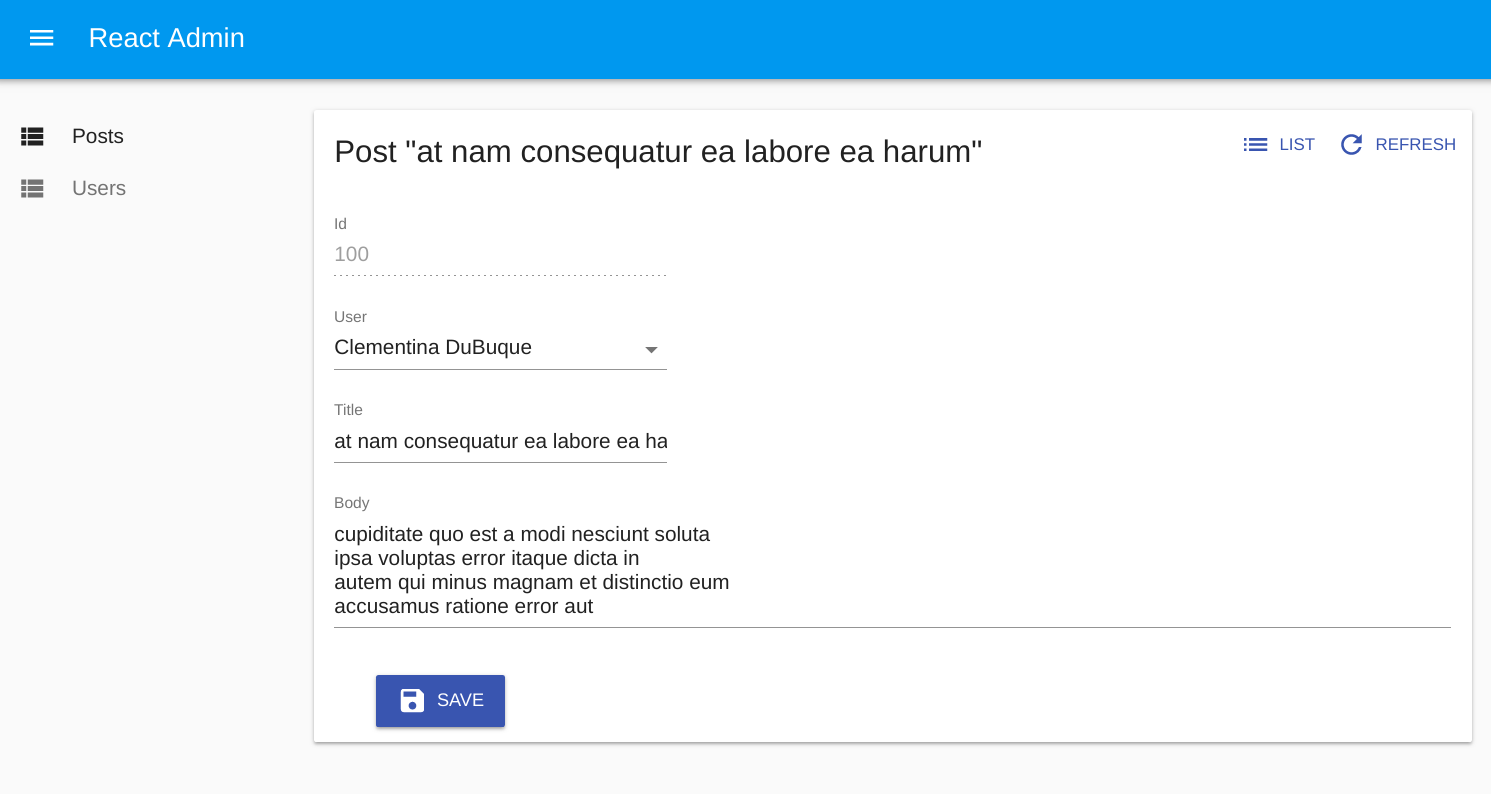
Tip: You might find it cumbersome to repeat the same input components for both the <Create> and the <Edit> view. In practice, these two views almost never have exactly the same form inputs. For instance, in the previous snippet, the <Edit> view shows related comments to the current post, which makes no sense for a new post. Having two separate sets of input components for the two views is, therefore, a deliberate choice. However, if you have the same set of input components, export them as a custom Form component to avoid repetition.
React-admin injects a few props to the create and edit views: the resource name, the basePath (the root URL), the permissions, and, in the case of the edit view, the record id. That’s why you need to pass the props to the <Create> and <Edit> components.
The <Create> and <Edit> components
The <Create> and <Edit> components call the dataProvider, prepare the form submit handler, and render the page title and actions. They are not responsible for rendering the actual form - that’s the job of their child component (usually <SimpleForm>). This form component uses its children (<Input> components) to render each form input.
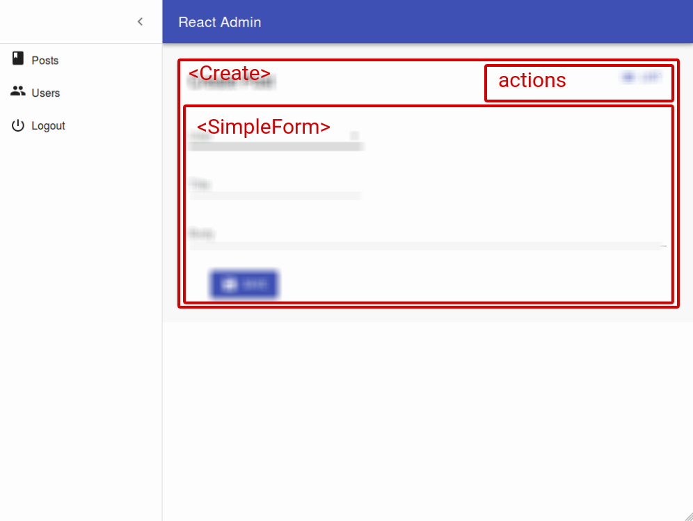
The <Create> component clones its child, and passes it an empty object {} as record prop. It also passes a callback as save prop, which calls dataProvider.create().
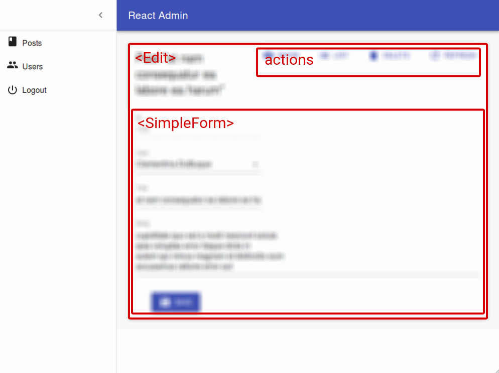
The <Edit> component calls dataProvider.getOne(), using the id from the URL. It also clones its child, and passes it the fetched record as record prop. It also passes a callback as save prop, which calls dataProvider.update().
You can customize the <Create> and <Edit> components using the following props:
titleactionsasidecomponentundoable(<Edit>only) (deprecated)mutationMode(<Edit>only)onSuccessonFailuretransformsuccessMessage(deprecated - useonSuccessinstead)
<Create> also accepts a record prop, to initialize the form based on a value object.
CSS API
The <Create> and <Edit> components accepts the usual className prop, but you can override many class names injected to the inner components by React-admin thanks to the classes property (as most Material UI components, see their documentation about it). This property accepts the following keys:
| Rule name | Description |
|---|---|
root |
Alternative to using className. Applied to the root element |
main |
Applied to the main container |
noActions |
Applied to the main container when actions prop is false |
card |
Applied to the child component inside the main container (Material UI’s Card by default) |
To override the style of all instances of <Create> and <Edit> components using the material-ui style overrides, use the RaCreate and RaEdit keys respectively.
Page Title
By default, the title for the Create view is “Create [resource_name]”, and the title for the Edit view is “Edit [resource_name] #[record_id]”.
You can customize this title by specifying a custom title prop:
export const PostEdit = (props) => (
    <Edit title="Post edition" {...props}>
        ...
    </Edit>
);
More interestingly, you can pass an element as title. React-admin clones this element and, in the <EditView>, injects the current record. This allows to customize the title according to the current record:
const PostTitle = ({ record }) => {
    return <span>Post {record ? `"${record.title}"` : ''}</span>;
};
export const PostEdit = (props) => (
    <Edit title={<PostTitle />} {...props}>
        ...
    </Edit>
);
Actions
You can replace the list of default actions by your own element using the actions prop:
import * as React from "react";
import Button from '@material-ui/core/Button';
import { TopToolbar, ShowButton } from 'react-admin';

const PostEditActions = ({ basePath, data, resource }) => (
    <TopToolbar>
        <ShowButton basePath={basePath} record={data} />
        {/* Add your custom actions */}
        <Button color="primary" onClick={customAction}>Custom Action</Button>
    </TopToolbar>
);

export const PostEdit = (props) => (
    <Edit actions={<PostEditActions />} {...props}>
        ...
    </Edit>
);
The <ListButton> component
A common customization is to add a button to go back to the List. Use the <ListButton> for that:
import { TopToolbar, ListButton, ShowButton } from 'react-admin';

const PostEditActions = ({ basePath, data }) => (
    <TopToolbar>
        <ListButton basePath={basePath} />
        <ShowButton basePath={basePath} record={data} />
    </TopToolbar>
);
If you want this button to look like a Back button, you can pass a custom label and icon to the ListButton:
import ChevronLeft from '@material-ui/icons/ChevronLeft';

const PostEditActions = ({ basePath, data }) => (
    <TopToolbar>
        <ListButton basePath={basePath} label="Back" icon={<ChevronLeft />} />
        <ShowButton basePath={basePath} record={data} />
    </TopToolbar>
);
Aside component
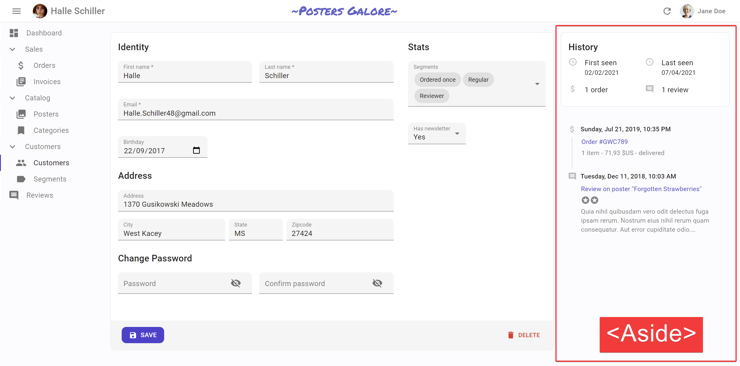
You may want to display additional information on the side of the form. Use the aside prop for that, passing the component of your choice:
const Aside = () => (
    <div style={{ width: 200, margin: '1em' }}>
        <Typography variant="h6">Post details</Typography>
        <Typography variant="body2">
            Posts will only be published once an editor approves them
        </Typography>
    </div>
);

const PostEdit = props => (
    <Edit aside={<Aside />} {...props}>
       // ...
    </Edit>
);
The aside component receives the same props as the Edit or Create child component: basePath, record, resource, and version. That means you can display non-editable details of the current record in the aside component:
const Aside = ({ record }) => (
    <div style={{ width: 200, margin: '1em' }}>
        <Typography variant="h6">Post details</Typography>
        {record && (
            <Typography variant="body2">
                Creation date: {record.createdAt}
            </Typography>
        )}
    </div>
);
Tip: Always test the record is defined before using it, as react-admin starts rendering the UI before the API call is over.
Component
By default, the Create and Edit views render the main form inside a material-ui <Card> element. The actual layout of the form depends on the Form component you’re using (<SimpleForm>, <TabbedForm>, or a custom form component).
Some form layouts also use Card, in which case the user ends up seeing a card inside a card, which is bad UI. To avoid that, you can override the main page container by passing a component prop :
// use a div as root component
const PostEdit = props => (
    <Edit component="div" {...props}>
        ...
    </Edit>
);

// use a custom component as root component
const PostEdit = props => (
    <Edit component={MyComponent} {...props}>
        ...
    </Edit>
);
The default value for the component prop is Card.
Undoable
Note: This prop is deprecated, use mutationMode="undoable" instead.
By default, the Save and Delete actions are undoable, i.e. react-admin only sends the related request to the data provider after a short delay, during which the user can cancel the action. This is part of the “optimistic rendering” strategy of react-admin ; it makes the user interactions more reactive.
You can disable this behavior by setting undoable={false}. With that setting, clicking on the Delete button displays a confirmation dialog. Both the Save and Delete actions become blocking and delay the refresh of the screen until the data provider responds.
const PostEdit = props => (
    <Edit undoable={false} {...props}>
        // ...
    </Edit>
);
Tip: If you want a confirmation dialog for the Delete button but don’t mind undoable Edits, then pass a custom toolbar to the form, as follows:
import * as React from "react";
import {
    Toolbar,
    SaveButton,
    DeleteButton,
    Edit,
    SimpleForm,
} from 'react-admin';
import { makeStyles } from '@material-ui/core/styles';

const useStyles = makeStyles({
    toolbar: {
        display: 'flex',
        justifyContent: 'space-between',
    },
});

const CustomToolbar = props => (
    <Toolbar {...props} classes={useStyles()}>
        <SaveButton />
        <DeleteButton undoable={false} />
    </Toolbar>
);

const PostEdit = props => (
    <Edit {...props}>
        <SimpleForm toolbar={<CustomToolbar />}>
            ...
        </SimpleForm>
    </Edit>
);
mutationMode
The <Edit> view exposes two buttons, Save and Delete, which perform “mutations” (i.e. they alter the data). React-admin offers three modes for mutations. The mode determines when the side effects (redirection, notifications, etc.) are executed:
pessimistic: The mutation is passed to the dataProvider first. When the dataProvider returns successfully, the mutation is applied locally, and the side effects are executed.optimistic: The mutation is applied locally and the side effects are executed immediately. Then the mutation is passed to the dataProvider. If the dataProvider returns successfully, nothing happens (as the mutation was already applied locally). If the dataProvider returns in error, the page is refreshed and an error notification is shown.undoable(default): The mutation is applied locally and the side effects are executed immediately. Then a notification is shown with an undo button. If the user clicks on undo, the mutation is never sent to the dataProvider, and the page is refreshed. Otherwise, after a 5 seconds delay, the mutation is passed to the dataProvider. If the dataProvider returns successfully, nothing happens (as the mutation was already applied locally). If the dataProvider returns in error, the page is refreshed and an error notification is shown.
By default, pages using <Edit> use the undoable mutation mode. This is part of the “optimistic rendering” strategy of react-admin ; it makes user interactions more reactive.
You can change this default by setting the mutationMode prop - and this affects both the Save and Delete buttons. For instance, to remove the ability to undo the changes, use the optimistic mode:
const PostEdit = props => (
    <Edit mutationMode="optimistic" {...props}>
        // ...
    </Edit>
);
And to make both the Save and Delete actions blocking, and wait for the dataProvider response to continue, use the pessimistic mode:
const PostEdit = props => (
    <Edit mutationMode="pessimistic" {...props}>
        // ...
    </Edit>
);
Tip: When using any other mode than undoable, the <DeleteButton> displays a confirmation dialog before calling the dataProvider.
Tip: If you want a confirmation dialog for the Delete button but don’t mind undoable Edits, then pass a custom toolbar to the form, as follows:
import * as React from "react";
import {
    Toolbar,
    SaveButton,
    DeleteButton,
    Edit,
    SimpleForm,
} from 'react-admin';
import { makeStyles } from '@material-ui/core/styles';

const useStyles = makeStyles({
    toolbar: {
        display: 'flex',
        justifyContent: 'space-between',
    },
});

const CustomToolbar = props => (
    <Toolbar {...props} classes={useStyles()}>
        <SaveButton />
        <DeleteButton mutationMode="pessimistic" />
    </Toolbar>
);

const PostEdit = props => (
    <Edit {...props}>
        <SimpleForm toolbar={<CustomToolbar />}>
            ...
        </SimpleForm>
    </Edit>
);
onSuccess
By default, when the save action succeeds, react-admin shows a notification, and redirects to another page. You can override this behavior and pass custom side effects by providing a function as onSuccess prop:
import * as React from 'react';
import { useNotify, useRefresh, useRedirect, Edit, SimpleForm } from 'react-admin';

const PostEdit = props => {
    const notify = useNotify();
    const refresh = useRefresh();
    const redirect = useRedirect();

    const onSuccess = () => {
        notify(`Changes saved`);
        redirect('/posts');
        refresh();
    };

    return (
        <Edit onSuccess={onSuccess} {...props}>
            <SimpleForm>
                ...
            </SimpleForm>
        </Edit>
    );
}
By default, the <Edit> view runs updates in mutationMode="undoable", which means that it calls the onSuccess side effects immediately, even before the dataProvider is called.
The default onSuccess function is:
// for the <Create> component:
() => {
    notify('ra.notification.created', { messageArgs: { smart_count: 1 } });
    redirect('edit', basePath, data.id, data);
}

// for the <Edit> component:
() => {
    notify('ra.notification.created', {
        messageArgs: { smart_count: 1 },
        undoable: mutationMode === 'undoable'
    });
    redirect('list', basePath, data.id, data);
}
To learn more about built-in side effect hooks like useNotify, useRedirect and useRefresh, check the Querying the API documentation.
Tip: When you use mutationMode="pessimistic", the onSuccess function receives the response from the dataProvider call (dataProvider.create() or dataProvider.update()), which is the created/edited record (see the dataProvider documentation for details). You can use that response in the success side effects:
import * as React from 'react';
import { useNotify, useRefresh, useRedirect, Edit, SimpleForm } from 'react-admin';

const PostEdit = props => {
    const notify = useNotify();
    const refresh = useRefresh();
    const redirect = useRedirect();

  const onSuccess = ({ data }) => {
        notify(`Changes to post "${data.title}" saved`);
        redirect('/posts');
        refresh();
    };

    return (
        <Edit onSuccess={onSuccess} mutationMode="pessimistic" {...props}>
            <SimpleForm>
                ...
            </SimpleForm>
        </Edit>
    );
}
Tip: When you set the onSuccess prop, the successMessage prop is ignored.
Tip: If you want to have different success side effects based on the button clicked by the user (e.g. if the creation form displays two submit buttons, one to “save and redirect to the list”, and another to “save and display an empty form”), you can set the onSuccess prop on the <SaveButton> component, too.
onFailure
By default, when the save action fails at the dataProvider level, react-admin shows an error notification. On an Edit page with mutationMode set to undoable or optimistic, it refreshes the page, too.
You can override this behavior and pass custom side effects by providing a function as onFailure prop:
import * as React from 'react';
import { useNotify, useRefresh, useRedirect, Edit, SimpleForm } from 'react-admin';

const PostEdit = props => {
    const notify = useNotify();
    const refresh = useRefresh();
    const redirect = useRedirect();

    const onFailure = (error) => {
        notify(`Could not edit post: ${error.message}`);
        redirect('/posts');
        refresh();
    };

    return (
        <Edit onFailure={onFailure} {...props}>
            <SimpleForm>
                ...
            </SimpleForm>
        </Edit>
    );
}
The onFailure function receives the error from the dataProvider call (dataProvider.create() or dataProvider.update()), which is a JavaScript Error object (see the dataProvider documentation for details).
The default onFailure function is:
// for the <Create> component:
(error) => {
    notify(typeof error === 'string' ? error : error.message || 'ra.notification.http_error', { type: 'warning' });
}

// for the <Edit> component:
(error) => {
    notify(typeof error === 'string' ? error : error.message || 'ra.notification.http_error', { type: 'warning' });
    if (mutationMode === 'undoable' || mutationMode === 'pessimistic') {
        refresh();
    }
}
Tip: If you want to have different failure side effects based on the button clicked by the user, you can set the onFailure prop on the <SaveButton> component, too.
transform
To transform a record after the user has submitted the form but before the record is passed to the dataProvider, use the transform prop. It expects a function taking a record as argument, and returning a modified record. For instance, to add a computed field upon creation:
export const UserCreate = (props) => {
    const transform = data => ({
        ...data,
        fullName: `${data.firstName} ${data.lastName}`
    });
    return (
        <Create {...props} transform={transform}>
            ...
        </Create>
    );
}
The transform function can also return a Promise, which allows you to do all sorts of asynchronous calls (e.g. to the dataProvider) during the transformation.
Tip: If you want to have different transformations based on the button clicked by the user (e.g. if the creation form displays two submit buttons, one to “save”, and another to “save and notify other admins”), you can set the transform prop on the <SaveButton> component, too. See Altering the Form Values Before Submitting for an example.
Success message
Deprecated: use the onSuccess prop instead. See Changing The Success or Failure Notification Message for the new syntax.
Once the dataProvider returns successfully after save, users see a generic notification (“Element created” / “Element updated”). You can customize this message by passing a successMessage prop:
const PostEdit = props => (
    <Edit successMessage="messages.post_saved" {...props}>
        // ...
    </Edit>
);
Tip: The message will be translated.
Prefilling a <Create> Record
Users may need to create a copy of an existing record. For that use case, use the <CloneButton> component. It expects a record and a basePath (usually injected to children of <Datagrid>, <SimpleForm>, <SimpleShowLayout>, etc.), so it’s as simple to use as a regular field or input.
For instance, to allow cloning all the posts from the list:
import * as React from "react";
import { List, Datagrid, TextField, CloneButton } from 'react-admin';

const PostList = props => (
    <List {...props}>
        <Datagrid>
            <TextField source="title" />
            <CloneButton />
        </Datagrid>
    </List>
);
Note: <CloneButton> is designed to be used in a <Datagrid> and in an edit view <Actions> component, not inside the form <Toolbar>. The Toolbar is basically for submitting the form, not for going to another resource.
Alternately, users need to prepopulate a record based on a related record. For instance, to create a comment related to an existing post.
By default, the <Create> view starts with an empty record. However, if the location object (injected by react-router-dom) contains a record in its state, the <Create> view uses that record instead of the empty object. That’s how the <CloneButton> works under the hood.
That means that if you want to create a link to a creation form, presetting some values, all you have to do is to set the location state. react-router-dom provides the <Link> component for that:
import * as React from "react";
import { Datagrid } from 'react-admin';
import Button from '@material-ui/core/Button';
import { Link } from 'react-router-dom';

const CreateRelatedCommentButton = ({ record }) => (
    <Button
        component={Link}
        to={{
            pathname: '/comments/create',
            state: { record: { post_id: record.id } },
        }}
    >
        Write a comment for that post
    </Button>
);

export default PostList = props => (
    <List {...props}>
        <Datagrid>
            ...
            <CreateRelatedCommentButton />
        </Datagrid>
    </List>
)
Tip: To style the button with the main color from the material-ui theme, use the Link component from the react-admin package rather than the one from react-router-dom.
Tip: The <Create> component also watches the “source” parameter of location.search (the query string in the URL) in addition to location.state (a cross-page message hidden in the router memory). So the CreateRelatedCommentButton could also be written as:
import * as React from "react";
import Button from '@material-ui/core/Button';
import { Link } from 'react-router-dom';

const CreateRelatedCommentButton = ({ record }) => (
    <Button
        component={Link}
        to={{
            pathname: '/comments/create',
            search: `?source=${JSON.stringify({ post_id: record.id })}`,
        }}
    >
        Write a comment for that post
    </Button>
);
Should you use the location state or the location search? The latter modifies the URL, so it’s only necessary if you want to build cross-application links (e.g. from one admin to the other). In general, using the location state is a safe bet.
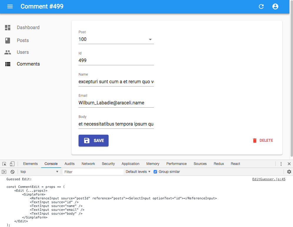
The <EditGuesser> component
Instead of a custom Edit, you can use the EditGuesser to determine which inputs to use based on the data returned by the API.
// in src/App.js
import * as React from "react";
import { Admin, Resource, EditGuesser } from 'react-admin';
import jsonServerProvider from 'ra-data-json-server';

const App = () => (
    <Admin dataProvider={jsonServerProvider('https://jsonplaceholder.typicode.com')}>
        <Resource name="posts" edit={EditGuesser} />
    </Admin>
);
Just like Edit, EditGuesser fetches the data. It then analyzes the response and guesses the inputs it should use to display a basic form with the data. It also dumps the components it has guessed in the console, where you can copy it into your own code. Use this feature to quickly bootstrap an Edit on top of an existing API, without adding the inputs one by one.
React-admin provides guessers for the List view (ListGuesser), the Edit view (EditGuesser), and the Show view (ShowGuesser).
Tip: Do not use the guessers in production. They are slower than manually-defined components because they have to infer types based on the content. Besides, the guesses are not always perfect.
useCreateController and useEditController
The <Create> and <Edit> components both take care of two things:
- (the “controller”) Fetching data based on the URL and transforming it
- (the “view”) Rendering the page title, the actions, the content and aside areas
In some cases, you may want to customize the view entirely (i.e. keep the code for step 1, and provide your own code for step 2). For these cases, react-admin provides two hooks, useCreateController() and useEditController(). These hooks contain just the controller part of the <Create> and <Edit> components.
Tip: You should not use these hooks to hide or show form inputs based on the data. For that need, check <FormDataConsumer>.
useCreateController
This hook takes one object as input (the props passed to a <Create> component) and returns the save callback for the Create view, as well as some pre-computed values. You can use it to create your own custom Create view, like this one:
import { useCreateController, CreateContextProvider, SimpleForm } from 'react-admin';

const MyCreate = props => {
    const createControllerProps = useCreateController(props);
    const {
        basePath, // deduced from the location, useful for action buttons
        defaultTitle, // the translated title based on the resource, e.g. 'Create Post'
        record, // empty object, unless some values were passed in the location state to prefill the form
        redirect, // the default redirection route. Defaults to 'edit', unless the resource has no edit view, in which case it's 'list'
        resource, // the resource name, deduced from the location. e.g. 'posts'
        save, // the create callback, to be passed to the underlying form as submit handler
        saving, // boolean that becomes true when the dataProvider is called to create the record
        version, // integer used by the refresh feature
    } = createControllerProps;
    return (
        <CreateContextProvider value={createControllerProps}>
            <div>
                <h1>{defaultTitle}</h1>
                {cloneElement(props.children, {
                    basePath,
                    record,
                    redirect,
                    resource,
                    save,
                    saving,
                    version,
                })}
            </div>
        </CreateContextProvider>
    );
}

const PostCreate = props => (
    <MyCreate {...props}>
        <SimpleForm>
            ...
        </SimpleForm>
    </MyCreate>
)
This custom Create view has no action buttons or aside component - it’s up to you to add them in pure React.
Tip: You don’t have to clone the child element. If you can’t reuse an existing form component like <SimpleForm> or <TabbedForm>, feel free to write the form code inside your custom MyCreate component.
useEditController
This hook takes one object as input (the props passed to an <Edit> component) and returns the fetched data and callbacks for the Edit view. You can use it to create your own custom Edit view, like this one:
import { useEditController, EditContextProvider, SimpleForm } from 'react-admin';

const MyEdit = props => {
    const controllerProps = useEditController(props);
    const {
        basePath, // deduced from the location, useful for action buttons
        defaultTitle, // the translated title based on the resource, e.g. 'Post #123'
        error,  // error returned by dataProvider when it failed to fetch the record. Useful if you want to adapt the view instead of just showing a notification using the `onFailure` side effect.
        loaded, // boolean that is false until the record is available
        loading, // boolean that is true on mount, and false once the record was fetched
        record, // record fetched via dataProvider.getOne() based on the id from the location
        redirect, // the default redirection route. Defaults to 'list'
        resource, // the resource name, deduced from the location. e.g. 'posts'
        save, // the update callback, to be passed to the underlying form as submit handler
        saving, // boolean that becomes true when the dataProvider is called to update the record
        version, // integer used by the refresh feature
    } = controllerProps;
    return (
        <EditContextProvider value={controllerProps}>
            <div>
                <h1>{defaultTitle}</h1>
                {cloneElement(props.children, {
                    basePath,
                    record,
                    redirect,
                    resource,
                    save,
                    saving,
                    version,
                })}
            </div>
        </EditContextProvider>
    );
}

const PostEdit = props => (
    <MyEdit {...props}>
        <SimpleForm>
            ...
        </SimpleForm>
    </MyEdit>
)
This custom Edit view has no action buttons or aside component - it’s up to you to add them in pure React.
Tip: You don’t have to clone the child element. If you can’t reuse an existing form component like <SimpleForm> or <TabbedForm>, feel free to write the form code inside your custom MyEdit component.
The <SimpleForm> component
The <SimpleForm> component receives the record as prop from its parent component. It is responsible for rendering the actual form. It is also responsible for validating the form data. Finally, it receives a handleSubmit function as prop, to be called with the updated record as an argument when the user submits the form.
The <SimpleForm> renders its child components line by line (within <div> components). It accepts Input and Field components as children. It relies on react-final-form for form handling.
By default, the <SimpleForm> submits the form when the user presses ENTER. If you want
to change this behaviour you can pass false for the submitOnEnter property, and the user will only be able to submit by pressing the save button. This can be useful e.g. if you have an input widget using ENTER for a special function.
Here are all the props you can set on the <SimpleForm> component:
initialValuesvalidatesubmitOnEnterredirecttoolbarvariantmargincomponentwarnWhenUnsavedChangessanitizeEmptyValues
export const PostCreate = (props) => (
    <Create {...props}>
        <SimpleForm>
            <TextInput source="title" />
            <RichTextInput source="body" />
            <NumberInput source="nb_views" />
        </SimpleForm>
    </Create>
);
Tip: Create and Edit inject more props to their child. So SimpleForm also expects these props to be set (you should set them yourself only in particular cases like the submission validation):
save: The function invoked when the form is submitted.saving: A boolean indicating whether a save operation is ongoing.
Label Decoration
<SimpleForm> scans its children for the addLabel prop, and automatically wraps a child in a <Labeled> component when found. This displays a label on top of the child, based on the label prop. This is not necessary for <Input> components, as they already contain their label. Also, all the react-admin <Field> components have a default prop addLabel: true, which explains why react-admin shows a label on top of Fields when they are used as children of <SimpleForm>.
For your own components that don’t include a label by default, set the addLabel prop if you want to use them as <SimpleForm> children.
const IdentifierField = ({ record }) => (
    <Typography>{record.id}</Typography>
);

const BodyField = ({ record }) => (
    <Identifier label="body">
        <Typography>
            {record.body}
        </Typography>
    </Identifier>
);

const PostEdit = (props) => (
    <Create {...props}>
        <SimpleForm>
            <IdentifierField addLabel label="Identifier" /> {/* SimpleForm will add a label */}
            <TextField source="title" /> {/* SimpleForm will add a label, too (TextField has addLabel:true in defaultProps) */}
            <BodyField /> {/* SimpleForm will NOT add a label */}
            <NumberInput source="nb_views" /> {/* SimpleForm will NOT add a label */}
        </SimpleForm>
    </Create>
);
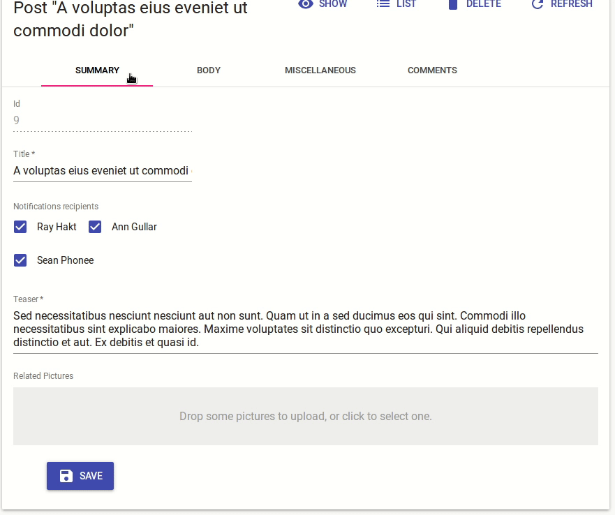
The <TabbedForm> component
Just like <SimpleForm>, <TabbedForm> receives the record prop, renders the actual form, and handles form validation on submit. However, the <TabbedForm> component renders inputs grouped by tab. The tabs are set by using <FormTab> components, which expect a label and an icon prop.
By default, the <TabbedForm> submits the form when the user presses ENTER, if you want
to change this behaviour you can pass false for the submitOnEnter property.
Here are all the props accepted by the <TabbedForm> component:
initialValuesvalidatesubmitOnEnterredirecttabstoolbarvariantmarginsave: The function invoked when the form is submitted. This is passed automatically byreact-adminwhen the form component is used insideCreateandEditcomponents.saving: A boolean indicating whether a save operation is ongoing. This is passed automatically byreact-adminwhen the form component is used insideCreateandEditcomponents.warnWhenUnsavedChangessanitizeEmptyValuessyncWithLocation
import * as React from "react";
import {
    TabbedForm,
    FormTab,
    Edit,
    Datagrid,
    TextField,
    DateField,
    TextInput,
    ReferenceManyField,
    NumberInput,
    DateInput,
    BooleanInput,
    EditButton
} from 'react-admin';

export const PostEdit = (props) => (
    <Edit {...props}>
        <TabbedForm>
            <FormTab label="summary">
                <TextInput disabled label="Id" source="id" />
                <TextInput source="title" validate={required()} />
                <TextInput multiline source="teaser" validate={required()} />
            </FormTab>
            <FormTab label="body">
                <RichTextInput source="body" validate={required()} addLabel={false} />
            </FormTab>
            <FormTab label="Miscellaneous">
                <TextInput label="Password (if protected post)" source="password" type="password" />
                <DateInput label="Publication date" source="published_at" />
                <NumberInput source="average_note" validate={[ number(), minValue(0) ]} />
                <BooleanInput label="Allow comments?" source="commentable" defaultValue />
                <TextInput disabled label="Nb views" source="views" />
            </FormTab>
            <FormTab label="comments">
                <ReferenceManyField reference="comments" target="post_id" addLabel={false}>
                    <Datagrid>
                        <TextField source="body" />
                        <DateField source="created_at" />
                        <EditButton />
                    </Datagrid>
                </ReferenceManyField>
            </FormTab>
        </TabbedForm>
    </Edit>
);
To style the tabs, the <FormTab> component accepts two props:
classNameis passed to the tab headercontentClassNameis passed to the tab content
Sync With Location
You can also opt out the location synchronization by passing false to the syncWithLocation prop of the <TabbedForm> component. This allows e.g. to have several <TabbedForm> components in a page.
export const PostEdit = (props) => (
    <Edit {...props}>
        <TabbedForm syncWithLocation={false}>
            <FormTab label="summary">
                <TextInput disabled label="Id" source="id" />
                <TextInput source="title" validate={required()} />
                <TextInput multiline source="teaser" validate={required()} />
            </FormTab>
            <FormTab label="body">
                <RichTextInput source="body" validate={required()} addLabel={false} />
            </FormTab>
            <FormTab label="Miscellaneous">
                <TextInput label="Password (if protected post)" source="password" type="password" />
                <DateInput label="Publication date" source="published_at" />
                <NumberInput source="average_note" validate={[ number(), minValue(0) ]} />
                <BooleanInput label="Allow comments?" source="commentable" defaultValue />
                <TextInput disabled label="Nb views" source="views" />
            </FormTab>
            <FormTab label="comments">
                <ReferenceManyField reference="comments" target="post_id" addLabel={false}>
                    <Datagrid>
                        <TextField source="body" />
                        <DateField source="created_at" />
                        <EditButton />
                    </Datagrid>
                </ReferenceManyField>
            </FormTab>
        </TabbedForm>
    </Edit>
);
Tip: When syncWithLocation is false, the path prop of the <FormTab> components is ignored.
Label Decoration
<FormTab> scans its children for the addLabel prop, and automatically wraps a child in a <Labeled> component when found. This displays a label on top of the child, based on the label prop. This is not necessary for <Input> components, as they already contain their label. Also, all the react-admin <Field> components have a default prop addLabel: true, which explains why react-admin shows a label on top of Fields when they are used as children of <FormTab>.
For your own components that don’t include a label by default, set the addLabel prop if you want to use them as <FormTab> children.
const IdentifierField = ({ record }) => (
    <Typography>{record.id}</Typography>
);

const BodyField = ({ record }) => (
    <Identifier label="body">
        <Typography>
            {record.body}
        </Typography>
    </Identifier>
);

const PostEdit = props => (
    <Create {...props}>
        <TabbedForm>
            <FormTab label="main">
                <IdentifierField addLabel label="Identifier" /> {/* FormTab will add a label */}
                <TextField source="title" /> {/* FormTab will add a label, too (TextField has addLabel:true) in defaultProps */}
                <BodyField /> {/* FormTab will NOT add a label */}
                <NumberInput source="nb_views" /> {/* FormTab will NOT add a label */}
            </FormTab>
        </TabbedForm>
    </Create>
);
TabbedFormTabs
By default <TabbedForm> uses <TabbedFormTabs>, an internal react-admin component, to renders tabs. You can pass a custom component as the tabs prop to override the default component. Besides, props from <TabbedFormTabs> are passed to material-ui’s <Tabs> component inside <TabbedFormTabs>.
The following example shows how to make use of scrollable <Tabs>. Pass variant="scrollable" and scrollButtons="auto" props to <TabbedFormTabs> and use it in the tabs prop from <TabbedForm>.
import * as React from "react";
import {
    Edit,
    TabbedForm,
    TabbedFormTabs,
} from 'react-admin';

export const PostEdit = (props) => (
    <Edit {...props}>
        <TabbedForm tabs={<TabbedFormTabs variant="scrollable" scrollButtons="auto" />}>
            ...
        </TabbedForm>
    </Edit>
);
The <AccordionForm> Component
This Enterprise Edition component offers an alternative layout for Edit and Create forms, where Inputs are grouped into expandable panels.

import {
    Edit,
    TextField,
    TextInput,
    DateInput,
    SelectInput,
    ArrayInput,
    SimpleFormIterator,
    BooleanInput,
} from 'react-admin';

import { AccordionForm, AccordionFormPanel } from '@react-admin/ra-form-layout';

// don't forget the component="div" prop on the main component to disable the main Card
const CustomerEdit = props => (
    <Edit {...props} component="div">
        <AccordionForm autoClose>
            <AccordionFormPanel label="Identity">
                <TextField source="id" />
                <TextInput source="first_name" validate={required()} />
                <TextInput source="last_name" validate={required()} />
                <DateInput source="dob" label="born" validate={required()} />
                <SelectInput source="sex" choices={sexChoices} />
            </AccordionFormPanel>
            <AccordionFormPanel label="Occupations">
                <ArrayInput source="occupations" label="">
                    <SimpleFormIterator>
                        <TextInput source="name" validate={required()} />
                        <DateInput source="from" validate={required()} />
                        <DateInput source="to" />
                    </SimpleFormIterator>
                </ArrayInput>
            </AccordionFormPanel>
            <AccordionFormPanel label="Preferences">
                <SelectInput
                    source="language"
                    choices={languageChoices}
                    defaultValue="en"
                />
                <BooleanInput source="dark_theme" />
                <BooleanInput source="accepts_emails_from_partners" />
            </AccordionFormPanel>
        </AccordionForm>
    </Edit>
);
You can also use the <AccordionSection> component as a child of <SimpleForm> for secondary inputs:

Check the ra-form-layout documentation for more details.
The <WizardForm> Component
This Enterprise Edition component offers an alternative layout for large Create forms, allowing users to enter data step-by-step.

import * as React from 'react';
import { Create, TextInput, required } from 'react-admin';
import { WizardForm, WizardFormStep } from '@react-admin/ra-form-layout';

const PostCreate = props => (
    <Create {...props}>
        <WizardForm>
            <WizardFormStep label="First step">
                <TextInput source="title" validate={required()} />
            </WizardFormStep>
            <WizardFormStep label="Second step">
                <TextInput source="description" />
            </WizardFormStep>
            <WizardFormStep label="Third step">
                <TextInput source="fullDescription" validate={required()} />
            </WizardFormStep>
        </WizardForm>
    </Create>
);
Check the ra-form-layout documentation for more details.
The <CreateDialog> and <EditDialog> Components
These Enterprise Edition components offer an alternative layout for adding or updating a record without leaving the context of the list page.

import * as React from 'react';
import { List, Datagrid, SimpleForm, TextField, TextInput, DateInput, required } from 'react-admin';
import { EditDialog, CreateDialog } from '@react-admin/ra-form-layout';

const CustomerList = props => (
    <>
        <List {...props}>
            <Datagrid>
                ...
            </Datagrid>
        </List>
        <EditDialog {...props}>
            <SimpleForm>
                <TextField source="id" />
                <TextInput source="first_name" validate={required()} />
                <TextInput source="last_name" validate={required()} />
                <DateInput source="date_of_birth" label="born" validate={required()} />
            </SimpleForm>
        </EditDialog>
        <CreateDialog {...props}>
            <SimpleForm>
                <TextField source="id" />
                <TextInput source="first_name" validate={required()} />
                <TextInput source="last_name" validate={required()} />
                <DateInput source="date_of_birth" label="born" validate={required()} />
            </SimpleForm>
        </CreateDialog>
    </>
);
Check the ra-form-layout documentation for more details.
Default Values
To define default values, you can add a initialValues prop to form components (<SimpleForm>, <TabbedForm>, etc.), or add a defaultValue to individual input components. Let’s see each of these options.
Note: on RA v2 the initialValues used to be named defaultValue
Global Default Value
The value of the form initialValues prop is an object, or a function returning an object, specifying default values for the created record. For instance:
const postDefaultValue = () => ({ id: uuid(), created_at: new Date(), nb_views: 0 });
export const PostCreate = (props) => (
    <Create {...props}>
        <SimpleForm initialValues={postDefaultValue}>
            <TextInput source="title" />
            <RichTextInput source="body" />
            <NumberInput source="nb_views" />
        </SimpleForm>
    </Create>
);
Tip: You can include properties in the form initialValues that are not listed as input components, like the created_at property in the previous example.
Per Input Default Value
Alternatively, you can specify a defaultValue prop directly in <Input> components. React-admin will merge the input default values with the form default value (input > form):
export const PostCreate = (props) => (
    <Create {...props}>
        <SimpleForm>
            <TextInput source="title" />
            <RichTextInput source="body" />
            <NumberInput source="nb_views" defaultValue={0} />
        </SimpleForm>
    </Create>
);
Tip: Per-input default values cannot be functions. For default values computed at render time, set the initialValues at the form level, as explained in the previous section.
Validation
React-admin relies on react-final-form for the validation.
To validate values submitted by a form, you can add a validate prop to the form component, to individual inputs, or even mix both approaches.
Global Validation
The value of the form validate prop must be a function taking the record as input, and returning an object with error messages indexed by field. For instance:
const validateUserCreation = (values) => {
    const errors = {};
    if (!values.firstName) {
        errors.firstName = 'The firstName is required';
    }
    if (!values.age) {
        // You can return translation keys
        errors.age = 'ra.validation.required';
    } else if (values.age < 18) {
        // Or an object if the translation messages need parameters
        errors.age = {
            message: 'ra.validation.minValue',
            args: { min: 18 }
        };
    }
    return errors
};

export const UserCreate = (props) => (
    <Create {...props}>
        <SimpleForm validate={validateUserCreation}>
            <TextInput label="First Name" source="firstName" />
            <TextInput label="Age" source="age" />
        </SimpleForm>
    </Create>
);
Tip: The props you pass to <SimpleForm> and <TabbedForm> are passed to the <Form> of react-final-form.
Tip: The validate function can return a promise for asynchronous validation. See the Server-Side Validation section below.
Per Input Validation: Built-in Field Validators
Alternatively, you can specify a validate prop directly in <Input> components, taking either a function or an array of functions. React-admin already bundles a few validator functions, that you can just require, and use as input-level validators:
required(message)if the field is mandatory,minValue(min, message)to specify a minimum value for integers,maxValue(max, message)to specify a maximum value for integers,minLength(min, message)to specify a minimum length for strings,maxLength(max, message)to specify a maximum length for strings,number(message)to check that the input is a valid number,email(message)to check that the input is a valid email address,regex(pattern, message)to validate that the input matches a regex,choices(list, message)to validate that the input is within a given list,
Example usage:
import {
    required,
    minLength,
    maxLength,
    minValue,
    maxValue,
    number,
    regex,
    email,
    choices
} from 'react-admin';

const validateFirstName = [required(), minLength(2), maxLength(15)];
const validateEmail = email();
const validateAge = [number(), minValue(18)];
const validateZipCode = regex(/^\d{5}$/, 'Must be a valid Zip Code');
const validateGender = choices(['m', 'f', 'nc'], 'Please choose one of the values');

export const UserCreate = (props) => (
    <Create {...props}>
        <SimpleForm>
            <TextInput label="First Name" source="firstName" validate={validateFirstName} />
            <TextInput label="Email" source="email" validate={validateEmail} />
            <TextInput label="Age" source="age" validate={validateAge}/>
            <TextInput label="Zip Code" source="zip" validate={validateZipCode}/>
            <SelectInput label="Gender" source="gender" choices={[
                { id: 'm', name: 'Male' },
                { id: 'f', name: 'Female' },
                { id: 'nc', name: 'Prefer not say' },
            ]} validate={validateGender}/>
        </SimpleForm>
    </Create>
);
Tip: If you pass a function as a message, react-admin calls this function with { args, value, values,translate, ...props } as argument. For instance:
const message = ({ translate }) => translate('myroot.validation.email_invalid');
const validateEmail = email(message);
Per Input Validation: Custom Function Validator
You can also define your own validator functions. These functions should return undefined when there is no error, or an error string.
const required = (message = 'Required') =>
    value => value ? undefined : message;
const maxLength = (max, message = 'Too short') =>
    value => value && value.length > max ? message : undefined;
const number = (message = 'Must be a number') =>
    value => value && isNaN(Number(value)) ? message : undefined;
const minValue = (min, message = 'Too small') =>
    value => value && value < min ? message : undefined;

const ageValidation = (value, allValues) => {
    if (!value) {
        return 'The age is required';
    }
    if (value < 18) {
        return 'Must be over 18';
    }
    return undefined;
};

const validateFirstName = [required(), maxLength(15)];
const validateAge = [required(), number(), ageValidation];

export const UserCreate = (props) => (
    <Create {...props}>
        <SimpleForm>
            <TextInput label="First Name" source="firstName" validate={validateFirstName} />
            <TextInput label="Age" source="age" validate={validateAge}/>
        </SimpleForm>
    </Create>
);
React-admin will combine all the input-level functions into a single function looking just like the previous one.
Input validation functions receive the current field value and the values of all fields of the current record. This allows for complex validation scenarios (e.g. validate that two passwords are the same).
Tip: If your admin has multi-language support, validator functions should return message identifiers rather than messages themselves. React-admin automatically passes these identifiers to the translation function:
// in validators/required.js
const required = () => (value, allValues, props) =>
    value
        ? undefined
        : 'myroot.validation.required';

// in i18n/en.json
export default {
    myroot: {
        validation: {
            required: 'Required field',
        }
    }
}
If the translation depends on a variable, the validator can return an object rather than a translation identifier:
// in validators/minLength.js
const minLength = (min) => (value, allValues, props) =>
    value.length >= min
        ? undefined
        : { message: 'myroot.validation.minLength', args: { min } };

// in i18n/en.js
export default {
    myroot: {
        validation: {
            minLength: 'Must be %{min} characters at least',
        }
    }
}
See the Translation documentation for details.
Tip: Make sure to define validation functions or array of functions in a variable outside your component, instead of defining them directly in JSX. This can result in a new function or array at every render, and trigger infinite rerender.
const validateStock = [required(), number(), minValue(0)];

export const ProductEdit = ({ ...props }) => (
    <Edit {...props}>
        <SimpleForm initialValues={{ stock: 0 }}>
            ...
            {/* do this */}
            <NumberInput source="stock" validate={validateStock} />
            {/* don't do that */}
            <NumberInput source="stock" validate={[required(), number(), minValue(0)]} />
            ...
        </SimpleForm>
    </Edit>
);
Tip: The props of your Input components are passed to a react-final-form Field component.
Tip: You can use both Form validation and input validation.
Tip: The custom validator function can return a promise, e.g. to use server-side validation. See next section for details.
Server-Side Validation
You can validate the entire form data server-side by returning a Promise in the form validate function. For instance:
const validateUserCreation = async (values) => {
    const errors = {};
    if (!values.firstName) {
        errors.firstName = 'The firstName is required';
    }
    if (!values.age) {
        errors.age = 'The age is required';
    } else if (values.age < 18) {
        errors.age = 'Must be over 18';
    }

    const isEmailUnique = await checkEmailIsUnique(values.email);
    if (!isEmailUnique) {
        // Return a message directly
        errors.email = 'Email already used';
        // Or a translation key
        errors.email = 'myapp.validation.email_not_unique';
        // Or an object if the translation needs parameters
        errors.email = {
            message: 'myapp.validation.email_not_unique',
            args: { email: values.email }
        };
    }
    return errors
};

export const UserCreate = (props) => (
    <Create {...props}>
        <SimpleForm validate={validateUserCreation}>
            <TextInput label="First Name" source="firstName" />
            <TextInput label="Email" source="email" />
            <TextInput label="Age" source="age" />
        </SimpleForm>
    </Create>
);
Per Input validators can also return a Promise to call the server for validation. For instance:
const validateEmailUnicity = async (value) => {
    const isEmailUnique = await checkEmailIsUnique(value);
    if (!isEmailUnique) {
        return 'Email already used';

        // You can return a translation key as well
        return 'myroot.validation.email_already_used';

        // Or even an object just like the other validators
        return { message: 'myroot.validation.email_already_used', args: { email: value } }

    }

    return undefined;
};

const emailValidators = [required(), validateEmailUnicity];

export const UserCreate = (props) => (
    <Create {...props}>
        <SimpleForm validate={validateUserCreation}>
            ...
            <TextInput label="Email" source="email" validate={emailValidators} />
            ...
        </SimpleForm>
    </Create>
);
Important: Note that asynchronous validators are not supported on the <ArrayInput> component due to a limitation of react-final-form-arrays.
Submission Validation
The form can be validated by the server after its submission. In order to display the validation errors, a custom save function needs to be used:
import * as React from 'react';
import { useCallback } from 'react';
import { Create, SimpleForm, TextInput, useMutation } from 'react-admin';

export const UserCreate = (props) => {
    const [mutate] = useMutation();
    const save = useCallback(
        async (values) => {
            try {
                await mutate({
                    type: 'create',
                    resource: 'users',
                    payload: { data: values },
                }, { returnPromise: true });
            } catch (error) {
                if (error.body.errors) {
                    return error.body.errors;
                }
            }
        },
        [mutate],
    );

    return (
        <Create {...props}>
            <SimpleForm save={save}>
                <TextInput label="First Name" source="firstName" />
                <TextInput label="Age" source="age" />
            </SimpleForm>
        </Create>
    );
};
Tip: The shape of the returned validation errors must correspond to the form: a key needs to match a source prop.
Tip: The returned validation errors might have any validation format we support (simple strings or object with message and args) for each key.
Submit On Enter
By default, pressing ENTER in any of the form fields submits the form - this is the expected behavior in most cases. However, some of your custom input components (e.g. Google Maps widget) may have special handlers for the ENTER key. In that case, to disable the automated form submission on enter, set the submitOnEnter prop of the form component to false:
export const PostEdit = (props) => (
    <Edit {...props}>
        <SimpleForm submitOnEnter={false}>
            ...
        </SimpleForm>
    </Edit>
);
Redirection After Submission
By default:
- Submitting the form in the
<Create>view redirects to the<Edit>view - Submitting the form in the
<Edit>view redirects to the<List>view
You can customize the redirection by setting the redirect prop of the form component. Possible values are “edit”, “show”, “list”, and false to disable redirection. You may also specify a custom path such as /my-custom-route. For instance, to redirect to the <Show> view after edition:
export const PostEdit = (props) => (
    <Edit {...props}>
        <SimpleForm redirect="show">
            ...
        </SimpleForm>
    </Edit>
);
You can also pass a custom route (e.g. “/home”) or a function as redirect prop value. For example, if you want to redirect to a page related to the current object:
// redirect to the related Author show page
const redirect = (basePath, id, data) => `/author/${data.author_id}/show`;

export const PostEdit = (props) => (
    <Edit {...props}>
        <SimpleForm redirect={redirect}>
            // ...
        </SimpleForm>
    </Edit>
);
This affects both the submit button, and the form submission when the user presses ENTER in one of the form fields.
Tip: The redirect prop is ignored if you’ve set the onSuccess prop in the <Edit>/<Create> component, or in the <SaveButton> component.
Tip: You may wonder why the redirect prop does the same thing as onSuccess: that’s for historical reasons. The recommended way is to change redirection using onSuccess rather than redirect.
Toolbar
At the bottom of the form, the toolbar displays the submit button. You can override this component by setting the toolbar prop, to display the buttons of your choice.
The most common use case is to display two submit buttons in the <Create> view:
- One that creates and redirects to the
<Show>view of the new resource, and - One that redirects to a blank
<Create>view after creation (allowing bulk creation)
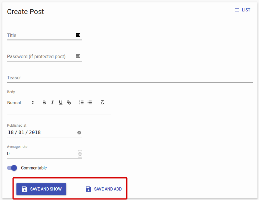
For that use case, use the <SaveButton> component with a custom redirect prop:
import * as React from "react";
import { Create, SimpleForm, SaveButton, Toolbar } from 'react-admin';

const PostCreateToolbar = props => (
    <Toolbar {...props} >
        <SaveButton
            label="post.action.save_and_show"
            redirect="show"
            submitOnEnter={true}
        />
        <SaveButton
            label="post.action.save_and_add"
            redirect={false}
            submitOnEnter={false}
            variant="text"
        />
    </Toolbar>
);

export const PostCreate = (props) => (
    <Create {...props}>
        <SimpleForm toolbar={<PostCreateToolbar />} redirect="show">
            ...
        </SimpleForm>
    </Create>
);
Another use case is to remove the <DeleteButton> from the toolbar in an edit view. In that case, create a custom toolbar containing only the <SaveButton> as a child:
import * as React from "react";
import { Edit, SimpleForm, SaveButton, Toolbar } from 'react-admin';

const PostEditToolbar = props => (
    <Toolbar {...props} >
        <SaveButton />
    </Toolbar>
);

export const PostEdit = (props) => (
    <Edit {...props}>
        <SimpleForm toolbar={<PostEditToolbar />}>
            // ...
        </SimpleForm>
    </Edit>
);
In the default <Toolbar>, the <SaveButton> is disabled when the form is pristine. You can bypass this behavior and always enable it without customizing the <Toolbar> thanks to the prop alwaysEnableSaveButton:
import * as React from 'react';
import { Edit, SimpleForm, Toolbar } from 'react-admin';

export const PostEdit = (props) => (
    <Edit {...props}>
        <SimpleForm toolbar={<Toolbar alwaysEnableSaveButton />}>
            ...
        </SimpleForm>
    </Edit>
);
But if you want to customize the <Toolbar> (to remove the <DeleteButton> for example), you have to manage the disabled behaviour of the <SaveButton> by yourself:
import * as React from "react";
import { Edit, SimpleForm, SaveButton, Toolbar } from 'react-admin';

const PostEditToolbar = props => (
    <Toolbar {...props} >
        <SaveButton disabled={props.pristine} />
    </Toolbar>
);

export const PostEdit = (props) => (
    <Edit {...props}>
        <SimpleForm toolbar={<PostEditToolbar />}>
            // ...
        </SimpleForm>
    </Edit>
);
Here are the props received by the Toolbar component when passed as the toolbar prop of the SimpleForm or TabbedForm components:
alwaysEnableSaveButton: Force enabling the<SaveButton>. If it’s not defined or isfalse, the<SaveButton>will be enabled using thepristineprop (disabled if pristine, enabled otherwise).handleSubmitWithRedirect: The function to call in order to submit the form. It accepts a single parameter overriding the form’s default redirect.handleSubmitwhich is the same prop as in react-final-forminvalid: A boolean indicating whether the form is invalidpristine: A boolean indicating whether the form is pristine (eg: no inputs have been changed yet)redirect: The default form’s redirectsaving: A boolean indicating whether a save operation is ongoing.submitOnEnter: A boolean indicating whether the form should be submitted when pressingenterwidth: A string apply to the mobile or desktop classes depending on its value. Passxsto display the mobile version.
CSS API
The <Toolbar> accepts the usual className prop, but you can override many class names injected to the inner components by React-admin thanks to the classes property (as most Material UI components, see their documentation about it). This property accepts the following keys:
| Rule name | Description |
|---|---|
toolbar |
Applied to the underlying MuiToolbar component |
defaultToolbar |
Applied to the container of the <Toolbar> buttons when no children are passed |
desktopToolbar |
Applied to the underlying MuiToolbar component when width prop is not xs |
mobileToolbar |
Applied to the underlying MuiToolbar component when width prop is xs |
spacer |
Applied to the div below the underlying MuiToolbar used as spacer |
To override the style of all instances of <Toolbar> components using the material-ui style overrides, use the RaToolbar key.
Tip: Use react-admin’s <Toolbar> component instead of material-ui’s <Toolbar> component. The former builds upon the latter and adds support for an alternative mobile layout (and is therefore responsive).
Tip: Don’t forget to also set the redirect prop of the Form component to handle submission by the ENTER key.
Tip: To alter the form values before submitting, you should use the handleSubmit prop. See Altering the Form Values before Submitting for more information and examples.
Tip: If you want to include a custom Button in a <Toolbar> that doesn’t render a react-admin <Button>, the props injected by <Toolbar> to its children (handleSubmit, handleSubmitWithRedirect, onSave, invalid, pristine, saving, and submitOnEnter) will cause React warnings. You’ll need to wrap your custom Button in another component and ignore the injected props, as follows:
import * as React from "react";
import Button from '@material-ui/core/Button';

const CustomButton = props => <Button label="My Custom Button" {...props} />

const ToolbarCustomButton = ({
  handleSubmit,
  handleSubmitWithRedirect,
  onSave,
  invalid,
  pristine,
  saving,
  submitOnEnter,
  ...rest
}) => <CustomButton {...rest} />;

const PostEditToolbar = props => (
    <Toolbar {...props} >
        <ToolbarCustomButton />
    </Toolbar>
);
Customizing The Form Layout
You can customize each row in a <SimpleForm> or in a <TabbedForm> by passing props to the Input components:
classNamevariantmarginformClassNamefullWidth
You can find more about these props in the Input documentation.
You can also wrap inputs inside containers, or create a custom Form component, alternative to <SimpleForm> or <TabbedForm>.
Variant
By default, react-admin input components use the Material Design “filled” variant. If you want to use the “standard” or “outlined” variants, you can either set the variant prop on each Input component individually, or set the variant prop directly on the Form component. In that case, the Form component will transmit the variant to each Input.
export const PostEdit = (props) => (
    <Edit {...props}>
        <SimpleForm variant="standard">
            ...
        </SimpleForm>
    </Edit>
);
Tip: If your form contains not only Inputs but also Fields, the injection of the variant property to the form children will cause a React warning. You’ll need to wrap every Field component in another component to ignore the injected variant prop, as follows:
+const TextFieldInForm = ({ variant, ...props }) => <TextField {...props} />;
+TextFieldInForm.defaultProps = TextField.defaultProps;

```jsx
export const PostEdit = (props) => (
    <Edit {...props}>
        <SimpleForm variant="standard">
-           <TextField source="title" />
+           <TextFieldInForm source="title" />
        </SimpleForm>
    </Edit>
);
Margin
By default, react-admin input components use the Material Design “dense” margin. If you want to use the “normal” or “none” margins, you can either set the margin prop on each Input component individually, or set the margin prop directly on the Form component. In that case, the Form component will transmit the margin to each Input.
export const PostEdit = (props) => (
    <Edit {...props}>
        <SimpleForm margin="normal">
            ...
        </SimpleForm>
    </Edit>
);
SimpleForm component
By default, the SimpleForm view renders the main form’s children inside a CardContentInner, an internal react-admin component which returns a material-ui <CardContent> element.
To customize that, you can override the main container by passing a component prop :
const MyChildrenContainerComponent = props => (
    <div>{props.children}</div>
);

// Use a custom component as root container of the form's children
const PostEdit = props => (
    <Edit {...props}>
        <SimpleForm component={MyChildrenContainerComponent}>
            ...
        </SimpleForm>
    </Edit>
);
formClassName
The input components are wrapped inside a div to ensure a good-looking form by default. You can pass a formClassName prop to the input components to customize the style of this div. For example, here is how to display two inputs on the same line:
import * as React from "react";
import {
    Edit,
    SimpleForm,
    TextInput,
} from 'react-admin';
import { makeStyles } from '@material-ui/core/styles';

const useStyles = makeStyles({
    inlineBlock: { display: 'inline-flex', marginRight: '1rem' },
});

export const UserEdit = props => {
    const classes = useStyles();
    return (
        <Edit {...props}>
            <SimpleForm>
                <TextInput source="first_name" formClassName={classes.inlineBlock} />
                <TextInput source="last_name" formClassName={classes.inlineBlock} />
                {/* This input will be display below the two first ones */}
                <TextInput source="email" type="email" />
            </SimpleForm>
        </Edit>
    )
}
fullWidth
If you just need a form row to take the entire form width, use the fullWidth prop instead:
export const UserEdit = props => (
    <Edit {...props}>
        <SimpleForm>
            <TextInput source="first_name" fullWidth />
            <TextInput source="last_name" fullWidth />
            <TextInput source="email" type="email" fullWidth />
        </SimpleForm>
    </Edit>
);
Custom Row Container
You may want to customize the styles of Input components by wrapping them inside a container with a custom style. Unfortunately, this doesn’t work:
export const PostCreate = props => (
    <Create {...props}>
        <SimpleForm>
            {/* this does not work */}
            <div className="special-input">
                <TextInput source="title" />
            </div>
            <RichTextInput source="body" />
            <NumberInput source="nb_views" />
        </SimpleForm>
    </Create>
);
That’s because <SimpleForm> clones its children and injects props to them (like record or resource). Input and Field components expect these props, but DOM elements don’t. That means that if you wrap an Input or a Field element in a <div>, you’ll get a React warning about unrecognized DOM attributes, and an error about missing props in the child.
You can try passing className to the Input element directly - all form inputs accept a className prop.
Alternatively, you can create a custom Input component:
const MyTextInput = props => (
    <div className="special-input">
        <TextInput {...props} />
    </div>
)
export const PostCreate = (props) => (
    <Create {...props}>
        <SimpleForm>
            {/* this works */}
            <MyTextInput source="title" />
            <RichTextInput source="body" />
            <NumberInput source="nb_views" />
        </SimpleForm>
    </Create>
);
Custom Form Component
The <SimpleForm> and <TabbedForm> layouts are quite simple. In order to better use the screen real estate, you may want to arrange inputs differently, e.g. putting them in groups, adding separators, etc. For that purpose, you need to write a custom form layout, and use it instead of <SimpleForm>.
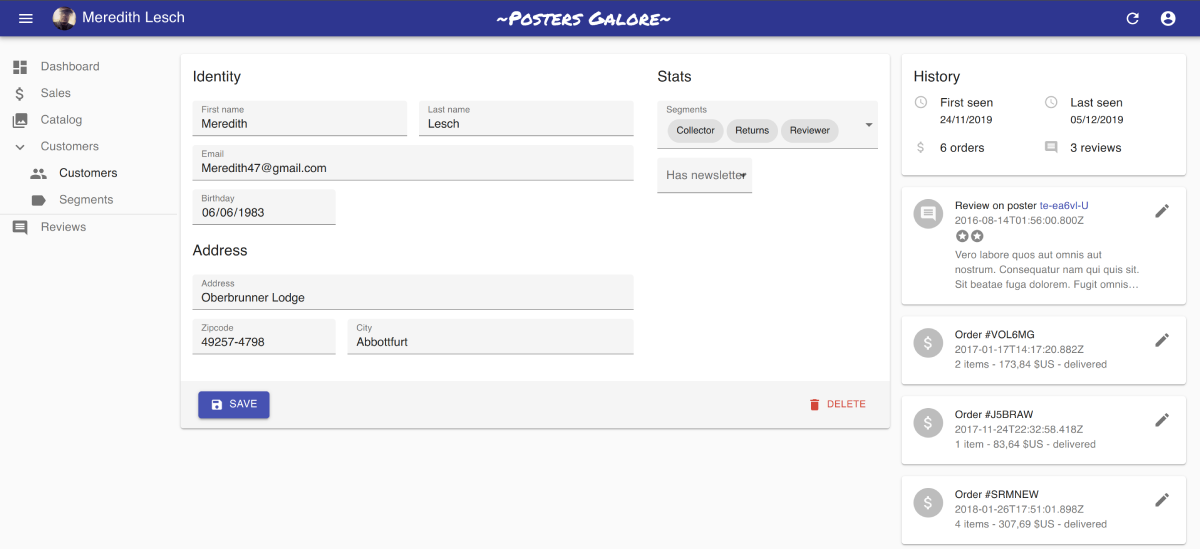
Here is an example of such custom form, taken from the Posters Galore demo. It uses material-ui’s <Box> component, and it’s a good starting point for your custom form layouts.
import * as React from "react";
import {
    FormWithRedirect,
    DateInput,
    SelectArrayInput,
    TextInput,
    SaveButton,
    DeleteButton,
    NullableBooleanInput,
} from 'react-admin';
import { Typography, Box, Toolbar } from '@material-ui/core';

const segments = [
    { id: 'compulsive', name: 'Compulsive' },
    { id: 'collector', name: 'Collector' },
    { id: 'ordered_once', name: 'Ordered Once' },
    { id: 'regular', name: 'Regular' },
    { id: 'returns', name: 'Returns' },
    { id: 'reviewer', name: 'Reviewer' },
];

const VisitorForm = props => (
    <FormWithRedirect
        {...props}
        render={formProps => (
            // here starts the custom form layout
            <form>
                <Box p="1em">
                    <Box display="flex">
                        <Box flex={2} mr="1em">

                            <Typography variant="h6" gutterBottom>Identity</Typography>

                            <Box display="flex">
                                <Box flex={1} mr="0.5em">
                                    <TextInput source="first_name" resource="customers" fullWidth />
                                </Box>
                                <Box flex={1} ml="0.5em">
                                    <TextInput source="last_name" resource="customers" fullWidth />
                                </Box>
                            </Box>
                            <TextInput source="email" resource="customers" type="email" fullWidth />
                            <DateInput source="birthday" resource="customers" />
                            <Box mt="1em" />

                            <Typography variant="h6" gutterBottom>Address</Typography>

                            <TextInput resource="customers" source="address" multiline fullWidth />
                            <Box display="flex">
                                <Box flex={1} mr="0.5em">
                                    <TextInput source="zipcode" resource="customers" fullWidth />
                                </Box>
                                <Box flex={2} ml="0.5em">
                                    <TextInput source="city" resource="customers" fullWidth />
                                </Box>
                            </Box>
                        </Box>

                        <Box flex={1} ml="1em">

                            <Typography variant="h6" gutterBottom>Stats</Typography>

                            <SelectArrayInput source="groups" resource="customers" choices={segments} fullWidth />
                            <NullableBooleanInput source="has_newsletter" resource="customers" />
                        </Box>

                    </Box>
                </Box>
                <Toolbar>
                    <Box display="flex" justifyContent="space-between" width="100%">
                        <SaveButton
                            saving={formProps.saving}
                            handleSubmitWithRedirect={formProps.handleSubmitWithRedirect}
                        />
                        <DeleteButton record={formProps.record} />
                    </Box>
                </Toolbar>
            </form>
        )}
    />
);
This custom form layout component uses the FormWithRedirect component, which wraps react-final-form’s Form component to handle redirection logic. It also uses react-admin’s <SaveButton> and a <DeleteButton>.
Tip: When Input components have a resource prop, they use it to determine the input label. <SimpleForm> and <TabbedForm> inject this resource prop to Input components automatically. When you use a custom form layout, pass the resource prop manually - unless the Input has a label prop.
To use this form layout, simply pass it as child to an Edit component:
const VisitorEdit = props => (
    <Edit {...props}>
        <VisitorForm />
    </Edit>
);
Tip: FormWithRedirect contains some logic that you may not want. In fact, nothing forbids you from using a react-final-form Form component as root component for a custom form layout. You’ll have to set initial values based the injected record prop manually, as follows:
import { sanitizeEmptyValues } from 'react-admin';
import { Form } from 'react-final-form';
import arrayMutators from 'final-form-arrays';
import { CardContent, Typography, Box } from '@material-ui/core';

// the parent component (Edit or Create) injects these props to their child
const VisitorForm = ({ basePath, record, save, saving, version }) => {
    const submit = values => {
        // React-final-form removes empty values from the form state.
        // To allow users to *delete* values, this must be taken into account
        save(sanitizeEmptyValues(record, values));
    };
    return (
        <Form
            initialValues={record}
            onSubmit={submit}
            mutators={{ ...arrayMutators }} // necessary for ArrayInput
            subscription={defaultSubscription} // don't redraw entire form each time one field changes
            key={version} // support for refresh button
            keepDirtyOnReinitialize
            render={formProps => (
                {/* render your custom form here */}
            )}
        />
    );
};
const defaultSubscription = {
    submitting: true,
    pristine: true,
    valid: true,
    invalid: true,
    validating: true,
};
Warning About Unsaved Changes
React-admin keeps track of the form state, so it can detect when the user leaves an Edit or Create page with unsaved changes. To avoid data loss, you can use this ability to ask the user to confirm before leaving a page with unsaved changes.
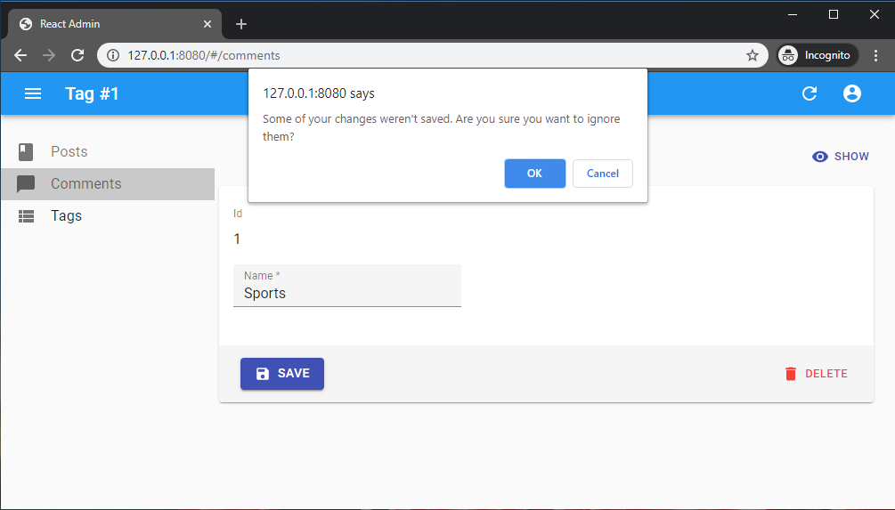
Warning about unsaved changes is an opt-in feature: you must set the warnWhenUnsavedChanges prop in the form component to enable it:
export const TagEdit = props => (
    <Edit {...props}>
        <SimpleForm warnWhenUnsavedChanges>
            <TextField source="id" />
            <TextInput source="name" />
            ...
        </SimpleForm>
    </Edit>
);
And that’s all. warnWhenUnsavedChanges works for both <SimpleForm> and <TabbedForm>. In fact, this feature is provided by a custom hook called useWarnWhenUnsavedChanges(), which you can use in your own react-final-form forms.
import { Form, Field } from 'react-final-form';
import { useWarnWhenUnsavedChanges } from 'react-admin';

const MyForm = () => (
    <Form onSubmit={() => { /*...*/}} component={FormBody} />
);

const FormBody = ({ handleSubmit }) => {
    // enable the warn when unsaved changes feature
    useWarnWhenUnsavedChanges(true);
    return (
        <form onSubmit={handleSubmit}>
            <label id="firstname-label">First Name</label>
            <Field name="firstName" aria-labelledby="firstname-label" component="input" />
            <button type="submit">Submit</button>
        </form>
    );
};
Tip: You can customize the message displayed in the confirm dialog by setting the ra.message.unsaved_changes message in your i18nProvider.
Setting Empty Values To Null
<SimpleForm> and <TabbedForm> recreate deleted or missing attributes based on its initialValues in order to send them to the data provider with a null value, as most APIs requires all attributes for a given record, even if they are nullable.
It is possible to opt-out this default behavior by passing the sanitizeEmptyValues prop:
export const PostEdit = (props) => (
    <Edit {...props}>
        <SimpleForm sanitizeEmptyValues={false}>
            <TextInput source="title" />
            <JsonInput source="body" />
        </SimpleForm>
    </Edit>
);
Recipes
Displaying Fields or Inputs Depending on the User Permissions
You might want to display some fields, inputs or filters only to users with specific permissions.
Before rendering the Create and Edit components, react-admin calls the authProvider.getPermissions() method, and passes the result to the component as the permissions prop. It’s up to your authProvider to return whatever you need to check roles and permissions inside your component.
Here is an example inside a Create view with a SimpleForm and a custom Toolbar:
const UserCreateToolbar = ({ permissions, ...props }) =>
    <Toolbar {...props}>
        <SaveButton
            label="user.action.save_and_show"
            redirect="show"
            submitOnEnter={true}
        />
        {permissions === 'admin' &&
            <SaveButton
                label="user.action.save_and_add"
                redirect={false}
                submitOnEnter={false}
                variant="text"
            />}
    </Toolbar>;

export const UserCreate = ({ permissions, ...props }) =>
    <Create {...props}>
        <SimpleForm
            toolbar={<UserCreateToolbar permissions={permissions} />}
            initialValues={{ role: 'user' }}
        >
            <TextInput source="name" validate={[required()]} />
            {permissions === 'admin' &&
                <TextInput source="role" validate={[required()]} />}
        </SimpleForm>
    </Create>;
Tip: Note how the permissions prop is passed down to the custom toolbar component.
This also works inside an Edition view with a TabbedForm, and you can hide a FormTab completely:
export const UserEdit = ({ permissions, ...props }) =>
    <Edit title={<UserTitle />} {...props}>
        <TabbedForm initialValues={{ role: 'user' }}>
            <FormTab label="user.form.summary">
                {permissions === 'admin' && <TextInput disabled source="id" />}
                <TextInput source="name" validate={required()} />
            </FormTab>
            {permissions === 'admin' &&
                <FormTab label="user.form.security">
                    <TextInput source="role" validate={required()} />
                </FormTab>}
        </TabbedForm>
    </Edit>;
Changing The Success or Failure Notification Message
Once the dataProvider returns successfully after save, users see a generic notification (“Element created” / “Element updated”). You can customize this message by passing a custom success side effect function as the <Edit onSuccess> prop:
import { Edit, useNotify, useRedirect } from 'react-admin';

const PostEdit = props => {
    const notify = useNotify();
    const redirect = useRedirect();
    const onSuccess = () => {
        notify('Post saved successfully'); // default message is 'ra.notification.updated'
        redirect('list', props.basePath);
    }
    return (
        <Edit {...props} onSuccess={onSuccess}>
            ...
        </Edit>
    );
}
Tip: In optimistic and undoable mutation modes, react-admin calls the the onSuccess callback method with no argument. In pessimistic mode, it calls it with the response returned by the dataProvider as argument.
You can do the same for error notifications, e.g. to display a different message depending on the error returned by the dataProvider:
import * as React from 'react';
import { Edit, useNotify, useRedirect } from 'react-admin';

const PostEdit = props => {
    const notify = useNotify();
    const redirect = useRedirect();
    const onFailure = (error) => {
        if (error.code == 123) {
            notify('Could not save changes: concurrent edition in progress', { type: 'warning' });
        } else {
            notify('ra.notification.http_error', { type: 'warning' });
        }
        redirect('list', props.basePath);
    }
    return (
        <Edit {...props} onFailure={onFailure}>
            ...
        </Edit>
    );
}
If the form has several save buttons, you can also pass a custom onSuccess or onFailure function to the <SaveButton> components, to have a different message and/or redirection depending on the submit button clicked.
Tip: The notify message will be translated.
Altering the Form Values Before Submitting
Sometimes, you may want to alter the form values before sending them to the dataProvider. For those cases, use the transform prop either on the view component (<Create> or <Edit>) or on the <SaveButton> component.
In the following example, a create view for a Post displays a form with two submit buttons. Both buttons create a new record, but the ‘save and notify’ button should trigger an email to other admins on the server side. The POST /posts API route only sends the email when the request contains a special HTTP header.
So the save button with ‘save and notify’ will transform the record before react-admin calls the dataProvier.create() method, adding a notify field:
const PostCreateToolbar = props => (
    <Toolbar {...props}>
        <SaveButton submitOnEnter={true} />
        <SaveButton
            label="post.action.save_and_notify"
            transform={data => ({ ...data, notify: true })}
            submitOnEnter={false}
        />
    </Toolbar>
);

const PostCreate = (props) => (
    <Create {...props}>
        <SimpleForm toolbar={<PostCreateToolbar />}>
            // ...
        </SimpleForm>
    </Create>
);
Then, in the dataProvider.create() code, detect the presence of the notify field in the data, and add the HTTP header if necessary. Something like:
const dataProvider = {
    // ...
    create: (resource, params) => {
        const { notify, ...record } = params.data;
        const headers = new Headers({
            'Content-Type': 'application/json',
        });
        if (notify) {
            headers.set('X-Notify', 'true');
        }
        return httpClient(`${apiUrl}/${resource}`, {
            method: 'POST',
            body: JSON.stringify(record),
            headers,
        }).then(({ json }) => ({
            data: { ...record, id: json.id },
        }));
    },
}
Using onSave To Alter the Form Submission Behavior
Deprecated: use the <SaveButton onSuccess> prop instead.
React-admin provides a way to override the data provider call executed upon submission, and its side effects, in the <SaveButton>. It’s called onSave, and here is how you would use it:
import * as React from 'react';
import { useCallback } from 'react';
import {
    SaveButton,
    Toolbar,
    useCreate,
    useRedirect,
    useNotify,
} from 'react-admin';

const SaveWithNoteButton = props => {
    const [create] = useCreate('posts');
    const redirectTo = useRedirect();
    const notify = useNotify();
    const { basePath } = props;
    const handleSave = useCallback(
        (values, redirect) => {
            create(
                {
                    payload: { data: { ...values, average_note: 10 } },
                },
                {
                    onSuccess: ({ data: newRecord }) => {
                        notify('ra.notification.created', { messageArgs: { smart_count: 1 } });
                        redirectTo(redirect, basePath, newRecord.id, newRecord);
                    },
                }
            );
        },
        [create, notify, redirectTo, basePath]
    );
    // set onSave props instead of handleSubmitWithRedirect
    return <SaveButton {...props} onSave={handleSave} />;
};
The onSave value should be a function expecting 2 arguments: the form values to save, and the redirection to perform.
Grouping Inputs
Sometimes, you may want to group inputs in order to make a form more approachable. You may use a <TabbedForm>, an <AccordionForm> or you may want to roll your own layout. In this case, you might need to know the state of a group of inputs: whether it’s valid or if the user has changed them (dirty/pristine state).
For this, you can use the <FormGroupContextProvider>, which accepts a group name. All inputs rendered inside this context will register to it (thanks to the useInput hook). You may then call the useFormGroup hook to retrieve the status of the group. For example:
import { Edit, SimpleForm, TextInput, FormGroupContextProvider, useFormGroup } from 'react-admin';
import { Accordion, AccordionDetails, AccordionSummary, Typography } from '@material-ui/core';

const PostEdit = (props) => (
    <Edit {...props}>
        <SimpleForm>
            <TextInput source="title" />
            <FormGroupContextProvider name="options">
                <Accordion>
                    <AccordionSummary
                        expandIcon={<ExpandMoreIcon />}
                        aria-controls="options-content"
                        id="options-header"
                    >
                        <AccordionSectionTitle name="options">Options</AccordionSectionTitle>
                    </AccordionSummary>
                    <AccordionDetails id="options-content" aria-labelledby="options-header">
                        <TextInput source="teaser" validate={minLength(20)} />
                    </AccordionDetails>
                </Accordion>
            </FormGroupContextProvider>
        </SimpleForm>
    </Edit>
);

const AccordionSectionTitle = ({ children, name }) => {
    const formGroupState = useFormGroup(name);

    return (
        <Typography color={formGroupState.invalid && formGroupState.dirty ? 'error' : 'inherit'}>
            {children}
        </Typography>
    );
}