Theming
Whether you need to adjust a CSS rule for a single component, or change the color of the labels in the entire app, you’re covered!
Overriding A Component Style
Every react-admin component provides a className property, which is always applied to the root element.
Here is an example customizing an EditButton component inside a Datagrid, using its className property and the makeStyles hook from Material-UI:
import * as React from 'react';
import { NumberField, List, Datagrid, TextField, EditButton } from 'react-admin';
import { makeStyles } from '@material-ui/core/styles';

const useStyles = makeStyles({
    button: {
        fontWeight: 'bold',
        // This is JSS syntax to target a deeper element using css selector, here the svg icon for this button
        '& svg': { color: 'orange' }
    },
});

const MyEditButton = props => {
    const classes = useStyles();
    return <EditButton className={classes.button} {...props} />;
};

export const ProductList = (props) => (
    <List {...props}>
        <Datagrid>
            <TextField source="sku" />
            <TextField source="price" />
            <MyEditButton />
        </Datagrid>
    </List>
);
For some components, you may want to override not only the root component style, but also the style of components inside the root. In this case, the className property isn’t enough. You can take advantage of the classes property to customize the classes that the component uses internally.
Here is an example using the classes property of the <Datagrid> component:
import * as React from 'react';
import {
    BooleanField,
    Datagrid,
    DateField,
    EditButton,
    List,
    NumberField,
    TextField,
    ShowButton,
} from 'react-admin';
import Icon from '@material-ui/icons/Person';
import { makeStyles } from '@material-ui/core/styles';

export const VisitorIcon = Icon;

// The `Datagrid` component uses makeStyles, and supports overriding styles through the `classes` property
const useStyles = makeStyles({
    table: {
        backgroundColor: 'Lavender',
    },
    headerCell: {
        backgroundColor: 'MistyRose',
    },
});

export const PostList = props => {
    const classes = useStyles();
    return (
        <List {...props}>
            <Datagrid classes={classes} {...props}>
                <TextField source="id" />
                <TextField source="title" />
                <DateField source="published_at" sortByOrder="DESC"/>
                <BooleanField source="commentable" sortable={false} />
                <NumberField source="views" sortByOrder="DESC" />
                <EditButton />
                <ShowButton />
            </Datagrid>
        </List>
    )
};
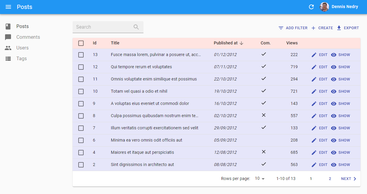
This example results in:
Take a look at a component documentation and source code to know which classes are available for styling. For instance, you can have a look at the Datagrid CSS documentation.
If you need more control over the HTML code, you can also create your own Field and Input components.
Conditional Formatting
Sometimes you want the format to depend on the value. The following example shows how to create a new custom NumberField component which highlight its text in red when its value is 100 or higher.
import * as React from 'react';
import { NumberField, List, Datagrid, TextField, EditButton } from 'react-admin';
import { makeStyles } from '@material-ui/core/styles';
import classnames from 'classnames';

const useStyles = makeStyles({
    small: { color: 'black' },
    big: { color: 'red' },
});

const ColoredNumberField = props => {
    const classes = useStyles();
    return (
        <NumberField
            className={classnames({
                [classes.small]: props.record[props.source] < 100,
                [classes.big]: props.record[props.source] >= 100,
            })}
            {...props}
        />
    );
};

// Ensure the original component defaultProps are still applied as they may be used by its parents (such as the `Show` component):
ColoredNumberField.defaultProps = NumberField.defaultProps;

export const PostList = props => (
    <List {...props}>
        <Datagrid>
            <TextField source="id" />
            ...
            <ColoredNumberField source="nb_views" />
            <EditButton />
        </Datagrid>
    </List>
);
Furthermore, you may extract this highlighting strategy into a Higher Order Component if you’d like to reuse it for other components as well:
import * as React from 'react';
import { NumberField, List, Datagrid, TextField, EditButton } from 'react-admin';
import { makeStyles } from '@material-ui/core/styles';
import classnames from 'classnames';

const useStyles = makeStyles({
    small: { color: 'black' },
    big: { color: 'red' },
});

const colored = WrappedComponent => props => {
    const classes = useStyles();
    return (
        <WrappedComponent
            className={classnames({
                [classes.small]: props.record[props.source] < 500,
                [classes.big]: props.record[props.source] >= 500,
            })}
            {...props}
        />
    )
};


const ColoredNumberField = colored(NumberField);
// Ensure the original component defaultProps are still applied as they may be used by its parents (such as the `Show` component):
ColoredNumberField.defaultProps = NumberField.defaultProps;

export const PostList = (props) => (
    <List {...props}>
        <Datagrid>
            <TextField source="id" />
            ...
            <ColoredNumberField source="nb_views" />
            <EditButton />
        </Datagrid>
    </List>
);
If you want to read more about higher-order components, check out this SitePoint tutorial: Higher Order Components: A React Application Design Pattern
useMediaQuery Hook
To provide an optimized experience on mobile, tablet, and desktop devices, you often need to display different components depending on the screen size. Material-ui provides a hook dedicated to help such responsive layouts: useMediaQuery.
It expects a function receiving the material-ui theme as a parameter, and returning a media query. Use the theme breakpoints to check for common screen sizes. The hook returns a boolean indicating if the current screen matches the media query or not.
const isXSmall = useMediaQuery(theme => theme.breakpoints.down('xs'));
const isSmall = useMediaQuery(theme => theme.breakpoints.down('sm'));
const isDesktop = useMediaQuery(theme => theme.breakpoints.up('md'));
You can also pass a custom media query as a screen.
const isSmall = useMediaQuery('(min-width:600px)');
Here is an example for a responsive list of posts, displaying a SimpleList on mobile, and a Datagrid otherwise:
// in src/posts.js
import * as React from 'react';
import { useMediaQuery } from '@material-ui/core';
import { List, SimpleList, Datagrid, TextField, ReferenceField, EditButton } from 'react-admin';

export const PostList = (props) => {
    const isSmall = useMediaQuery(theme => theme.breakpoints.down('sm'));
    return (
        <List {...props}>
            {isSmall ? (
                <SimpleList
                    primaryText={record => record.title}
                    secondaryText={record => `${record.views} views`}
                    tertiaryText={record => new Date(record.published_at).toLocaleDateString()}
                />
            ) : (
                <Datagrid>
                    <TextField source="id" />
                    <ReferenceField label="User" source="userId" reference="users">
                        <TextField source="name" />
                    </ReferenceField>
                    <TextField source="title" />
                    <TextField source="body" />
                    <EditButton />
                </Datagrid>
            )}
        </List>
    );
};
Tip: Previous versions of react-admin shipped a <Responsive> component to do media queries. This component is now deprecated. Use useMediaQuery instead.
Using a Predefined Theme
Material UI also supports complete theming out of the box. Material UI ships two base themes: light and dark. React-admin uses the light one by default. To use the dark one, pass it to the <Admin> component, in the theme prop (along with createTheme()).
import { createTheme } from '@material-ui/core/styles';

const theme = createTheme({
  palette: {
    type: 'dark', // Switching the dark mode on is a single property value change.
  },
});

const App = () => (
    <Admin theme={theme} dataProvider={simpleRestProvider('http://path.to.my.api')}>
        // ...
    </Admin>
);
Writing a Custom Theme
If you need more fine-tuning, you’ll need to write your own theme object, following Material UI themes documentation.
For instance, here is how to override the default react-admin theme:
import { defaultTheme } from 'react-admin';
import merge from 'lodash/merge';
import indigo from '@material-ui/core/colors/indigo';
import pink from '@material-ui/core/colors/pink';
import red from '@material-ui/core/colors/red';

const myTheme = merge({}, defaultTheme, {
    palette: {
        primary: indigo,
        secondary: pink,
        error: red,
        contrastThreshold: 3,
        tonalOffset: 0.2,
    },
    typography: {
        // Use the system font instead of the default Roboto font.
        fontFamily: ['-apple-system', 'BlinkMacSystemFont', '"Segoe UI"', 'Arial', 'sans-serif'].join(','),
    },
    overrides: {
        MuiButton: { // override the styles of all instances of this component
            root: { // Name of the rule
                color: 'white', // Some CSS
            },
        },
    },
});
A theme object can contain the following keys:
breakpointsdirectionmixinsoverridespalettepropsshadowsspacingtransitionstypographyzIndex
Tip: Check Material UI default theme documentation to see the default values and meaning for these keys.
Once your theme is defined, pass it to the <Admin> component, in the theme prop.
const App = () => (
    <Admin theme={myTheme} dataProvider={simpleRestProvider('http://path.to.my.api')}>
        // ...
    </Admin>
);
Using a Custom Layout
Instead of the default layout, you can use your own component as the admin layout. Just use the layout prop of the <Admin> component:
// in src/App.js
import MyLayout from './MyLayout';

const App = () => (
    <Admin layout={MyLayout} dataProvider={simpleRestProvider('http://path.to.my.api')}>
        // ...
    </Admin>
);
Your custom layout can extend the default <Layout> component if you only want to override the sidebar, the appBar, the menu, the notification component or the error page. For instance:
// in src/MyLayout.js
import { Layout } from 'react-admin';
import MyAppBar from './MyAppBar';
import MySidebar from './MySidebar';
import MyMenu from './MyMenu';
import MyNotification from './MyNotification';

const MyLayout = props => <Layout
    {...props}
    appBar={MyAppBar}
    sidebar={MySidebar}
    menu={MyMenu}
    notification={MyNotification}
/>;

export default MyLayout;
UserMenu Customization
You can replace the default user menu by your own by setting the userMenu prop of the <AppBar> component. For instance, to add custom menu items, just decorate the default <UserMenu> by adding children to it:
import * as React from 'react';
import { AppBar, UserMenu, MenuItemLink } from 'react-admin';
import SettingsIcon from '@material-ui/icons/Settings';

const ConfigurationMenu = forwardRef(({ onClick }, ref) => (
    <MenuItemLink
        ref={ref}
        to="/configuration"
        primaryText="Configuration"
        leftIcon={<SettingsIcon />}
        onClick={onClick} // close the menu on click
    />
));

const MyUserMenu = props => (
    <UserMenu {...props}>
        <ConfigurationMenu />
    </UserMenu>
);

const MyAppBar = props => <AppBar {...props} userMenu={<MyUserMenu />} />;

const MyLayout = props => <Layout {...props} appBar={MyAppBar} />;
You can also remove the <UserMenu> from the <AppBar> by passing false to the userMenu prop:
import * as React from 'react';
import { AppBar } from 'react-admin';

const MyAppBar = props => <AppBar {...props} userMenu={false} />;

const MyLayout = props => <Layout {...props} appBar={MyAppBar} />;
You can also customize the default icon by setting the icon prop to the <UserMenu /> component.
import { AppBar, UserMenu } from 'react-admin';
import { makeStyles } from '@material-ui/core/styles';
import Avatar from '@material-ui/core/Avatar';

const useStyles = makeStyles({
    avatar: {
        height: 30,
        width: 30,
    },
});

const MyCustomIcon = () => {
    const classes = useStyles();
    return (
        <Avatar
            className={classes.avatar}
            src="https://marmelab.com/images/avatars/adrien.jpg"
        />
    )
};

const MyUserMenu = props => (<UserMenu {...props} icon={<MyCustomIcon />} />);

const MyAppBar = props => <AppBar {...props} userMenu={<MyUserMenu />} />;
Sidebar Customization
You can specify the Sidebar width by setting the width and closedWidth property on your custom material-ui theme:
import { defaultTheme } from "react-admin";
import { createTheme } from '@material-ui/core/styles';

const theme = createTheme({
    ...defaultTheme,
    sidebar: {
        width: 300, // The default value is 240
        closedWidth: 70, // The default value is 55
    },
});

const App = () => (
    <Admin theme={theme} dataProvider={simpleRestProvider('http://path.to.my.api')}>
        // ...
    </Admin>
);
For more advanced sidebar theming, pass your own Sidebar component to a custom Layout:
import { Sidebar, Layout } from 'react-admin';
import { makeStyles } from '@material-ui/core/styles';

const useSidebarStyles = makeStyles({
    drawerPaper: {
        backgroundColor: 'red',
    },
});

const MySidebar = props => {
    const classes = useSidebarStyles();
    return (
        <Sidebar classes={classes} {...props} />
    );
};

const MyLayout = props => <Layout {...props} sidebar={MySidebar} />
Layout From Scratch
For more custom layouts, write a component from scratch. It must contain a {children} placeholder, where react-admin will render the resources. Use the default layout as a starting point. Here is a simplified version (with no responsive support):
// in src/MyLayout.js
import * as React from 'react';
import { useEffect } from 'react';
import PropTypes from 'prop-types';
import { useSelector, useDispatch } from 'react-redux';
import { makeStyles } from '@material-ui/core/styles';
import { ThemeProvider } from '@material-ui/styles';
import {
    AppBar,
    Menu,
    Notification,
    Sidebar,
    setSidebarVisibility,
    ComponentPropType,
} from 'react-admin';

const useStyles = makeStyles(theme => ({
    root: {
        display: 'flex',
        flexDirection: 'column',
        zIndex: 1,
        minHeight: '100vh',
        backgroundColor: theme.palette.background.default,
        position: 'relative',
    },
    appFrame: {
        display: 'flex',
        flexDirection: 'column',
        overflowX: 'auto',
    },
    contentWithSidebar: {
        display: 'flex',
        flexGrow: 1,
    },
    content: {
        display: 'flex',
        flexDirection: 'column',
        flexGrow: 2,
        padding: theme.spacing(3),
        marginTop: '4em',
        paddingLeft: 5,
    },
}));

const MyLayout = ({
    children,
    dashboard,
    logout,
    title,
}) => {
    const classes = useStyles();
    const dispatch = useDispatch();
    const open = useSelector(state => state.admin.ui.sidebarOpen);

    useEffect(() => {
        dispatch(setSidebarVisibility(true));
    }, [setSidebarVisibility]);

    return (
        <div className={classes.root}>
            <div className={classes.appFrame}>
                <AppBar title={title} open={open} logout={logout} />
                <main className={classes.contentWithSidebar}>
                    <Sidebar>
                        <Menu logout={logout} hasDashboard={!!dashboard} />
                    </Sidebar>
                    <div className={classes.content}>
                        {children}
                    </div>
                </main>
                <Notification />
            </div>
        </div>
    );
};

MyLayout.propTypes = {
    children: PropTypes.oneOfType([PropTypes.func, PropTypes.node]),
    dashboard: PropTypes.oneOfType([
        PropTypes.func,
        PropTypes.string,
    ]),
    logout: ComponentPropType,
    title: PropTypes.string.isRequired,
};

export default MyLayout;
Tip: Don’t forget to render a <Notification> component in your custom layout, otherwise the undoable updates will never be sent to the server. That’s because part of the “undo” logic of react-admin lies in the <Notification> component.
Adding a Breadcrumb
The <Breadcrumb> component is part of ra-navigation, an Enterprise Edition module. It displays a breadcrumb based on a site structure that you can override at will.
import * as React from 'react';
import {
    AppLocationContext,
    Breadcrumb,
    ResourceBreadcrumbItems,
} from '@react-admin/ra-navigation';
import { Admin, Resource, Layout } from 'react-admin';

import PostList from './PostList';
import PostEdit from './PostEdit';
import PostShow from './PostShow';
import PostCreate from './PostCreate';

const MyLayout = ({ children, ...props }) => (
    <AppLocationContext>
        <Layout {...props}>
            <Breadcrumb {...props}>
                <ResourceBreadcrumbItems />
            </Breadcrumb>
            {children}
        </Layout>
    </AppLocationContext>
);

const App = () => (
    <Admin dataProvider={dataProvider} layout={MyLayout}>
        <Resource
            name="posts"
            list={PostList}
            edit={PostEdit}
            show={PostShow}
            create={PostCreate}
        />
    </Admin>
);
Check the ra-navigation documentation for more details.
Customizing the AppBar Content
By default, the react-admin <AppBar> component displays the page title. You can override this default by passing children to <AppBar> - they will replace the default title. And if you still want to include the page title, make sure you include an element with id react-admin-title in the top bar (this uses React Portals).
Here is an example customization for <AppBar> to include a company logo in the center of the page header:
// in src/MyAppBar.js
import * as React from 'react';
import { AppBar } from 'react-admin';
import Typography from '@material-ui/core/Typography';
import { makeStyles } from '@material-ui/core/styles';

import Logo from './Logo';

const useStyles = makeStyles({
    title: {
        flex: 1,
        textOverflow: 'ellipsis',
        whiteSpace: 'nowrap',
        overflow: 'hidden',
    },
    spacer: {
        flex: 1,
    },
});

const MyAppBar = props => {
    const classes = useStyles();
    return (
        <AppBar {...props}>
            <Typography
                variant="h6"
                color="inherit"
                className={classes.title}
                id="react-admin-title"
            />
            <Logo />
            <span className={classes.spacer} />
        </AppBar>
    );
};

export default MyAppBar;
To use this custom MyAppBar component, pass it as prop to a custom Layout, as shown below:
// in src/MyLayout.js
import * as React from 'react';
import { Layout } from 'react-admin';
import MyAppBar from './MyAppBar';

const MyLayout = (props) => <Layout {...props} appBar={MyAppBar} />;

export default MyLayout;
Then, use this layout in the <Admin> with the layout prop:
// in src/App.js
import MyLayout from './MyLayout';

const App = () => (
    <Admin layout={MyLayout} dataProvider={simpleRestProvider('http://path.to.my.api')}>
        // ...
    </Admin>
);
Tip: You can change the color of the <AppBar> by setting the color prop to default, inherit, primary, secondary or transparent. The default value is secondary.
Replacing The AppBar
By default, React-admin uses Material-ui’s <AppBar> component together with a custom container that internally uses a Slide to hide the AppBar on scroll. Here is an example of how to change this container with any component:
// in src/MyAppBar.js
import * as React from 'react';
import { Fragment } from 'react';
import { AppBar } from 'react-admin';

const MyAppBar = props => (
    <AppBar {...props} container={Fragment} />
);

export default MyAppBar;
For more drastic changes of the top component, you will probably want to create an <AppBar> from scratch instead of just passing children to react-admin’s <AppBar>. Here is an example top bar rebuilt from scratch:
// in src/MyAppBar.js
import * as React from 'react';
import AppBar from '@material-ui/core/AppBar';
import Toolbar from '@material-ui/core/Toolbar';
import Typography from '@material-ui/core/Typography';

const MyAppBar = props => (
    <AppBar {...props}>
        <Toolbar>
            <Typography variant="h6" id="react-admin-title" />
        </Toolbar>
    </AppBar>
);

export default MyAppBar;
Take note that this uses material-ui’s <AppBar> instead of react-admin’s <AppBar>. To use this custom AppBar component, pass it as prop to a custom Layout, as explained in the previous section.
To make it easier to customize, we export some of the components and hooks used by the <AppBar>:
<LoadingIndicator>: ACircularProgressbound to the dataProvider activity.<SidebarToggleButton>: AnIconButtonused to toggle the<Sidebar>.useToggleSidebar: A hook that returns the sidebar open state and a function to toggle it. Used internally by<SidebarToggleButton>.
Adding Dark Mode Support
The <ToggleThemeButton> component is part of ra-preferences, an Enterprise Edition module. It lets users switch from light to dark mode, and persists that choice in local storage so that users only have to do it once.

You can add the <ToggleThemeButton> to a custom App Bar:
import * as React from 'react';
import { Layout, AppBar } from 'react-admin';
import { Box, Typography } from '@material-ui/core';
import { ToggleThemeButton } from '@react-admin/ra-preferences';

const MyAppBar = props => (
    <AppBar {...props}>
        <Box flex="1">
            <Typography variant="h6" id="react-admin-title"></Typography>
        </Box>
        <ToggleThemeButton />
    </AppBar>
);

const MyLayout = props => <Layout {...props} appBar={MyAppBar} />;
Check the ra-preferences documentation for more details.
Using a Custom Menu
By default, React-admin uses the list of <Resource> components passed as children of <Admin> to build a menu to each resource with a list component. If you want to reorder, add or remove menu items, for instance to link to non-resources pages, you have to provide a custom <Menu> component to your Layout.
Custom Menu Example
You can create a custom menu component using the <DashboardMenuItem> and <MenuItemLink> components:
// in src/Menu.js
import * as React from 'react';
import { DashboardMenuItem, Menu, MenuItemLink } from 'react-admin';
import BookIcon from '@material-ui/icons/Book';
import ChatBubbleIcon from '@material-ui/icons/ChatBubble';
import PeopleIcon from '@material-ui/icons/People';
import LabelIcon from '@material-ui/icons/Label';

export const Menu = (props) => (
    <Menu {...props}>
        <DashboardMenuItem />
        <MenuItemLink to="/posts" primaryText="Posts" leftIcon={<BookIcon />}/>
        <MenuItemLink to="/comments" primaryText="Comments" leftIcon={<ChatBubbleIcon />}/>
        <MenuItemLink to="/users" primaryText="Users" leftIcon={<PeopleIcon />}/>
        <MenuItemLink to="/custom-route" primaryText="Miscellaneous" leftIcon={<LabelIcon />}/>
    </Menu>
);
To use this custom menu component, pass it to a custom Layout, as explained above:
// in src/Layout.js
import { Layout } from 'react-admin';
import { Menu } from './Menu';

export const Layout = (props) => <Layout {...props} menu={Menu} />;
Then, use this layout in the <Admin> layout prop:
// in src/App.js
import { Layout }  from './Layout';

const App = () => (
    <Admin layout={Layout} dataProvider={simpleRestProvider('http://path.to.my.api')}>
        // ...
    </Admin>
);
Tip: You can generate the menu items for each of the resources by reading the Resource configurations from the Redux store:
// in src/Menu.js
import * as React from 'react';
import { createElement } from 'react';
import { useSelector } from 'react-redux';
import { useMediaQuery } from '@material-ui/core';
import { DashboardMenuItem, Menu, MenuItemLink, getResources } from 'react-admin';
import DefaultIcon from '@material-ui/icons/ViewList';
import LabelIcon from '@material-ui/icons/Label';

export const Menu = (props) => {
    const resources = useSelector(getResources);
    const open = useSelector(state => state.admin.ui.sidebarOpen);
    return (
        <Menu {...props}>
            <DashboardMenuItem />
            {resources.map(resource => (
                <MenuItemLink
                    key={resource.name}
                    to={`/${resource.name}`}
                    primaryText={
                        (resource.options && resource.options.label) ||
                        resource.name
                    }
                    leftIcon={
                        resource.icon ? <resource.icon /> : <DefaultIcon />
                    }
                    onClick={props.onMenuClick}
                    sidebarIsOpen={open}
                />
            ))}
            {/* add your custom menus here */}
        </Menu>
    );
};
Tip: If you need a multi-level menu, or a Mega Menu opening panels with custom content, check out the ra-navigation module (part of the Enterprise Edition)


<MenuItemLink>
The <MenuItemLink> component displays a menu item with a label and an icon - or only the icon with a tooltip when the sidebar is minimized. It also handles the automatic closing of the menu on tap on mobile.
The primaryText prop accepts a string or a React node. You can use it e.g. to display a badge on top of the menu item:
import Badge from '@material-ui/core/Badge';

<MenuItemLink to="/custom-route" primaryText={
    <Badge badgeContent={4} color="primary">
        Notifications
    </Badge>
} />
The letfIcon prop allows to set the menu left icon.
Additional props are passed down to the underling material-ui <MenuItem> component.
Tip: The <MenuItemLink> component makes use of the React Router NavLink component, hence allowing to customize the active menu style. For instance, here is how to use a custom theme to show a left border for the active menu:
export const theme = {
    palette: {
        // ...
    },
    overrides: {
        RaMenuItemLink: {
            active: {
                borderLeft: '3px solid #4f3cc9',
            },
            root: {
                borderLeft: '3px solid #fff', // invisible menu when not active, to avoid scrolling the text when selecting the menu
            },
        },
    },
};
Menu To A Filtered List
As the filter values are taken from the URL, you can link to a pre-filtered list by setting the filter query parameter.
For instance, to include a menu to a list of published posts:
<MenuItemLink
    to={{
        pathname: '/posts',
        search: `filter=${JSON.stringify({ is_published: true })}`,
    }}
    primaryText="Posts"
    leftIcon={<BookIcon />}
/>
Menu To A List Without Filters
By default, a click on <MenuItemLink > for a list page opens the list with the same filters as they were applied the last time the user saw them. This is usually the expected behavior, but your users may prefer that clicking on a menu item resets the list filters.
Just use an empty filter query parameter to force empty filters:
<MenuItemLink
    to="/posts?filter=%7B%7D" // %7B%7D is JSON.stringify({})
    primaryText="Posts"
    leftIcon={<BookIcon />}
/>
Using a Custom Login Page
Changing the Background Image
By default, the login page displays a gradient background. If you want to change the background, you can use the default Login page component and pass an image URL as the backgroundImage prop.
import { Admin, Login } from 'react-admin';

const MyLoginPage = () => (
    <Login
        // A random image that changes everyday
        backgroundImage="https://source.unsplash.com/random/1600x900/daily"
    />
);

const App = () => (
    <Admin loginPage={MyLoginPage}>
        // ...
    </Admin>
);
Using a Custom Logout Button
Changing the Icon
It is possible to use a completely custom logout button or you can simply override some properties of the default button. If you want to change the icon, you can use the default <Logout> component and pass a different icon as the icon prop.
import { Admin, Logout } from 'react-admin';
import ExitToAppIcon from '@material-ui/icons/ExitToApp';

const MyLogoutButton = props => <Logout {...props} icon={<ExitToAppIcon/>} />;

const App = () => (
    <Admin logoutButton={MyLogoutButton}>
        // ...
    </Admin>
);
Notifications
You can override the notification component, for instance to change the notification duration. It defaults to 4000, i.e. 4 seconds, and you can override it using the autoHideDuration prop. For instance, to create a custom Notification component with a 5 seconds default:
// in src/MyNotification.js
import { Notification } from 'react-admin';

const MyNotification = props => <Notification {...props} autoHideDuration={5000} />;

export default MyNotification;
Tip: if you use the showNotification action, then you can define autoHideDuration per message as the third parameter of the showNotification action creator.
To use this custom notification component, pass it to a custom Layout, as explained above:
// in src/MyLayout.js
import { Layout } from 'react-admin';
import MyNotification from './MyNotification';

const MyLayout = (props) => <Layout {...props} notification={MyNotification} />;

export default MyLayout;
Then, use this layout in the <Admin> layout prop:
// in src/App.js
import MyLayout from './MyLayout';

const App = () => (
    <Admin layout={MyLayout} dataProvider={simpleRestProvider('http://path.to.my.api')}>
        // ...
    </Admin>
);
Customizing The Error Page
Whenever a client-side error happens in react-admin, the user sees a default error message. If you want to customize this page, or log the error to a third-party service, create your own <Error> component. The following snippet is a simplified version of the react-admin Error component, that you can use as a base for your own:
// in src/MyError.js
import * as React from 'react';
import Button from '@material-ui/core/Button';
import ErrorIcon from '@material-ui/icons/Report';
import History from '@material-ui/icons/History';
import { Title, useTranslate } from 'react-admin';

const MyError = ({
    error,
    errorInfo,
    ...rest
}) => {
    const translate = useTranslate();
    return (
        <div>
            <Title title="Error" />
            <h1><ErrorIcon /> Something Went Wrong </h1>
            <div>A client error occurred and your request couldn't be completed.</div>
            {process.env.NODE_ENV !== 'production' && (
                <details>
                    <h2>{translate(error.toString())}</h2>
                    {errorInfo.componentStack}
                </details>
            )}
            <div>
                <Button
                    variant="contained"
                    startIcon={<History />}
                    onClick={() => history.go(-1)}
                >
                    Back
                </Button>
            </div>
        </div>
    );
};

export default MyError;
To use this custom error component, pass it to a custom Layout, as explained above:
// in src/MyLayout.js
import { Layout } from 'react-admin';
import MyError from './MyError';

const MyLayout = (props) => <Layout {...props} error={MyError} />;

export default MyLayout;
Then, use this layout in the <Admin> layout prop:
// in src/App.js
import MyLayout from './MyLayout';

const App = () => (
    <Admin layout={MyLayout} dataProvider={simpleRestProvider('http://path.to.my.api')}>
        // ...
    </Admin>
);
Loading
Display a circular progress component with optional messages. Display the same loading component as react-admin on custom pages for consistency.
Supported props:
| Prop | Required | Type | Default | Descriptions |
|---|---|---|---|---|
loadingPrimary |
Optional | string |
ra.page.loading |
Label to use for primary loading message |
loadingSecondary |
Optional | string |
ra.message.loading |
Label to use for secondary loading message |
Usage:
<Loading loadingPrimary="app.page.loading" loadingSecondary="app.message.loading" />
LinearProgress
Display a linear progress component. Display the same loading component as react-admin on custom inputs for consistency.
Usage:
({ data, ...props }) => !data ?
        <LinearProgress /> :
        <MyInput data={data} />;