Buttons
React-Admin provides button components for all the common uses.
Navigation Buttons
These buttons allow users to navigate between the various react-admin views.
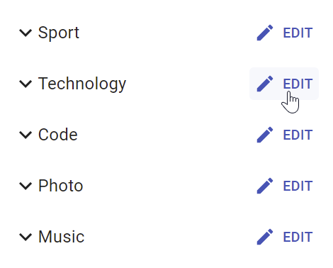
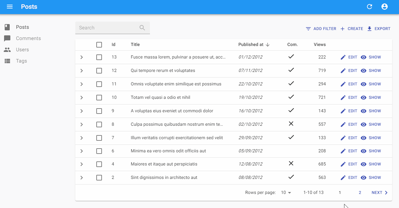
<EditButton>
Opens the Edit view of a given record:
import { EditButton } from 'react-admin';

const CommentEditButton = ({ record }) => (
    <EditButton basePath="/comments" label="Edit comment" record={record} />
);
<EditButton> is based on react-admin’s base <Button>, so it’s responsive, accessible, and the label is translatable.
| Prop | Required | Type | Default | Description |
|---|---|---|---|---|
basePath |
Required | string |
- | Base path to resource, e.g. ‘/posts’ |
record |
Required | Object |
- | Record to link to, e.g. { id: 12, foo: 'bar' } |
label |
Optional | string |
‘ra.action.edit’ | Label or translation message to use |
icon |
Optional | ReactElement |
- | Icon element, e.g. <CommentIcon /> |
scrollToTop |
Optional | boolean |
true |
Scroll to top after link |
It also supports all the other <Button> props.
Tip: You can use it as <Datagrid> child with no props, since <Datagrid> injects record and basePath to its children. However, you should use the <Datagrid rowClick="edit"> prop instead to avoid using one column for the Edit button.
Tip: If you want to link to the Edit view manually, use the /{resource}/{record.id} location.
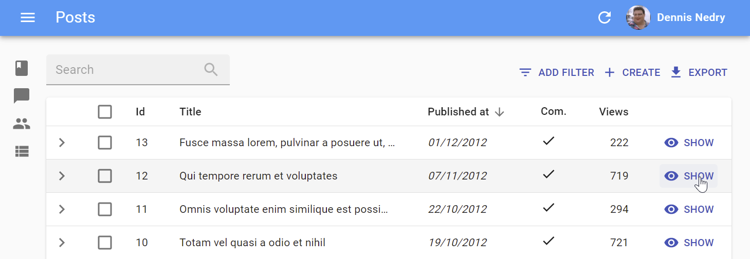
<ShowButton>
Opens the Show view of a given record:
import { ShowButton } from 'react-admin';

const CommentShowButton = ({ record }) => (
    <ShowButton basePath="/comments" label="Show comment" record={record} />
);
<ShowButton> is based on react-admin’s base <Button>, so it’s responsive, accessible, and the label is translatable.
| Prop | Required | Type | Default | Description |
|---|---|---|---|---|
basePath |
Required | string |
- | Base path to resource, e.g. ‘/posts’ |
record |
Required | Object |
- | Record to link to, e.g. { id: 12, foo: 'bar' } |
component |
Optional | ReactElement |
- | Base path to resource, e.g. ‘/posts’ |
label |
Optional | string |
‘ra.action.show’ | Label or translation message to use |
icon |
Optional | ReactElement |
- | Icon element, e.g. <CommentIcon /> |
scrollToTop |
Optional | boolean |
true |
Scroll to top after link |
It also supports all the other <Button> props.
Tip: You can use it as <Datagrid> child with no props, since <Datagrid> injects record and basePath to its children. However, you should use the <Datagrid rowClick="show"> prop instead to avoid using one column for the Edit button.
Tip: If you want to link to the Show view manually, use the /{resource}/{record.id}/show location.
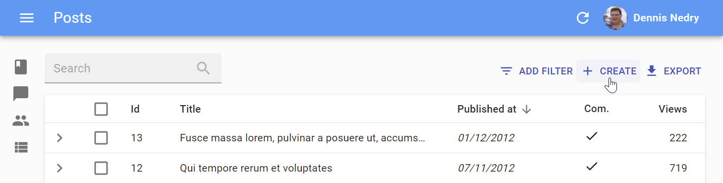
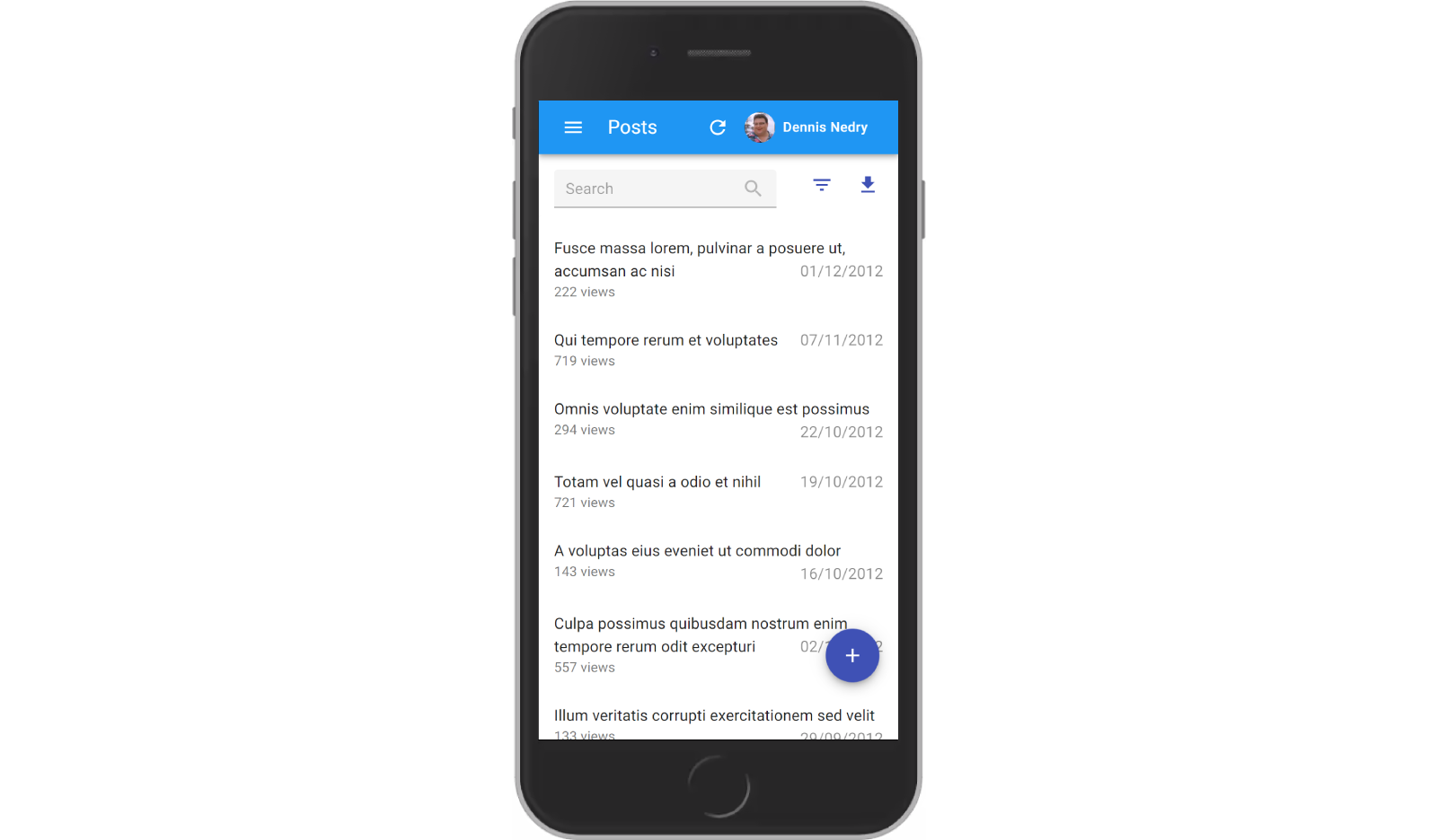
<CreateButton>
Opens the Create view of a given resource:
import { CreateButton } from 'react-admin';

const CommentCreateButton = () => (
    <CreateButton basePath="/comments" label="Create comment" />
);
<CreateButton> is based on react-admin’s base <Button>, so it’s responsive, accessible, and the label is translatable. On mobile, it turns into a “Floating Action Button”.
| Prop | Required | Type | Default | Description |
|---|---|---|---|---|
basePath |
Required | string |
- | base path to resource, e.g. ‘/posts’ |
label |
Optional | string |
‘ra.action.create’ | label or translation message to use |
icon |
Optional | ReactElement |
- | iconElement, e.g. <CommentIcon /> |
scrollToTop |
Optional | boolean |
true |
Scroll to top after link |
It also supports all the other <Button> props.
Tip: If you want to link to the Create view manually, use the /{resource}/create location.
CSS API
| Rule name | Description |
|---|---|
floating |
Applied to the underlying MuiFab component used in small screens |
To override the style of all instances of <CreateButton> using the material-ui style overrides, use the RaCreateButton key.
<ListButton>
Opens the List view of a given resource:
import { ListButton } from 'react-admin';

const CommentListButton = () => (
    <ListButton basePath="/comments" label="Comments" />
);
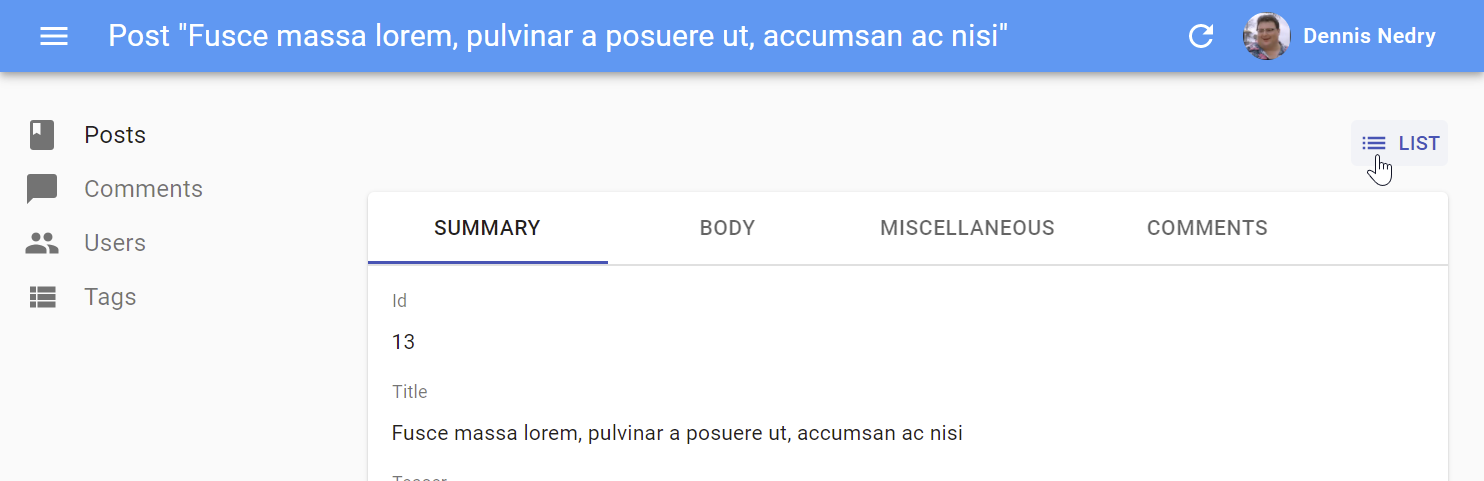
<ListButton> is based on react-admin’s base <Button>, so it’s responsive, accessible, and the label is translatable.
By default, react-admin doesn’t display a <ListButton> in Edit and Show views action toolbar. This saves visual clutter, and users can always use the back button. You can add it by specifying your own actions:
// linking back to the list from the Edit view
import { TopToolbar, ListButton, ShowButton, Edit } from 'react-admin';

const PostEditActions = ({ basePath, record, resource }) => (
    <TopToolbar>
        <ListButton basePath={basePath} />
        <ShowButton basePath={basePath} record={record} />
    </TopToolbar>
);

export const PostEdit = (props) => (
    <Edit actions={<PostEditActions />} {...props}>
        ...
    </Edit>
);
| Prop | Required | Type | Default | Description |
|---|---|---|---|---|
basePath |
Required | string |
- | base path to resource, e.g. ‘/posts’ |
label |
Optional | string |
‘ra.action.list’ | label or translation message to use |
icon |
Optional | ReactElement |
- | iconElement, e.g. <CommentIcon /> |
It also supports all the other <Button> props.
Tip: If you want to link to the List view manually, use the /{resource} location.
List Buttons
The following buttons are designed to be used in List views.
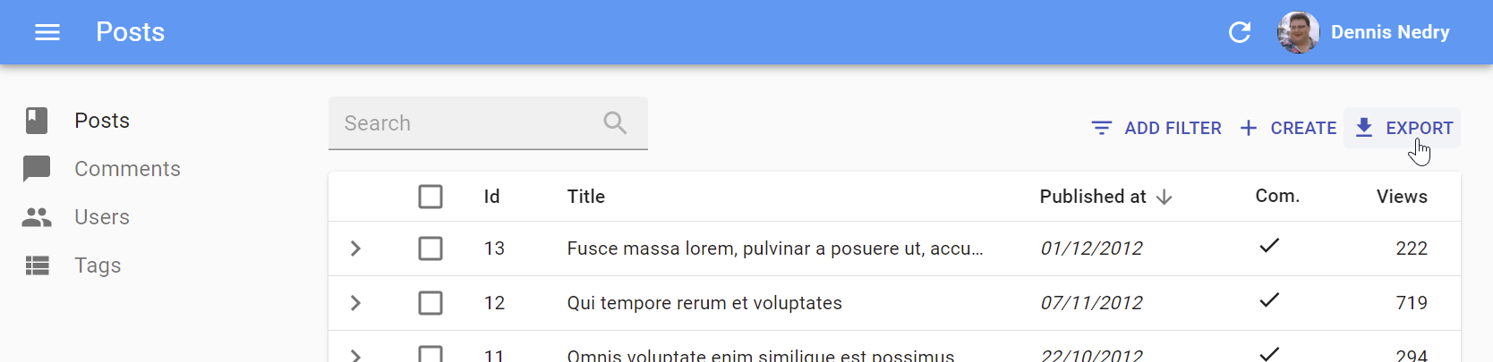
<ExportButton>
Exports the current list, with filters applied, but without pagination. It relies on the exporter function passed to the <List> component, via the ListContext. It’s disabled for empty lists.
By default, the <ExportButton> is included in the List actions.
import { CreateButton, ExportButton, TopToolbar } from 'react-admin';

const PostListActions = ({ basePath }) => (
    <TopToolbar>
        <PostFilter context="button" />
        <CreateButton basePath={basePath} />
        <ExportButton />
    </TopToolbar>
);

export const PostList = (props) => (
    <List actions={<PostListActions />} {...props}>
        ...
    </List>
);
| Prop | Required | Type | Default | Description |
|---|---|---|---|---|
maxResults |
Optional | number |
1000 | Maximum number of records to export |
label |
Optional | string |
‘ra.action.export’ | label or translation message to use |
icon |
Optional | ReactElement |
<DownloadIcon> |
iconElement, e.g. <CommentIcon /> |
exporter |
Optional | Function |
- | Override the List exporter function |
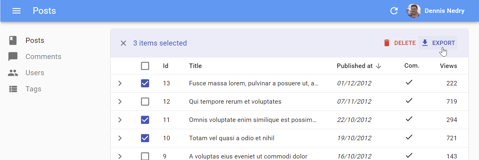
<BulkExportButton>
Same as <ExportButton>, except it only exports the selected rows instead of the entire list. To be used inside the <List bulkActionButtons> prop.
import * as React from 'react';
import { Fragment } from 'react';
import { BulkDeleteButton, BulkExportButton } from 'react-admin';

const PostBulkActionButtons = ({ basePath }) => (
    <Fragment>
        <BulkExportButton />
        <BulkDeleteButton basePath={basePath} />
    </Fragment>
);

export const PostList = (props) => (
    <List {...props} bulkActionButtons={<PostBulkActionButtons />}>
        ...
    </List>
);
| Prop | Required | Type | Default | Description |
|---|---|---|---|---|
label |
Optional | string |
‘ra.action.export’ | label or translation message to use |
icon |
Optional | ReactElement |
<DownloadIcon> |
iconElement, e.g. <CommentIcon /> |
exporter |
Optional | Function |
- | Override the List exporter function |
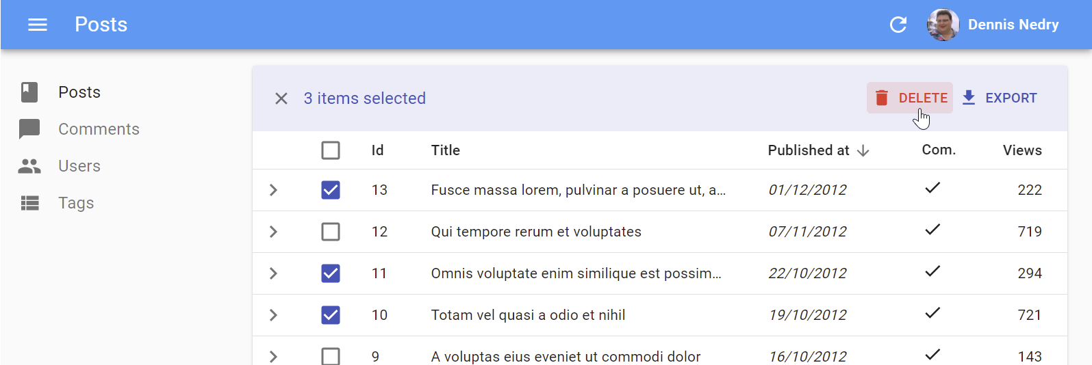
<BulkDeleteButton>
Deletes the selected rows. To be used inside the <List bulkActionButtons> prop (where it’s enabled by default).
import * as React from 'react';
import { Fragment } from 'react';
import { BulkDeleteButton, BulkExportButton } from 'react-admin';

const PostBulkActionButtons = ({ basePath }) => (
    <Fragment>
        <BulkExportButton />
        <BulkDeleteButton basePath={basePath} />
    </Fragment>
);

export const PostList = (props) => (
    <List {...props} bulkActionButtons={<PostBulkActionButtons />}>
        ...
    </List>
);
| Prop | Required | Type | Default | Description |
|---|---|---|---|---|
label |
Optional | string |
‘ra.action.delete’ | label or translation message to use |
icon |
Optional | ReactElement |
<DeleteIcon> |
iconElement, e.g. <CommentIcon /> |
exporter |
Optional | Function |
- | Override the List exporter function |
undoable |
Optional | boolean |
true |
Allow users to cancel the deletion |
<FilterButton>
This button is an internal component used by react-admin in the Filter button/form combo.
CSS API
| Rule name | Description |
|---|---|
root |
Alternative to using className. Applied to the root element |
To override the style of all instances of <FilterButton> using the material-ui style overrides, use the RaFilterButton key.
<SortButton>
Some List views don’t have a natural UI for sorting - e.g. the <SimpleList>, or a list of images, don’t have column headers like the <Datagrid>. For these cases, react-admin offers the <SortButton>, which displays a dropdown list of fields that the user can choose to sort on.
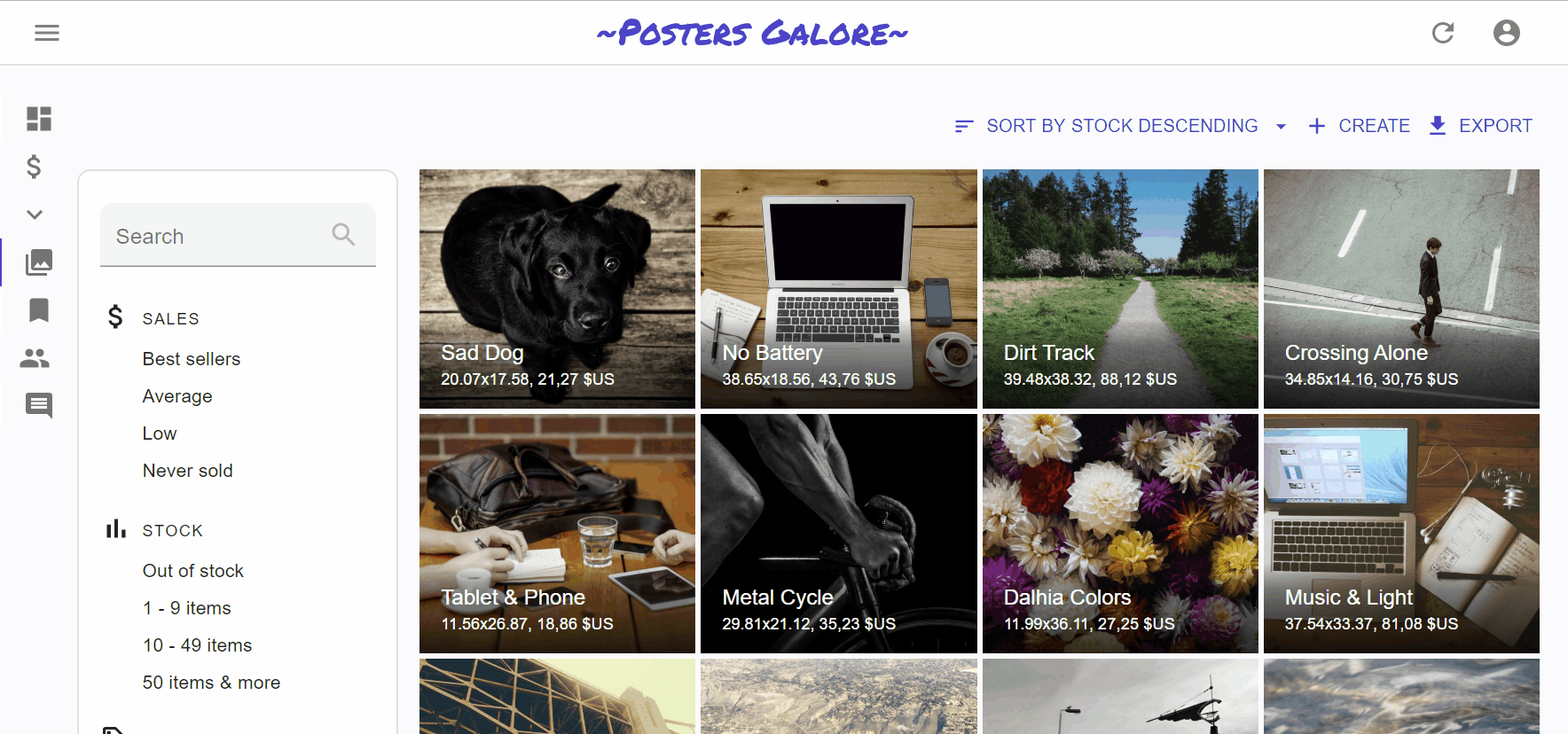
<SortButton> expects one prop: fields, the list of fields it should allow to sort on. For instance, here is how to offer a button to sort on the reference, sales, and stock fields:
import * as React from 'react';
import { TopToolbar, SortButton, CreateButton, ExportButton } from 'react-admin';

const ListActions = () => (
    <TopToolbar>
        <SortButton fields={['reference', 'sales', 'stock']} />
        <CreateButton basePath="/products" />
        <ExportButton />
    </TopToolbar>
);
| Prop | Required | Type | Default | Description |
|---|---|---|---|---|
fields |
Required | string[] |
- | List of fields to offer sort on |
icon |
Optional | ReactElement |
<DeleteIcon> |
iconElement, e.g. <CommentIcon /> |
label |
Optional | string |
‘ra.action.delete’ | label or translation message to use |
Record Buttons
<DeleteButton>
<CloneButton>
<SaveButton>
Miscellaneous
<Button>
Base component for most react-admin buttons. Responsive (displays only the icon with a tooltip on mobile) and accessible.
| Prop | Required | Type | Default | Description |
|---|---|---|---|---|
alignIcon |
Optional | 'left' | 'right |
'left' |
Icon position relative to the label |
children |
Optional | ReactElement |
- | icon to use |
className |
Optional | string |
- | path to link to, e.g. ‘/posts’ |
color |
Optional | 'default' | 'inherit'| 'primary' | 'secondary' |
'primary' |
Label and icon color |
disabled |
Optional | boolean |
false |
If true, the button will be disabled |
size |
Optional | 'large' | 'medium' | 'small' |
'small' |
Button size |
Other props are passed down to the underlying material-ui <Button>.
CSS API
| Rule name | Description |
|---|---|
button |
Applied to the underlying MuiButton component |
label |
Applied to the Button’s label when alignIcon prop is ‘left’ |
labelRightIcon |
Applied to the Button’s label when alignIcon prop is ‘left’ |
smallIcon |
Applied to the Button’s children when size prop is small and alignIcon prop is ‘right’ |
mediumIcon |
Applied to the Button’s children when size prop is medium and alignIcon prop is ‘right’ |
largeIcon |
Applied to the Button’s children when size prop is large and alignIcon prop is ‘right’ |
To override the style of all instances of <Button> using the material-ui style overrides, use the RaButton key.
<RefreshButton>
<SkipNavigationButton>
CSS API
| Rule name | Description |
|---|---|
skipToContentButton |
Applied to the underlying MuiButton component |
To override the style of all instances of <SkipNavigationButton> using the material-ui style overrides, use the RaSkipNavigationButton key.
<MenuItemLink>
The <MenuItemLink> component displays a menu item with a label and an icon - or only the icon with a tooltip when the sidebar is minimized. It also handles the automatic closing of the menu on tap on mobile.
| Prop | Required | Type | Default | Description |
|---|---|---|---|---|
to |
Required | string | location |
- | The menu item’s target. It is passed to a React Router NavLink component. |
primaryText |
Required | ReactNode |
- | The menu content, displayed when the menu isn’t minimized. |
leftIcon |
Optional | ReactNode |
- | The menu icon |
Additional props are passed down to the underling material-ui <MenuItem> component.
You can create a custom menu component using the <DashboardMenuItem> and <MenuItemLink> components:
// in src/Menu.js
import * as React from 'react';
import { DashboardMenuItem, Menu, MenuItemLink } from 'react-admin';
import BookIcon from '@material-ui/icons/Book';
import ChatBubbleIcon from '@material-ui/icons/ChatBubble';
import PeopleIcon from '@material-ui/icons/People';
import LabelIcon from '@material-ui/icons/Label';

export const Menu = (props) => (
    <Menu {...props}>
        <DashboardMenuItem />
        <MenuItemLink to="/posts" primaryText="Posts" leftIcon={<BookIcon />}/>
        <MenuItemLink to="/comments" primaryText="Comments" leftIcon={<ChatBubbleIcon />}/>
        <MenuItemLink to="/users" primaryText="Users" leftIcon={<PeopleIcon />}/>
        <MenuItemLink to="/custom-route" primaryText="Miscellaneous" leftIcon={<LabelIcon />}/>
    </Menu>
);
To use this custom menu component, pass it to a custom Layout:
// in src/Layout.js
import { Layout } from 'react-admin';
import { Menu } from './Menu';

export const Layout = (props) => <Layout {...props} menu={Menu} />;
Then, use this layout in the <Admin> layout prop:
// in src/App.js
import { Layout }  from './Layout';

const App = () => (
    <Admin layout={Layout} dataProvider={simpleRestProvider('http://path.to.my.api')}>
        // ...
    </Admin>
);
See The theming documentation for more details.
Tip: If you need a multi-level menu, or a Mega Menu opening panels with custom content, check out the ra-navigation module (part of the Enterprise Edition)


CSS API
| Rule name | Description |
|---|---|
root |
Alternative to using className. Applied to the root element |
active |
Applied to the underlying MuiMenuItem’s activeClassName prop |
icon |
Applied to the ListItemIcon component when leftIcon prop is set |
To override the style of all instances of <MenuItemLink> using the material-ui style overrides, use the RaMenuItemLink key.
<UserMenu>
| Prop | Required | Type | Default | Description |
|---|---|---|---|---|
children |
Optional | ReactElement |
- | elements to use as menu items |
label |
Required | string |
‘ra.auth.user_menu’ | label or translation message to use |
logout |
Optional | ReactElement |
- | logout component |
icon |
Optional | ReactElement |
<AccountCircle> |
iconElement, e.g. <CommentIcon /> |
CSS API
| Rule name | Description |
|---|---|
user |
Alternative to using className. Applied to the root element |
userButton |
Applied to the underlying MuiButton component when useGetIdentity().loaded is true and useGetIdentity().identity.fullName is set |
avatar |
Applied to the underlying MuiAvatar component when useGetIdentity().avatar is true |
To override the style of all instances of <UserMenu> using the material-ui style overrides, use the RaUserMenu key.