The Show View
The Show view displays a record fetched from the API in a read-only fashion. It delegates the actual rendering of the record to a layout component - usually <SimpleShowLayout>. This layout component uses its children (<Fields> components) to render each record field.
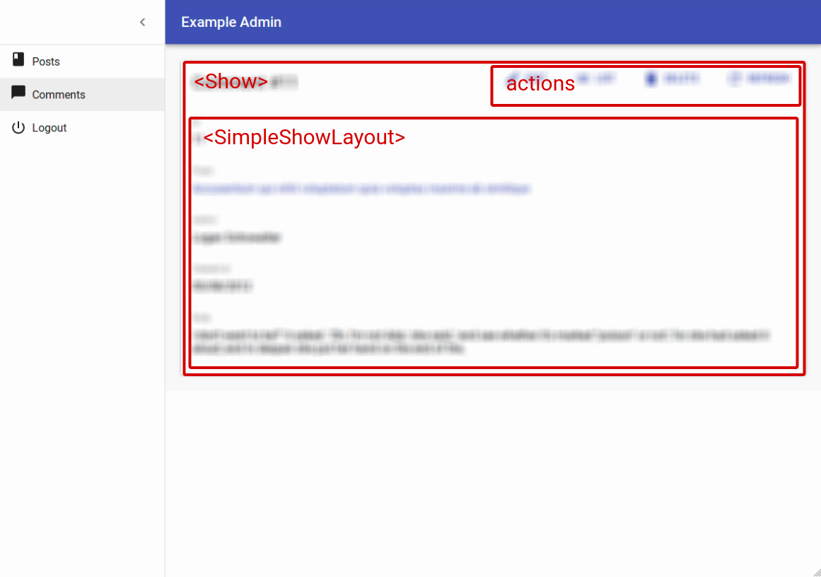
The <Show> component
The <Show> component renders the page title and actions, and fetches the record from the REST API. It is not responsible for rendering the actual record - that’s the job of its child component (usually <SimpleShowLayout>), to which they pass the record as prop.
Here are all the props accepted by the <Show> component:
CSS API
The <Show> component accepts the usual className prop but you can override many class names injected to the inner components by React-admin thanks to the classes property (as most Material UI components, see their documentation about it). This property accepts the following keys:
| Rule name | Description |
|---|---|
root |
Alternative to using className. Applied to the root element |
main |
Applied to the main container |
noActions |
Applied to the main container when actions prop is false |
card |
Applied to the child component inside the main container (Material UI’s Card by default) |
To override the style of all instances of <Show> using the material-ui style overrides, use the RaShow key.
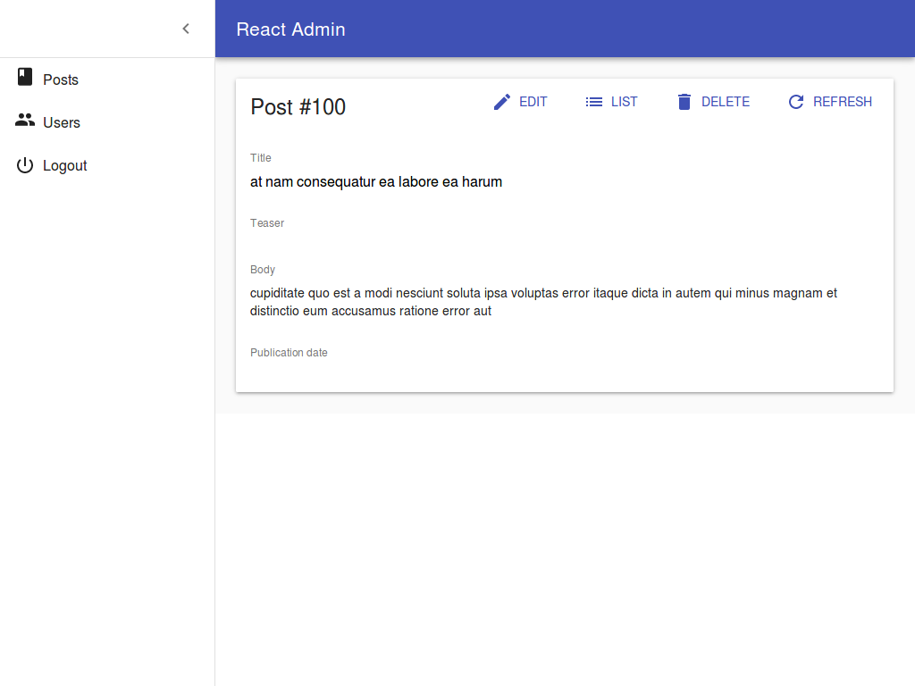
Here is the minimal code necessary to display a view to show a post:
// in src/App.js
import * as React from "react";
import { Admin, Resource } from 'react-admin';
import jsonServerProvider from 'ra-data-json-server';

import { PostCreate, PostEdit, PostShow } from './posts';

const App = () => (
    <Admin dataProvider={jsonServerProvider('https://jsonplaceholder.typicode.com')}>
        <Resource name="posts" show={PostShow} create={PostCreate} edit={PostEdit} />
    </Admin>
);

export default App;

// in src/posts.js
import * as React from "react";
import { Show, SimpleShowLayout, TextField, DateField, RichTextField } from 'react-admin';

export const PostShow = (props) => (
    <Show {...props}>
        <SimpleShowLayout>
            <TextField source="title" />
            <TextField source="teaser" />
            <RichTextField source="body" />
            <DateField label="Publication date" source="created_at" />
        </SimpleShowLayout>
    </Show>
);
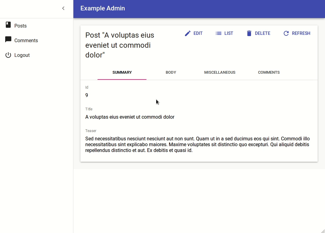
That’s enough to display the post show view:
Page Title
By default, the title for the Show view is “[resource_name] #[record_id]”.
You can customize this title by specifying a custom title prop:
export const PostShow = (props) => (
    <Show title="Post view" {...props}>
        ...
    </Show>
);
More interestingly, you can pass a component as title. React-admin clones this component and, in the <ShowView>, injects the current record. This allows to customize the title according to the current record:
const PostTitle = ({ record }) => {
    return <span>Post {record ? `"${record.title}"` : ''}</span>;
};
export const PostShow = (props) => (
    <Show title={<PostTitle />} {...props}>
        ...
    </Show>
);
Actions
You can replace the list of default actions by your own component using the actions prop:
import Button from '@material-ui/core/Button';
import { EditButton, TopToolbar } from 'react-admin';

const PostShowActions = ({ basePath, data, resource }) => (
    <TopToolbar>
        <EditButton basePath={basePath} record={data} />
        {/* Add your custom actions */}
        <Button color="primary" onClick={customAction}>Custom Action</Button>
    </TopToolbar>
);

export const PostShow = (props) => (
    <Show actions={<PostShowActions />} {...props}>
        ...
    </Show>
);
Aside component
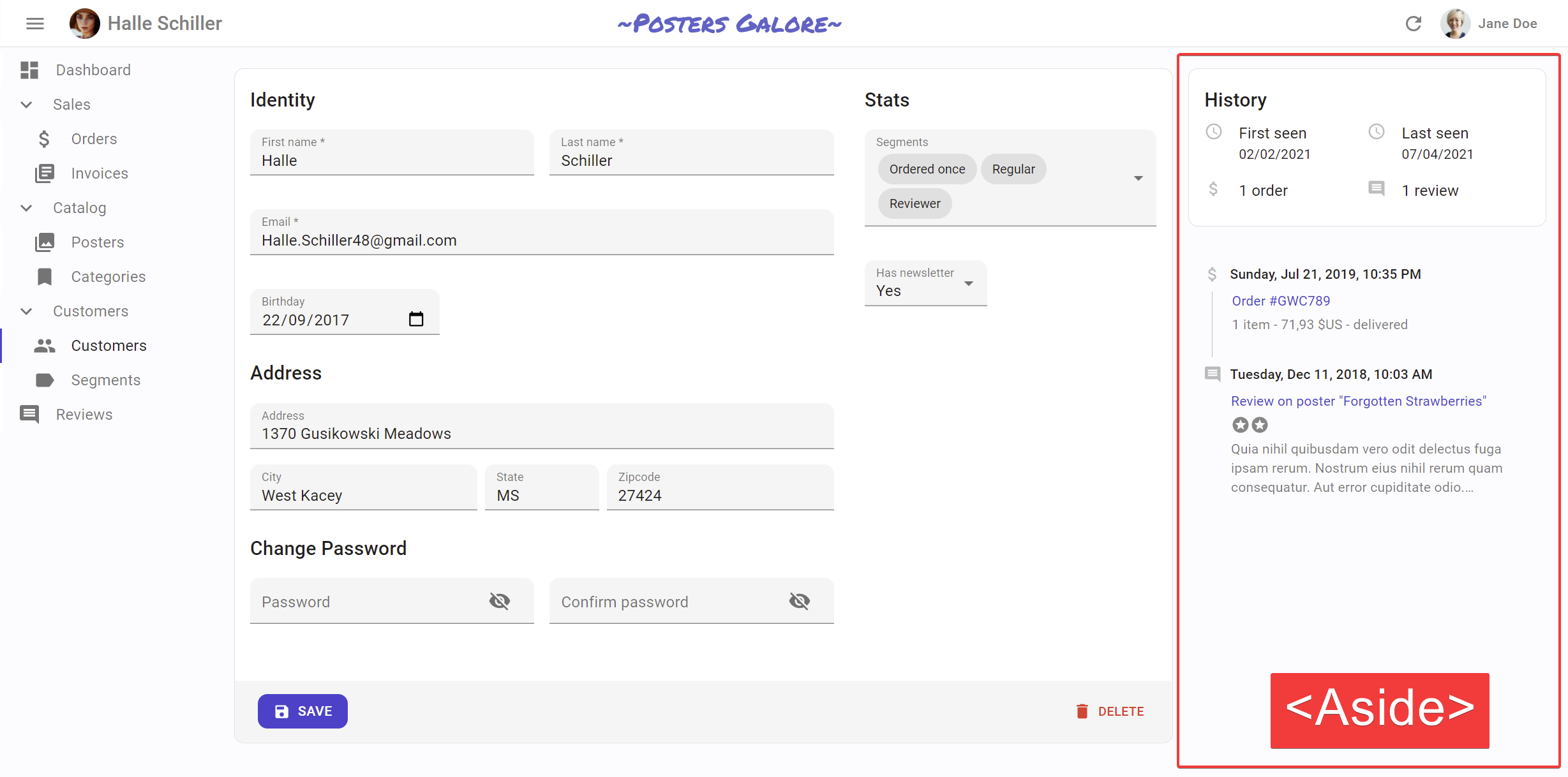
You may want to display additional information on the side of the resource detail. Use the aside prop for that, passing the element of your choice:
const Aside = () => (
    <div style={{ width: 200, margin: '1em' }}>
        <Typography variant="h6">Post details</Typography>
        <Typography variant="body2">
            Posts will only be published once an editor approves them
        </Typography>
    </div>
);

const PostShow = props => (
    <Show aside={<Aside />} {...props}>
        ...
    </Show>
);
You can use the useRecordContext hook to display non-editable details about the current record in the aside component:
const Aside = () => {
    const record = useRecordContext();
    return (
        <div style={{ width: 200, margin: '1em' }}>
            <Typography variant="h6">Post details</Typography>
            {record && (
                <Typography variant="body2">
                    Creation date: {record.createdAt}
                </Typography>
            )}
        </div>
    );
}
Tip: Always test the record is defined before using it, as react-admin starts rendering the UI before the API call is over.
Component
By default, the Show view renders the main content area inside a material-ui <Card> element. The actual layout of the area depends on the ShowLayout component you’re using (<SimpleShowLayout>, <TabbedShowLayout>, or a custom layout component).
Some layouts also use Card, in which case the user ends up seeing a card inside a card, which is bad UI. To avoid that, you can override the main area container by passing a component prop:
// use a div as root component
const PostShow = props => (
    <Show component="div" {...props}>
        ...
    </Show>
);

// use a custom component as root component
const PostShow = props => (
    <Show component={MyComponent} {...props}>
        ...
    </Show>
);
The default value for the component prop is Card.
onFailure
By default, when the getOne action fails at the dataProvider level, react-admin shows an error notification and refreshes the page.
You can override this behavior and pass custom side effects by providing a function as onFailure prop:
import * as React from 'react';
import { useNotify, useRefresh, useRedirect, Show, SimpleShowLayout } from 'react-admin';

const PostShow = props => {
    const notify = useNotify();
    const refresh = useRefresh();
    const redirect = useRedirect();

    const onFailure = (error) => {
        notify(`Could not load post: ${error.message}`);
        redirect('/posts');
        refresh();
    };

    return (
        <Show onFailure={onFailure} {...props}>
            <SimpleShowLayout>
                ...
            </SimpleShowLayout>
        </Show>
    );
}
The onFailure function receives the error from the dataProvider call (dataProvider.getOne()), which is a JavaScript Error object (see the dataProvider documentation for details).
The default onFailure function is:
(error) => {
    notify('ra.notification.item_doesnt_exist', { type: 'warning' });
    redirect('list', basePath);
    refresh();
}
The <ShowGuesser> component
Instead of a custom Show, you can use the ShowGuesser to determine which fields to use based on the data returned by the API.
// in src/App.js
import * as React from "react";
import { Admin, Resource, ShowGuesser } from 'react-admin';
import jsonServerProvider from 'ra-data-json-server';

const App = () => (
    <Admin dataProvider={jsonServerProvider('https://jsonplaceholder.typicode.com')}>
        <Resource name="posts" show={ShowGuesser} />
    </Admin>
);
Just like Show, ShowGuesser fetches the data. It then analyzes the response, and guesses the fields it should use to display a basic page with the data. It also dumps the components it has guessed in the console, where you can copy it into your own code. Use this feature to quickly bootstrap a Show on top of an existing API, without adding the inputs one by one.
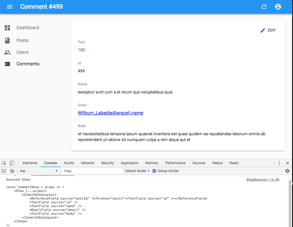
React-admin provides guessers for the List view (ListGuesser), the Edit view (EditGuesser), and the Show view (ShowGuesser).
Tip: Do not use the guessers in production. They are slower than manually-defined components, because they have to infer types based on the content. Besides, the guesses are not always perfect.
useShowController
The <Show> component takes care of two things:
- (the “controller”) Fetching data based on the URL and transforming it
- (the “view”) Rendering the page title, the actions, the content and aside areas
In some cases, you may want to customize the view entirely (i.e. keep the code for step 1, and provide your own code for step 2). For these cases, react-admin provides a hook called useShowController(), which contains just the controller part of the <Show> component.
This hook takes one object as input (the props passed to a <Show> component) and returns the fetched data for the Show view. You can use it to create your own custom Show view, like this one:
import { useShowController, SimpleShowLayout } from 'react-admin';

const MyShow = props => {
    const {
        basePath, // deduced from the location, useful for action buttons
        defaultTitle, // the translated title based on the resource, e.g. 'Post #123'
        error,  // error returned by dataProvider when it failed to fetch the record. Useful if you want to adapt the view instead of just showing a notification using the `onFailure` side effect.
        loaded, // boolean that is false until the record is available
        loading, // boolean that is true on mount, and false once the record was fetched
        record, // record fetched via dataProvider.getOne() based on the id from the location
        resource, // the resource name, deduced from the location. e.g. 'posts'
        version, // integer used by the refresh feature
    } = useShowController(props);
    return (
        <div>
            <h1>{defaultTitle}</h1>
            {cloneElement(props.children, {
                basePath,
                record,
                resource,
                version,
            })}
        </div>
    );
}

const PostShow = props => (
    <MyShow {...props}>
        <SimpleShowLayout>
            ...
        </SimpleShowLayout>
    </MyShow>
)
This custom Show view has no action buttons or aside component - it’s up to you to add them in pure React.
Tip: You don’t have to clone the child element. If you can’t reuse an existing form component like <SimpleShowLayout>, feel free to write the form code inside your custom MyShow component.
The <SimpleShowLayout> component
The <SimpleShowLayout> component receives the record as prop from its parent component. It is responsible for rendering the actual view.
The <SimpleShowLayout> renders its child components line by line (within <div> components) inside a material-ui <CardContent/>.
export const PostShow = (props) => (
    <Show {...props}>
        <SimpleShowLayout>
            <TextField source="title" />
            <RichTextField source="body" />
            <NumberField source="nb_views" />
        </SimpleShowLayout>
    </Show>
);
It accepts a className prop to let you override the style of the <CardContent/>.
The <TabbedShowLayout> component
Just like <SimpleShowLayout>, <TabbedShowLayout> receives the record prop and renders the actual view. However, the <TabbedShowLayout> component renders fields grouped by tab. The tabs are set by using <Tab> components, which expect a label and an optional icon prop. Switching tabs will update the current url. By default, it uses the tabs indexes and the first tab will be displayed at the root url. You can customize the path by providing a path prop to each Tab component. If you’d like the first one to act as an index page, just omit the path prop.
import { TabbedShowLayout, Tab } from 'react-admin'

export const PostShow = (props) => (
    <Show {...props}>
        <TabbedShowLayout>
            <Tab label="summary">
                <TextField label="Id" source="id" />
                <TextField source="title" />
                <TextField source="teaser" />
            </Tab>
            <Tab label="body" path="body">
                <RichTextField source="body" addLabel={false} />
            </Tab>
            <Tab label="Miscellaneous" path="miscellaneous">
                <TextField label="Password (if protected post)" source="password" type="password" />
                <DateField label="Publication date" source="published_at" />
                <NumberField source="average_note" />
                <BooleanField label="Allow comments?" source="commentable" defaultValue />
                <TextField label="Nb views" source="views" />
            </Tab>
            <Tab label="comments" path="comments">
                <ReferenceManyField reference="comments" target="post_id" addLabel={false}>
                    <Datagrid>
                        <TextField source="body" />
                        <DateField source="created_at" />
                        <EditButton />
                    </Datagrid>
                </ReferenceManyField>
            </Tab>
        </TabbedShowLayout>
    </Show>
);
To style the tabs, the <Tab> component accepts two props:
classNameis passed to the tab headercontentClassNameis passed to the tab content
You can also opt out the location synchronization by passing false to the syncWithLocation prop of the <TabbedShowLayout> component. This allows e.g. to have several <TabbedShowLayout> components in a page.
import { TabbedShowLayout, Tab } from 'react-admin'

export const PostShow = (props) => (
    <Show {...props}>
        <TabbedShowLayout syncWithLocation={false}>
            <Tab label="summary">
                <TextField label="Id" source="id" />
                <TextField source="title" />
                <TextField source="teaser" />
            </Tab>
            <Tab label="body" path="body">
                <RichTextField source="body" addLabel={false} />
            </Tab>
            <Tab label="Miscellaneous" path="miscellaneous">
                <TextField label="Password (if protected post)" source="password" type="password" />
                <DateField label="Publication date" source="published_at" />
                <NumberField source="average_note" />
                <BooleanField label="Allow comments?" source="commentable" defaultValue />
                <TextField label="Nb views" source="views" />
            </Tab>
            <Tab label="comments" path="comments">
                <ReferenceManyField reference="comments" target="post_id" addLabel={false}>
                    <Datagrid>
                        <TextField source="body" />
                        <DateField source="created_at" />
                        <EditButton />
                    </Datagrid>
                </ReferenceManyField>
            </Tab>
        </TabbedShowLayout>
    </Show>
);
Tip: When syncWithLocation is false, the path prop of the <Tab> components is ignored.
Tabs element
By default, <TabbedShowLayout> renders its tabs using <TabbedShowLayoutTabs>, an internal react-admin component. You can pass a custom component as the tabs prop to override that default. Also, props passed to <TabbedShowLayoutTabs> are passed to the material-ui’s <Tabs> component inside <TabbedShowLayoutTabs>. That means you can create a custom tabs component without copying several components from the react-admin source.
For instance, to make use of scrollable <Tabs>, you can pass variant="scrollable" and scrollButtons="auto" props to <TabbedShowLayoutTabs> and use it in the tabs prop from <TabbedShowLayout> as follows:
import {
    Show,
    TabbedShowLayout,
    TabbedShowLayoutTabs,
} from 'react-admin';

const ScrollableTabbedShowLayout = props => (
    <Show {...props}>
        <TabbedShowLayout tabs={<TabbedShowLayoutTabs variant="scrollable" scrollButtons="auto" {...props} />}>
            ...
        </TabbedShowLayout>
    </Show>
);

export default ScrollableTabbedShowLayout;
Third-Party Components
You can find components for react-admin in third-party repositories.
- ra-compact-ui: plugin that allows to have custom styled show layouts.
Displaying Fields depending on the user permissions
You might want to display some fields only to users with specific permissions.
Before rendering the Show component, react-admin calls the authProvider.getPermissions() method, and passes the result to the component as the permissions prop. It’s up to your authProvider to return whatever you need to check roles and permissions inside your component.
Here’s an example inside a Show view with a SimpleShowLayout and a custom actions component:
import TopToolbar from '@material-ui/core/TopToolbar';
import Button from '@material-ui/core/Button';
import { EditButton, DeleteButton } from 'react-admin';

const PostShowActions = ({ permissions, basePath, data, resource }) => (
    <TopToolbar>
        <EditButton basePath={basePath} record={data} />
        {permissions === 'admin' &&
            <DeleteButton basePath={basePath} record={data} resource={resource} />
        }
    </TopToolbar>
);

export const PostShow = ({ permissions, ...props }) => (
    <Show actions={<PostShowActions permissions={permissions} />} {...props}>
        <SimpleShowLayout>
            <TextField source="title" />
            <RichTextField source="body" />
            {permissions === 'admin' &&
                <NumberField source="nb_views" />
            }
        </SimpleShowLayout>
    </Show>
);
Tip Note how the permissions prop is passed down to the custom actions component.
This also works inside a TabbedShowLayout, and you can hide a Tab completely:
export const UserShow = ({ permissions, ...props }) =>
    <Show {...props}>
        <TabbedShowLayout>
            <Tab label="user.form.summary">
                {permissions === 'admin' && <TextField source="id" />}
                <TextField source="name" />
            </Tab>
            {permissions === 'admin' &&
                <Tab label="user.form.security">
                    <TextField source="role" />
                </Tab>}
        </TabbedShowLayout>
    </Show>;