Input Components
An Input component displays an input, or a dropdown list, a list of radio buttons, etc. Such components allow to edit a record property, and are common in the <Edit> and <Create> components, and in the List Filters.
// in src/posts.js
import * as React from "react";
import { Edit, SimpleForm, ReferenceInput, SelectInput, TextInput, required } from 'react-admin';

export const PostEdit = (props) => (
    <Edit title={<PostTitle />} {...props}>
        <SimpleForm>
            <TextInput disabled source="id" />
            <ReferenceInput label="User" source="userId" reference="users" validate={[required()]}>
                <SelectInput optionText="name" />
            </ReferenceInput>
            <TextInput source="title" label="Post title" validate={[required()]} />
            <TextInput multiline source="body" initialValue="Lorem Ipsum" />
        </SimpleForm>
    </Edit>
);
Common Input Props
All input components accept the following props:
| Prop | Required | Type | Default | Description |
|---|---|---|---|---|
source |
Required | string |
- | Name of the entity property to use for the input value |
label |
Optional | string |
- | Input label. In i18n apps, the label is passed to the translate function. Defaults to the humanized source when omitted. Set label={false} to hide the label. |
validate |
Optional | Function | array |
- | Validation rules for the current property. See the Validation Documentation for details. |
helperText |
Optional | string |
- | Text to be displayed under the input |
fullWidth |
Optional | boolean |
false |
If true, the input will expand to fill the form width |
className |
Optional | string |
- | Class name (usually generated by JSS) to customize the look and feel of the field element itself |
formClassName |
Optional | string |
- | Class name to be applied to the container of the input (e.g. the <div> forming each row in <SimpleForm>) |
<TextInput source="zb_title" label="Title" initialValue="Foo" />
React-admin uses react-final-form to control form inputs. Each input component also accepts all react-final-form FieldProps, including:
| Prop | Required | Type | Default | Description |
|---|---|---|---|---|
initialValue |
Optional | mixed |
- | Value to be set when the property is undefined |
format |
Optional | Function |
- | Callback taking the value from the form state and the name of the field, and returns the input value. See the Transforming Input Value section. |
parse |
Optional | Function |
- | Callback taking the input value and name of the field, and returns the value you want stored in the form state. See the Transforming Input Value section. |
Additional props are passed down to the underlying component (usually a material-ui component). For instance, when setting the className prop on a TextInput component, the underlying material-ui <TextField> receives it, and renders with custom styles. You can also set the underlying component variant and margin that way.
Tip: If you edit a record with a complex structure, you can use a path as the source parameter. For instance, if the API returns the following ‘book’ record:
{
    "id": 1234,
    "title": "War and Peace",
    "author": {
        "firstName": "Leo",
        "lastName": "Tolstoi"
    }
}
Then you can display a text input to edit the author first name as follows:
<TextInput source="author.firstName" />
Tip: If your interface has to support multiple languages, don’t use the label prop, and put the localized labels in a dictionary instead. See the Translation documentation for details.
Tip: For compatibility reasons, input components also accept the defaultValue prop - which is simply copied as the initialValue prop.
Basic Inputs
<BooleanInput> and <NullableBooleanInput>
<BooleanInput /> is a toggle button allowing you to attribute a true or false value to a record field.
import { BooleanInput } from 'react-admin';

<BooleanInput label="Commentable" source="commentable" />

This input does not handle null values. You would need the <NullableBooleanInput /> component if you have to handle non-set booleans.
You can use the options prop to pass any option supported by the Material UI’s Switch components. For example, here’s how to set a custom checked icon:
import { BooleanInput } from 'react-admin';
import FavoriteIcon from '@material-ui/icons/Favorite';

<BooleanInput
    source="favorite"
    options={{
        checkedIcon: <FavoriteIcon />,
    }}
/>
Refer to Material UI Switch documentation for more details.
<NullableBooleanInput /> renders as a dropdown list, allowing choosing between true, false, and null values.
import { NullableBooleanInput } from 'react-admin';

<NullableBooleanInput label="Commentable" source="commentable" />
The labels of the options can be customized for the entire application by overriding the translation.
import polyglotI18nProvider from 'ra-i18n-polyglot';
import englishMessages from 'ra-language-english';

englishMessages.ra.boolean.null = 'Null label';
englishMessages.ra.boolean.false = 'False label';
englishMessages.ra.boolean.true = 'True label';
const i18nProvider = polyglotI18nProvider(() => englishMessages, 'en');

<Admin i18nProvider={i18nProvider}></Admin>
Additionally, individual instances of NullableBooleanInput may be customized by setting the nullLabel, falseLabel and trueLabel properties. Values specified for those properties will be translated by react-admin.
import { NullableBooleanInput } from 'react-admin';

<NullableBooleanInput
    label="Commentable"
    source="commentable"
    nullLabel="Either"
    falseLabel="No"
    trueLabel="Yes"
/>

<BooleanInput> and <NullableBooleanInput> also accept the common input props.
CSS API
| Rule name | Description |
|---|---|
input |
Applied to the underlying Material UI’s TextField component |
To override the style of all instances of <NullableBooleanInput> using the material-ui style overrides, use the RaNullableBooleanInput key.
<DateInput>
Ideal for editing dates, <DateInput> renders an HTML <input type="date"> element, that most browsers display as a standard Date Picker.
The appearance of <DateInput> depends on the browser, and falls back to a text input on Safari. The date formatting in this input depends on the user’s locale.
import { DateInput } from 'react-admin';
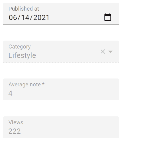
<DateInput source="published_at" />
<DateInput> also accepts the common input props.
Tip: For a material-ui styled <DateInput> component, check out vascofg/react-admin-date-inputs.

<DateTimeInput>
An input for editing dates with time. <DateTimeInput> renders a standard browser Date and Time Picker, so the appearance depends on the browser (and falls back to a text input on safari).
import { DateTimeInput } from 'react-admin';
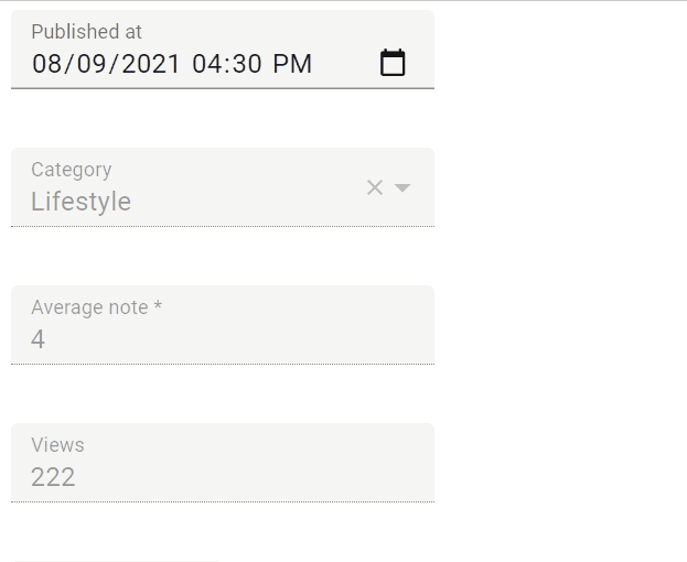
<DateTimeInput source="published_at" />
<DateTimeInput> also accepts the common input props.
Tip: For a material-ui styled <DateTimeInput> component, check out vascofg/react-admin-date-inputs.
<ImageInput>
<ImageInput> allows to upload some pictures using react-dropzone.
Properties
| Prop | Required | Type | Default | Description |
|---|---|---|---|---|
accept |
Optional | string | string[] |
- | Accepted file type(s), e. g. ‘image/*,.pdf’. If left empty, all file types are accepted. Equivalent of the accept attribute of an <input type="file">. See MDN input docs for syntax and examples. |
children |
Optional | ReactNode |
- | Element used to display the preview of an image (cloned several times if the select accepts multiple files). |
minSize |
Optional | number |
0 | Minimum image size (in bytes), e.g. 5000 for 5KB |
maxSize |
Optional | number |
Infinity |
Maximum image size (in bytes), e.g. 5000000 for 5MB |
multiple |
Optional | boolean |
false |
Set to true if the input should accept a list of images, false if it should only accept one image |
labelSingle |
Optional | string |
‘ra.input.image. upload_single’ | Invite displayed in the drop zone if the input accepts one image |
labelMultiple |
Optional | string |
‘ra.input.file. upload_multiple’ | Invite displayed in the drop zone if the input accepts several images |
placeholder |
Optional | string | ReactNode |
- | Invite displayed in the drop zone, overrides labelSingle and labelMultiple |
options |
Optional | Object |
{} |
Additional options passed to react-dropzone’s useDropzone() hook. See the react-dropzone source for details . |
<ImageInput> also accepts the common input props.
Usage
Files are accepted or rejected based on the accept, multiple, minSize and maxSize props. accept must be a valid MIME type according to input element specification or a valid file extension. If multiple is set to false and additional files are dropped, all files besides the first will be rejected. Any file which does not have a size in the [minSize, maxSize] range, will be rejected as well.
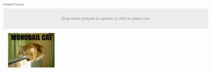
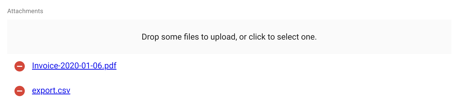
<ImageInput> delegates the preview of currently selected images to its child. <ImageInput> clones its child as many times as there are selected images, passing the image as the record prop. To preview a simple list of image thumbnails, you can use <ImageField> as child, as follows:
<ImageInput source="pictures" label="Related pictures" accept="image/*">
    <ImageField source="src" title="title" />
</ImageInput>
Writing a custom preview component is quite straightforward: it’s a standard field.
When receiving new images, ImageInput will add a rawFile property to the object passed as the record prop of children. This rawFile is the File instance of the newly added file. This can be useful to display information about size or MIME type inside a custom field.
The ImageInput component accepts an options prop, allowing to set the react-dropzone properties.
If the default Dropzone label doesn’t fit with your need, you can pass a placeholder prop to overwrite it. The value can be anything React can render (PropTypes.node):
<ImageInput source="pictures" label="Related pictures" accept="image/*" placeholder={<p>Drop your file here</p>}>
    <ImageField source="src" title="title" />
</ImageInput>
Note that the image upload returns a File object. It is your responsibility to handle it depending on your API behavior. You can for instance encode it in base64, or send it as a multi-part form data. Check this example for base64 encoding data by extending the REST Client.
CSS API
| Rule name | Description |
|---|---|
root |
Styles pass to the underlying FileInput component |
dropZone |
Styles pass to the underlying FileInput component |
preview |
Styles pass to the underlying FileInput component |
removeButton |
Styles pass to the underlying FileInput component |
To override the style of all instances of <ImageInput> using the material-ui style overrides, use the RaImageInput key.
<FileInput>
<FileInput> allows uploading files using react-dropzone.
Properties
| Prop | Required | Type | Default | Description |
|---|---|---|---|---|
accept |
Optional | string | string[] |
- | Accepted file type(s), e. g. ‘application/json,video/*’ or ‘application/vnd.openxmlformats-officedocument.spreadsheetml.sheet’. If left empty, all file types are accepted. Equivalent of the accept attribute of an <input type="file">. See MDN input docs for syntax and examples. |
children |
Optional | ReactNode |
- | Element used to display the preview of a file (cloned several times if the select accepts multiple files). |
minSize |
Optional | number |
0 | Minimum file size (in bytes), e.g. 5000 for 5KB |
maxSize |
Optional | number |
Infinity |
Maximum file size (in bytes), e.g. 5000000 for 5MB |
multiple |
Optional | boolean |
false |
Set to true if the input should accept a list of files, false if it should only accept one file |
labelSingle |
Optional | string |
‘ra.input.file. upload_single’ | Invite displayed in the drop zone if the input accepts one file |
labelMultiple |
Optional | string |
‘ra.input.file. upload_several’ | Invite displayed in the drop zone if the input accepts several files |
placeholder |
Optional | ReactNode |
- | Invite displayed in the drop zone, overrides labelSingle and labelMultiple |
options |
Optional | Object |
{} |
Additional options passed to react-dropzone’s useDropzone() hook. See the react-dropzone source for details . |
<FileInput> also accepts the common input props.
Usage
Files are accepted or rejected based on the accept, multiple, minSize and maxSize props. accept must be a valid MIME type according to input element specification or a valid file extension. If multiple is set to false and additional files are dropped, all files besides the first will be rejected. Any file which does not have a size in the [minSize, maxSize] range, will be rejected as well.
FileInput delegates the preview of currently selected files to its child. FileInput clones its child as many times as there are selected files, passing the file as the record prop. To preview a simple list of files names, you can use <FileField> as child, as follows:
<FileInput source="files" label="Related files" accept="application/pdf">
    <FileField source="src" title="title" />
</FileInput>
Writing a custom preview component is quite straightforward: it’s a standard field.
When receiving new files, FileInput will add a rawFile property to the object passed as the record prop of children. This rawFile is the File instance of the newly added file. This can be useful to display information about size or MIME type inside a custom field.
The FileInput component accepts an options prop into which you can pass all the react-dropzone properties.
If the default Dropzone label doesn’t fit with your need, you can pass a placeholder prop to overwrite it. The value can be anything React can render (PropTypes.node):
<FileInput source="files" label="Related files" accept="application/pdf" placeholder={<p>Drop your file here</p>}>
    <ImageField source="src" title="title" />
</FileInput>
Note that the file upload returns a File object. It is your responsibility to handle it depending on your API behavior. You can for instance encode it in base64, or send it as a multi-part form data. Check this example for base64 encoding data by extending the REST Client.
CSS API
| Rule name | Description |
|---|---|
root |
Applied to the underlying Labeled component |
dropZone |
Applied to the main container of the component |
preview |
Applied to each children |
removeButton |
Applied to each of the Material UI’s IconButton component used as remove button |
To override the style of all instances of <FileInput> using the material-ui style overrides, use the RaFileInput key.
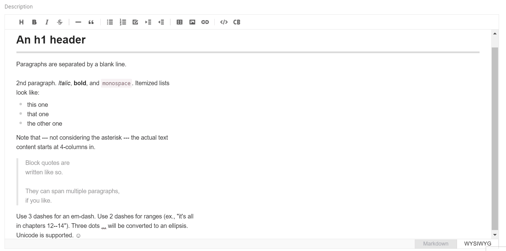
<MarkdownInput>
This Enterprise Edition component allows to edit and preview Markdown data, based on the Toast UI editor.
import { Edit, SimpleForm, TextInput } from 'react-admin';
import { MarkdownInput } from '@react-admin/ra-markdown';

const PostEdit = props => (
    <Edit {...props}>
        <SimpleForm>
            <TextInput source="title" />
            <MarkdownInput source="description" />
        </SimpleForm>
    </Edit>
);
Check the ra-markdown documentation for more details.
<NumberInput>
<NumberInput> translates to an HTML <input type="number">.
It is necessary for numeric values because of a known React bug, which prevents using the more generic <TextInput> in that case.
import { NumberInput } from 'react-admin';
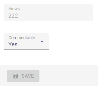
<NumberInput source="nb_views" />
Properties
| Prop | Required | Type | Default | Description |
|---|---|---|---|---|
max |
Optional | number |
’’ | The maximum value to accept for this input |
min |
Optional | number |
’’ | The minimum value to accept for this input |
step |
Optional | number |
any |
A stepping interval to use when using up and down arrows to adjust the value, as well as for validation |
<NumberInput> also accepts the common input props.
Usage
You can customize the step props (which defaults to “any”). For instance, to restrict the value to integers, ise a value of 1 for the step:
<NumberInput source="nb_views" step={1} />
<PasswordInput>
<PasswordInput> works like the <TextInput> but overwrites its type prop to password or text in accordance with a visibility button, hidden by default.
import { PasswordInput } from 'react-admin';
<PasswordInput source="password" />
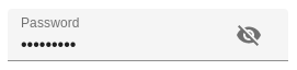
It is possible to change the default behavior and display the value by default via the initiallyVisible prop:
import { PasswordInput } from 'react-admin';
<PasswordInput source="password" initiallyVisible />
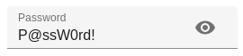
Tip: It is possible to set the autocomplete attribute by injecting an input props:
<PasswordInput source="password" inputProps={{ autocomplete: 'current-password' }} />
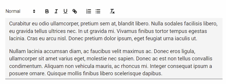
<RichTextInput>
<RichTextInput> is the ideal component if you want to allow your users to edit some HTML contents. It
is powered by Quill.
Note: Due to its size, <RichTextInput> is not bundled by default with react-admin. You must install it first, using npm:
npm install ra-input-rich-text
Then use it as a normal input component:
import RichTextInput from 'ra-input-rich-text';

<RichTextInput source="body" />
You can customize the rich text editor toolbar using the toolbar attribute, as described on the Quill official toolbar documentation.
<RichTextInput source="body" toolbar={[ ['bold', 'italic', 'underline', 'link'] ]} />
If you need to add Quill modules or themes, you can do so by passing them in the options prop.
<RichTextInput
    source="body"
    options={{
        modules: {
            history: { // History module
                delay: 2000,
                maxStack: 500,
                userOnly: true
            }
        },
        theme: "snow"
    }}
/>
If you need more customization, you can access the quill object through the configureQuill callback that will be called just after its initialization.
const configureQuill = quill => quill.getModule('toolbar').addHandler('bold', function (value) {
    this.quill.format('bold', value)
});

// ...

<RichTextInput source="text" configureQuill={configureQuill}/>
<RichTextInput> also accepts the common input props.
Tip: When used inside a material-ui <Card> (e.g. in the default <Edit> view), <RichTextInput> displays link tooltip as cut off when the user wants to add a hyperlink to a word located on the left side of the input. This is due to an incompatibility between material-ui’s <Card> component and Quill’s positioning algorithm for the link tooltip.
To fix this problem, you should override the default card style, as follows:
import { Edit, SimpleForm, TextInput } from 'react-admin';
+import { withStyles } from '@material-ui/core/styles';

-const PostEdit = props => (
+const PostEdit = withStyles({ card: { overflow: 'initial' } })(props => (
   <Edit {...props}>
       <SimpleForm>
            // ...
       </SimpleForm>
   </Edit>
-);
+));
<TextInput>
<TextInput> is the most common input. It is used for texts, emails, URL or passwords. In translates to an HTML <input> tag.
import { TextInput } from 'react-admin';

<TextInput source="title" />
Properties
| Prop | Required | Type | Default | Description |
|---|---|---|---|---|
multiline |
Optional | boolean |
false |
If true, the input height expands as the text wraps over several lines |
resettable |
Optional | boolean |
false |
If true, display a button to reset the changes in this input value |
type |
Optional | string |
text |
Type attribute passed to the <input> element |
<TextInput> also accepts the common input props.
Usage
You can choose a specific input type using the type attribute, for instance text (the default), email, url, or password:
<TextInput label="Email Address" source="email" type="email" />
You can make the <TextInput> expandable using the multiline prop for multiline text values. It renders as an auto expandable textarea.
<TextInput multiline source="body" />
You can make the <TextInput> component resettable using the resettable prop. This will add a reset button which will be displayed only when the field has a value and is focused.
import { TextInput } from 'react-admin';

<TextInput source="title" resettable />
Warning: Do not use type="number", or you’ll receive a string as value (this is a known React bug). Instead, use <NumberInput>.
Choice Inputs
<AutocompleteInput>
To let users choose a value in a list using a dropdown with autocompletion, use <AutocompleteInput>.
It renders using downshift and a fuzzySearch filter.
Set the choices attribute to determine the options list (with id, name tuples).
import { AutocompleteInput } from 'react-admin';

<AutocompleteInput source="category" choices={[
    { id: 'programming', name: 'Programming' },
    { id: 'lifestyle', name: 'Lifestyle' },
    { id: 'photography', name: 'Photography' },
]} />
Properties
| Prop | Required | Type | Default | Description |
|---|---|---|---|---|
allowEmpty |
Optional | boolean |
false |
If false and the searchText typed did not match any suggestion, the searchText will revert to the current value when the field is blurred. If true and the searchText is set to '' then the field will set the input value to null. |
clearAlwaysVisible |
Optional | boolean |
false |
When resettable is true, set this prop to true to have the Reset button visible even when the field is empty |
choices |
Required | Object[] |
- |
List of items to autosuggest |
create |
Optional | Element |
- |
A React Element to render when users want to create a new choice |
createLabel |
Optional | string |
ra.action.create |
The label for the menu item allowing users to create a new choice. Used when the filter is empty |
createItemLabel |
Optional | string |
ra.action.create_item |
The label for the menu item allowing users to create a new choice. Used when the filter is not empty |
emptyValue |
Optional | any |
'' |
The value to use for the empty element |
emptyText |
Optional | string |
'' |
The text to use for the empty element |
matchSuggestion |
Optional | Function |
- |
Required if optionText is a React element. Function returning a boolean indicating whether a choice matches the filter. (filter, choice) => boolean |
onCreate |
Optional | Function |
- |
A function called with the current filter value when users choose to create a new choice. |
optionText |
Optional | string | Function | Component |
name |
Field name of record to display in the suggestion item or function which accepts the correct record as argument ((record)=> {string}) |
optionValue |
Optional | string |
id |
Field name of record containing the value to use as input value |
inputText |
Optional | Function |
- |
If optionText is a custom Component, this function is needed to determine the text displayed for the current selection. |
resettable |
Optional | boolean |
false |
Display a button to reset the text filter. Useful when using <AutocompleteInput> inside the list filters |
setFilter |
Optional | Function |
null |
A callback to inform the searchText has changed and new choices can be retrieved based on this searchText. Signature searchText => void. This function is automatically setup when using ReferenceInput. |
shouldRenderSuggestions |
Optional | Function |
() => true |
A function that returns a boolean to determine whether or not suggestions are rendered. Use this when working with large collections of data to improve performance and user experience. This function is passed into the underlying react-autosuggest component. Ex.(value) => value.trim().length > 2 |
suggestionLimit |
Optional | number |
null |
Limits the numbers of suggestions that are shown in the dropdown list |
<AutocompleteInput> also accepts the common input props.
Usage
You can customize the properties to use for the option name and value, thanks to the optionText and optionValue attributes:
const choices = [
    { _id: 123, full_name: 'Leo Tolstoi', sex: 'M' },
    { _id: 456, full_name: 'Jane Austen', sex: 'F' },
];
<AutocompleteInput source="author_id" choices={choices} optionText="full_name" optionValue="_id" />
optionText also accepts a function, so you can shape the option text at will:
const choices = [
   { id: 123, first_name: 'Leo', last_name: 'Tolstoi' },
   { id: 456, first_name: 'Jane', last_name: 'Austen' },
];
const optionRenderer = choice => `${choice.first_name} ${choice.last_name}`;
<AutocompleteInput source="author_id" choices={choices} optionText={optionRenderer} />
optionText also accepts a custom Component. However, as the underlying Autocomplete component requires that the current selection is a string, if you opt for a Component, you must pass a function as the inputText prop. This function should return text representation of the current selection:
const choices = [
   { id: 123, first_name: 'Leo', last_name: 'Tolstoi', avatar:'/pengouin' },
   { id: 456, first_name: 'Jane', last_name: 'Austen', avatar:'/panda' },
];
const OptionRenderer = choice => (
    <span>
        <img src={choice.avatar} />
        {choice.first_name} {choice.last_name}
    </span>
);
const inputText = choice => `${choice.first_name} ${choice.last_name}`;
<AutocompleteInput
    source="author_id"
    choices={choices}
    optionText={<OptionRenderer />}
    inputText={inputText}
/>
The choices are translated by default, so you can use translation identifiers as choices:
const choices = [
   { id: 'M', name: 'myroot.gender.male' },
   { id: 'F', name: 'myroot.gender.female' },
];
However, in some cases (e.g. inside a <ReferenceInput>), you may not want the choice to be translated.
In that case, set the translateChoice prop to false.
<AutocompleteInput source="gender" choices={choices} translateChoice={false}/>
If you want to limit the initial choices shown to the current value only, you can set the limitChoicesToValue prop.
When dealing with a large amount of choices you may need to limit the number of suggestions that are rendered in order to maintain usable performance. The shouldRenderSuggestions is an optional prop that allows you to set conditions on when to render suggestions. An easy way to improve performance would be to skip rendering until the user has entered 2 or 3 characters in the search box. This lowers the result set significantly, and might be all you need (depending on your data set).
Ex. <AutocompleteInput shouldRenderSuggestions={(val) => { return val.trim().length > 2 }} /> would not render any suggestions until the 3rd character has been entered. This prop is passed to the underlying react-autosuggest component and is documented here.
<AutocompleteInput> renders a material-ui <TextField> component. Use the options attribute to override any of the <TextField> attributes:
<AutocompleteInput source="category" options={{
    color: 'secondary',
}} />
Tip: If you want to populate the choices attribute with a list of related records, you should decorate <AutocompleteInput> with <ReferenceInput>, and leave the choices empty:
import { AutocompleteInput, ReferenceInput } from 'react-admin';

<ReferenceInput label="Post" source="post_id" reference="posts">
    <AutocompleteInput optionText="title" />
</ReferenceInput>
Lastly, would you need to override the props of the suggestion’s container (a Popper element), you can specify them using the options.suggestionsContainerProps. For example:
<AutocompleteInput source="category" options={{
    suggestionsContainerProps: {
        disablePortal: true,
}}} />
Tip: <AutocompleteInput> is a stateless component, so it only allows to filter the list of choices, not to extend it. If you need to populate the list of choices based on the result from a fetch call (and if <ReferenceInput> doesn’t cover your need), you’ll have to write your own Input component based on material-ui <AutoComplete> component.
Creating New Choices
The <AutocompleteInput> can allow users to create a new choice if either the create or onCreate prop is provided.
Use the onCreate prop when you only require users to provide a simple string and a prompt is enough. You can return either the new choice directly or a Promise resolving to the new choice.
import { AutocompleteInput, Create, SimpleForm, TextInput } from 'react-admin';

const PostCreate = (props) => {
    const categories = [
        { name: 'Tech', id: 'tech' },
        { name: 'Lifestyle', id: 'lifestyle' },
    ];
    return (
        <Create {...props}>
            <SimpleForm>
                <TextInput source="title" />
                <AutocompleteInput
                    onCreate={() => {
                        const newCategoryName = prompt('Enter a new category');
                        const newCategory = { id: newCategoryName.toLowerCase(), name: newCategoryName };
                        categories.push(newCategory);
                        return newCategory;
                    }}
                    source="category"
                    choices={categories}
                />
            </SimpleForm>
        </Create>
    );
}
Use the create prop when you want a more polished or complex UI. For example a Material UI <Dialog> asking for multiple fields because the choices are from a referenced resource.
import {
    AutocompleteInput,
    Create,
    ReferenceInput,
    SimpleForm,
    TextInput,
    useCreateSuggestionContext
} from 'react-admin';

import {
    Box,
    BoxProps,
    Button,
    Dialog,
    DialogActions,
    DialogContent,
    TextField,
} from '@material-ui/core';

const PostCreate = (props) => {
    return (
        <Create {...props}>
            <SimpleForm>
                <TextInput source="title" />
                <ReferenceInput source="category_id" reference="categories">
                    <AutocompleteInput create={<CreateCategory />} />
                </ReferenceInput>
            </SimpleForm>
        </Create>
    );
}

const CreateCategory = () => {
    const { filter, onCancel, onCreate } = useCreateSuggestionContext();
    const [value, setValue] = React.useState(filter || '');
    const [create] = useCreate('categories');

    const handleSubmit = (event) => {
        event.preventDefault();
        create(
            {
                payload: {
                    data: {
                        title: value,
                    },
                },
            },
            {
                onSuccess: ({ data }) => {
                    setValue('');
                    onCreate(data);
                },
            }
        );
    };

    return (
        <Dialog open onClose={onCancel}>
            <form onSubmit={handleSubmit}>
                <DialogContent>
                    <TextField
                        label="New category name"
                        value={value}
                        onChange={event => setValue(event.target.value)}
                        autoFocus
                    />
                </DialogContent>
                <DialogActions>
                    <Button type="submit">Save</Button>
                    <Button onClick={onCancel}>Cancel</Button>
                </DialogActions>
            </form>
        </Dialog>
    );
};
CSS API
| Rule name | Description |
|---|---|
container |
Applied to the root element |
suggestionsContainer |
Applied to the suggestions container |
To override the style of all instances of <AutocompleteInput> using the material-ui style overrides, use the RaAutocompleteInput key.
<RadioButtonGroupInput>
If you want to let the user choose a value among a list of possible values that are always shown (instead of hiding them behind a dropdown list, as in <SelectInput>), <RadioButtonGroupInput> is the right component.

Set the choices attribute to determine the options (with id, name tuples):
import { RadioButtonGroupInput } from 'react-admin';

<RadioButtonGroupInput source="category" choices={[
    { id: 'programming', name: 'Programming' },
    { id: 'lifestyle', name: 'Lifestyle' },
    { id: 'photography', name: 'Photography' },
]} />
Properties
| Prop | Required | Type | Default | Description |
|---|---|---|---|---|
choices |
Required | Object[] |
- | List of items to show as options |
options |
Optional | Object |
- | Props to pass to the underlying <RadioButtonGroup> element |
optionText |
Optional | string | Function |
name |
Field name of record to display in the suggestion item or function which accepts the current record as argument (record => {string}) |
optionValue |
Optional | string |
id |
Field name of record containing the value to use as input value |
row |
Optional | boolean |
true |
Display options in a compact row. |
translateChoice |
Optional | boolean |
true |
Whether the choices should be translated |
<RadioButtonGroupInput> also accepts the common input props.
Usage
You can customize the properties to use for the option name and value, thanks to the optionText and optionValue attributes:
const choices = [
    { _id: 123, full_name: 'Leo Tolstoi', sex: 'M' },
    { _id: 456, full_name: 'Jane Austen', sex: 'F' },
];
<RadioButtonGroupInput source="author_id" choices={choices} optionText="full_name" optionValue="_id" />
optionText also accepts a function, so you can shape the option text at will:
const choices = [
   { id: 123, first_name: 'Leo', last_name: 'Tolstoi' },
   { id: 456, first_name: 'Jane', last_name: 'Austen' },
];
const optionRenderer = choice => `${choice.first_name} ${choice.last_name}`;
<RadioButtonGroupInput source="author_id" choices={choices} optionText={optionRenderer} />
optionText also accepts a React Element, that will be cloned and receive the related choice as the record prop. You can use Field components there.
const choices = [
   { id: 123, first_name: 'Leo', last_name: 'Tolstoi' },
   { id: 456, first_name: 'Jane', last_name: 'Austen' },
];
const FullNameField = ({ record }) => <span>{record.first_name} {record.last_name}</span>;
<RadioButtonGroupInput source="gender" choices={choices} optionText={<FullNameField />}/>
The choices are translated by default, so you can use translation identifiers as choices:
const choices = [
   { id: 'M', name: 'myroot.gender.male' },
   { id: 'F', name: 'myroot.gender.female' },
];
However, in some cases (e.g. inside a <ReferenceInput>), you may not want the choice to be translated. In that case, set the translateChoice prop to false.
<RadioButtonGroupInput source="gender" choices={choices} translateChoice={false}/>
Lastly, use the options attribute if you want to override any of Material UI’s <RadioButtonGroup> attributes:
<RadioButtonGroupInput source="category" options={{
    labelPosition: 'right'
}} />
Refer to Material UI RadioGroup documentation for more details.
Tip: If you want to populate the choices attribute with a list of related records, you should decorate <RadioButtonGroupInput> with <ReferenceInput>, and leave the choices empty:
import { RadioButtonGroupInput, ReferenceInput } from 'react-admin';

<ReferenceInput label="Author" source="author_id" reference="authors">
    <RadioButtonGroupInput optionText="last_name" />
</ReferenceInput>
CSS API
| Rule name | Description |
|---|---|
label |
Applied to the underlying Material UI’s FormLabel component |
To override the style of all instances of <RadioButtonGroupInput> using the material-ui style overrides, use the RaRadioButtonGroupInput key.
<SelectInput>
To let users choose a value in a list using a dropdown, use <SelectInput>. It renders using Material ui’s <Select>.

Set the choices attribute to determine the options (with id, name tuples):
import { SelectInput } from 'react-admin';

<SelectInput source="category" choices={[
    { id: 'programming', name: 'Programming' },
    { id: 'lifestyle', name: 'Lifestyle' },
    { id: 'photography', name: 'Photography' },
]} />
Properties
| Prop | Required | Type | Default | Description |
|---|---|---|---|---|
allowEmpty |
Optional | boolean |
false |
If true, the first option is an empty one |
choices |
Required | Object[] |
- | List of items to show as options |
create |
Optional | Element |
- |
A React Element to render when users want to create a new choice |
createLabel |
Optional | string |
ra.action.create |
The label for the menu item allowing users to create a new choice. Used when the filter is empty |
emptyText |
Optional | string |
’’ | The text to display for the empty option |
onCreate |
Optional | Function |
- |
A function called with the current filter value when users choose to create a new choice. |
options |
Optional | Object |
- | Props to pass to the underlying <SelectInput> element |
optionText |
Optional | string | Function |
name |
Field name of record to display in the suggestion item or function which accepts the current record as argument (record => {string}) |
optionValue |
Optional | string |
id |
Field name of record containing the value to use as input value |
resettable |
Optional | boolean |
false |
If true, display a button to reset the changes in this input value |
translateChoice |
Optional | boolean |
true |
Whether the choices should be translated |
<SelectInput> also accepts the common input props.
Usage
You can customize the properties to use for the option name and value, thanks to the optionText and optionValue attributes:
const choices = [
    { _id: 123, full_name: 'Leo Tolstoi', sex: 'M' },
    { _id: 456, full_name: 'Jane Austen', sex: 'F' },
];
<SelectInput source="author_id" choices={choices} optionText="full_name" optionValue="_id" />
optionText also accepts a function, so you can shape the option text at will:
const choices = [
   { id: 123, first_name: 'Leo', last_name: 'Tolstoi' },
   { id: 456, first_name: 'Jane', last_name: 'Austen' },
];
const optionRenderer = choice => `${choice.first_name} ${choice.last_name}`;
<SelectInput source="author_id" choices={choices} optionText={optionRenderer} />
optionText also accepts a React Element, that will be cloned and receive the related choice as the record prop. You can use Field components there.
const choices = [
   { id: 123, first_name: 'Leo', last_name: 'Tolstoi' },
   { id: 456, first_name: 'Jane', last_name: 'Austen' },
];
const FullNameField = ({ record }) => <span>{record.first_name} {record.last_name}</span>;
<SelectInput source="gender" choices={choices} optionText={<FullNameField />}/>
Enabling the allowEmpty props adds an empty choice (with a default '' value, which you can overwrite with the emptyValue prop) on top of the options. You can furthermore customize the MenuItem for the empty choice by using the emptyText prop, which can receive either a string or a React Element, which doesn’t receive any props.
<SelectInput source="category" allowEmpty emptyValue={null} choices={[
    { id: 'programming', name: 'Programming' },
    { id: 'lifestyle', name: 'Lifestyle' },
    { id: 'photography', name: 'Photography' },
]} />
The choices are translated by default, so you can use translation identifiers as choices:
const choices = [
   { id: 'M', name: 'myroot.gender.male' },
   { id: 'F', name: 'myroot.gender.female' },
];
However, in some cases, you may not want the choice to be translated. In that case, set the translateChoice prop to false.
<SelectInput source="gender" choices={choices} translateChoice={false}/>
Note that translateChoice is set to false when <SelectInput> is a child of <ReferenceInput>.
Lastly, use the options attribute if you want to override any of Material UI’s <SelectField> attributes:
<SelectInput source="category" options={{
    maxHeight: 200
}} />
Refer to Material UI Select documentation for more details.
Tip: If you want to populate the choices attribute with a list of related records, you should decorate <SelectInput> with <ReferenceInput>, and leave the choices empty:
import { SelectInput, ReferenceInput } from 'react-admin';

<ReferenceInput label="Author" source="author_id" reference="authors">
    <SelectInput optionText="last_name" />
</ReferenceInput>
If, instead of showing choices as a dropdown list, you prefer to display them as a list of radio buttons, try the <RadioButtonGroupInput>. And if the list is too big, prefer the <AutocompleteInput>.
You can make the SelectInput component resettable using the resettable prop. This will add a reset button which will be displayed only when the field has a value.

You can set disabled values by setting the disabled property of one item:
const choices = [
    { _id: 123, full_name: 'Leo Tolstoi', sex: 'M' },
    { _id: 456, full_name: 'Jane Austen', sex: 'F' },
    { _id: 1, full_name: 'System Administrator', sex: 'F', disabled: true },
];
<SelectInput source="author_id" choices={choices} optionText="full_name" optionValue="_id" />
You can use a custom field name by setting disableValue prop:
const choices = [
    { _id: 123, full_name: 'Leo Tolstoi', sex: 'M' },
    { _id: 456, full_name: 'Jane Austen', sex: 'F' },
    { _id: 987, full_name: 'Jack Harden', sex: 'M', not_available: true },
];
<SelectInput source="contact_id" choices={choices} optionText="full_name" optionValue="_id" disableValue="not_available" />
Creating New Choices
The <SelectInput> can allow users to create a new choice if either the create or onCreate prop is provided.
Use the onCreate prop when you only require users to provide a simple string and a prompt is enough. You can return either the new choice directly or a Promise resolving to the new choice.
import { SelectInput, Create, SimpleForm, TextInput } from 'react-admin';

const PostCreate = (props) => {
    const categories = [
        { name: 'Tech', id: 'tech' },
        { name: 'Lifestyle', id: 'lifestyle' },
    ];
    return (
        <Create {...props}>
            <SimpleForm>
                <TextInput source="title" />
                <SelectInput
                    onCreate={() => {
                        const newCategoryName = prompt('Enter a new category');
                        const newCategory = { id: newCategoryName.toLowerCase(), name: newCategoryName };
                        categories.push(newCategory);
                        return newCategory;
                    }}
                    source="category"
                    choices={categories}
                />
            </SimpleForm>
        </Create>
    );
}
Use the create prop when you want a more polished or complex UI. For example a Material UI <Dialog> asking for multiple fields because the choices are from a referenced resource.
import {
    SelectInput,
    Create,
    ReferenceInput,
    SimpleForm,
    TextInput,
    useCreateSuggestionContext
} from 'react-admin';

import {
    Box,
    BoxProps,
    Button,
    Dialog,
    DialogActions,
    DialogContent,
    TextField,
} from '@material-ui/core';

const PostCreate = (props) => {
    return (
        <Create {...props}>
            <SimpleForm>
                <TextInput source="title" />
                <ReferenceInput source="category_id" reference="categories">
                    <SelectInput create={<CreateCategory />} />
                </ReferenceInput>
            </SimpleForm>
        </Create>
    );
}

const CreateCategory = () => {
    const { filter, onCancel, onCreate } = useCreateSuggestionContext();
    const [value, setValue] = React.useState(filter || '');
    const [create] = useCreate('categories');

    const handleSubmit = (event) => {
        event.preventDefault();
        create(
            {
                payload: {
                    data: {
                        title: value,
                    },
                },
            },
            {
                onSuccess: ({ data }) => {
                    setValue('');
                    onCreate(data);
                },
            }
        );
    };

    return (
        <Dialog open onClose={onCancel}>
            <form onSubmit={handleSubmit}>
                <DialogContent>
                    <TextField
                        label="New category name"
                        value={value}
                        onChange={event => setValue(event.target.value)}
                        autoFocus
                    />
                </DialogContent>
                <DialogActions>
                    <Button type="submit">Save</Button>
                    <Button onClick={onCancel}>Cancel</Button>
                </DialogActions>
            </form>
        </Dialog>
    );
};
CSS API
| Rule name | Description |
|---|---|
input |
Applied to the underlying ResettableTextField component |
To override the style of all instances of <SelectInput> using the material-ui style overrides, use the RaSelectInput key.
Array Inputs
<ArrayInput>
To edit arrays of data embedded inside a record, <ArrayInput> creates a list of sub-forms.
import { ArrayInput, SimpleFormIterator, DateInput, TextInput } from 'react-admin';

<ArrayInput source="authors">
    <SimpleFormIterator>
        <DateInput source="user" />
        <TextInput source="role" />
    </SimpleFormIterator>
</ArrayInput>
<ArrayInput> allows editing of embedded arrays, like the authors field in the following post record:
{
  "id": 123,
  "authors": [
        {
            "user_id": 123,
            "role": "head_writer",
        },
        {
            "user_id": 456,
            "url": "co_writer",
        }
   ]
}
Usage
<ArrayInput> expects a single child, which must be a form iterator component. A form iterator is a component accepting a fields object as passed by react-final-form-array, and defining a layout for an array of fields. For instance, the <SimpleFormIterator> component displays an array of react-admin Inputs in an unordered list (<ul>), one sub-form by list item (<li>). It also provides controls for adding and removing a sub-record (a backlink in this example).
You can pass disableAdd, disableRemove and disableReordering as props of SimpleFormIterator, to disable ADD, REMOVE and the UP/DOWN button(s) respectively. Default value of each is false.
import { ArrayInput, SimpleFormIterator, DateInput, TextInput } from 'react-admin';

<ArrayInput source="backlinks">
    <SimpleFormIterator disableRemove >
        <DateInput source="date" />
        <TextInput source="url" />
    </SimpleFormIterator>
</ArrayInput>
You can also use addButton, removeButton and reOrderButtons props to pass your custom add, remove and reordering buttons to SimpleFormIterator.
import { ArrayInput, SimpleFormIterator, DateInput, TextInput } from 'react-admin';

<ArrayInput source="backlinks">
    <SimpleFormIterator addButton={<CustomAddButton />} removeButton={<CustomRemoveButton />}>
        <DateInput source="date" />
        <TextInput source="url" />
    </SimpleFormIterator>
</ArrayInput>
Furthermore, if you want to customize the label displayed for each item, you can pass a function to <SimpleFormIterator> via the getItemLabel prop.
import { ArrayInput, SimpleFormIterator, DateInput, TextInput } from 'react-admin';

<ArrayInput source="backlinks">
    <SimpleFormIterator getItemLabel={(index) => `${index + 1}. link`}>
        <DateInput source="date" />
        <TextInput source="url" />
    </SimpleFormIterator>
</ArrayInput>
Note: <SimpleFormIterator> only accepts Input components as children. If you want to use some Fields instead, you have to use a <FormDataConsumer> to get the correct source, as follows:
import { ArrayInput, SimpleFormIterator, DateInput, TextInput, FormDataConsumer } from 'react-admin';

<ArrayInput source="backlinks">
    <SimpleFormIterator disableRemove >
        <DateInput source="date" />
        <FormDataConsumer>
            {({ getSource, scopedFormData }) => {
                return (
                    <TextField
                        source={getSource('url')}
                        record={scopedFormData}
                    />
                );
            }}
        </FormDataConsumer>
    </SimpleFormIterator>
</ArrayInput>
<ArrayInput> also accepts the common input props (except format and parse).
Important: Note that asynchronous validators are not supported on the <ArrayInput> component due to a limitation of react-final-form-arrays.
<AutocompleteArrayInput>
To let users choose multiple values in a list using a dropdown with autocompletion, use <AutocompleteArrayInput>.
It renders using downshift and a fuzzySearch filter.

Set the choices attribute to determine the options list (with id, name tuples).
import { AutocompleteArrayInput } from 'react-admin';

<AutocompleteArrayInput source="tags" choices={[
    { id: 'programming', name: 'Programming' },
    { id: 'lifestyle', name: 'Lifestyle' },
    { id: 'photography', name: 'Photography' },
]} />
Properties
| Prop | Required | Type | Default | Description |
|---|---|---|---|---|
allowEmpty |
Optional | boolean |
false |
If true, the first option is an empty one |
allowDuplicates |
Optional | boolean |
false |
If true, the options can be selected several times |
create |
Optional | Element |
- |
A React Element to render when users want to create a new choice |
createLabel |
Optional | string |
ra.action.create |
The label for the menu item allowing users to create a new choice. Used when the filter is empty |
createItemLabel |
Optional | string |
ra.action.create_item |
The label for the menu item allowing users to create a new choice. Used when the filter is not empty |
debounce |
Optional | number |
250 |
The delay to wait before calling the setFilter function injected when used in a ReferenceInput. |
choices |
Required | Object[] |
- | List of items to autosuggest |
matchSuggestion |
Optional | Function |
- | Required if optionText is a React element. Function returning a boolean indicating whether a choice matches the filter. (filter, choice) => boolean |
onCreate |
Optional | Function |
- |
A function called with the current filter value when users choose to create a new choice. |
optionValue |
Optional | string |
id |
Field name of record containing the value to use as input value |
optionText |
Optional | string | Function |
name |
Field name of record to display in the suggestion item or function which accepts the current record as argument (record => {string}) |
setFilter |
Optional | Function |
null |
A callback to inform the searchText has changed and new choices can be retrieved based on this searchText. Signature searchText => void. This function is automatically setup when using ReferenceInput. |
shouldRenderSuggestions |
Optional | Function |
() => true |
A function that returns a boolean to determine whether or not suggestions are rendered. Use this when working with large collections of data to improve performance and user experience. This function is passed into the underlying react-autosuggest component. Ex.(value) => value.trim().length > 2 |
source |
Required | string |
- | Name of field to edit, its type should match the type retrieved from optionValue |
suggestionLimit |
Optional | number |
null |
Limits the numbers of suggestions that are shown in the dropdown list |
<AutocompleteArrayInput> also accepts the common input props.
Usage
<AutocompleteArrayInput> is designed to for fields containing an array of scalar values, e.g.:
{
  "id": 123,
  "tags": ["lifestyle", "photography"]
}
When working with a field that contains an array of objects, use parse and format to turn the value into an array of scalar values.
So for instance, for editing the tags field of records looking like the following:
{
  "id": 123,
  "tags": [
      { "id": "lifestyle" },
      { "id": "photography" }
   ]
}
You should use the following syntax:
import { AutocompleteArrayInput } from 'react-admin';

<AutocompleteArrayInput
    source="tags"
    parse={value =>
        value && value.map(v => ({ id: v }))
    }
    format={value => value && value.map(v => v.id)}
    choices={[
        { id: 'programming', name: 'Programming' },
        { id: 'lifestyle', name: 'Lifestyle' },
        { id: 'photography', name: 'Photography' },
    ]}
/>
You can customize the properties to use for the option name and value, thanks to the optionText and optionValue attributes:
const choices = [
    { _id: 123, full_name: 'Leo Tolstoi', sex: 'M' },
    { _id: 456, full_name: 'Jane Austen', sex: 'F' },
];
<AutocompleteArrayInput source="author_id" choices={choices} optionText="full_name" optionValue="_id" />
optionText also accepts a function, so you can shape the option text at will:
const choices = [
   { id: 123, first_name: 'Leo', last_name: 'Tolstoi' },
   { id: 456, first_name: 'Jane', last_name: 'Austen' },
];
const optionRenderer = choice => `${choice.first_name} ${choice.last_name}`;
<AutocompleteArrayInput source="author_id" choices={choices} optionText={optionRenderer} />
The choices are translated by default, so you can use translation identifiers as choices:
const choices = [
   { id: 'M', name: 'myroot.gender.male' },
   { id: 'F', name: 'myroot.gender.female' },
];
However, in some cases (e.g. inside a <ReferenceInput>), you may not want the choice to be translated. In that case, set the translateChoice prop to false.
<AutocompleteArrayInput source="gender" choices={choices} translateChoice={false}/>
When dealing with a large amount of choices you may need to limit the number of suggestions that are rendered in order to maintain usable performance. The shouldRenderSuggestions is an optional prop that allows you to set conditions on when to render suggestions. An easy way to improve performance would be to skip rendering until the user has entered 2 or 3 characters in the search box. This lowers the result set significantly, and might be all you need (depending on your data set).
Ex. <AutocompleteArrayInput shouldRenderSuggestions={(val) => { return val.trim().length > 2 }} /> would not render any suggestions until the 3rd character has been entered. This prop is passed to the underlying react-autosuggest component and is documented here.
Lastly, <AutocompleteArrayInput> renders a material-ui <TextField> component. Use the options attribute to override any of the <TextField> attributes:
<AutocompleteArrayInput source="category" options={{
    color: 'secondary',
}} />
Tip: Like many other inputs, <AutocompleteArrayInput> accept a fullWidth prop.
Tip: If you want to populate the choices attribute with a list of related records, you should decorate <AutocompleteArrayInput> with <ReferenceArrayInput>, and leave the choices empty:
import { AutocompleteArrayInput, ReferenceArrayInput } from 'react-admin';

<ReferenceArrayInput label="Tags" reference="tags" source="tags">
    <AutocompleteArrayInput />
</ReferenceArrayInput>
If you need to override the props of the suggestion’s container (a Popper element), you can specify them using the options.suggestionsContainerProps. For example:
<AutocompleteArrayInput source="category" options={{
    suggestionsContainerProps: {
        disablePortal: true,
}}} />
Tip: <ReferenceArrayInput> is a stateless component, so it only allows to filter the list of choices, not to extend it. If you need to populate the list of choices based on the result from a fetch call (and if <ReferenceArrayInput> doesn’t cover your need), you’ll have to write your own Input component based on material-ui-chip-input.
Tip: React-admin’s <AutocompleteInput> has only a capital A, while material-ui’s <AutoComplete> has a capital A and a capital C. Don’t mix up the components!
Creating New Choices
The <AutocompleteArrayInput> can allow users to create a new choice if either the create or onCreate prop is provided.
Use the onCreate prop when you only require users to provide a simple string and a prompt is enough. You can return either the new choice directly or a Promise resolving to the new choice.
import { AutocompleteArrayInput, Create, SimpleForm, TextInput } from 'react-admin';

const PostCreate = (props) => {
    const tags = [
        { name: 'Tech', id: 'tech' },
        { name: 'Lifestyle', id: 'lifestyle' },
    ];
    return (
        <Create {...props}>
            <SimpleForm>
                <TextInput source="title" />
                <AutocompleteArrayInput
                    onCreate={() => {
                        const newTagName = prompt('Enter a new tag');
                        const newTag = { id: newTagName.toLowerCase(), name: newTagName };
                        tags.push(newTag);
                        return newTag;
                    }}
                    source="tags"
                    choices={tags}
                />
            </SimpleForm>
        </Create>
    );
}
Use the create prop when you want a more polished or complex UI. For example a Material UI <Dialog> asking for multiple fields because the choices are from a referenced resource.
import {
    AutocompleteArrayInput,
    Create,
    ReferenceArrayInput,
    SimpleForm,
    TextInput,
    useCreateSuggestionContext
} from 'react-admin';

import {
    Box,
    BoxProps,
    Button,
    Dialog,
    DialogActions,
    DialogContent,
    TextField,
} from '@material-ui/core';

const PostCreate = (props) => {
    return (
        <Create {...props}>
            <SimpleForm>
                <TextInput source="title" />
                <ReferenceArrayInput source="tags" reference="tags">
                    <AutocompleteArrayInput create={<CreateTag />} />
                </ReferenceArrayInput>
            </SimpleForm>
        </Create>
    );
}

const CreateTag = () => {
    const { filter, onCancel, onCreate } = useCreateSuggestionContext();
    const [value, setValue] = React.useState(filter || '');
    const [create] = useCreate('tags');

    const handleSubmit = (event) => {
        event.preventDefault();
        create(
            {
                payload: {
                    data: {
                        title: value,
                    },
                },
            },
            {
                onSuccess: ({ data }) => {
                    setValue('');
                    onCreate(data);
                },
            }
        );
    };

    return (
        <Dialog open onClose={onCancel}>
            <form onSubmit={handleSubmit}>
                <DialogContent>
                    <TextField
                        label="New tag"
                        value={value}
                        onChange={event => setValue(event.target.value)}
                        autoFocus
                    />
                </DialogContent>
                <DialogActions>
                    <Button type="submit">Save</Button>
                    <Button onClick={onCancel}>Cancel</Button>
                </DialogActions>
            </form>
        </Dialog>
    );
};
CSS API
| Rule name | Description |
|---|---|
container |
Applied to the container of the underlying Material UI’s TextField component input |
suggestionsContainer |
Applied to the suggestions container |
chip |
Applied to each Material UI’s Chip component used as selected item |
chipContainerFilled |
Applied to each container of each Material UI’s Chip component used as selected item when variant prop is filled |
chipContainerOutlined |
Applied to each container of each Chip component used as selected item when variant prop is outlined |
inputRoot |
Styles pass as the root class of the underlying Material UI’s TextField component input |
inputRootFilled |
Styles pass as the root class of the underlying Material UI’s TextField component input when variant prop is filled |
inputInput |
Styles pass as the input class of the underlying Material UI’s TextField component input |
To override the style of all instances of <AutocompleteArrayInput> using the material-ui style overrides, use the RaAutocompleteArrayInput key.
<CheckboxGroupInput>
If you want to let the user choose multiple values among a list of possible values by showing them all, <CheckboxGroupInput> is the right component.

Set the choices attribute to determine the options (with id, name tuples):
import { CheckboxGroupInput } from 'react-admin';

<CheckboxGroupInput source="category" choices={[
    { id: 'programming', name: 'Programming' },
    { id: 'lifestyle', name: 'Lifestyle' },
    { id: 'photography', name: 'Photography' },
]} />
Properties
| Prop | Required | Type | Default | Description |
|---|---|---|---|---|
choices |
Required | Object[] |
- | List of choices |
optionText |
Optional | string | Function |
name |
Field name of record to display in the suggestion item or function which accepts the correct record as argument (record => {string}) |
optionValue |
Optional | string |
id |
Field name of record containing the value to use as input value |
row |
Optional | boolean |
true |
Display group of elements in a compact row. |
Refer to Material UI Checkbox documentation for more details.
<CheckboxGroupInput> also accepts the common input props.
Usage
You can customize the properties to use for the option name and value, thanks to the optionText and optionValue attributes:
const choices = [
    { _id: 123, full_name: 'Leo Tolstoi', sex: 'M' },
    { _id: 456, full_name: 'Jane Austen', sex: 'F' },
];
<CheckboxGroupInput source="author_id" choices={choices} optionText="full_name" optionValue="_id" />
optionText also accepts a function, so you can shape the option text at will:
const choices = [
   { id: 123, first_name: 'Leo', last_name: 'Tolstoi' },
   { id: 456, first_name: 'Jane', last_name: 'Austen' },
];
const optionRenderer = choice => `${choice.first_name} ${choice.last_name}`;
<CheckboxGroupInput source="author_id" choices={choices} optionText={optionRenderer} />
optionText also accepts a React Element, that will be cloned and receive the related choice as the record prop. You can use Field components there.
const choices = [
   { id: 123, first_name: 'Leo', last_name: 'Tolstoi' },
   { id: 456, first_name: 'Jane', last_name: 'Austen' },
];
const FullNameField = ({ record }) => <span>{record.first_name} {record.last_name}</span>;
<CheckboxGroupInput source="gender" choices={choices} optionText={<FullNameField />}/>
The choices are translated by default, so you can use translation identifiers as choices:
const choices = [
    { id: 'programming', name: 'myroot.category.programming' },
    { id: 'lifestyle', name: 'myroot.category.lifestyle' },
    { id: 'photography', name: 'myroot.category.photography' },
];
However, in some cases (e.g. inside a <ReferenceInput>), you may not want the choice to be translated. In that case, set the translateChoice prop to false.
<CheckboxGroupInput source="gender" choices={choices} translateChoice={false}/>
Lastly, use the options attribute if you want to override any of Material UI’s <Checkbox> attributes:
import { FavoriteBorder, Favorite } from '@material-ui/icons';

<CheckboxGroupInput source="category" options={{
    icon: <FavoriteBorder />,
    checkedIcon: <Favorite />
}} />
CSS API
| Rule name | Description |
|---|---|
root |
Applied to the root element |
label |
Applied to the underlying Material UI’s FormLabel component |
To override the style of all instances of <CheckboxGroupInput> using the material-ui style overrides, use the RaCheckboxGroupInput key.
<DualListInput>
This Enterprise Edition component allows to edit array values, one-to-many or many-to-many relationships by moving items from one list to another. It’s a good alternative to <SelectInput> for a small number of choices.

import { ReferenceInput } from 'react-admin';
import { DualListInput } from '@react-admin/ra-relationships';

<ReferenceInput label="Author" source="author_id" reference="authors">
    <DualListInput optionText="last_name" />
</ReferenceInput>
Check the ra-relationships documentation for more details.
<SelectArrayInput>
To let users choose several values in a list using a dropdown, use <SelectArrayInput>. It renders using Material ui’s <Select>.
Properties
| Prop | Required | Type | Default | Description |
|---|---|---|---|---|
allowEmpty |
Optional | boolean |
false |
If true, the first option is an empty one |
choices |
Required | Object[] |
- | List of items to show as options |
create |
Optional | Element |
- |
A React Element to render when users want to create a new choice |
createLabel |
Optional | string |
ra.action.create |
The label for the menu item allowing users to create a new choice. Used when the filter is empty |
emptyText |
Optional | string |
’’ | The text to display for the empty option |
onCreate |
Optional | Function |
- |
A function called with the current filter value when users choose to create a new choice. |
options |
Optional | Object |
- | Props to pass to the underlying <SelectInput> element |
optionText |
Optional | string | Function |
name |
Field name of record to display in the suggestion item or function which accepts the current record as argument (record => {string}) |
optionValue |
Optional | string |
id |
Field name of record containing the value to use as input value |
resettable |
Optional | boolean |
false |
If true, display a button to reset the changes in this input value |
translateChoice |
Optional | boolean |
true |
Whether the choices should be translated |
<SelectArrayInput> also accepts the common input props.
Usage
Set the choices attribute to determine the options (with id, name tuples):
import { SelectArrayInput } from 'react-admin';

<SelectArrayInput label="Tags" source="categories" choices={[
    { id: 'music', name: 'Music' },
    { id: 'photography', name: 'Photo' },
    { id: 'programming', name: 'Code' },
    { id: 'tech', name: 'Technology' },
    { id: 'sport', name: 'Sport' },
]} />
You can also customize the properties to use for the option name and value,
thanks to the optionText and optionValue attributes.
const choices = [
   { _id: '1', name: 'Book', plural_name: 'Books' },
   { _id: '2', name: 'Video', plural_name: 'Videos' },
   { _id: '3', name: 'Audio', plural_name: 'Audios' },
];
<SelectArrayInput source="categories" choices={choices} optionText="plural_name" optionValue="_id" />
optionText also accepts a function, so you can shape the option text at will:
const choices = [
   { id: '1', name: 'Book', quantity: 23 },
   { id: '2', name: 'Video', quantity: 56 },
   { id: '3', name: 'Audio', quantity: 12 },
];
const optionRenderer = choice => `${choice.name} (${choice.quantity})`;
<SelectArrayInput source="categories" choices={choices} optionText={optionRenderer} />
The choices are translated by default, so you can use translation identifiers as choices:
const choices = [
   { id: 'books', name: 'myroot.category.books' },
   { id: 'sport', name: 'myroot.category.sport' },
];
You can render any item as disabled by setting its disabled property to true:
const choices = [
    { _id: 123, full_name: 'Leo Tolstoi', sex: 'M' },
    { _id: 456, full_name: 'Jane Austen', sex: 'F' },
    { _id: 1, full_name: 'System Administrator', sex: 'F', disabled: true },
];
<SelectArrayInput source="author_id" choices={choices} optionText="full_name" optionValue="_id" />
You can use a custom field name by setting the disableValue prop:
const choices = [
    { _id: 123, full_name: 'Leo Tolstoi', sex: 'M' },
    { _id: 456, full_name: 'Jane Austen', sex: 'F' },
    { _id: 987, full_name: 'Jack Harden', sex: 'M', not_available: true },
];
<SelectArrayInput source="contact_id" choices={choices} optionText="full_name" optionValue="_id" disableValue="not_available" />
Lastly, use the options attribute if you want to override any of the <Select> attributes:
<SelectArrayInput source="category" options={{ autoWidth: true }} />
Refer to the Select documentation for more details.
The SelectArrayInput component cannot be used inside a ReferenceInput but can be used inside a ReferenceArrayInput.
import * as React from "react";
import {
    ChipField,
    Create,
    DateInput,
    ReferenceArrayInput,
    SelectArrayInput,
    TextInput,
} from 'react-admin';

export const PostCreate = props => (
    <Create {...props}>
        <SimpleForm>
            <TextInput source="title" />
            <TextInput multiline source="body" />
            <DateInput source="published_at" />

            <ReferenceArrayInput reference="tags" source="tags">
                <SelectArrayInput>
                    <ChipField source="name" />
                </SelectArrayInput>
            </ReferenceArrayInput>
        </SimpleForm>
    </Create>
);
Tip: As it does not provide autocompletion, the SelectArrayInput might not be suited when the referenced resource has a lot of items.
<SelectArrayInput> also accepts the common input props.
Creating New Choices
The <SelectArrayInput> can allow users to create a new choice if either the create or onCreate prop is provided.
Use the onCreate prop when you only require users to provide a simple string and a prompt is enough. You can return either the new choice directly or a Promise resolving to the new choice.
import { SelectArrayInput, Create, SimpleForm, TextInput } from 'react-admin';

const PostCreate = (props) => {
    const tags = [
        { name: 'Tech', id: 'tech' },
        { name: 'Lifestyle', id: 'lifestyle' },
    ];
    return (
        <Create {...props}>
            <SimpleForm>
                <TextInput source="title" />
                <SelectArrayInput
                    onCreate={() => {
                        const newTagName = prompt('Enter a new tag');
                        const newTag = { id: newTagName.toLowerCase(), name: newTagName };
                        tags.push(newTag);
                        return newTag;
                    }}
                    source="tags"
                    choices={tags}
                />
            </SimpleForm>
        </Create>
    );
}
Use the create prop when you want a more polished or complex UI. For example a Material UI <Dialog> asking for multiple fields because the choices are from a referenced resource.
import {
    SelectArrayInput,
    Create,
    ReferenceArrayInput,
    SimpleForm,
    TextInput,
    useCreateSuggestionContext
} from 'react-admin';

import {
    Box,
    BoxProps,
    Button,
    Dialog,
    DialogActions,
    DialogContent,
    TextField,
} from '@material-ui/core';

const PostCreate = (props) => {
    return (
        <Create {...props}>
            <SimpleForm>
                <TextInput source="title" />
                <ReferenceArrayInput source="tags" reference="tags">
                    <SelectArrayInput create={<CreateTag />} />
                </ReferenceArrayInput>
            </SimpleForm>
        </Create>
    );
}

const CreateTag = () => {
    const { filter, onCancel, onCreate } = useCreateSuggestionContext();
    const [value, setValue] = React.useState(filter || '');
    const [create] = useCreate('tags');

    const handleSubmit = (event) => {
        event.preventDefault();
        create(
            {
                payload: {
                    data: {
                        title: value,
                    },
                },
            },
            {
                onSuccess: ({ data }) => {
                    setValue('');
                    onCreate(data);
                },
            }
        );
    };

    return (
        <Dialog open onClose={onCancel}>
            <form onSubmit={handleSubmit}>
                <DialogContent>
                    <TextField
                        label="New tag"
                        value={value}
                        onChange={event => setValue(event.target.value)}
                        autoFocus
                    />
                </DialogContent>
                <DialogActions>
                    <Button type="submit">Save</Button>
                    <Button onClick={onCancel}>Cancel</Button>
                </DialogActions>
            </form>
        </Dialog>
    );
};
CSS API
| Rule name | Description |
|---|---|
root |
Applied to the root element |
chip |
Applied to each Material UI’s Chip component used as selected item |
chips |
Applied to the container of Material UI’s Chip components used as selected items |
To override the style of all instances of <SelectArrayInput> using the material-ui style overrides, use the RaSelectArrayInput key.
Reference Inputs
<ReferenceArrayInput>
Use <ReferenceArrayInput> to edit an array of reference values, i.e. to let users choose a list of values (usually foreign keys) from another REST endpoint.
<ReferenceArrayInput> fetches the related resources (using dataProvider.getMany()) as well as possible resources (using dataProvider.getList()) in the reference endpoint.
For instance, if the post object has many tags, a post resource may look like:
{
    "id": 1234,
    "tag_ids": [1, 23, 4]
}
Then <ReferenceArrayInput> would fetch a list of tag resources from these two calls:
http://myapi.com/tags?id=[1,23,4]
http://myapi.com/tags?page=1&perPage=25
Once it receives the deduplicated reference resources, this component delegates rendering to a subcomponent, by providing the possible choices through the ReferenceArrayInputContext. This context value can be accessed with the useReferenceArrayInputContext hook.
This means you can use <ReferenceArrayInput> with <SelectArrayInput>, or with the component of your choice, provided it supports the choices attribute.
The component expects a source and a reference attributes. For instance, to make the tag_ids for a post editable:
import { ReferenceArrayInput, SelectArrayInput } from 'react-admin';

<ReferenceArrayInput source="tag_ids" reference="tags">
    <SelectArrayInput optionText="name" />
</ReferenceArrayInput>
Note: You must add a <Resource> for the reference resource - react-admin needs it to fetch the reference data. You can omit the list prop in this reference if you want to hide it in the sidebar menu.
<Admin dataProvider={myDataProvider}>
    <Resource name="posts" list={PostList} edit={PostEdit} />
    <Resource name="tags" />
</Admin>
Set the allowEmpty prop when you want to add an empty choice with a value of null in the choices list.
Disabling allowEmpty does not mean that the input will be required. If you want to make the input required, you must add a validator as indicated in Validation Documentation. Enabling the allowEmpty props just adds an empty choice (with null value) on top of the options, and makes the value nullable.
import { ReferenceArrayInput, SelectArrayInput } from 'react-admin';

<ReferenceArrayInput source="tag_ids" reference="tags" allowEmpty>
    <SelectArrayInput optionText="name" />
</ReferenceArrayInput>
Tip: allowEmpty is set by default for all Input components passed as <List filters>.
You can tweak how this component fetches the possible values using the perPage, sort, and filter props.
// by default, fetches only the first 25 values. You can extend this limit
// by setting the `perPage` prop.
<ReferenceArrayInput
    source="tag_ids"
    reference="tags"
    perPage={100}
>
    <SelectArrayInput optionText="name" />
</ReferenceArrayInput>

// by default, orders the possible values by id desc. You can change this order
// by setting the `sort` prop (an object with `field` and `order` properties).
<ReferenceArrayInput
    source="tag_ids"
    reference="tags"
    sort={{ field: 'title', order: 'ASC' }}
>
    <SelectArrayInput optionText="name" />
</ReferenceArrayInput>

// you can filter the query used to populate the possible values. Use the
// `filter` prop for that.
<ReferenceArrayInput
    source="tag_ids"
    reference="tags"
    filter={{ is_published: true }}
>
    <SelectArrayInput optionText="name" />
</ReferenceArrayInput>
Tip: <ReferenceArrayInput> can also be used with an <AutocompleteArrayInput> to allow filtering the choices. By default, it will fetch the choices on mount, but you can prevent this by using the enableGetChoices. This prop should be a function that receives the filterValues as parameter and return a boolean. In order to also hide the choices when enableGetChoices returns false, you should use shouldRenderSuggestions on the <AutocompleteArrayInput>:
<ReferenceArrayInput
    label="Tags"
    reference="tags"
    source="tags"
    enableGetChoices={({ q }) => (q ? q.length >= 2 : false)}
>
    <AutocompleteArrayInput
        shouldRenderSuggestions={value => value.length >= 2}
    />
</ReferenceArrayInput>
In addition to the ReferenceArrayInputContext, <ReferenceArrayInput> also sets up a ListContext providing access to the records from the reference resource in a similar fashion to that of the <List> component. This ListContext value is accessible with the useListContext hook.
<ReferenceArrayInput> also accepts the common input props.
useReferenceArrayInputContext
The <ReferenceArrayInput> component take care of fetching the data, and put that data in a context called ReferenceArrayInputContext so that it’s available for its descendants. This context also stores filters, pagination, sort state, and provides callbacks to update them.
Any component descendant of <ReferenceArryInput> can grab information from the ReferenceArrayInputContext using the useReferenceArrayInputContext hook. Here is what it returns:
const {
    choices, // An array of records matching both the current input value and the filters
    error, // A potential error that may have occured while fetching the data
    warning, // A potential warning regarding missing references
    loaded, // boolean that is false until the data is available
    loading, // boolean that is true on mount, and false once the data was fetched
    setFilter, // a callback to update the filters, e.g. setFilters({ q: 'query' })
    setPagination, // a callback to change the pagination, e.g. setPagination({ page: 2, perPage: 50 })
    setSort, // a callback to change the sort, e.g. setSort({ field: 'name', order: 'DESC' })
    setSortForList, // a callback to set the sort with the same signature as the one from the ListContext. This is required to avoid breaking backward compatibility and will be removed in v4
} = useReferenceArrayInputContext();
<ReferenceInput>
Use <ReferenceInput> for foreign-key values, for instance, to edit the post_id of a comment resource. This component fetches the related record (using dataProvider.getMany()) as well as possible choices (using dataProvider.getList() in the reference resource), then delegates rendering to a subcomponent, to which it passes the possible choices as the choices attribute.
This means you can use <ReferenceInput> with any of <SelectInput>, <AutocompleteInput>, or <RadioButtonGroupInput>, or even with the component of your choice, provided it supports the choices attribute.
The component expects a source and a reference attributes. For instance, to make the post_id for a comment editable:
import { ReferenceInput, SelectInput } from 'react-admin';

<ReferenceInput label="Post" source="post_id" reference="posts">
    <SelectInput optionText="title" />
</ReferenceInput>
Note: You must add a <Resource> for the reference resource - react-admin needs it to fetch the reference data. You can omit the list prop in this reference if you want to hide it in the sidebar menu.
<Admin dataProvider={myDataProvider}>
    <Resource name="comments" list={CommentList} />
    <Resource name="posts" />
</Admin>
Properties
| Prop | Required | Type | Default | Description |
|---|---|---|---|---|
allowEmpty |
Optional | boolean |
false |
If true, add an empty item to the list of choices to allow for empty value |
filter |
Optional | Object |
{} |
Permanent filters to use for getting the suggestion list |
filterToQuery |
Optional | string => Object |
searchText => ({ q: [searchText] }) |
How to transform the searchText (passed e.g. by an <AutocompleteArrayInput>) into a parameter for the data provider |
perPage |
Optional | number |
25 | Number of suggestions to show |
reference |
Required | string |
’’ | Name of the reference resource, e.g. ‘posts’. |
sort |
Optional | { field: String, order: 'ASC' or 'DESC' } |
{ field: 'id', order: 'DESC' } |
How to order the list of suggestions |
enableGetChoices |
Optional | ({q: string}) => boolean |
() => true |
Function taking the filterValues and returning a boolean to enable the getList call. |
<ReferenceInput> also accepts the common input props.
Usage
Set the allowEmpty prop when you want to add an empty choice with a value of null in the choices list.
Disabling allowEmpty does not mean that the input will be required. If you want to make the input required, you must add a validator as indicated in Validation Documentation. Enabling the allowEmpty props just adds an empty choice (with null value) on top of the options, and makes the value nullable.
import { ReferenceInput, SelectInput } from 'react-admin';

<ReferenceInput label="Post" source="post_id" reference="posts" allowEmpty>
    <SelectInput optionText="title" />
</ReferenceInput>
Tip: allowEmpty is set by default for all Input components passed as <List filters>:
const commentFilters = [
    <ReferenceInput label="Post" source="post_id" reference="posts"> // no need for allowEmpty
        <SelectInput optionText="title" />
    </ReferenceInput>
];
You can tweak how this component fetches the possible values using the perPage, sort, and filter props.
// by default, fetches only the first 25 values. You can extend this limit
// by setting the `perPage` prop.
<ReferenceInput
    source="post_id"
    reference="posts"
    perPage={100}
>
    <SelectInput optionText="title" />
</ReferenceInput>

// by default, orders the possible values by id desc. You can change this order
// by setting the `sort` prop (an object with `field` and `order` properties).
<ReferenceInput
    source="post_id"
    reference="posts"
    sort={{ field: 'title', order: 'ASC' }}
>
    <SelectInput optionText="title" />
</ReferenceInput>

// you can filter the query used to populate the possible values. Use the
// `filter` prop for that.
<ReferenceInput
    source="post_id"
    reference="posts"
    filter={{ is_published: true }}
>
    <SelectInput optionText="title" />
</ReferenceInput>
The child component may further filter results (that’s the case, for instance, for <AutocompleteInput>). ReferenceInput passes a setFilter function as prop to its child component. It uses the value to create a filter for the query - by default { q: [searchText] }. You can customize the mapping
searchText => searchQuery by setting a custom filterToQuery function prop:
<ReferenceInput
    source="post_id"
    reference="posts"
    filterToQuery={searchText => ({ title: searchText })}
>
    <AutocompleteInput optionText="title" />
</ReferenceInput>
The child component receives the following props from <ReferenceInput>:
loading: whether the request for possible values is loading or notfilter: the current filter of the request for possible values. Defaults to{}.pagination: the current pagination of the request for possible values. Defaults to{ page: 1, perPage: 25 }.sort: the current sorting of the request for possible values. Defaults to{ field: 'id', order: 'DESC' }.error: the error message if the form validation failed for that inputwarning: the warning message if the form validation failed for that inputonChange: function to call when the value changessetFilter: function to call to update the filter of the request for possible valuessetPagination: : function to call to update the pagination of the request for possible valuessetSort: function to call to update the sorting of the request for possible values
Tip You can make the getList() call lazy by using the enableGetChoices prop. This prop should be a function that receives the filterValues as parameter and return a boolean. This can be useful when using an AutocompleteInput on a resource with a lot of data. The following example only starts fetching the options when the query has at least 2 characters:
<ReferenceInput
     source="post_id"
     reference="posts"
     enableGetChoices={({ q }) => q.length >= 2}>
    <AutocompleteInput optionText="title" />
</ReferenceInput>
Tip: Why does <ReferenceInput> use the dataProvider.getMany() method with a single value [id] instead of dataProvider.getOne() to fetch the record for the current value? Because when there are many <ReferenceInput> for the same resource in a form (for instance when inside an <ArrayInput>), react-admin aggregates the calls to dataProvider.getMany() into a single one with [id1, id2, ...]. This speeds up the UI and avoids hitting the API too much.
<ReferenceManyToManyInput>
This Enterprise Edition component allows to create, edit or remove relationships between two resources sharing an associative table. The changes in the associative table are sent to the dataProvider when the user submits the form, so that they can cancel the changes before submission.
In this example, artists.id matches performances.artist_id, and performances.event_id matches events.id:
┌────────────┐       ┌──────────────┐      ┌────────┐
│ artists    │       │ performances │      │ events │
│------------│       │--------------│      │--------│
│ id         │───┐   │ id           │      │ id     │
│ first_name │   └──╼│ artist_id    │   ┌──│ name   │
│ last_name  │       │ event_id     │╾──┘  │        │
└────────────┘       └──────────────┘      └────────┘
The form displays the events name in a <SelectArrayInput>:
import * as React from 'react';
import { Edit, SelectArrayInput, SimpleForm, TextInput } from 'react-admin';
import { ReferenceManyToManyInput, useReferenceManyToManyUpdate } from '@react-admin/ra-many-to-many';

/**
 * Decorate <SimpleForm> to override the default save function.
 * This is necessary to save changes in the associative table
 * only on submission.
 */
const ArtistEditForm = props => {
    const save = useReferenceManyToManyUpdate({
        basePath: props.basePath,
        record: props.record,
        redirect: props.redirect || 'list',
        reference: 'events',
        resource: props.resource,
        source: 'id',
        through: 'performances',
        undoable: props.undoable,
        using: 'artist_id,event_id',
    });

    return <SimpleForm {...props} save={save} />;
};

const ArtistEdit = props => (
    <Edit {...props}>
        <ArtistEditForm>
            <TextInput disabled source="id" />
            <TextInput source="first_name" />
            <TextInput source="last_name" />
            <ReferenceManyToManyInput
                source="id"
                reference="events"
                through="performances"
                using="artist_id,event_id"
                fullWidth
                label="Performances"
            >
                <SelectArrayInput optionText="name" />
            </ReferenceManyToManyInput>
        </ArtistEditForm>
    </Edit>
);

export default ArtistEdit;
Check the ra-relationships documentation for more details.
Translatable Inputs
You may have inputs which are translated in multiple languages and want users to edit translations for each language separately. To display them, you can use the <TranslatableInputs> component.
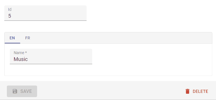
It expects the translatable values to have the following structure:
{
    name: {
        en: 'The english value',
        fr: 'The french value',
        tlh: 'The klingon value',
    },
    description: {
        en: 'The english value',
        fr: 'The french value',
        tlh: 'The klingon value',
    }
}
This is how to use it:
<TranslatableInputs locales={['en', 'fr']}>
    <TextInput source="name" />
    <RichTextInput source="description" />
</TranslatableInputs>
React-admin uses the user locale as the default locale in this field. You can override this setting using the defaultLocale prop.
<TranslatableInputs locales={['en', 'fr']} defaultLocale="fr">
    <TextInput source="name" />
    <RichTextInput source="description" />
</TranslatableInputs>
By default, <TranslatableInputs> will allow users to select the displayed locale using Material-ui tabs with the locale code as their labels.
You may override the tabs labels using translation keys following this format: ra.locales.[locale_code]. For instance, ra.locales.en or ra.locales.fr.
You may override the language selector using the selector prop, which accepts a React element:
const Selector = () => {
    const {
        locales,
        selectLocale,
        selectedLocale,
    } = useTranslatableContext();

    const handleChange = event => {
        selectLocale(event.target.value);
    };

    return (
        <select
            aria-label="Select the locale"
            onChange={handleChange}
            value={selectedLocale}
        >
            {locales.map(locale => (
                <option
                    key={locale}
                    value={locale}
                    // This allows to correctly link the containers for each locale to their labels
                    id={`translatable-header-${locale}`}
                >
                    {locale}
                </option>
            ))}
        </select>
    );
};

<TranslatableInputs
    record={record}
    resource="products"
    basePath="/products"
    locales={['en', 'fr']}
    selector={<Selector />}
>
    <TextInput source="name" />
    <RichTextInput source="description" />
</TranslatableInputs>
If you have multiple TranslatableInputs on the same page, you should specify a groupKey so that react-admin can create unique identifiers for accessibility.
<TranslatableInputs locales={['en', 'fr']} groupKey="essential-fields">
    <TextInput source="name" />
    <RichTextInput source="description" />
</TranslatableInputs>
You can add validators to any of the inputs inside a TranslatableInputs. If an input has some validation error, the label of its parent tab will be highlighted as invalid:
<TranslatableInputs locales={['en', 'fr']}>
    <TextInput source="name" validate={[required()]} />
    <RichTextInput source="description" validate={[maxLength(100)]} />
</TranslatableInputs>
Recipes
Transforming Input Value to/from Record
The data format returned by the input component may not be what your API desires. Since React-admin uses react-final-form, we can use its parse and format functions to transform the input value when saving to and loading from the record.
Mnemonic for the two functions:
parse(): input -> recordformat(): record -> input
Say the user would like to input values of 0-100 to a percentage field but your API (hence record) expects 0-1.0. You can use simple parse() and format() functions to archive the transform:
<NumberInput source="percent" format={v => v * 100} parse={v => parseFloat(v) / 100} label="Formatted number" />
<DateInput> stores and returns a string. If you would like to store a JavaScript Date object in your record instead:
const dateFormatRegex = /^\d{4}-\d{2}-\d{2}$/;
const dateParseRegex = /(\d{4})-(\d{2})-(\d{2})/;

const convertDateToString = value => {
    // value is a `Date` object
    if (!(value instanceof Date) || isNaN(value.getDate())) return '';
    const pad = '00';
    const yyyy = value.getFullYear().toString();
    const MM = (value.getMonth() + 1).toString();
    const dd = value.getDate().toString();
    return `${yyyy}-${(pad + MM).slice(-2)}-${(pad + dd).slice(-2)}`;
};

const dateFormatter = value => {
    // null, undefined and empty string values should not go through dateFormatter
    // otherwise, it returns undefined and will make the input an uncontrolled one.
    if (value == null || value === '') return '';
    if (value instanceof Date) return convertDateToString(value);
    // Valid dates should not be converted
    if (dateFormatRegex.test(value)) return value;

    return convertDateToString(new Date(value));
};

const dateParser = value => {
    //value is a string of "YYYY-MM-DD" format
    const match = dateParseRegex.exec(value);
    if (match === null) return;
    const d = new Date(match[1], parseInt(match[2], 10) - 1, match[3]);
    if (isNaN(d.getDate())) return;
    return d;
};

<DateInput source="isodate" format={dateFormatter} parse={dateParser} initialValue={new Date()} />
Linking Two Inputs
Edition forms often contain linked inputs, e.g. country and city (the choices of the latter depending on the value of the former).
React-admin relies on react-final-form for form handling. You can grab the current form values using react-final-form useFormState hook.
import * as React from 'react';
import { Edit, SimpleForm, SelectInput } from 'react-admin';
import { useFormState } from 'react-final-form';

const countries = ['USA', 'UK', 'France'];
const cities = {
    USA: ['New York', 'Los Angeles', 'Chicago', 'Houston', 'Phoenix'],
    UK: ['London', 'Birmingham', 'Glasgow', 'Liverpool', 'Bristol'],
    France: ['Paris', 'Marseille', 'Lyon', 'Toulouse', 'Nice'],
};
const toChoices = items => items.map(item => ({ id: item, name: item }));

const CityInput = props => {
    const { values } = useFormState();
    return (
        <SelectInput
            choices={values.country ? toChoices(cities[values.country]) : []}
            {...props}
        />
    );
};

const OrderEdit = props => (
    <Edit {...props}>
        <SimpleForm>
            <SelectInput source="country" choices={toChoices(countries)} />
            <CityInput source="cities" />
        </SimpleForm>
    </Edit>
);

export default OrderEdit;
Alternatively, you can use the react-admin <FormDataConsumer> component, which grabs the form values, and passes them to a child function. As <FormDataConsumer> uses the render props pattern, you can avoid creating an intermediate component like the <CityInput> component above:
import * as React from 'react';
import { Edit, SimpleForm, SelectInput, FormDataConsumer } from 'react-admin';

const OrderEdit = props => (
    <Edit {...props}>
        <SimpleForm>
            <SelectInput source="country" choices={toChoices(countries)} />
            <FormDataConsumer>
                {({ formData, ...rest }) => (
                    <SelectInput
                        source="cities"
                        choices={
                            formData.country
                                ? toChoices(cities[formData.country])
                                : []
                        }
                        {...rest}
                    />
                )}
            </FormDataConsumer>
        </SimpleForm>
    </Edit>
);
Tip: When using a FormDataConsumer inside an ArrayInput, the FormDataConsumer will provide three additional properties to its children function:
scopedFormData: an object containing the current values of the currently rendered item from theArrayInputgetSource: a function which will translate the source into a valid one for theArrayInput
And here is an example usage for getSource inside <ArrayInput>:
import { FormDataConsumer } from 'react-admin';

const PostEdit = (props) => (
    <Edit {...props}>
        <SimpleForm>
            <ArrayInput source="authors">
                <SimpleFormIterator>
                    <TextInput source="name" />
                    <FormDataConsumer>
                        {({
                            formData, // The whole form data
                            scopedFormData, // The data for this item of the ArrayInput
                            getSource, // A function to get the valid source inside an ArrayInput
                            ...rest
                        }) =>
                            scopedFormData && scopedFormData.name ? (
                                <SelectInput
                                    source={getSource('role')} // Will translate to "authors[0].role"
                                    choices={[{id:1, name:'Head Writer'}, {id:2, name:'Co-Writer'}]
                                    {...rest}
                                />
                            ) : null
                        }
                    </FormDataConsumer>
                </SimpleFormIterator>
            </ArrayInput>
        </SimpleForm>
    </Edit>
);
Hiding Inputs Based On Other Inputs
You may want to display or hide inputs base on the value of another input - for instance, show an email input only if the hasEmail boolean input has been ticked to true.
For such cases, you can use the approach described above, using the <FormDataConsumer> component.
import { FormDataConsumer } from 'react-admin';

 const PostEdit = (props) => (
     <Edit {...props}>
         <SimpleForm>
             <BooleanInput source="hasEmail" />
             <FormDataConsumer>
                 {({ formData, ...rest }) => formData.hasEmail &&
                      <TextInput source="email" {...rest} />
                 }
             </FormDataConsumer>
         </SimpleForm>
     </Edit>
 );
Tip: When using a FormDataConsumer you can define subscription prop to pass to the react-final-form
import { FormDataConsumer } from 'react-admin';

 const PostEdit = (props) => (
     <Edit {...props}>
         <SimpleForm>
             <BooleanInput source="hasEmail" />
             <FormDataConsumer subscription={{ values: true }}>
                 {({ formData, ...rest }) => formData.hasEmail &&
                      <TextInput source="email" {...rest} />
                 }
             </FormDataConsumer>
         </SimpleForm>
     </Edit>
 );
Writing Your Own Input Component
If you need a more specific input type, you can write it directly in React. You’ll have to rely on react-final-form’s Field component, or its useField hook, to handle the value update cycle.
Using <Field>
For instance, let’s write a component to edit the latitude and longitude of the current record:
// in LatLongInput.js
import { Field } from 'react-final-form';
const LatLngInput = () => (
<span>
<Field name="lat" component="input" type="number" placeholder="latitude" />
<Field name="lng" component="input" type="number" placeholder="longitude" />
</span>
);
export default LatLngInput;
// in ItemEdit.js
const ItemEdit = (props) => (
<Edit {...props}>
<SimpleForm>
<LatLngInput />
</SimpleForm>
</Edit>
);
LatLngInput takes no props, because the <Field> component can access the current record via the form context. The name prop serves as a selector for the record property to edit. All the props passed to Field except name and component are passed to the child component (an <input> in that example). Executing this component will render roughly the following code:
<span>
    <input type="number" placeholder="latitude" value={record.lat} />
    <input type="number" placeholder="longitude" value={record.lng} />
</span>
Tip: React-final-form’s <Field> component supports dot notation in the name prop, to allow binding to nested values:
const LatLongInput = () => (
<span>
<Field name="position.lat" component="input" type="number" placeholder="latitude" />
<Field name="position.lng" component="input" type="number" placeholder="longitude" />
</span>
);
Using <Labeled>
This component lacks a label. React-admin provides the <Labeled> component for that:
// in LatLongInput.js
import { Field } from 'react-final-form';
import { Labeled } from 'react-admin';
const LatLngInput = () => (
<Labeled label="position">
<span>
<Field name="lat" component="input" type="number" placeholder="latitude" />
<Field name="lng" component="input" type="number" placeholder="longitude" />
</span>
</Labeled>
);
export default LatLngInput;
Now the component will render with a label:
<label>Position</label>
<span>
    <input type="number" placeholder="longitude" value={record.lat} />
    <input type="number" placeholder="longitude" value={record.lng} />
</span>
Using Material-ui Field Components
Instead of HTML input elements, you can use a material-ui component like TextField. To bind material-ui components to the form values, use the useField() hook:
// in LatLongInput.js
import TextField from '@material-ui/core/TextField';
import { useField } from 'react-final-form';
const BoundedTextField = ({ name, label }) => {
const {
input: { onChange },
meta: { touched, error }
} = useField(name);
return (
<TextField
name={name}
label={label}
onChange={onChange}
error={!!(touched && error)}
helperText={touched && error}
/>
);
};
const LatLngInput = () => (
<span>
<BoundedTextField name="lat" label="latitude" />
<BoundedTextField name="lng" label="longitude" />
</span>
);
Tip: Material-ui’s <TextField> component already includes a label, so you don’t need to use <Labeled> in this case.
useField() returns two values: input and meta. To learn more about these props, please refer to the useField hook documentation in the react-final-form website.
Instead of HTML input elements or material-ui components, you can use react-admin input components, like <NumberInput> for instance. React-admin components already use useField(), and already include a label, so you don’t need either useField() or <Labeled> when using them:
// in LatLongInput.js
import { NumberInput } from 'react-admin';
const LatLngInput = () => (
<span>
<NumberInput source="lat" label="latitude" />
<NumberInput source="lng" label="longitude" />
</span>
);
export default LatLngInput;
The useInput() Hook
React-admin adds functionality to react-final-form:
- handling of custom event emitters like
onChange, - support for an array of validators,
- detection of required fields to add an asterisk to the field label.
So internally, react-admin components use another hook, which wraps react-final-form’s useField() hook. It’s called useInput() ; use it instead of useField() to create form inputs that have the exact same API as react-admin Input components:
// in LatLongInput.js
import TextField from '@material-ui/core/TextField';
import { useInput, required } from 'react-admin';
const BoundedTextField = props => {
const {
input: { name, onChange, ...rest },
meta: { touched, error },
isRequired
} = useInput(props);
return (
<TextField
name={name}
label={props.label}
onChange={onChange}
error={!!(touched && error)}
helperText={touched && error}
required={isRequired}
{...rest}
/>
);
};
const LatLngInput = props => {
const {source, ...rest} = props;
return (
<span>
<BoundedTextField source="lat" label="Latitude" validate={required()} {...rest} />
<BoundedTextField source="lng" label="Longitude" validate={required()} {...rest} />
</span>
);
};
Here is another example, this time using a material-ui Select component:
// in SexInput.js
import Select from '@material-ui/core/Select';
import MenuItem from '@material-ui/core/MenuItem';
import { useInput } from 'react-admin';

const SexInput = props => {
    const {
        input,
        meta: { touched, error }
    } = useInput(props);

    return (
        <Select
            label="Sex"
            {...input}
        >
            <MenuItem value="M">Male</MenuItem>
            <MenuItem value="F">Female</MenuItem>
        </Select>
    );
};
export default SexInput;
Tip: useInput accepts all arguments that you can pass to useField. That means that components using useInput accept props like format and parse, to convert values from the form to the input, and vice-versa:
const parse = value => {/* ... */};
const format = value => {/* ... */};

const PersonEdit = props => (
    <Edit {...props}>
        <SimpleForm>
            <SexInput
                source="sex"
                format={formValue => formValue === 0 ? 'M' : 'F'}
                parse={inputValue => inputValue === 'M' ? 0 : 1}
            />
        </SimpleForm>
    </Edit>
);
Third-Party Components
You can find components for react-admin in third-party repositories.
- marmelab/ra-richtext-tiptap: a rich text input based on Tiptap
- vascofg/react-admin-color-input: a color input using React Color, a collection of color pickers.
- vascofg/react-admin-date-inputs: a collection of Date Inputs, based on material-ui-pickers
- MrHertal/react-admin-json-view: JSON field and input for react-admin.
- @bb-tech/ra-components:
JsonInputwhich allows only valid JSON as input,JsonFieldto view JSON properly on show card andTrimFieldto trim the fields while showing inDatagridinListcomponent. -
@react-page/react-admin: ReactPage is a rich content editor and comes with a ready-to-use React-admin input component. check out the demo
- DEPRECATED V3 LoicMahieu/aor-tinymce-input: a TinyMCE component, useful for editing HTML