<SimpleFormIterator>
This component provides a UI for editing arrays of objects, one row per object.
<SimpleFormIterator> lets users edit, add, remove and reorder sub-records. It is designed to be used as a child of <ArrayInput> or <ReferenceManyInput>. You can also use it within an ArrayInputContext containing a field array, i.e. the value returned by react-hook-form’s useFieldArray hook.
Usage
<SimpleFormIterator> requires no prop by default. It expects an array of inputs as children. It renders these inputs once per row and takes care of setting a different source for each row.
import {
    Edit,
    SimpleForm,
    TextInput,
    DateInput,
    ArrayInput,
    NumberInput,
    SimpleFormIterator
} from 'react-admin';

const OrderEdit = () => (
    <Edit>
        <SimpleForm>
            <TextInput source="customer" />
            <DateInput source="date" />
            <ArrayInput source="items">
                <SimpleFormIterator inline>
                    <TextInput source="name" helperText={false} />
                    <NumberInput source="price" helperText={false} />
                    <NumberInput source="quantity" helperText={false} />
                </SimpleFormIterator>
            </ArrayInput>
        </SimpleForm>
    </Edit>
);
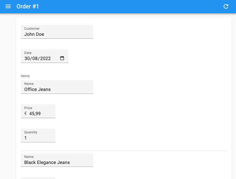
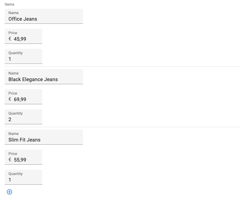
In the example above, the inputs for each row appear inline, with no helper text. This dense layout is adapted to arrays with many items. If you need more room, omit the inline prop to use the default layout, where each input is displayed in a separate row.
const OrderEdit = () => (
    <Edit>
        <SimpleForm>
            <TextInput source="customer" />
            <DateInput source="date" />
            <ArrayInput source="items">
                <SimpleFormIterator>
                    <TextInput source="name" />
                    <NumberInput source="price" />
                    <NumberInput source="quantity" />
                </SimpleFormIterator>
            </ArrayInput>
        </SimpleForm>
    </Edit>
);

Props
| Prop | Required | Type | Default | Description |
|---|---|---|---|---|
addButton |
Optional | ReactElement |
- | Component to render for the add button |
children |
Optional | ReactElement |
- | List of inputs to display for each row |
className |
Optional | string |
- | Applied to the root element (<ul>) |
disableAdd |
Optional | boolean |
false |
When true, the user cannot add new rows |
disableClear |
Optional | boolean |
false |
When true, the user cannot clear the array |
disableRemove |
Optional | boolean |
false |
When true, the user cannot remove rows |
disableReordering |
Optional | boolean |
false |
When true, the user cannot reorder rows |
fullWidth |
Optional | boolean |
false |
Set to true to push the actions to the right |
getItemLabel |
Optional | function |
x => x |
Callback to render the label displayed in each row |
inline |
Optional | boolean |
false |
When true, inputs are put on the same line |
removeButton |
Optional | ReactElement |
- | Component to render for the remove button |
reOrderButtons |
Optional | ReactElement |
- | Component to render for the up / down button |
sx |
Optional | SxProps |
- | Material UI shortcut for defining custom styles |
addButton
This prop lets you pass a custom element to replace the default Add button.
<SimpleFormIterator addButton={<Button>Add</Button>}>
    <TextInput source="name" />
    <NumberInput source="price" />
    <NumberInput source="quantity" />
</SimpleFormIterator>
children
A list of Input elements, that will be rendered on each row.
<SimpleFormIterator>
    <TextInput source="name" />
    <NumberInput source="price" />
    <NumberInput source="quantity" />
</SimpleFormIterator>
By default, <SimpleFormIterator> renders one input per line, but they can be displayed inline with the inline prop.
<SimpleFormIterator> also accepts <FormDataConsumer> as child. When used inside a form iterator, <FormDataConsumer> provides two additional properties to its children function:
scopedFormData: an object containing the current values of the currently rendered item from the ArrayInputgetSource: a function that translates the source into a valid one for the ArrayInput
And here is an example usage for getSource inside <ArrayInput>:
import { FormDataConsumer } from 'react-admin';

const PostEdit = () => (
    <Edit>
        <SimpleForm>
            <ArrayInput source="authors">
                <SimpleFormIterator>
                    <TextInput source="name" />
                    <FormDataConsumer>
                        {({
                            formData, // The whole form data
                            scopedFormData, // The data for this item of the ArrayInput
                            getSource, // A function to get the valid source inside an ArrayInput
                            ...rest
                        }) =>
                            scopedFormData && scopedFormData.name ? (
                                <SelectInput
                                    source={getSource('role')} // Will translate to "authors[0].role"
                                    choices={[{ id: 1, name: 'Head Writer' }, { id: 2, name: 'Co-Writer' }]}
                                    {...rest}
                                />
                            ) : null
                        }
                    </FormDataConsumer>
                </SimpleFormIterator>
            </ArrayInput>
        </SimpleForm>
    </Edit>
);
Tip: TypeScript users will notice that scopedFormData and getSource are typed as optional parameters. This is because the <FormDataConsumer> component can be used outside of a <SimpleFormIterator> and in that case, these parameters will be undefined. If you are inside a <SimpleFormIterator>, you can safely assume that these parameters will be defined.
Note: <SimpleFormIterator> only accepts Input components as children. If you want to use some Fields instead, you have to use a <FormDataConsumer>, as follows:
import { ArrayInput, SimpleFormIterator, DateInput, TextField, FormDataConsumer, Labeled } from 'react-admin';

<ArrayInput source="backlinks">
    <SimpleFormIterator disableRemove>
        <DateInput source="date" />
        <FormDataConsumer>
            {({ scopedFormData }) => (
                <Labeled label="Url">
                    <TextField source="url" record={scopedFormData} />
                </Labeled>
            )}
        </FormDataConsumer>
    </SimpleFormIterator>
</ArrayInput>
Caution: <SimpleFormIterator> clones its children several times, as it needs to override their actual source for each record. If you use a custom Input element, make sure they accept a custom source prop.
className
CSS classes passed to the root component.
<SimpleFormIterator className="dummy">
    <TextInput source="name" />
    <NumberInput source="price" />
    <NumberInput source="quantity" />
</SimpleFormIterator>
Note: To customize field styles, prefer the sx prop.
disableAdd
When true, the Add button isn’t rendered, so users cannot add new rows.
<SimpleFormIterator disableAdd>
    <TextInput source="name" />
    <NumberInput source="price" />
    <NumberInput source="quantity" />
</SimpleFormIterator>
disableClear
When true, the array clear button isn’t rendered, so the user cannot clear the array.
<SimpleFormIterator disableClear>
    <TextInput source="name" />
    <NumberInput source="price" />
    <NumberInput source="quantity" />
</SimpleFormIterator>
disableRemove
When true, the Remove buttons aren’t rendered, so users cannot remove existing rows.
<SimpleFormIterator disableRemove>
    <TextInput source="name" />
    <NumberInput source="price" />
    <NumberInput source="quantity" />
</SimpleFormIterator>
disableReordering
When true, the up and down buttons aren’t rendered, so the user cannot reorder rows.
<SimpleFormIterator disableReordering>
    <TextInput source="name" />
    <NumberInput source="price" />
    <NumberInput source="quantity" />
</SimpleFormIterator>
fullWidth
When true, the row actions appear at the end of the row.
<SimpleFormIterator fullWidth>
    <TextInput source="name" />
    <NumberInput source="price" />
    <NumberInput source="quantity" />
</SimpleFormIterator>

This differs with the default behavior, where the row actions appear after the inputs.

getItemLabel
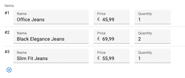
<SimpleFormIterator> can add a label in front of each row, based on the row index. Set the getItemLabel prop with a callback to enable this feature.
<SimpleFormIterator getItemLabel={index => `#${index + 1}`}>
    <TextInput source="name" />
    <NumberInput source="price" />
    <NumberInput source="quantity" />
</SimpleFormIterator>

inline
When true, inputs are put on the same line. Use this option to make the lines more compact, especially when the children are narrow inputs.
<SimpleFormIterator inline>
    <TextInput source="name" />
    <NumberInput source="price" />
    <NumberInput source="quantity" />
</SimpleFormIterator>

Without this prop, <SimpleFormIterator> will render one input per line.
<SimpleFormIterator>
    <TextInput source="name" />
    <NumberInput source="price" />
    <NumberInput source="quantity" />
</SimpleFormIterator>

removeButton
This prop lets you pass a custom element to replace the default Remove button.
<SimpleFormIterator removeButton={<Button>Remove</Button>}>
    <TextInput source="name" />
    <NumberInput source="price" />
    <NumberInput source="quantity" />
</SimpleFormIterator>
reOrderButtons
This prop lets you pass a custom element to replace the default Up and Down buttons. This custom element must use the useSimpleFormIteratorItem hook to access the current row index and reorder callback.
const ReOrderButtons = () => {
    const { index, total, reOrder } = useSimpleFormIteratorItem();

    return (
        <>
            <IconButton
                size="small"
                onClick={() => reOrder(index - 1)}
                disabled={index <= 0}
            >
                <ArrowUpwardIcon />
            </IconButton>
            <IconButton
                size="small"
                onClick={() => reOrder(index + 1)}
                disabled={total == null || index >= total - 1}
            >
                <ArrowDownwardIcon />
            </IconButton>
        </>
    );
};

const OrderEdit = () => (
    <Edit>
        <SimpleForm>
            <TextInput source="customer" />
            <DateInput source="date" />
            <ArrayInput source="items">
                <SimpleFormIterator reOrderButtons={<ReOrderButtons />}>
                    <TextInput source="name" />
                    <NumberInput source="price" />
                    <NumberInput source="quantity" />
                </SimpleFormIterator>
            </ArrayInput>
        </SimpleForm>
    </Edit>
);
sx
You can override the style of the root element (a <div> element) as well as those of the inner components thanks to the sx property. It relies on MUI System and supports CSS and shorthand properties (see their documentation about it).
This property accepts the following subclasses:
| Rule name | Description |
|---|---|
RaSimpleFormIterator-action |
Applied to the action zone on each row (the one containing the Remove button) |
RaSimpleFormIterator-add |
Applied to the bottom line containing the Add button |
RaSimpleFormIterator-form |
Applied to the subform on each row |
RaSimpleFormIterator-index |
Applied to the row label when getItemLabel is set |
RaSimpleFormIterator-inline |
Applied to rows when inline is true |
RaSimpleFormIterator-line |
Applied to each row |
RaSimpleFormIterator-list |
Applied to the <ul> element |

