React Admin March 2024 Update


The development of react-admin, our open-source frontend framework for building B2B applications on top of REST/GraphQL APIs, continues to thrive. Since our October update article, we released two new minor versions (4.15 and 4.16), updates for provider packages, and two new packages for the Enterprise Edition. Here is a summary of what’s new in React Admin for the last 4 months:
- New YouTube Channel
- New Demo: Writer’s Delight
- New or Enhanced Components
<DatagridAG>: A Datagrid Based on AG Grid- History: Track Changes With Revisions And Diffs
<DateInput>: Material UI date picker And Custom Locale<EditableDatagrid>: Now Featuring Configurable Columns<SearchWithResult>: Adding Search To Your AdminreadOnlysupport for Inputs<SingleFieldList>Enhanced
- Provider Updates
- UI
New YouTube Channel
We’ve recently launched a YouTube channel to share video content about react-admin. Our focus is on short videos (a few minutes each) that dive into specific topics. Give us a visit; you might discover something new in the time it takes to watch a couple of cat videos!

We’ve already produced several tutorials (primarily aimed at beginners), and we plan to regularly publish new content: advanced tutorials, feature overviews, best practices, and more. We’ve also begun integrating these videos into our documentation, such as on the <Admin> component page.
Make sure you subscribe to the channel to be notified when we publish new content!
New Demo: Writer’s Delight
To demonstrate the versatility of react-admin beyond the conventional CRUD interfaces featuring tables and forms, we’ve introduced a new demo named Writer’s Delight. This unique note-taking application showcases the power of AI-driven input components first introduced in our last update, offering inline suggestions as you type, enhancing productivity and creativity.

- Demo: https://marmelab.com/writers-delight/
- Source code: https://github.com/marmelab/writers-delight/
This demo shows how to implement the following features:
- Predictive Text Input
- AutoSave
- Infinite List
- Edit with List sidebar
- Offline-first data provider
- Custom Layout
- Custom theme
- Splash Screen
- Headless Delete
- useCreate
- useStore
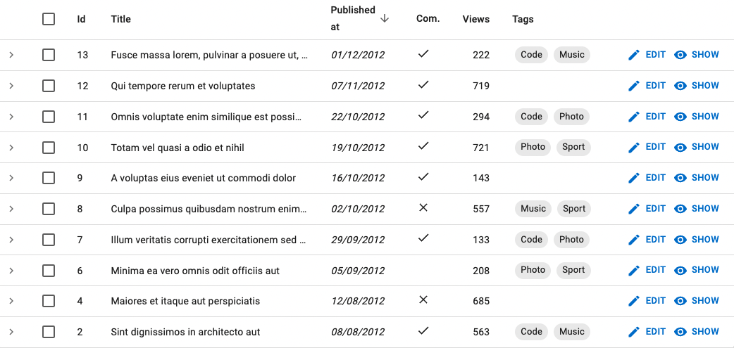
<DatagridAG>: A Datagrid Based on AG Grid
For those times when the <Datagrid> component doesn’t quite meet your users’ needs, we’ve introduced a more robust table component named <DatagridAG>. This component is powered by the widely acclaimed AG Grid library unlocking a host of advanced features, including:
- Multi-column sorting
- Column resizing and reordering
- In-place editing
- Advanced filtering options
- Automatic adjustment of page size
- Automatic adjustment of column width
- Row selection and bulk actions
While the syntax for <DatagridAG> is slightly different from the standard <Datagrid>, it remains intuitive for anyone who has previously worked with AG Grid.
import "ag-grid-community/styles/ag-grid.css";import "ag-grid-community/styles/ag-theme-alpine.css";import React from "react";import { List } from "react-admin";import { DatagridAG } from "@react-admin/ra-datagrid-ag";
export const PostList = () => {  const columnDefs = [    { field: "title" },    { field: "published_at" },    { field: "body" },  ];  return (    <List perPage={10000} pagination={false}>      <DatagridAG columnDefs={columnDefs} />    </List>  );};
<DatagridAG> is compatible with AG Grid Enterprise, which offers even more features:
- Row Grouping
- Aggregation
- Tree Data
- Pivoting
- More advanced filtering
- Master Detail views
- Range Selection
- Excel Export
- And more…
<DatagridAG> is an Enterprise component. You can learn more about it in the <DatagridAG> documentation.
History: Track Changes With Revisions And Diffs
If you need to track the changes made in your admin, these new backend-agnostic components will prove super useful. They empower users to access the revision history, compare the differences between any two versions, and, if needed, revert to a prior state.
For instance, you can switch to using <TabbedFormWithRevision> in place of <TabbedForm>. This component generates a new revision each time the form is submitted. It applies changes from a chosen revision when a user decides to revert to a past version. Additionally, it introduces an extra tab showcasing a list of all revisions. Lastly, clicking on the Delete button now removes all revisions linked to the current record.
import { Edit, TextInput } from "react-admin";import { TabbedFormWithRevision } from "@react-admin/ra-history";
export const PostEdit = () => (  <Edit>    <TabbedFormWithRevision>      <TabbedFormWithRevision.Tab label="Main">        <TextInput source="title" />        <TextInput source="teaser" />        <TextInput multiline source="body" />      </TabbedFormWithRevision.Tab>    </TabbedFormWithRevision>  </Edit>);
The history components are compact and modular, so you can design your own history UI with ease. They are part of a new package available in the Enterprise Edition. For more information, refer to the ra-history documentation.
<DateInput>: Material UI date picker And Custom Locale
While browsers offer native date and time inputs, these do not allow for the customization of the locale or the interface of the date and time pickers themselves. Material UI addresses this limitation with its advanced and customizable pickers found in the MUI X package, which are now integrated with react-admin.
The ra-form-layout package introduces alternative <DateInput>, <DateTimeInput>, and <TimeInput> components based on Material UI pickers.
You can use them as you would any other react-admin input, for instance as children of a <SimpleForm> component:
import {  DateInput,  DateTimeInput,  TimeInput,} from "@react-admin/ra-form-layout";import { Edit, SimpleForm } from "react-admin";
export const EventEdit = () => (  <Edit>    <SimpleForm>      <DateInput source="event_date" />      <TimeInput source="event_start_time" />      <DateTimeInput source="published_at" />    </SimpleForm>  </Edit>);
Check the the <DateInput> component documentation for more details.
<EditableDatagrid>: Now With Configurable Columns
If you’re familiar with <DatagridConfigurable>, a variant of <Datagrid> that enables users to select and reorder columns, you’ll be pleased to know about the latest update in ra-editable-datagrid version 4.4.0. It introduced a similar feature for the <EditableDatagrid> component.
This component gives more control to users, who can tweak the layout of the table and persist these changes between sessions. The layout of the row editing form follows the modified table layout, ensuring a consistent user experience.
To use it, replace the <EditableDatagrid> with <EditableDatagridConfigurable> and the <RowForm> with <RowFormConfigurable>:
import { List, TextField } from 'react-admin';import {   EditableDatagrid,   EditableDatagridConfigurable,   RowForm,   RowFormConfigurable,} from '@react-admin/ra-editable-datagrid';
const ArtistForm = ({ meta }) => (    <RowForm>    <RowFormConfigurable>        <TextField source="id" />        <TextInput source="firstname" validate={required()} />        <TextInput source="name" validate={required()} />        <DateInput source="dob" label="Born" validate={required()} />        <SelectInput            source="prof"            label="Profession"            choices={professionChoices}        />   </RowForm>    </RowFormConfigurable>);
const ArtistList = () => (    <List hasCreate empty={false}>        <EditableDatagrid        <EditableDatagridConfigurable            mutationMode="undoable"            createForm={<ArtistForm />}            editForm={<ArtistForm />}        >            <TextField source="id" />            <TextField source="firstname" />            <TextField source="name" />            <DateField source="dob" label="born" />            <SelectField                source="prof"                label="Profession"                choices={professionChoices}            />        </EditableDatagrid>        </EditableDatagridConfigurable>    </List>);
Get more details by reading the <EditableDatagrid> documentation.
<SearchWithResult>: Adding Search To Your Admin
We designed the search feature in ra-search for use in a top bar. But, we got lots of feedback asking for a search component that fits into custom pages or panels. The new <SearchWithResult> component is our response.
It has a search box and shows results right below. You can use it in <SolarLayout>:
There’s a special page for this new component.
readOnly Support for Inputs
Ever wondered about the difference between disabled and readOnly? According to MDN, neither disabled nor readOnly inputs can be edited. But, forms don’t submit disabled input values, while they do submit readOnly input values.
React-hook-form, which react-admin uses for forms, recently updated to stop submitting disabled input values. This matches HTML standards but might mess with forms that expected those values to submit, especially when using warnWhenUnsavedChanges.
React-admin 4.16.12 introduces the readOnly prop to fix this. It works like disabled used to but follows the rules. You can use it on any input:
const PostEdit = () => ( <Edit> <SimpleForm warnWhenUnsavedChanges> <TextEdit source="id" disabled /> <TextEdit source="id" readOnly /> </SimpleForm> </Edit>);For more information, see the readOnly prop section in the Inputs chapter of the documentation.
<SingleFieldList> Enhanced
<SingleFieldList> is a popular choice for showing arrays of referenced records, like tags, using chips. With react-admin 4.16, this component has received some upgrades.
Now, <SingleFieldList> uses the record representation for the referenced resource. This means you no longer need to add a child component to it.
const PostList = () => ( <List> <Datagrid> <TextField source="id" /> <TextField source="title" /> <DateField source="published_at" /> <BooleanField source="commentable" /> <NumberField source="views" /> <ReferenceArrayField label="Tags" reference="tags" source="tags"> <SingleFieldList> <ChipField source="title" /> </SingleFieldList> <SingleFieldList /> </ReferenceArrayField> </Datagrid> </List>)Besides, we added support for the empty prop, allowing you to customize what’s displayed when the record has no value:
<SingleFieldList empty={<p>Nothing to display</p>} />Finally, <SingleFieldList> now displays its children in a <Stack> and supports all its props, achieving a better design by default:
I18next Support
React-admin’s support for multiple languages through its localization features is designed to be backend-independent. While the initial i18nProvider was built on Polyglot, we’re excited to introduce an alternative based on i18next with the release of ra-i18n-i18next.
Opting for ra-i18n-i18next might be your best choice if you:
- Already use i18next services, like locize.
- Seek more control over translation organization using multiple files and namespaces.
- Desire more flexibility in loading translations.
- Wish to access features not present in Polyglot, such as:
Setting this i18n provider up is as simple as the Polyglot one. You can even reuse existing translation packages.
import { Admin } from "react-admin";import {  useI18nextProvider,  convertRaMessagesToI18next,} from "ra-i18n-i18next";import englishMessages from "ra-language-english";
const App = () => {  const i18nProvider = useI18nextProvider({    options: {      resources: {        translations: convertRaMessagesToI18next(englishMessages),      },    },  });  if (!i18nProvider) return <div>Loading...</div>;
  return <Admin i18nProvider={i18nProvider}>...</Admin>;};
Refer to the ra-i18n-i18next documentation for more details.
Supabase: Improved Filters and Permissions
The ra-supabase package facilitates integration with the Supabase backend through custom data and authentication providers. It is actively maintained by the React-Admin core team.
We’ve upgraded ra-supabase to enhance its filtering capabilities, enabling support for multiple filters on the same field. For instance, you can now implement a “between” filter using standard Supabase filter operators like @gte (greater than or equal) and @lte (less than or equal).
Additionally, the supabaseAuthProvider has been updated to include an optional getPermissions method. This feature enables the fetching of user permissions. Here’s an example that fetches permissions from a userPermissions table:
// in authProvider.jsimport { supabaseAuthProvider } from "ra-supabase-core";import { supabase } from "./supabase";export const authProvider = supabaseAuthProvider(supabase, { getPermissions: async (user) => { const { data, error } = await supabase .from("userPermissions") .select("id, can_edit") .match({ email: user.email }) .single(); if (!data || error) { throw new Error(); } return { id: data.id, canEdit: data.can_edit, }; },});You can then use the usePermissions hook to retrieve them later.
Check the ra-supabase documentation for more details.
Cognito: TOTP MFA Support
Version 1.1 of ra-auth-cognito, supported by the React-Admin core team, now includes support for a more secure multi-factor authentication (MFA) method known as Time-based One-Time Password (TOTP). This method is a safer alternative to SMS MFA, which can be compromised through SIM swap attacks.
Set up TOTP MFA in Cognito, and ra-auth-cognito will recognize it automatically. Now, when users sign in, they’ll be asked to link an authenticator app for the admin area. After linking, they’ll need to enter a code from the app each time they log in.
Check the ra-auth-cognito documentation for more details.
GraphQL: Simplified Custom Methods
Adding custom methods to your data provider for specific API endpoint calls, like a dataProvider.sendEmail() mutation to send an email, is a standard practice. However, implementing this with the ra-data-graphql-simple package was unexpectedly challenging due to an implementation detail involving the use of a Proxy to manage the dataProvider.
Starting with react-admin 4.16.2, you can extend the generated GraphQL dataProvider with your own methods:
// in App.jsimport * as React from 'react';import { useState, useEffect } from 'react';import buildGraphQLProvider from 'ra-data-graphql';import { Admin, Resource } from 'react-admin';
import buildQuery from './buildQuery';import { PostCreate, PostEdit, PostList } from '../components/admin/posts';
const App = () => {    const [dataProvider, setDataProvider] = useState(null);
    useEffect(() => {        buildGraphQLProvider({ buildQuery })            .then(dataProvider => setDataProvider({              ...dataProvider,              sendEmail: (email, subject, body) => /* your custom logic here */            }));    }, []);
    if (!dataProvider) {        return <div>Loading</div>;    }
    return (        <Admin dataProvider={dataProvider}>            <Resource name="Post" list={PostList} edit={PostEdit} create={PostCreate} />        </Admin>    );}
export default App;
Check the ra-data-graphql-simple documentation for more details.
New Themes
Although react-admin apps have a distinct “Google Material” look by default, you can use theming to fully customize your app’s appearance. However, starting a new theme can seem daunting. To help developers, React Admin v4.15 introduces three new themes: Nano, Radiant, and House. Each of these themes supports light and dark modes.
Whether you aim for a layout with higher information density or prefer a simpler, more subdued aesthetic, these new themes offer great starting points.
We reworked the theming documentation to mention these new themes. We also added more details about how to customize your application UI.
Daisy UI and shadcn/ui integrations
React-admin has always relied on a headless core library called ra-core. This means that it’s possible to integrate react-admin with another UI Library.
We’ve provided an example integration for two popular UI libraries:
- Daisy UI, a component library for Tailwind CSS: marmelab/ra-tailwind-demo
- shadcn/ui, a collection of reusable components: marmelab/ra-shadcn-demo
If you want to learn how to integrate react-admin with another UI library, check out Gildas’ great tutorial: Using React-Admin With Your Favorite UI Library.
Broader Sx Support In Enterprise Edition Components
Based on customer feedback, we’ve extended the ability to customize the style of the Enterprise Edition components.
For instance, you can now tweak the style of the <SolarMenu>, <StackedFilters>, <Breadcrumb>, and <AccordionForm> components, as they now all support the sx prop.
You can also override default labels with a custom element. As an example, <AccordionForm.Panel> now accepts a React element as the label and secondary props:
The Enterprise Edition packages now offer the same level of customization as the core react-admin components. Check the ra-enterprise documentation for more details.
Miscellaneous
There are too many changes to describe them all in detail, but here are a few more notable ones:
- Add
<Form disableInvalidFormNotification>to allow disabling notifications when the form is invalid - Add
<LocalesMenuButton icon>prop - Add
<LoadingIndicator onClick>prop (to eventually control react-query cache) - Add
<ReferenceArrayField queryOptions>to specify options for the reference array field query - Add
<DeleteButton confirmColor>and<BulkDeleteButton confirmColor> - Add
<CheckForApplicationUpdate fetchOptions>prop - Add ability to pass url state in
<CreateButton> - Make
<EditableDataiird>work anywhere there is a<ListContext> - Add
<AccordionFormPanel count>and<AccordionSection count> - Add i18n support for
<JsonSchemaForm> - Update
<Breadcrumb>to use a 🏠️ icon instead of the ‘Dashboard’ text for the breadcrumb home item - Add support for permissions with an array of resources in RBAC package, e.g.
[{ action: 'read', resource: ['products', 'categories'] }]
We’ve skipped the documentation updates in this article, but we’ve been working hard to improve the documentation, too. We’ve added more illustrations and examples pretty much everywhere, and we’ve started to integrate video content.
And finally, we’ve published a series of articles about the economics of react-admin. The Enterprise Edition customers provide a constant revenue stream that allows us to maintain and improve the open-source version. As a consequence, react-admin is sustainable, and you can rely on it for the long term.
Conclusion
The release of new features has slowed down recently as we’re focusing on the next major release, react-admin v5. It won’t be a revolution, and the upgrade path will be smooth. But we’re taking the opportunity to clean up the codebase and make the library more flexible and easier to use. Check the 5.0 Roadmap for a list of upcoming changes, and look out for the first beta release in the coming weeks.

Authors
Full-stack web developer at marmelab, Gildas has a strong appetite for emerging technologies. If you want an informed opinion on a new library, ask him, he's probably used it on a real project already.
Marmelab founder and CEO, passionate about web technologies, agile, sustainability, leadership, and open-source. Lead developer of react-admin, founder of GreenFrame.io, and regular speaker at tech conferences.