React Admin October 2023 Update

What? Another super-long article about react-admin updates? But when am I supposed to read this?
We’ve heard that feedback: It’s sometimes hard to keep up with the pace of updates on react-admin, our open-source frontend framework for building B2B applications on top of REST/GraphQL APIs. The problem is that react-admin becomes better every day, and we only publish a blog post about updates every three months. So, when we do, we have a lot to say (just like the last time).
Let’s see the highlights of the past three months of work on react-admin (4.12, 4.13, and 4.14, and Enterprise Edition updates). It’s long, but it’s worth it.
-
New Components
<PrevNextButtons>: Let users navigate between record<CheckForApplicationUpdate>: Notify users chan they should refresh the app codeuseUnique: A new validator for unique values<PredictiveTextInput>and<SmartRichTextInput>: AI-powered authoring inputs<RecordRepresentation>: The simplest way to render a record<UpdateButton>: A faster way to add simple update actions<BulkUpdateFormButton>: An efficient UI to edit multiple records
-
UI
-
Auth Providers
-
Performance
-
Developer Experience
-
Documentation
Ready? Let’s dive in.
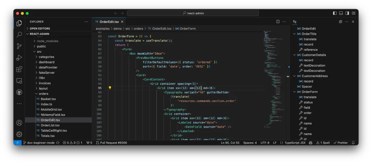
Navigating Through Records With <PrevNextButtons>
Stop wasting time going back to the main list. <PrevNextButtons>, part of React Admin v4.14, lets users navigate between records like invoices or customers swiftly. This component renders navigation buttons linking to the next or previous record within a resource.
<PrevNextButtons> is quite smart. Once users check out the list view for a resource, it won’t bug the API again for previous and next links—it uses the react-query cache. Plus, if it needs to hit your API, it keeps things consistent by reusing the list’s sorting and filters.
Add it to the actions toolbar of an Edition view, and let your users fly through records.
// in src/CustomerEdit.tsximport {  Edit,  PrevNextButtons,  ShowButton,  SimpleForm,  TextInput,  TopToolbar,} from "react-admin";
export const CustomerEdit = () => (  <Edit    actions={      <TopToolbar>        <PrevNextButtons />        <ShowButton />      </TopToolbar>    }  >    <SimpleForm>      <TextInput source="first_name" />      <TextInput source="last_name" />      <TextInput source="email" />      <TextInput source="city" />    </SimpleForm>  </Edit>);
Check out the <PrevNextButtons> documentation for more details.
Automatic Application Update With <CheckForApplicationUpdate>
While hosting a static bundle of a Single-Page App is cost-effective and easily deployable, it comes with a challenge. Users who don’t refresh their application may never see the updates. This becomes even more problematic if there are simultaneous changes in the API, causing potential mismatches and errors.
React Admin v4.13 introduces the <CheckForApplicationUpdate> component to solve that problem. It prompts users to reload the page when an update is available.

To detect updates, <CheckForApplicationUpdate> fetches the current site URL (the index.html) at regular intervals and compares the hash of the response content. It then compares the hash of the returned content. As bundlers typically modify the links to JS and CSS bundles following a code change, this method effectively recognizes an update.
To add this feature to your application, include <CheckForApplicationUpdate> in a custom layout and you’re good to go:
// in src/MyLayout.tsximport { CheckForApplicationUpdate, Layout, LayoutProps } from "react-admin";
export const MyLayout = ({ children, ...props }: LayoutProps) => (  <Layout {...props}>    {children}    <CheckForApplicationUpdate />  </Layout>);
// in src/App.tsximport { Admin, ListGuesser, Resource } from "react-admin";import { MyLayout } from "./MyLayout";
export const App = () => (  <Admin layout={MyLayout}>    <Resource name="posts" list={ListGuesser} />  </Admin>);
Check out the <CheckForApplicationUpdate> documentation for more details.
Validating The Uniqueness Of a Field With useUnique
Validating that a value is unique (e.g. a username) is a very common requirement. Before React Admin v4.12, you had two options to implement this control in a Create or Edit view, both challenging:
- Leverage server side validation on submit (but that requires pessimistic update)
- Build a custom asynchronous validator
React Admin now provides the useUnique hook to make this easier. It accounts for eventual filters (e.g. unique username within an organization), excludes the current record in edit views, and takes care of not calling your API too many times to avoid lags in the UI or rate limitings errors, etc.
This validator is a good candidate for the validate prop of any Input component:
import { SimpleForm, TextInput, useUnique } from "react-admin";
const UserCreateForm = () => {  const unique = useUnique();  return (    <SimpleForm>      <TextInput source="username" validate={unique()} />    </SimpleForm>  );};
Check the useUnique documentation for more details.
AI Powered Authoring With <PredictiveTextInput> And <SmartRichTextInput>
Thanks to new AI changes, many tasks that needed hands-on work can now be done automatically. We looked into how to use these changes to improve the user experience and productivity of admin and B2B apps. The result is a set of new Form inputs that use Large Language Models to help users write better and more quickly.
The first one is <PredictiveTextInput>. It’s a drop-in replacement for the default <TextInput> component that brings autocompletion to your forms, based on the current form values.
The second input, <SmartRichTextInput>, extends the <RichTextInput> component with edition brushes to auto-correct, rephrase, summarize or extend the current selection.
Use them like any other react-admin inputs:
import { Edit, SimpleForm, TextInput } from "react-admin";import { PredictiveTextInput, SmartRichTextInput } from "@react-admin/ra-ai";
const PersonEdit = () => (  <Edit>    <SimpleForm>      <TextInput source="firstName" />      <TextInput source="lastName" />      <TextInput source="company" />      <PredictiveTextInput source="email" />      <PredictiveTextInput source="website" />      <PredictiveTextInput source="bio" multiline />    </SimpleForm>  </Edit>);
export const PostEdit = () => (  <Edit>    <SimpleForm>      <TextInput source="title" />      <SmartRichTextInput source="body" />    </SimpleForm>  </Edit>);
These two components are part of ra-ai, which is an Enterprise Edition module. For more details, you can read our article highlighting the ra-ai module, or read the documentation for the inputs:
<RecordRepresentation>, A New Component That Renders a Record Reference
There are several places where react-admin needs to render a string representation for a record:
- In the page title for the
<Edit>and<Show>views - In reference components such as
<ReferenceField>or<ReferenceInput> - In the
<Breadcrumb>for the<Edit>and<Show>views
You can already define the default record representation for each resource using the <Resource recordRepresentation> prop.
<Resource name="users" list={UserList} recordRepresentation={(record) => `${record.first_name} ${record.last_name}`}/>However, if you needed this representation in a custom component, you had to rely on the useGetRecordRepresentation and the useRecordContext hooks. React-admin v4.13.0 makes it easier by introducing the <RecordRepresentation> component:
// in src/posts/PostBreadcrumbs.tsximport * as React from "react";import { Breadcrumbs, Typography } from "@mui/material";import { Link, useGetRecordRepresentation, useRecordContext, useResourceContext } from "react-admin";import { Link, RecordRepresentation } from "react-admin";
export const PostBreadcrumbs = () => {    const record = useRecordContext();    const resource = useResourceContext();    const getRecordRepresentation = useGetRecordRepresentation(resource);    return (        <div role="presentation">            <Breadcrumbs aria-label="breadcrumb">                <Link underline="hover" color="inherit" to="/">                    Home                </Link>                <Link underline="hover" color="inherit" to="/posts">                    Posts                </Link>                <Typography color="text.primary">{getRecordRepresentation(record)}</Typography>                <Typography color="text.primary"><RecordRepresentation /></Typography>            </Breadcrumbs>        </div>    );};
// in src/posts/PostEdit.tsximport { EditBase, EditView, SimpleForm, TextInput } from "react-admin";import { PostBreadcrumbs } from "./PostBreadcrumbs";
const PostEdit = () => (    <EditBase>        <PostBreadcrumbs />        <EditView>            <SimpleForm>                <TextInput source="title" />            </SimpleForm>        </EditView>    </EditBase>);
Speaking of recordRepresentation, the <SimpleList> component now uses it as the default primaryText, making it even faster to use:
const UserList = () => ( <List> <SimpleList primaryText={(record) => `${record.first_name} ${record.last_name}`} /> <SimpleList /> </List>)Find more details in the <RecordRepresentation> documentation.
<UpdateButton>, A Faster Way To Add Simple Update Actions
Many buttons in admin apps trigger an update on the current record. For instance, a “Mark as read” button on a notification, a “Archive” button on a message, etc. You can implement such buttons using the data provider hooks, but it’s a bit verbose and requires understanding the react-query useMutation hook.
React-admin v4.13 introduces the <UpdateButton> component to simplify this process. It renders a button that triggers an update on the current record when clicked. Its API is much simpler than the useMutation hook:
import {    List,    Datagrid,    DateField,    TextField,   Button,   useDataProvider,   useRecordContext,   UpdateButton,} from 'react-admin';import { useMutation } from 'react-query';
const MarkAsReadButton = () => {    const record = useRecordContext();    const dataProvider = useDataProvider();    const { mutate, isLoading } = useMutation(        () => dataProvider.update(           'notifications',           { id: record.id, data: { read: true } }        ),    );    return (       <Button           label="Mark as read"           onClick={() => mutate()}           disabled={isLoading}       />    );};
export const NotificationList = () => (    <List filter={{ read: false }}>        <Datagrid>            <DateField source="date" />            <TextField source="body" />           <MarkAsReadButton />           <UpdateButton label="Mark as read" data={{ read: true }} />        </Datagrid>    </List>);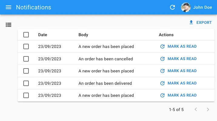
You can get more details in the <UpdateButton> documentation.
Easy Bulk Edition With <BulkUpdateFormButton> And <InputSelectorForm>
Users often have to repeat the same changes on multiple records. For instance, they may want to mark several notifications as read, or update the publication date of several posts. Instead of editing each record one by one, they should be able to select multiple records and edit them all at once.
In ra-form-layout v4.9.0, we introduced the <BulkUpdateFormButton> component that streamlines this process.
This component renders a button that opens a dialog containing any form you want. On submit, the form calls the dataProvider.updateMany() method to update the selected records using the values from the form.
<BulkUpdateFormButton> uses a similar syntax to what you’re used to writing for a standard Edit view:
import {  BooleanField,  BooleanInput,  Datagrid,  DateField,  DateInput,  List,  SimpleForm,  TextField,} from "react-admin";import { BulkUpdateFormButton } from "@react-admin/ra-form-layout";
const PostBulkUpdateButton = () => (  <BulkUpdateFormButton>    <SimpleForm>      <DateInput source="published_at" />      <BooleanInput source="is_public" />    </SimpleForm>  </BulkUpdateFormButton>);
const PostList = () => (  <List>    <Datagrid bulkActionButtons={<PostBulkUpdateButton />}>      <TextField source="id" />      <TextField source="title" />      <DateField source="published_at" />      <BooleanField source="is_public" />    </Datagrid>  </List>);
But there’s more. The <InputSelectorForm> allows your users to choose which fields they want to change.
This UI is especially useful when you have a lot of fields to edit, or non-null default values. <InputSelectorForm> takes an array of inputs as a prop. Each input is an object with a label and an element property.
import {  BooleanInput,  DateInput,  SelectArrayInput,  TextInput,} from "react-admin";import { InputSelectorForm } from "@react-admin/ra-form-layout";
const PostEdit = () => (  <InputSelectorForm    inputs={[      {        label: "Title",        element: <TextInput source="title" />,      },      {        label: "Body",        element: <TextInput source="body" multiline />,      },      {        label: "Published at",        element: <DateInput source="published_at" />,      },      {        label: "Is public",        element: <BooleanInput source="is_public" />,      },      {        label: "Tags",        element: (          <SelectArrayInput            source="tags"            choices={[              { id: "react", name: "React" },              { id: "vue", name: "Vue" },              { id: "solid", name: "Solid" },              { id: "programming", name: "Programming" },            ]}          />        ),      },    ]}  />);
Combine <InputSelectorForm> with the <BulkUpdateFormButton> to give your users superpowers.
import { BooleanInput, DateInput } from "react-admin";import {  BulkUpdateFormButton,  InputSelectorForm,} from "@react-admin/ra-form-layout";
const PostBulkUpdateButton = () => (  <BulkUpdateFormButton>    <InputSelectorForm      inputs={[        {          label: "Published at",          element: <DateInput source="published_at" />,        },        {          label: "Is public",          element: <BooleanInput source="is_public" />,        },      ]}    />  </BulkUpdateFormButton>);
The <BulkUpdateFormButton> and <InputSelectorForm> are Enterprise Edition components, part of the ra-form-layout package. You can learn more about them in the documentation:
<SolarLayout>: A New Layout Optimized For Large Applications
The default <Layout> may be suitable for many situations, but its large sidebar and top bar limit screen space for large and complex applications. Our second layout, <ContainerLayout>, only works for apps with a small number of menu items. For a minimalist navigation experience, we introduce the <SolarLayout> which eliminates the top bar and features a slim menu, maximizing screen usability.
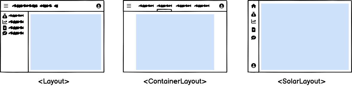
The menu items can reveal a secondary panel to show sub-menus, preference forms, a search engine, etc. It’s ideal for applications with a large number of resources.
On mobile, <SolarLayout> falls back to an AppBar to save horizontal space:
<SolarLayout> is a drop-in replacement for the default <Layout>. You can use it by setting the layout prop of the <Admin> component:
import { Admin, Resource, ListGuesser } from "react-admin";import { SolarLayout } from "@react-admin/ra-navigation";
export const App = () => (  <Admin dataProvider={dataProvider} layout={SolarLayout}>    <Resource name="songs" list={ListGuesser} />    <Resource name="artists" list={ListGuesser} />  </Admin>);
If you need a custom menu, you can leverage <SolarMenu>. It is very similar to what you’re used to with the default <Menu> component:
import { Admin, Resource, ListGuesser } from "react-admin";import {  SolarLayoutProps,  SolarLayout,  SolarMenu,} from "@react-admin/ra-navigation";import { dataProvider } from "./dataProvider";
const CustomMenu = () => (  <SolarMenu>    <SolarMenu.Item      label="Sales"      subMenu={        <SolarMenu.List>          <SolarMenu.ResourceItem name="orders" />          <SolarMenu.ResourceItem name="invoices" />        </SolarMenu.List>      }    />    <SolarMenu.Item      label="Catalog"      subMenu={        <SolarMenu.List>          <SolarMenu.ResourceItem name="products" />          <SolarMenu.ResourceItem name="categories" />        </SolarMenu.List>      }    />    <SolarMenu.Item      label="Customers"      subMenu={        <SolarMenu.List>          <SolarMenu.Item            name="customers.all"            label="All customers"            to={`/customers?filter=${encodeURIComponent(JSON.stringify({ filter: {} }))}`}          />          <SolarMenu.Item            name="customers.new"            label="New customers"            to={`/customers?filter=${encodeURIComponent(              JSON.stringify({                filter: {                  last_seen_gte: endOfYesterday().toISOString(),                },              }),            )}`}          />        </SolarMenu.List>      }    />    <SolarMenu.Item      label="Reviews"      subMenu={        <SolarMenu.List>          <SolarMenu.Item            name="reviews.all"            label="New reviews"            to={`/reviews?filter=${encodeURIComponent(JSON.stringify({ filter: {} }))}`}          />          <SolarMenu.Item            name="reviews.pending"            label="Pending reviews"            to={`/reviews?filter=${encodeURIComponent(JSON.stringify({ filter: { status: "pending" } }))}`}          />          <SolarMenu.Item            name="reviews.bad"            label="Bad reviews"            to={`/reviews?filter=${encodeURIComponent(JSON.stringify({ filter: { rating_lte: 2 } }))}`}          />        </SolarMenu.List>      }    />    <SolarMenu.ResourceItem name="stores" />    <SolarMenu.ResourceItem name="events" />  </SolarMenu>);
<SolarLayout> is an Enterprise Edition component, part of the ra-navigation package. You can learn more about it in the <SolarLayout> documentation.
Improved List Design and UX
On list pages with no filter form, the content used to come after a large top margin:
We removed this margin to make more room for your data:
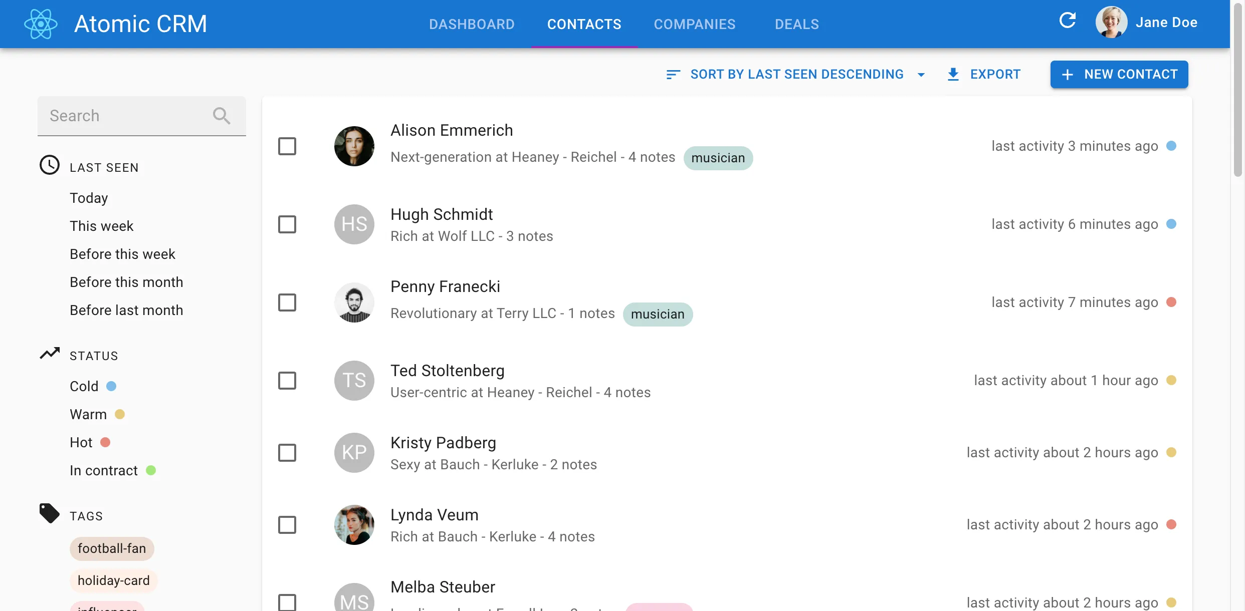
Besides, we’ve changed the UI for the filter form. The “clear” button that allows to remove an input from the form filter is now placed after the input instead of before is:
Moreover, on small devices, users would see a vertical list of filters with the remove buttons first and actions were below the filters, making them hard to spot. We now display the actions first, the filters below them, and the remove buttons at the end of each filter line:
| Before | After |
|---|---|
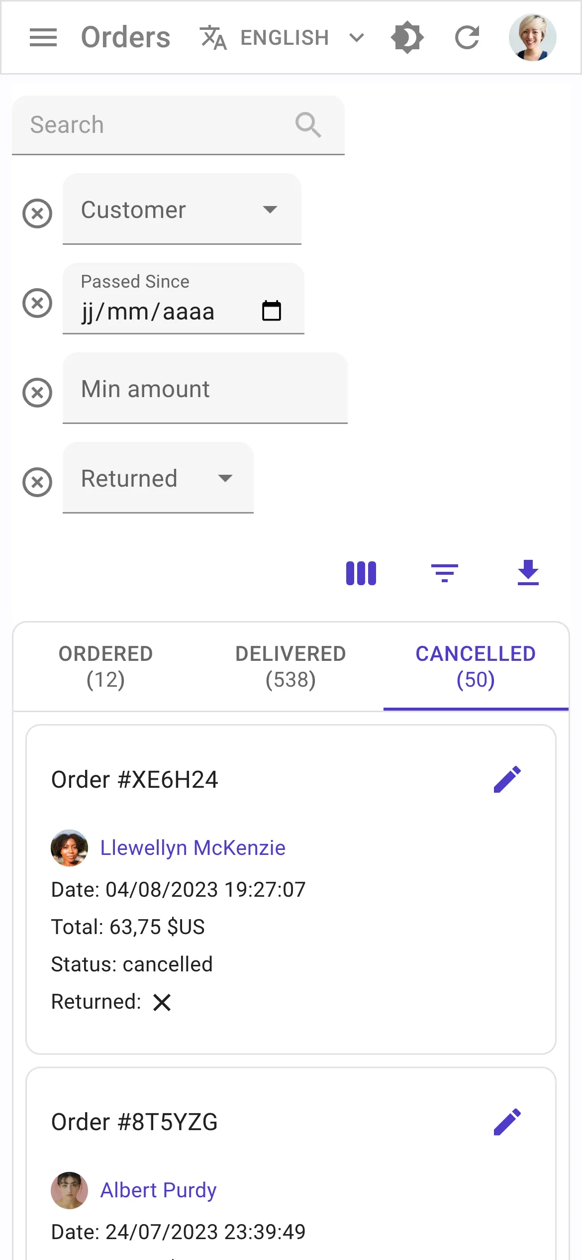 |  |
Finally, we improved the design of inputs on small devices by making them full width:
| Before | After |
|---|---|
 |  |
Overall, both the desktop and mobile UI now feel more intuitive, and the list page is more compact, leaving more room for your data.
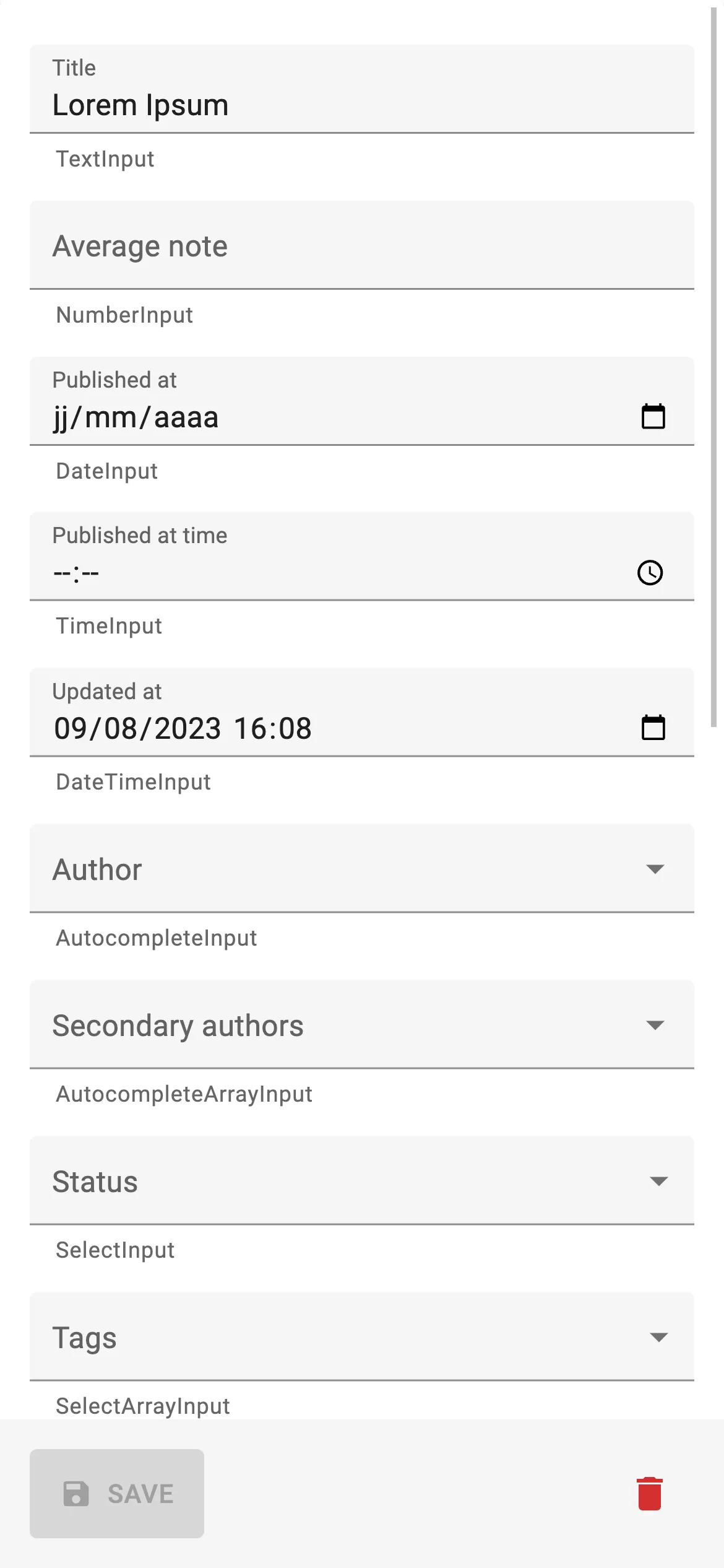
<TranslatableInputs> now allow vertical layout
The <TranslatableInputs> displays one input per row by default. This works well on small devices, but it’s a waste of space on desktop:
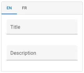
React Admin v4.13.0 lets you opt in to a row layout for <TranslatableInput>. We exposed the props of the underlying <Stack> component’s props to let you override the direction, gap, and overall style::
<TranslatableInputs locales={["en", "fr"]} StackProps={{ direction: "row" }}> <TextInput source="title" /> <TextInput source="description" sx={{ marginLeft: 2 }} /></TranslatableInputs>
Check the <TranslatableInputs> documentation for more details.
Microsoft Azure Active Directory Auth Provider
We added plug-and-play support for the Microsoft Authentication Library (MSAL). This is useful when using Azure Active Directory to authenticate your users.
Check the ra-auth-msal package documentation for more details.
Google Workplace Auth Provider
We also added plug-and-play support for Google Workplace to authenticate your users using the Google Identity Services (GIS).

Check the ra-auth-google package documentation for more details.
Support For Lazy-loaded React Components
The Single Page Application architecture allow all sorts of performance optimizations - and react-admin uses them all to make your apps super snappy. However, as an application grows in size, so does its JS bundle. Thanks to React Suspense and the lazy function, it’s possible to load parts of your application on-demand, reducing the size of the main JS bundle.
However, before React Admin v4.14, using React.lazy() required writing a custom layout. Not anymore! React-admin’s <Layout> now uses <Suspense>, so you can lazy load parts of your application and let react-admin gracefully handle the loading state.
This is great for pages that users don’t visit often, whether they are resources pages or custom routes:
// in src/App.tsximport * as React from "react";import { Admin, Resource, CustomRoutes } from "react-admin";import { Route } from "react-router-dom";
import { dataProvider } from "./dataProvider";import { users } from "./users";
const PostList = React.lazy(() => import("./posts/PostList"));const PostEdit = React.lazy(() => import("./posts/PostEdit"));const Analytics = React.lazy(() => import("./analytics/Analytics"));
const App = () => (  <Admin dataProvider={dataProvider}>    <Resource name="users" {...users} />    <Resource name="posts" list={PostList} edit={PostEdit} />    <CustomRoutes>      <Route path="/analytics" component={Analytics} />    </CustomRoutes>  </Admin>);
You can lazy-load components at a more granular level. For instance, the <RichTextInput> relies on Quill.js, and is quite heavy. Now you just have to lazy-load it as follows:
import { Edit, SimpleForm, TextInput } from 'react-admin';import { RichTextInput } from 'ra-input-rich-text';
const RichTextInput = React.lazy(() =>    import('ra-input-rich-text').then(module => ({        default: module.RichTextInput,    })));
export const PostEdit = () => (    <Edit>        <SimpleForm>            <TextInput source="title" />            <RichTextInput source="body" />        </SimpleForm>    </Edit>);
You can see lazy loading in action in our CRM demo: The Deals page, which features a Trello-like interface with drag & drop, is lazy-loaded when accessed for the first time.
Check the documentation about lazy-loading <Resource> components for more details.
Easier Theme-Aware Row Styling With <Datagrid rowSx>
It has always been possible to customize a <Datagrid> row based on its record values thanks to the rowStyle prop. However, it wasn’t so easy to use your theme values in the custom style as you had to use the useTheme hook.
React-admin v4.13.0 introduces the <Datagrid rowSx> prop that makes it easier to use your theme values:
import { List, Datagrid } from "react-admin";import { useMemo } from "react";import { useTheme, Theme } from "@mui/material";
const postRowSx = (record, index) => ({    backgroundColor: record.nb_views >= 500 ? `info.main` : 'background.paper',});
export const PostList = () => {    const theme = useTheme<Theme>();    const postRowStyle = useMemo(record, index) => ({        backgroundColor: record.nb_views >= 500 ? theme.palette.info.main : theme.palette.background.paper,    }, [theme]);
    return (        <List>            <Datagrid rowStyle={postRowStyle}>...</Datagrid>            <Datagrid postRowSx={postRowSx}>...</Datagrid>        </List>    );}
Check the <Datagrid rowSx> documentation for more details.
<DateField> And <NumberField> Now Accept a transform Prop
<DateField> and <NumberField> are great components to format a native date or number. But many APIs return string values for dates and numbers, forcing you to use the <FunctionField> instead, and do the formatting by hand.
React Admin v4.13 introduces a transform prop in <DateField> and <NumberField>, to let you transform the value before formatting it:
<DateField    source="published_at"    transform={value =>        new Date(value.replace(/(\d{2})-(\d{2})-(\d{2})/, '20$3-$1-$2'))    } />// renders the record { id: 1234, published_at: '01-23-22' } as<span>01/23/2022</span>
<NumberField source="price" transform={v => Math.floor(v / 100)} />// renders the record { id: 1234, price: '123456' } as<span>1234.56</span>
Check the <DateField> documentation and the <NumberField> documentation for more details.
Allow Disabling Store Persistence Of The List Parameters
It’s a common use case to display a <List> on a dashboard or any other custom page. However, the list parameters are persisted in the store by default, which means that if you navigate to a resource page and come back to your dashboard, the list will be displayed with the same filters, sort, and pagination parameters. This is not always the desired behavior.
In react-admin v4.12.0, it is now possible to disable the store persistence of the list parameters by setting the storeKey prop to false on the <List> component:
const MyDashboard = () => ( <Stack direction="row"> <List resource="orders" storeKey={false}> ... </List> <List resource="reviews" storeKey={false}> ... </List> <List resource="customers" storeKey={false}> ... </List> </Stack>);
Check the <List storeKey> documentation for more details.
Reload Permissions On Demand
Some applications are designed so that users have different permissions depending on the context. For instance, a user having access to two organizations might not have the same permissions for both. In this case, the permissions must be reloaded when the context changes.
This was very difficult to achieve before react-admin v4.12.0. The usePermissions hook now returns a refresh function that allows you to reload the permissions on demand:
const ChooseOrganization = () => {  const [organizations, setActiveOrganization] = useUserOrganizations();  const { refetch } = usePermissions();
  const handleChange = (event) => {    setActiveOrganization(event.target.value);    refetch();  };
  return (    <Select      labelId="demo-simple-select-label"      id="demo-simple-select"      value={age}      label="Age"      onChange={handleChange}    >      {organizations.map((organization) => (        <MenuItem key={organization.id} value={organization.id}>          {organization.name}        </MenuItem>      ))}    </Select>  );};
Check the usePermissions documentation for more details.
Key Concepts And Best Practices
React Admin has grown quite a bit since its humble beginnings. Since it’s now a large framework, it has became more difficult to understand how it works. Besides, many newcomers have legitimate questions about how to structure their applications.
To make it easier, we added a Key Concepts page that explains the architectural decisions we made, the patterns we use, and the different principles that drive our work.
We strongly advise you to get a look at this page, together with the Features page, which highlights the main features of react-admin.
Improved Theming documentation
Designing a react-admin app according to a brand style guide, or an existing design system, is a very common demand. However, it was hard to find the correct guidelines for doing so in the previous documentation.
We restructured the Theming page into a dedicated section with multiple pages to explain how to customize the design of react-admin apps:
In addition, we introduced dedicated pages for several react-admin key components for design, such as:
This improved documentation will make it easier for you to adjust your app design in a pixel-perfect way.
TypeScript Examples
React-admin is developed in TypeScript and exposes types for its components and hooks. However, we know that it’s not always easy to use these types in a react-admin application. One of the main pain points was that the documentation examples were written in JavaScript.
In addition to a new TypeScript sections, we started to rewrite the documentation examples in TypeScript. We’re not done yet but we are progressing.
The Tutorial, for instance, now works in both JavaScript and TypeScript. And many code examples offer a TypeScript/JavaScript toggle:
We hope this will help you to use TypeScript in your react-admin projects.
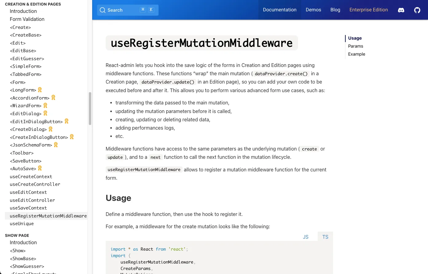
Document The useRegisterMutationMiddleware Hook
You might remember we introduced a middleware mechanism back in react-admin v4.1. Middleware functions “wrap” the main mutation (dataProvider.create() in a Creation page, dataProvider.update() in an Edition page), so you can add your own code to be executed before and after it. This allows you to perform various advanced form use cases, such as:
- transforming the data passed to the main mutation,
- updating the mutation parameters before it is called,
- creating, updating or deleting related data,
- adding performances logs,
- etc.
As powerful as it is, te mutation middleware feature wasn’t properly documented and only users who read the source code could use it.
We added a dedicated documentation page to explain how it works and how to use it, with examples.
To be honest, we pondered for some time before exposing this API, because it is VERY powerful. So remember: with great power comes great responsibility.
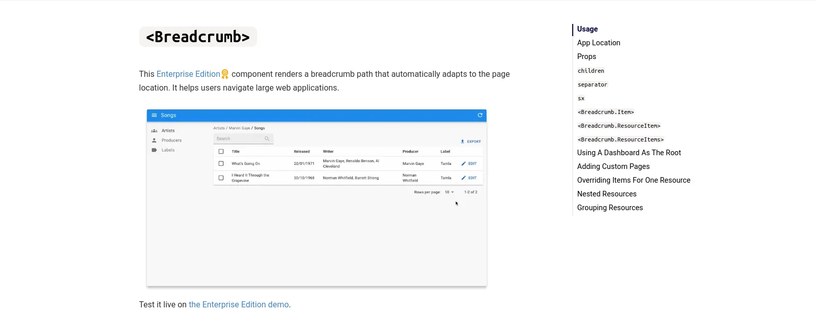
<Breadcrumb> Documentation Overhaul
We believe that <Breadcrumb> component, which renders a breadcrumb path that automatically adapts to the page location, is super smart and saves developers tons of time.
However, the poor documentation for this component wasn’t doing it justice, and many readers didn’t see the point of using it.
We rewrote the <Breadcrumb> documentation from the ground up to make it easier to understand, adding a detailed review of the underlying mechanisms such as the AppLocationContext and providing a lot more examples with screenshots and code snippets.
Miscellaneous Changes
Believe it or not, there were many more changes in the last 3 months than the ones listed above. We can’t cover them all, so here is a quick list of the other changes:
- Add support for mutationOptions in
<BulkUpdateButton> - Add eslint, prettier and default vite gitignore to create-react-admin
- Add
<FilterListItem icon>prop to show an icon for each filter list item - Add
<SortButton sx>prop to customize button style - Add
<ResourceMenuItems>to facilitate custom menus - Add full record to
<AutocompleteInput>and<AutocompleteArrayInput>’s onChange parameters
Conclusion
React-admin is constantly improving, helping developers around the world to build awesome web applications, faster.
The huge changelog above is the result of the hard work of the marmelab team and of the react-admin community. We’d like to thank all the contributors who helped us make react-admin better.
If you want to avoid reading super long articles about react-admin updates in the future, watch the marmelab/react-admin repository to be notified of new releases (one bug fix release every week, one minor release with new features every month).
And please come to our Discord server to get daily updates, tips & tricks, and a friendly community to help you with your react-admin projects!

Authors
Full-stack web developer at marmelab, Gildas has a strong appetite for emerging technologies. If you want an informed opinion on a new library, ask him, he's probably used it on a real project already.