<InfiniteList>
The <InfiniteList> component is an alternative to the <List> component that allows user to load more records when they scroll to the bottom of the list. It’s useful when you have a large number of records, or when users are using a mobile device.
<InfiniteList> fetches the list of records from the data provider, and renders the default list layout (title, buttons, filters). It delegates the rendering of the list of records to its child component. Usually, it’s a <Datagrid> or a <SimpleList>, responsible for displaying a table with one row for each record.
Usage
Here is the minimal code necessary to display a list of books with infinite scroll:
// in src/books.js
import { InfiniteList, Datagrid, TextField, DateField } from 'react-admin';

export const BookList = () => (
    <InfiniteList>
        <Datagrid>
            <TextField source="id" />
            <TextField source="title" />
            <DateField source="author" />
        </Datagrid>
    </InfiniteList>
);

// in src/App.js
import { Admin, Resource } from 'react-admin';
import jsonServerProvider from 'ra-data-json-server';

import { BookList } from './books';

const App = () => (
    <Admin dataProvider={jsonServerProvider('https://jsonplaceholder.typicode.com')}>
        <Resource name="books" list={BookList} />
    </Admin>
);

export default App;
That’s enough to display a basic post list, that users can sort and filter, and load additional records when they reach the bottom of the list.
Tip: <Datagrid> has a sticky header by default, so the user can always see the column names when they scroll down.
Props
The props are the same as the <List> component:
| Prop | Required | Type | Default | Description |
|---|---|---|---|---|
children |
Required | ReactNode |
- | The component to use to render the list of records. |
actions |
Optional | ReactElement |
- | The actions to display in the toolbar. |
aside |
Optional | ReactElement |
- | The component to display on the side of the list. |
component |
Optional | Component |
Card |
The component to render as the root element. |
debounce |
Optional | number |
500 |
The debounce delay in milliseconds to apply when users change the sort or filter parameters. |
disable Authentication |
Optional | boolean |
false |
Set to true to disable the authentication check. |
disable SyncWithLocation |
Optional | boolean |
false |
Set to true to disable the synchronization of the list parameters with the URL. |
empty |
Optional | ReactElement |
- | The component to display when the list is empty. |
empty WhileLoading |
Optional | boolean |
false |
Set to true to return null while the list is loading. |
exporter |
Optional | function |
- | The function to call to export the list. |
filters |
Optional | ReactElement |
- | The filters to display in the toolbar. |
filter |
Optional | object |
- | The permanent filter values. |
filter DefaultValues |
Optional | object |
- | The default filter values. |
hasCreate |
Optional | boolean |
false |
Set to true to show the create button. |
pagination |
Optional | ReactElement |
<Infinite Pagination> |
The pagination component to use. |
perPage |
Optional | number |
10 |
The number of records to fetch per page. |
queryOptions |
Optional | object |
- | The options to pass to the useQuery hook. |
resource |
Optional | string |
- | The resource name, e.g. posts. |
sort |
Optional | object |
- | The initial sort parameters. |
storeKey |
Optional | string |
- | The key to use to store the current filter & sort. |
title |
Optional | string |
- | The title to display in the App Bar. |
sx |
Optional | object |
- | The CSS styles to apply to the component. |
Check the <List> component for details about each prop.
Additional props are passed down to the root component (a MUI <Card> by default).
pagination
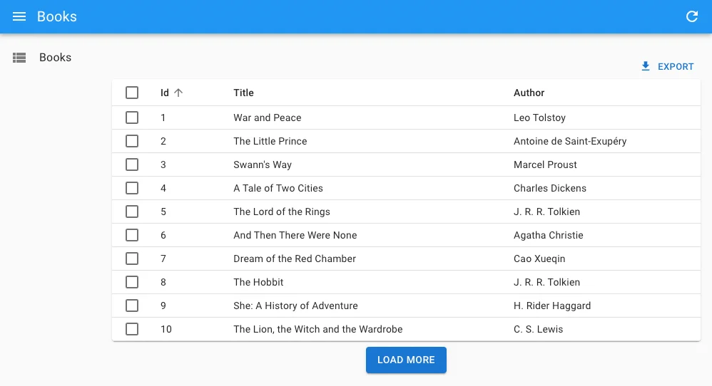
You can replace the default “load on scroll” pagination (triggered by a component named <InfinitePagination>) by a custom pagination component. To get the pagination state and callbacks, you’ll need to read the InfinitePaginationContext.

For example, here is a custom infinite pagination component displaying a “Load More” button at the bottom of the list:
import { InfiniteList, useInfinitePaginationContext, Datagrid, TextField } from 'react-admin';
import { Box, Button } from '@mui/material';

const LoadMore = () => {
    const {
        hasNextPage,
        fetchNextPage,
        isFetchingNextPage,
    } = useInfinitePaginationContext();
    return hasNextPage ? (
        <Box mt={1} textAlign="center">
            <Button
                disabled={isFetchingNextPage}
                onClick={() => fetchNextPage()}
            >
                Load more
            </Button>
        </Box>
    ) : null;
};

export const BookList = () => (
    <InfiniteList pagination={<LoadMore />}>
        <Datagrid>
            <TextField source="id" />
            <TextField source="title" />
            <TextField source="author" />
        </Datagrid>
    </InfiniteList>
);
Showing The Record Count
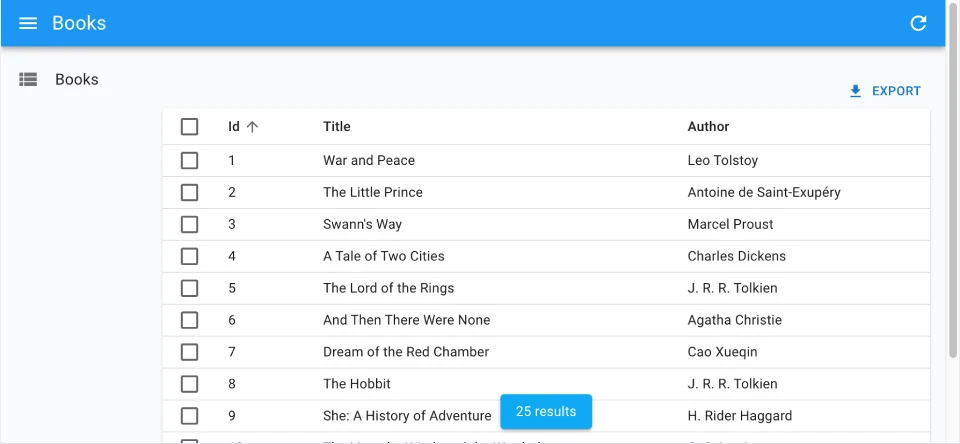
One drawback of the <InfiniteList> component is that it doesn’t show the number of results. To fix this, you can use useListContext to access the total property of the list, and render the total number of results in a sticky footer:

import { useListContext, InfinitePagination, InfiniteList } from 'react-admin';
import { Box, Card, Typography } from '@mui/material';

const CustomPagination = () => {
    const { total } = useListContext();
    return (
        <>
            <InfinitePagination />
            {total > 0 && (
                <Box position="sticky" bottom={0} textAlign="center">
                    <Card
                        elevation={2}
                        sx={{ px: 2, py: 1, mb: 1, display: 'inline-block' }}
                    >
                        <Typography variant="body2">{total} results</Typography>
                    </Card>
                </Box>
            )}
        </>
    );
};

export const BookList = () => (
    <InfiniteList pagination={<CustomPagination />}>
        // ...
    </InfiniteList>
);

