<MultiLevelMenu>
This Enterprise Edition component adds support for nested sub menus in the left navigation bar.
When a React-admin application grows significantly, the default menu might not be the best solution. The <MultiLevelMenu> can help unclutter the navigation: it renders a menu with an infinite number of levels and sub-menus. Menu Items that are not at the top level are rendered inside a collapsible panel.
When a React-admin application grows significantly, the default <Menu> component might not be the best solution. The <MultiLevelMenu> can help unclutter the navigation: it renders a menu with an infinite number of levels and sub menus. Menu Items that are not at the top level are rendered inside a collapsible panel.
Test it live on the Enterprise Edition Storybook.
Usage
Create a custom Menu component using <MultiLevelMenu> as root instead of <Menu>. Menu entries should be <MultiLevelMenu.Item> components. They are very similar to the default <MenuItemLink> from react-admin, except that they accept other <MultiLevelMenu.Item> as their children.
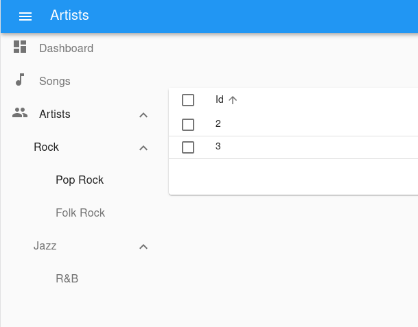
For instance, here is how to create a menu with sub menus for each artist genre. The menu target is actually the same page - the artists list - but with a different filter:
import { MultiLevelMenu } from '@react-admin/ra-navigation';

import DashboardIcon from '@mui/icons-material/Dashboard';
import MusicIcon from '@mui/icons-material/MusicNote';
import PeopleIcon from '@mui/icons-material/People';

const MyMenu = () => (
    <MultiLevelMenu>
        <MultiLevelMenu.Item name="dashboard" to="/" label="Dashboard" icon={<DashboardIcon />} />
        <MultiLevelMenu.Item name="songs" to="/songs" label="Songs" icon={<MusicIcon />}  />
        {/* The empty filter is required to avoid falling back to the previously set filter */}
        <MultiLevelMenu.Item name="artists" to={'/artists?filter={}'} label="Artists" icon={<PeopleIcon />}>
            <MultiLevelMenu.Item name="artists.rock" to={'/artists?filter={"type":"Rock"}'} label="Rock">
                <MultiLevelMenu.Item name="artists.rock.pop" to={'/artists?filter={"type":"Pop Rock"}'} label="Pop Rock" />
                <MultiLevelMenu.Item name="artists.rock.folk" to={'/artists?filter={"type":"Folk Rock"}'} label="Folk Rock" />
            </MultiLevelMenu.Item>
            <MultiLevelMenu.Item name="artists.jazz" to={'/artists?filter={"type":"Jazz"}'} label="Jazz">
                <MultiLevelMenu.Item name="artists.jazz.rb" to={'/artists?filter={"type":"RB"}'} label="R&B" />
            </MultiLevelMenu.Item>
        </MultiLevelMenu.Item>
    </MultiLevelMenu>
);
Note that each <MultiLevelMenu.Item> requires a unique name attribute.
Then, create a custom layout using the <Layout> component and pass your custom menu component to it. Make sure you wrap the layout with the <AppLocationContext> component.
// in src/MyLayout.js
import { Layout } from 'react-admin';
import { AppLocationContext } from '@react-admin/ra-navigation';

import { MyMenu } from './MyMenu';

export const MyLayout = ({ children }) => (
  <AppLocationContext>
    <Layout menu={MyMenu}>
        {children}
    </Layout>
  </AppLocationContext>
);
<AppLocationContext> is necessary because ra-navigation doesn’t use the URL to detect the current location. Instead, page components declare their location using a custom hook (useDefineAppLocation()). This allows complex site maps, with multiple levels of nesting. That’s the reason why each <MultiLevelMenu.Item> requires a unique name, that matches a particular page location.
You can set the AppLocation for a given page like so:
import { useDefineAppLocation } from '@react-admin/ra-navigation';

const ArtistRockList = () => {
    useDefineAppLocation('artists.rock');
    return <h1>Artist Rock List</h1>;
};
And then use this AppLocation as name for <MultiLevelMenu.Item>:
<MultiLevelMenu.Item
    name="artists.rock"
    to={'/artists/rock'}
    label="Rock"
>
Check the ra-navigation documentation to learn more about App Location.
Finally, pass this custom layout to the <Admin> component
// in src/App.js
import { Admin, Resource } from "react-admin";

import { MyLayout } from './MyLayout';

const App = () => (
    <Admin
        layout={MyLayout}
        dataProvider={...}
    >
        // ...
    </Admin>
);
Props
| Prop | Required | Type | Default | Description |
|---|---|---|---|---|
children |
Optional | ReactNode |
- | The Menu Items to be rendered. |
initialOpen |
Optional | boolean |
false |
Whether the menu is initially open. |
openItemList |
Optional | Array |
- | List of names of menu items that should be opened by default. |
sx |
Optional | SxProps |
- | Style overrides, powered by MUI System |
Additional props are passed down to the root <div> component.
children
Pass <MultiLevelMenu.Item> children to <MultiLevelMenu> to define the main menu entries.
// in src/MyMenu.js
import { MultiLevelMenu } from "@react-admin/ra-navigation";

import DashboardIcon from '@mui/icons-material/Dashboard';
import MusicIcon from '@mui/icons-material/MusicNote';
import PeopleIcon from '@mui/icons-material/People';

const MyMenu = () => (
  <MultiLevelMenu>
    <MultiLevelMenu.Item name="dashboard" to="/" label="Dashboard" icon={<DashboardIcon />} />
    <MultiLevelMenu.Item name="songs" to="/songs" label="Songs" icon={<MusicIcon />}  />
    <MultiLevelMenu.Item name="artists" to="/artists" label="Artists" icon={<PeopleIcon />} />
  </MultiLevelMenu>
);
Check the <MultiLevelMenu.Item> section for more information.
initialOpen
All the items of a <MultiLevelMenu> can be opened initially by setting initialOpen to true.
export const MyMenu = () => (
    <MultiLevelMenu initialOpen>
        // ...
    </MultiLevelMenu>
);
sx: CSS API
Pass an sx prop to customize the style of the main component and the underlying elements.
export const MyMenu = () => (
    <MultiLevelMenu sx={{ marginTop: 0 }}>
        // ...
    </MultiLevelMenu>
);
To override the style of <MultiLevelMenu> using the application-wide style overrides, use the RaMenuRoot key.
<MultiLevelMenu.Item>
The <MultiLevelMenu.Item> component displays a menu item with a label and an icon.
<MultiLevelMenu.Item
    name="dashboard"
    to="/"
    label="Dashboard"
    icon={<DashboardIcon />}
/>
It requires the following props:
name: the name of the location to match. This is used to highlight the current location.to: the location to link to.label: The menu item label.
It accepts optional props:
icon: the icon to display.children: Other<MultiLevelMenu.Item>children.sx: Style overrides, powered by MUI System
Additional props are passed down to the underling Material UI <listItem> component.
Creating Menu Items For Resources
If you want to render a custom menu item and the default resource menu items, use the useResourceDefinitions hook to retrieve the list of resources and create one menu item per resource.
// in src/MyMenu.js
import { createElement } from 'react';
import { useResourceDefinitions } from 'react-admin';
import { MultiLevelMenu } from "@react-admin/ra-navigation";
import LabelIcon from '@mui/icons-material/Label';

export const MyMenu = () => {
    const resources = useResourceDefinitions();

    return (
        <MultiLevelMenu>
            {Object.keys(resources).map(name => (
                <MultiLevelMenu.Item
                    key={name}
                    name={name}
                    to={`/${name}`}
                    label={resources[name].options && resources[name].options.label || name}
                    icon={createElement(resources[name].icon)}
                />
            ))}
            <MultiLevelMenu.Item name="custom.route" to="/custom-route" label="Miscellaneous" icon={<LabelIcon />} />
        </MultiLevelMenu>
    );
};