React-Admin: September 2025 Update

Since our last blog post about react-admin updates, we’ve published three minor versions (5.9, 5.10 and 5.11), along with new features in the Enterprise Edition. What an active summer!
Read on to discover all the improvements and new features we’ve added to react-admin in the last three months.
In a Nutshell
- Developer Experience
- Render props: Easier custom rendering in many components
- Reference fields
emptyprop for when there are no referenced records <DataTable>migration codemod to finally get rid ofDatagrid- ra-core: Headless react-admin with no UI dependencies
- shadcn-admin-kit is react-admin for a Shadcn UI
- New features
<RecordField>displays record fields with labels- Soft Delete makes archiving and restoring records easy
- Scheduling Components let you manage events with Bryntum Scheduler
- Menu keyboard navigation with shortcuts
<ReferenceManyInput>supports reordering<ColumnsButton>search to quickly find columns in a DataTable- Resource specific translations for buttons and pages
- Miscellaneous
<TreeInput>offers a more compact UI to select a tree node<LockStatus>improves the content locking mechanism- New Auth Providers: APISIX OpenID Connect and Appwrite
Render Props For Easier Customization
To render data in a custom way, react-admin used to force you create a separate component and to use hooks like useListContext or useRecordContext. This type of boilerplate code adds up quickly, especially when you just want to tweak the rendering a little bit.
To make this easier, react-admin now allows you to pass a render function in page and reference field components. For example, here’s how you can use the <List render> prop to render a list of books with <ul> and <li>:
import { List } from 'react-admin';import { Chip } from '@mui/material';
export const BookList = () => (    <List        render={({ data }) => (            <ul>                {data?.map(record => (                    <li key={record.id}>                        <strong>{record.title}</strong>                        <Chip label={record.year} />                    </li>                ))}            </ul>        )}    />);
The render function receives the current context as an argument. If you need to handle the loading and error states, you can also do it there:
import { List } from 'react-admin';import { Chip } from '@mui/material';
export const BookList = () => (    <List        render={({ data, error, isPending }) => {            if (isPending) {                return <div>Loading...</div>;            }            if (error) {                return <div>Error: {error.message}</div>;            }            return (                <ul>                    {data.map(record => (                        <li key={record.id}>                            <strong>{record.title}</strong>                            <Chip label={record.year} />                        </li>                    ))}                </ul>            );        }}    />);
All components providing a record or list context now support render props. This includes page components (like List, Show or Edit) and reference fields (like ReferenceField or ReferenceArrayField).
Empty Reference Fields
Sometimes, referenced records may not exist. For example, a comment may not be associated with a user, or a user may not have posts. In such cases, <ReferenceField> used to display nothing.
React-admin 5.10 introduced the empty prop in <ReferenceField>, <ReferenceOneField> and <ReferenceManyField>. This prop allows you to pass a React node that will be displayed when there are no referenced records.
export const CommentShow = () => (    <Show>        <SimpleShowLayout>            <ReferenceField                source="user_id"                reference="users"                empty={<span className="anonymous">Anonymous</span>}            >                <TextField source="name" />            </ReferenceField>
            <TextField source="content" />        </SimpleShowLayout>    </Show>);
Here is another example for <ReferenceManyField>:
export const UserShow = () => ( <Show> <SimpleShowLayout> <TextField source="name" /> <ReferenceManyField reference="posts" target="user_id" empty={<span>This user has no posts.</span>} > <DataTable> <TextField source="title" /> <DateField source="published_at" /> </DataTable> </ReferenceManyField> </SimpleShowLayout> </Show>);This should save you some boilerplate code when dealing with missing references.
DataTable Migration Codemod
In our previous react admin update blog post, we introduced the new <DataTable> component, a more flexible and powerful alternative to the existing <Datagrid> component.
This new component is now the default way to display tabular data in react-admin. The documentation has been updated to reflect this change, and we provide a codemod to help you migrate from <Datagrid> to <DataTable>.
Here is how to use the codemod to update your codebase:
npx jscodeshift ./path/to/src/ \ --extensions=ts,tsx \ --parser=tsx \ --transform=./node_modules/ra-core/codemods/replace-Datagrid-DataTable.tsOr, if you use Javascript:
npx jscodeshift ./path/to/src/ \ --extensions=js,jsx \ --transform=./node_modules/ra-core/codemods/replace-Datagrid-DataTable.tsIf you haven’t migrated yet, it’s time to do so! The codemod will take care of most of the migration for you, but you may need to make some manual adjustments depending on your use case. The Datagrid migration section provides detailed instructions on how to perform the migration, and the limits of the provided codemod.
Ra-core: Headless React Admin
React-admin is designed for MUI, but it relies on a headless core library called ra-core. It allows you to use your own design system or component library, while still benefiting from the powerful hooks and tools of react-admin.
We’ve noticed that more and more developers use ra-core to build custom admin interfaces. But until now, the only way to learn how to use it was to read the react-admin documentation. That’s why we recently published a dedicated ra-core documentation site where you can find guides, API references, and examples to help you get started.
For example, the documentation explains how you could use <ListBase> and useListContext to build a custom list view for books:
import { ListBase, useListContext } from 'ra-core';
const BooksListView = () => {    const { data, error, isPending, page, setPage } = useListContext();
    if (isPending) {        return <div>Loading...</div>;    }    if (error) {        return <div>Error...</div>;    }
    return (        <main>            <ul>                {data.map(record => (                    <li key={record.id}>{record.title}</li>                ))}            </ul>
            <div className="pagination">                <button disabled={page <= 1} onClick={() => setPage(page - 1)}>                    previous                </button>                <span>Page {page}</span>                <button onClick={() => setPage(page + 1)}>next</button>            </div>        </main>    );};
export const BooksList = () => (    <ListBase resource="books" perPage={5}>        <BooksListView />    </ListBase>);
As you can see, using ra-core allows you to focus on building your UI, while still leveraging the powerful data fetching and state management capabilities of react-admin.
A New Framework For Shadcn UI
Speaking of building custom UIs, Shadcn UI is a popular component library built on top of Tailwind CSS and Radix UI. It provides a set of accessible, customizable, and reusable components that can be used to build modern web applications.
We are excited to announce that we have created a version of react-admin for Shadcn UI. It’s called Shadcn Admin Kit, and it leverages ra-core, the headless part of react-admin. Check out the live demo to see it in action: https://marmelab.com/shadcn-admin-kit/demo.
We’ve already using Shadcn Admin Kit in production, so it’s ready for prime time. It even has its own Getting started guide and a complete documentation. Together with the ra-core documentation mentioned above, you now have everything you need to build your own admin interface with Shadcn UI and react-admin.
RecordField
<SimpleShowLayout> is the standard way to display a list of fields with their labels. But it is very limited in terms of layout, because it has to inspect and wrap its children Field components with <Labeled> to show a label. When you need to put two fields in the same row by wrapping them in a <Stack>, this breaks the label decoration, as in the following example where the title and author fields appear without labels:
export const ShowBook = () => ( <Show> <SimpleShowLayout> <Stack direction="row" gap={2}> <TextField source="title" /> <TextField source="author" /> </Stack> <TextField source="year" /> <NumberField source="pages" label="Number of pages" /> </SimpleShowLayout>);React-admin 5.9 solved this problem by inverting the control: instead of having a layout component that inspects its children, we now have a label component that can delegate the rendering of the value.
It’s called <RecordField>, and it’s the most versatile way to display a record field with a label.
<RecordField source="title" />
<RecordField> works everywhere there is a RecordContext, and it uses the same API as <DataTable.Col>, i.e. you can define what it renders using either a source prop, a field prop, a render prop, or even a child.
Here is an example of a Show view for a books resource:
export const ShowBook = () => ( <Show> <Stack gap={2}> <Stack direction="row" gap={2}> <RecordField source="title" /> <RecordField source="author" /> </Stack> <RecordField source="year" /> <RecordField label="Number of pages" source="pages" field={NumberField} /> </Stack> </Show>);Notice that this example doesn’t even use a <SimpleShowLayout> anymore! And the labels of the title and author fields are correctly displayed.
<RecordField> extracts the field passed as source from the current record, and renders it with a label inferred from the source but that you can customize.
To customize the rendering of the field, you can pass a field prop with any field component, such as <TextField>, <NumberField>, <DateField>, etc.
<RecordField source="published_at" field={DateField} />You can customize the rendering even further by using the render prop, which receives the record as an argument.
<RecordField label="Book" render={record => <><strong>"{record.title}"</strong>, by {record.author}</>}/>You can also use <RecordField> in Edit pages, to render read-only fields. As such, it’s a drop-in replacement for the <Labeled> component, which we’ll soon deprecate. <SimpleShowLayout> also becomes useless with <RecordField>, since you can use any layout component you want, such as <Stack>, <Box>, or <Grid>.
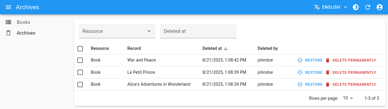
Soft Delete
A new enterprise package just dropped! Say hi to ra-soft-delete. With soft delete, instead of permanently deleting a record, you can mark it as deleted and hide it from the user interface. This allows a control by a second individual (e.g. in four eyes system), prevents accidental deletions, and facilitates the implementation of an archive system.
For instance, this package provides a <SoftDeleteButton> component that replaces the regular <DeleteButton> and marks the current record as deleted.
The server-side implementation is up to you: the package assumes the dataProvider implements a softDelete method that marks the record as deleted, e.g. by setting a deletedAt field to the current date, or by moving the record to a deleted_records table.
Ra-soft-delete proposes many more components to manage soft-deleted records, such as:
- a
<BulkSoftDeleteButton>for bulk actions, - a
<DeletedRecordsList>to fetch and render soft-deleted records - a
<ShowDeleted>component to visualize a soft-deleted record, - a
<RestoreButton>component to restore a soft-deleted record,
Let’s have a look at how simple it is to use these components in your application. Let’s say you have a posts resource, and you want to add a soft delete feature to the list:
import { List, DataTable } from 'react-admin';import { SoftDeleteButton } from '@react-admin/ra-soft-delete';
export const PostList = () => (    <List>        <DataTable>            <DataTable.Col source="id" />            <DataTable.Col source="title" />            <DataTable.Col>                <SoftDeleteButton />            </DataTable.Col>        </DataTable>    </List>);
Now that you have set up the <SoftDeleteButton>, you can use the <DeletedRecordsList> component to view and manage soft-deleted records:
import { Admin, Resource, CustomRoutes } from 'react-admin';import { Route } from 'react-router-dom';import { DeletedRecordsList } from '@react-admin/ra-soft-delete';
import { dataProvider } from './dataProvider';import { authProvider } from './authProvider';import { PostList } from './PostList';
export const App = () => (    <Admin dataProvider={dataProvider} authProvider={authProvider}>        <Resource name="posts" list={PostList} />        <CustomRoutes>            <Route path="/deleted" element={<DeletedRecordsList />} />        </CustomRoutes>    </Admin>);
By default, the <DeletedRecordsList> component will display all soft-deleted records, no matter the resource. However, you can also filter the list to show only soft-deleted records for a specific resource by passing the resource prop:
<Route path="/posts/deleted" element={<DeletedRecordsList resource="posts" />}/>Now, you have a working soft delete button, with a way to view and restore the soft deleted posts. However, the default bulk delete action in your PostList is still permanently deleting records. To change this behavior, you can override the bulkActionButtons to use the BulkSoftDeleteButton instead:
import { List, DataTable } from 'react-admin';import { BulkSoftDeleteButton } from '@react-admin/ra-soft-delete';
export const PostList = () => (    <List bulkActionButtons={<BulkSoftDeleteButton />}>        <DataTable>            <DataTable.Col source="id" />            <DataTable.Col source="title" />            <DataTable.Col>                <SoftDeleteButton />            </DataTable.Col>        </DataTable>    </List>);
Scheduling Components
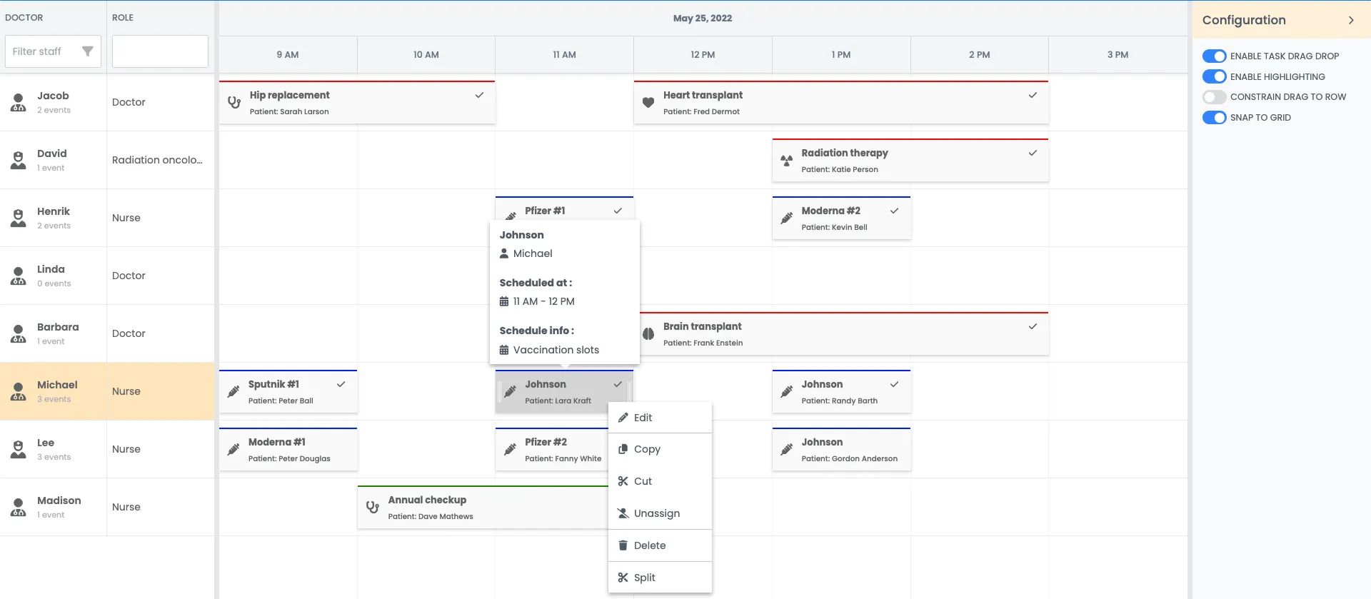
Another new enterprise package is ra-scheduler, based on the powerful Bryntum Scheduler. It provides a feature-rich scheduling component to manage tasks, assigments, events, scheduling constraints, and more.
To create the above interface with ra-scheduler, just use the <Scheduler> component instead of a <List>:
import { TopToolbar } from 'react-admin';import { Scheduler, SchedulerDaysNavigationButtons } from '@react-admin/ra-scheduler';import '@bryntum/core-thin/core.material.css';import '@bryntum/grid-thin/grid.material.css';import '@bryntum/scheduler-thin/scheduler.material.css';import { endOfDay, startOfDay } from 'date-fns';
export const EventList = () => (    <Scheduler        columns={[{ text: 'Name', field: 'name', width: 130 }]}        viewPreset="hourAndDay"        startDate={startOfDay(new Date())}        endDate={endOfDay(new Date())}        actions={            <TopToolbar>                <SchedulerDaysNavigationButtons />            </TopToolbar>        }    />);
Ra-scheduler offers many capabilities out-of-the-box, including:
- Drag-and-drop event resizing
- A convenient event editor popup
- Filters and search
- Customizable time ranges and views (day, week, month, etc.)
- Dependencies between events
- Ability to customize the task fields and rendering
Check out the ra-scheduler documentation for more details and examples.
Menu Keyboard Navigation
Did you ever wish to navigate a react-admin app only with your keyboard? Now you can! With the new MenuItem’s keyboardShortcut property, you can define a keyboard shortcut for each menu item.
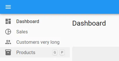
When the user presses the defined key combination, the corresponding menu item will be activated, allowing for quick navigation without using a mouse.
import { Menu } from 'react-admin';
const CustomMenu = () => (    <Menu>        <Menu.DashboardItem keyboardShortcut="G>D" />        <Menu.Item            to="/sales"            leftIcon={<PieChartOutlined />}            primaryText="Sales"            keyboardShortcut="G>S"        />        <Menu.Item            to="/customers"            leftIcon={<PeopleOutlined />}            primaryText="Customers very long"            keyboardShortcut="G>C"        />        <Menu.ResourceItem            name="products"            leftIcon={<Inventory />}            keyboardShortcut="G>P"        />    </Menu>);
The shortcuts are displayed next to the menu items on hover, so users can learn about them.
The menu keyboard shortcuts are based on the popular react-hotkeys-hook library, so you can add more shortcuts in your app using the useHotkeys hook.
import { useHotkeys } from 'react-hotkeys-hook';
function MyAwesomeComponent() {  const [count, setCount] = useState(0)  useHotkeys('a', () => setCount(prevCount =>    prevCount + 1  ))
  return (    <span>{count}</span>  )}
ReferenceManyInput Reordering
<ReferenceManyInput> is an Enterprise Edition component that lets you edit related records in an array of sub-forms, for example an array of product variants:
If the related resource features a rank column (or equivalent), <ReferenceManyIInput> can now leverage it to offer reordering of the referenced records.
To enable it, just pass the rankSource prop to the ReferenceManyInput component.
import { Edit, SimpleForm, SimpleFormIterator, TextInput } from 'react-admin';import { ReferenceManyInput } from '@react-admin/ra-relationships';
const TeacherEdit = () => (    <Edit>        <SimpleForm>            <ReferenceManyInput                reference="students"                target="teacher_id"                rankSource="rank"            >                <SimpleFormIterator inline>                    <TextInput source="first_name" />                    <TextInput source="last_name" />                </SimpleFormIterator>            </ReferenceManyInput>        </SimpleForm>    </Edit>);
This was a popular request, and we’re glad to finally deliver it with ra-relationships version 5.4
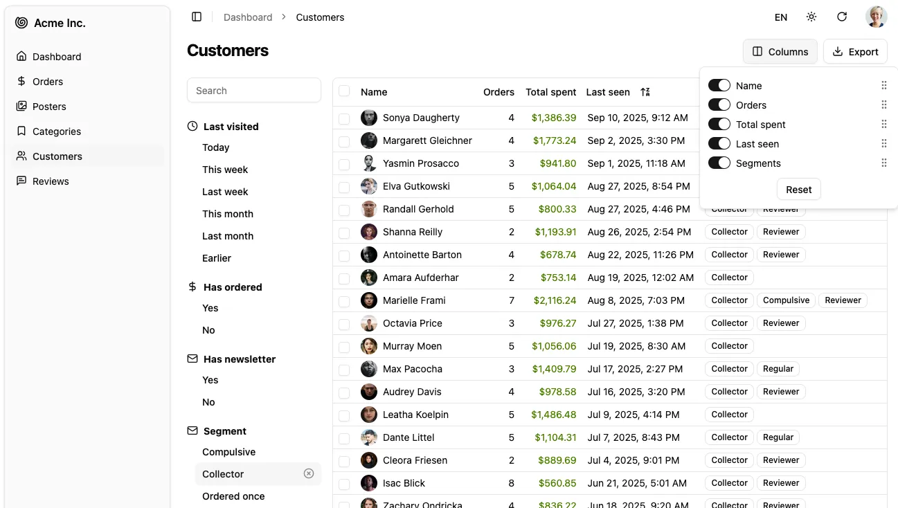
Search In Columns Button
The <ColumnsButton> lets users choose the visibility and order of columns in a <DataTable>. But when there are a lot of columns, users reported it can be hard to find the right one.
React-admin 5.10 adds a search input in the columns menu to quickly filter the list of columns.
This feature is available by default, no need to change anything! And if you want usage tips, check the <ColumnsButton> documentation.
Resource Specific Translations
The i18nProvider allows react-admin to translate interface messages using application-wide identifiers such as ra.notification.updated, so you can render them in a custom way for each language. For example, in English:
The record #123 has been deleted
The record #456 has been updated
However, there are cases where you may want to have more specific translations, e.g.:
The book “War and Peace” has been deleted
The author Leo Tolstoy has been updated
React-admin 5.9 supports resource-specific translation feature for notifications, buttons, and page titles. This means that you can add translations for these components for each resource. If not present, react-admin will fall back to the application-wide messages.
This feature is also useful in some languages such as French, where some words are gendered (New board = Nouveau tableau, New column = Nouvelle colonne).
import polyglotI18nProvider from 'ra-i18n-polyglot';import englishMessages from 'ra-language-english';
const messages = {    en: {        ...englishMessages,        resources: {            books: {                notifications: {                    deleted: 'The book "%{recordRepresentation}" has been deleted',                },            },        },    },};
const i18nProvider = polyglotI18nProvider(locale => messages[locale] || messages.en, 'en');
Check the documentation of each of the components supporting resource-specific translations to know the exact translation keys:
CreateButton,EditButton,ListButton,ShowButton,DeleteButton,UpdateButton,Create,Edit,List,Show.
Better Tree Input UI
The <TreeInput> component, available in the ra-tree Enterprise Edition package, lets users select a node in a tree, e.g. to select a category for a product.
This component has received a significant UI overhaul. The new selector works like a <SelectInput>, and only reveals the tree when focused. It is much more compact and fits better with the rest of the UI.
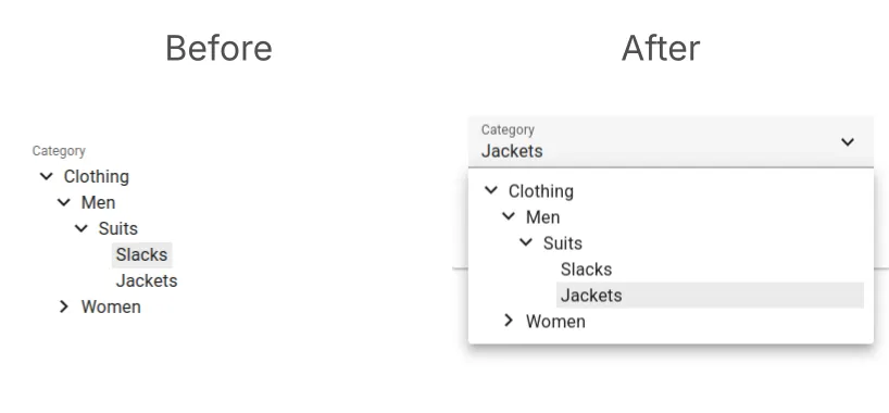
This new UI is available by default in ra-tree v7, no need to change anything.
Improved Locking Mechanism
Did you know about the locking mechanism in the ra-realtime package? It allows you to prevent multiple users from editing the same record at the same time. This is especially useful in collaborative applications where multiple users may be working on the same data.
We’ve made several improvements to the locking mechanism. First, we’ve introduced a new <LockStatus> component that allows to visually indicate whether the record is locked or not, by the current user or not, and provides an easy way to lock or unlock the record.
You can use this component in any record context, such as in the Edit view, where it is especially useful. Here’s how to add it in the toolbar:
import { Edit, SaveButton, SimpleForm, TextInput, Toolbar } from 'react-admin';import { LockStatus } from '@react-admin/ra-realtime';
const CustomToolbar = () => {    return (        <Toolbar>            <SaveButton sx={{ mr: 1 }} />            <LockStatus />        </Toolbar>    );};
export const PostEdit = () => (    <Edit>        <SimpleForm toolbar={<CustomToolbar />}>            <TextInput source="title" />            <TextInput source="body" multiline />        </SimpleForm>    </Edit>);
You can also use it in a <DataTable> to show the lock status of each record:
import { DataTable, List } from 'react-admin';import { LockStatus } from '@react-admin/ra-realtime';
const PostList = () => {    return (        <List>            <DataTable>                <DataTable.Col source="id" />                <DataTable.Col source="title" />                <DataTable.Col source="headline" />                <DataTable.Col source="author" />                <DataTable.Col label="Lock">                    <LockStatus hideWhenUnlocked />                </DataTable.Col>            </DataTable>        </List>    );};
Notice the hideWhenUnlocked property to avoid showing too many lock icons in the DataTable when most records are not locked.
But that’s not all! We’ve changed the useLockOnMount and useLockOnCall behavior on window unload (i.e. when closing the tab or refreshing the page). If users close their tab/browser when on a page with a locked record, the hook will block the navigation and show a notification until the record is unlocked. Hence it’s a good practice to give them a way to unlock the record manually, e.g. by using the doUnlock callback returned by the useLockCallbacks hook or the LockStatus component that was just introduced.
To help you manage the lock status when using useLockOnMount, the hook now returns the lock state. You can also use the new <LockOnMount> component that wraps the hook to lock the current record on mount.
import { Edit, SimpleForm, TextInput } from 'react-admin';import { LockOnMount } from '@react-admin/ra-realtime';
const PostEdit = () => (    <Edit>        <SimpleForm>            <TextInput source="title" fullWidth />            <TextInput source="headline" fullWidth multiline />            <TextInput source="author" fullWidth />            <LockOnMount />        </SimpleForm>    </Edit>);
New Auth Providers
The flexible authentication system of react-admin allows you to plug in your own authentication logic by providing an authProvider to the <Admin> component.
2 new auth providers are now available:
- APISIX OpenID Connect with @arte/ra-apisix-oidc, and
- Appwrite with ra-appwrite.
Conclusion
That’s it for this update! See the release notes for 5.9, 5.10 and 5.11 for the full list of changes.
We hope you enjoy the new features and improvements we’ve added to react-admin. We made a lot of progress, especially in the headless part of react-admin with ra-core, so everyone can benefit from the powerful hooks and tools of react-admin, even without MUI. We’ll continue to work in this direction, so stay tuned for more updates in the future.
If you haven’t updated your react-admin application recently, now is a great time to do so. Check out the recent releases and the Enterprise Edition changelog for more details and full changelogs.
We’d be happy to hear your feedback or questions about these new features. Join our Discord community!

Authors
Matthieu is a fullstack web developer at Marmelab. His expertise ranges from Laravel to React.js, with a special taste for strong typing and free software.