React-Admin: February 2026 Update


React-admin is still going strong in 2026, with one bugfix release every week and a new minor release every month. We keep on adding new features based on user feedback and customer requests, and polish the developer experience to make you (and your agent!) more productive.
Since our last blog post about react-admin updates, we’ve published three minor versions (5.12, 5.13 and 5.14), along with new features in the Enterprise Edition. What an active winter!
Read on to discover all the improvements and new features we’ve added to react-admin in the last three months.
In a nutshell
-
New Components
<RecordsIterator>: Easier rendering of lists of records<TextArrayField>: Versatile component to display arrays of strings<DataTableInput>: Select choices in a table within a dialog<FilterValue>: Display active filters as MUI Chips
-
Improved Features
- Form performance:
<ArrayInput>is now dramatically faster - Export everywhere:
<ExportButton>can now be used in every context - Fallback handling:
error,loading,empty, andofflineprops for page components - Smarter Guessers:
<TextArrayInput>and<TextArrayField>for scalar arrays <List>Selection State: Use several<List>in the same page<Breadcrumb>Revamp: Improved<Breadcrumb>developer experience<AutoPersistInStore>Cache Eviction: Cache no longer grows indefinitely<SimpleFormIterator>Auto-Focus: Can now be disabled
- Form performance:
-
Ecosystem Compatibility
-
Headless Core
<RecordsIterator>
When you need to render a list of records in a custom way, and neither <Datagrid> or <SimpleList> fit your needs, you used to have to create a custom list iterator component. That’s no longer the case with the new <RecordsIterator> component, which iterates over the records of the list and render them using either a render prop:
import { ListBase, RecordsIterator } from 'react-admin';
const MostVisitedPosts = () => (    <ListBase resource="posts" sort={{ field: 'views', order: 'DESC' }}>        <ul>            <RecordsIterator                render={record => <li>{record.title} - ({record.views} views)</li>}            />        </ul>    </ListBase>);
Alternatively to render, you can use the children prop to render each record, e.g., using Field components. This is because <RecordsIterator> creates a RecordContext for every record in the list:
import { ListBase, RecordsIterator, TextField, NumberField } from 'react-admin';
const MostVisitedPosts = () => (    <ListBase resource="posts" sort={{ field: 'views', order: 'DESC' }}>        <ul>            <RecordsIterator>                <li>                    <TextField source="title" />                    (<NumberField source="views" /> views)                </li>            </RecordsIterator>        </ul>    </ListBase>);
<RecordsIterator> works anywhere there is a ListContext, including inside these components:
<List><ListBase><InfiniteList><ReferenceManyField><ReferenceArrayField>
You can even use it outside of a list context by passing a data prop:
import { RecordsIterator, TextField } from 'react-admin';import { customerSegments } from './customerSegments.json';
const PostList = () => (    <ul>        <RecordsIterator            data={customerSegments}            total={customerSegments.length}        >            <li>                <TextField source="name" />            </li>        </RecordsIterator>    </ul>);
For more details, check out the RecordsIterator documentation.
<TextArrayField>
Need to render an array of strings, like a list of tags or genres? The new <TextArrayField> component is here to help you.
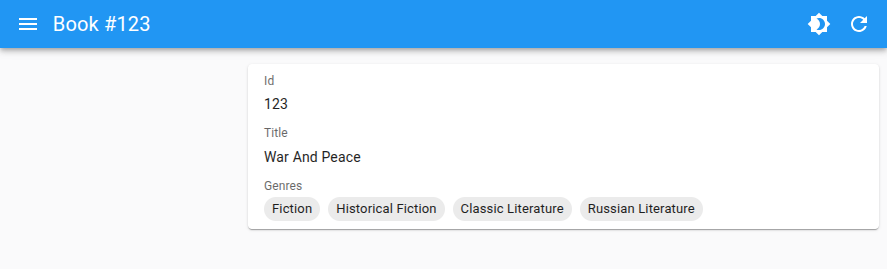
For example, if you have a book record with a genres field that is an array of strings:
const book = { id: 1, title: 'War and Peace', genres: [ 'Fiction', 'Historical Fiction', 'Classic Literature', 'Russian Literature', ],};Use <TextArrayField> to display the genres:
import { Show, SimpleShowLayout, TextArrayField } from 'react-admin';
const BookShow = () => (    <Show>        <SimpleShowLayout>            <TextField source="title" />            <TextArrayField source="genres" />        </SimpleShowLayout>    </Show>);
For more details, check out the TextArrayField documentation.
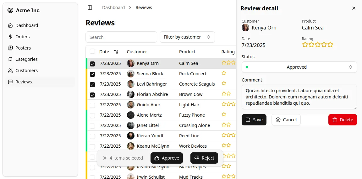
<DataTableInput>
This new selection input component, alternative to <AutocompleteInput>, allows you to select one or many choices using a table inside a dialog.
<DataTableInput> looks like a <SelectInput> at first. For example, look at the Authors inputs in the form below:
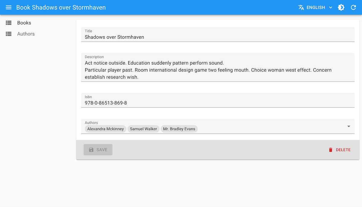
But when the user clicks on it, a dialog opens with a table to select the choices. The dialog can contain filter and pagination, just like a regular list.
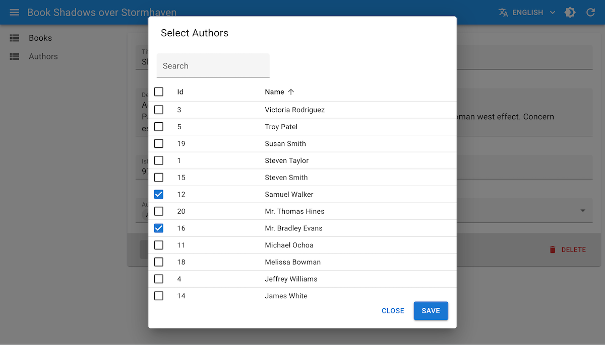
This allows users to easily find the choice they are looking for, even if there are a lot of choices or if the choice label is not enough to identify the choice and more details are needed.
Use it like any other choice input, e.g. as a child of a <ReferenceArrayInput> ; define the data table columns using <DataTable.Col> components:
import { Edit, SimpleForm, DataTable, ReferenceArrayInput, TextInput, SearchInput } from 'react-admin';import { DataTableInput } from '@react-admin/ra-form-layout';
export const BookEdit = () => (    <Edit>        <SimpleForm>            <TextInput source="title" />            <TextInput source="description" multiline />            <TextInput source="isbn" />            <ReferenceArrayInput source="author_ids" reference="authors">                <DataTableInput filters={[<SearchInput source="q" alwaysOn />]}>                    <DataTable.Col source="id" />                    <DataTable.Col source="name" />                    <DataTable.Col source="team" />                    <DataTable.Col source="role" />                    <DataTable.Col source="city" />                </DataTableInput>            </ReferenceArrayInput>        </SimpleForm>    </Edit>);
<DataTableInput> is a very powerful Enterprise Edition component with tons of options to customize the dialog, the filters and actions, the pagination, and the DataTable. Check them out in the DataTableInput documentation.
<FilterValue>
This new component renders the active filters as MUI Chips. It’s a great way to remind users of the active filters when they are not visible anymore (e.g. when the filters are displayed in a sidebar or a dialog, as with <StackedFilters>).
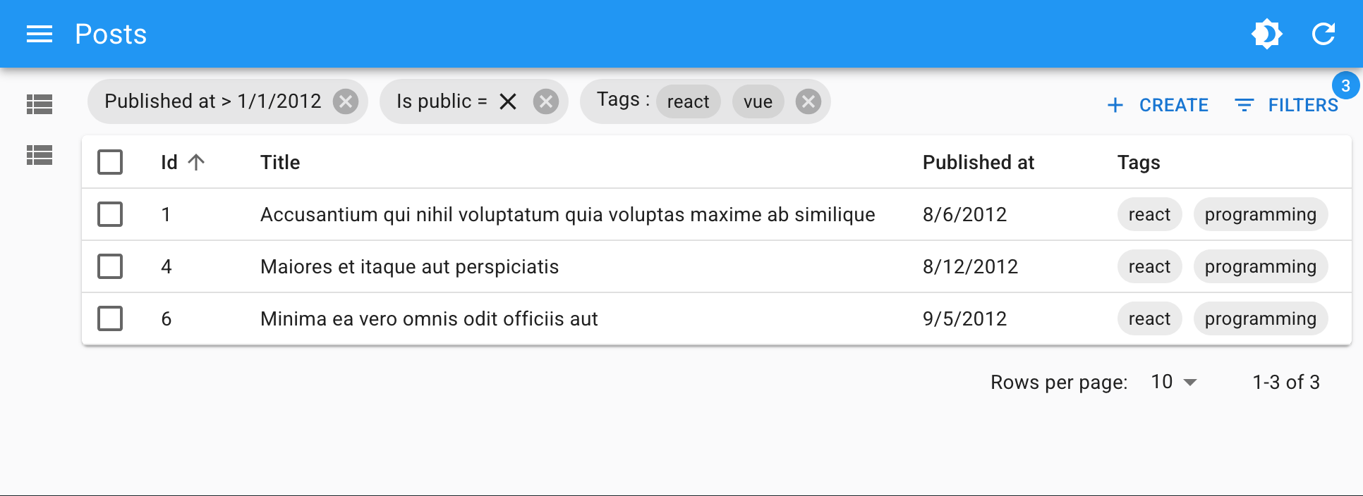
Place <FilterValue> as a descendant of a ListContext, e.g. in the ListToolbar, and define how each active filter should be rendered using the <FilterValue.Field> component:
import { BooleanField, CreateButton, DateField, DataTable, List, TextArrayField, TopToolbar } from 'react-admin';import { FilterValue, StackedFilters, booleanFilter, choicesArrayFilter, dateFilter, numberFilter, referenceFilter, textFilter } from '@react-admin/ra-form-layout';
const PostListToolbar = () => (    <TopToolbar sx={{ flex: 1 }}>        <FilterValue sx={{ flex: 1 }}>            <FilterValue.Field source="id" />            <FilterValue.Field source="title" />            <FilterValue.Field source="published_at" field={DateField} />            <FilterValue.Field source="is_public" field={BooleanField} />            <FilterValue.Field source="tags" field={TextArrayField} />        </FilterValue>        <CreateButton />        <StackedFilters config={{            id: textFilter({ operators: ['eq', 'neq'] }),            title: textFilter(),            published_at: dateFilter(),            is_public: booleanFilter(),            tags: choicesArrayFilter({                choices: [                    { id: 'solid', name: 'Solid' },                    { id: 'react', name: 'React' },                    { id: 'vue', name: 'Vue' },                    { id: 'programming', name: 'Programming' },                ],            }),        }} />    </TopToolbar>);
const PostList = () => (    <List actions={<PostListToolbar />}>        ...    </List>);
<ArrayInput> Performance
Developers love <ArrayInput> for its ability to handle arrays of objects in a form, and reuse the same input components as for regular fields.
However, developers didn’t love its performance: for arrays over a dozen elements, and with more than a few inputs per element, the form was getting really slow, with input lag and slow typing. The cause was a full rerender of the form array on every change (!).
We’ve solved this performance issue in react-admin 5.13. <ArrayInput> is now dramatically faster, getting advantage of the fine-grained subscriptions of the latest version of react-hook-form.
You don’t need to do anything to benefit from this improvement, apart from upgrading to react-admin 5.13.0 or later.
<ExportButton> in Every List
The <ExportButton> lets users download a file containing the records of the current list, regardless of pagination. Developers have long asked to be able to use this component outside of the <List> component, e.g. in a list of references. After all, all other list components can work in any ListContext, why not this one?
This was a bit harder than expected, but react-admin 5.14 now supports <ExportButton> in all components creating a ListContext. These include:
<ArrayField><ReferenceArrayField><ReferenceManyField>
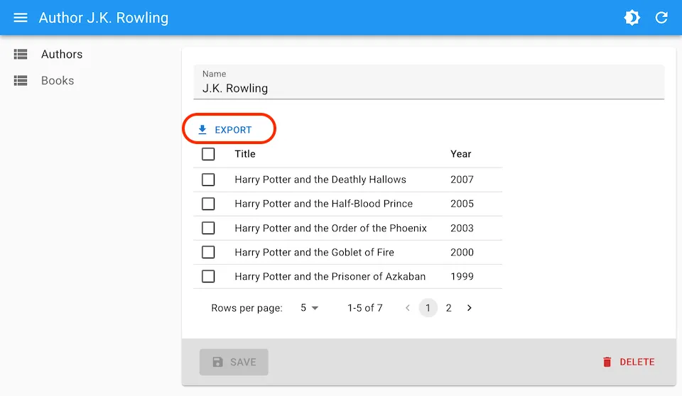
For example, here is how to use it in a <ReferenceManyField>:
const AuthorEdit = () => ( <Edit> <SimpleForm> <TextInput source="name" /> <ReferenceManyField reference="books" target="author_id" pagination={<Pagination />} perPage={5} > <ExportButton /> <DataTable> <DataTable.Col source="title" /> <DataTable.Col source="year" /> </DataTable> </ReferenceManyField> </SimpleForm> </Edit>);You can still alter the shape of the downloaded file and embed related data by passing a custom <ExportButton exporter> function, or by passing an exporter prop to the list component.
Enhanced Fallback Handling
We added error, loading, empty, and offline props to the page components (<List>, <ListBase>, <Edit>, <EditBase>, etc.) to allow you to set fallback UI for non-success states.
Here is an example with <ListBase>:
<ListBase resource="books" perPage={5} loading={<p>Loading...</p>} empty={<p>No books</p>} offline={<p>You are offline</p>} error={<p>Cannot load books.</p>}> <BookListView /></ListBase>It’s now easier to define custom fallback UI for your pages, without having to create custom content components or test for the list state in a render prop.
Smarter Guessers
Guessers let developer quickly scaffold a list or an edit form by guessing which field component to use based on the API response. For instance, if the API for products returns a shape like this:
[ { "id": 1, "name": "Office jeans", "price": 45.99, "category_id": 1, "last_update": "2023-10-01T00:00:00.000Z", "sizes": ["S", "M", "L", "XL"], }, { "id": 2, "name": "Black elegance jeans", "price": 69.99, "category_id": 1, "last_update": "2023-11-01T00:00:00.000Z", "sizes": ["S", "M", "L"], },]Then <ListGuesser> will render a DataTable with appropriate column types for each field.
React-admin 5.12 improves these guessers by adding support for arrays of strings, like the sizes field in the example above. The <ListGuesser> will use a <TextArrayField> to render this field, which is probably what you want in most cases.
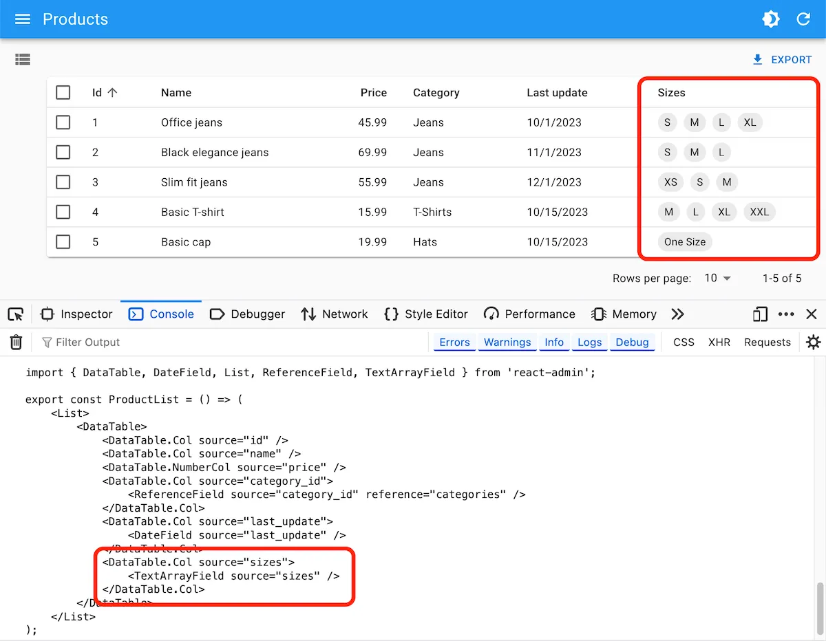
The guessers also use <TextArrayInput> for edition views.
<List> Selection State
React-admin used to share the selection state of the data tables between all lists of the same resource (e.g. “posts”). This was necessary to be able to unselect items on deletion. Most of the time, this was fine. But it prevented having multiple lists of the same resource on the same page with different selection states.
With react-admin 5.13, the selection state uses the <List storeKey> so you can have separate selections on each list. By default, the storeKey is the same as the resource name, so this change is backward compatible.
Here is an example with two lists of the same resource with different selection states:
const PostList = () => ( <div> <List storeKey="all-posts" resource="posts"> <Datagrid> <TextField source="title" /> </Datagrid> </List> <List storeKey="draft-posts" resource="posts" filter={{ status: 'draft' }}> <Datagrid> <TextField source="title" /> </Datagrid> </List> </div>);Check out the documentation for more details on the storeKey prop.
<Breadcrumb> Revamp
We’ve improved the developer experience of the <Breadcrumb> component to make it easier to customize breadcrumb items.
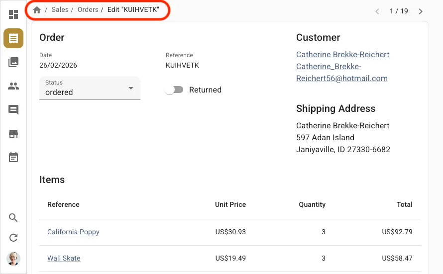
In particular, we’ve introduced new specialized components for more precise control:
<Breadcrumb.RecordItem>,<Breadcrumb.EditItem>,<Breadcrumb.ShowItem>,<Breadcrumb.ListItem>,<Breadcrumb.CreateItem>
This makes breadcrumb customization easier:
export const MyBreadcrumb = () => ( <Breadcrumb> <Breadcrumb.Item name="posts" label="Posts" to="/posts"> <Breadcrumb.Item name="edit" label={({ record }) => `Edit #${record.id}`} to={({ record }) => `/posts/${record.id}`} /> <Breadcrumb.Item name="show" label={({ record }) => `Show #${record.id}`} to={({ record }) => `/posts/${record.id}/show`} /> <Breadcrumb.Item name="create" label="Create" to="/posts/create" /> </Breadcrumb.Item> <Breadcrumb.ListItem resource="posts"> <Breadcrumb.EditItem resource="posts" /> <Breadcrumb.ShowItem resource="posts" /> <Breadcrumb.CreateItem resource="posts" /> </Breadcrumb.ListItem> </Breadcrumb>);The current record is no longer automatically injected to the breadcrumb items, so consumers must fetch it themselves when needed. This lets developers customize the metadata used to fetch the record.
import { useAppLocationMatcher } from '@react-admin/ra-navigation';import { useGetOne } from 'react-admin';
function PostBreadcrumbItem() {    const matcher = useAppLocationMatcher();    const match = matcher('posts.edit');   const data = match?.record;   const { data } = useGetOne(       'posts',       { id: match?.recordId, meta: { myMeta: true } },       { enabled: !!match }   );    if (!match) return null;    return <>Post "{data?.title}"</>;}
Dashboard detection is now automatic, and dashboard-related props (hasDashboard, dashboard) don’t have to be passed anymore.
For more details on the <Breadcrumb> Enterprise Edition component, check out the Breadcrumb documentation.
<AutoPersistInStore> Cache Eviction
<AutoPersistInStore> avoids data loss by storing unsaved form changes in local storage. Then, when users come back to the form, the component applies the unsaved changes automatically, letting users review the changes before saving.
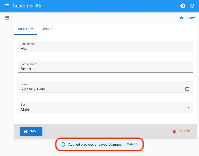
It is a replacement for the <AutoSave> component, which has several drawbacks (including the fact that autosave fails to save unsaved changes when the user closes the tab) and the warnWhenUnsavedChanged alert that many users find annoying.
However, saving data in local storage can lead to an ever-growing cache, especially for large forms. To solve this issue, we added an automated (but opt-in) cache eviction mechanism to <AutoPersistInStore>, that removes form entries older than a specified age from the local storage.
import { Edit, SimpleForm, TextInput, DateInput, SelectInput } from 'react-admin';import { AutoPersistInStore } from '@react-admin/ra-form-layout';
const CustomerEdit = () => (    <Edit>        <SimpleForm>            <TextInput source="first_name" />            <TextInput source="last_name" />            <DateInput source="born" />            <SelectInput source="sex" choices={genres} />            <AutoPersistInStore maxAge={10 * 60 * 1000 /* 10 minutes */} />        </SimpleForm>    </Edit>);
We’ve made other improvements to <AutoPersistInStore>, including the ability to specify a custom notification component, and the ability to use it outside of react-admin. The headless logic of the component is exported as a new useAutoPersistInStore hook.
See the AutoPersistInStore and useAutoPersistInStore documentation for more details.
<SimpleFormIterator> Configurable Auto-Focus
By default, <SimpleFormIterator> focuses the first input of a newly added row.
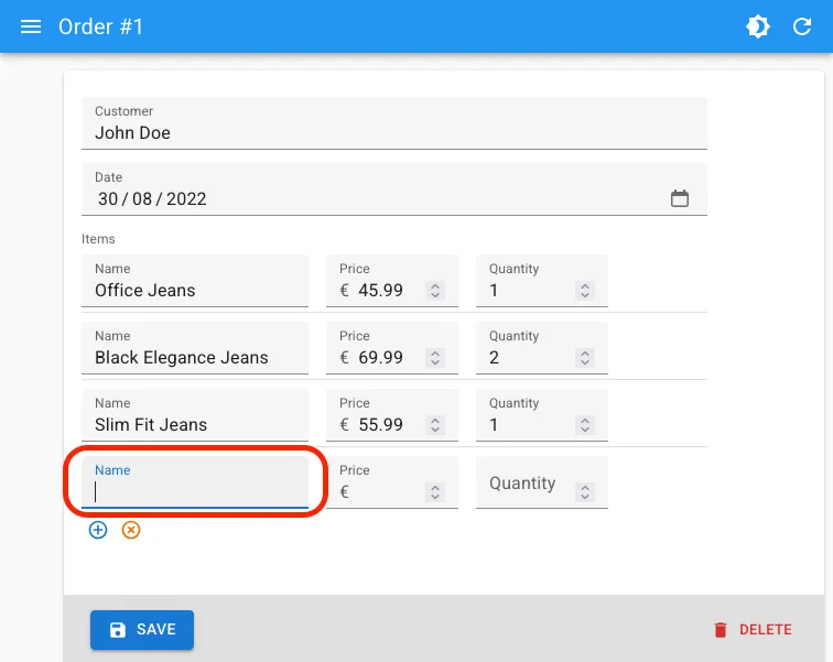
This autofocus is sometimes unnecessary, especially when the first input is a non-text input (e.g. a <ReferenceInput>), or when you want to autofocus a different input. As the default autofocus comes from react-hook-form’s useFieldArray, we had to write a custom logic to disable it.
With the new disableAutoFocus prop, introduced in react-admin 5.14, you can disable the default autofocus:
<ArrayInput source="items"> <SimpleFormIterator disableAutoFocus> <TextInput source="name" /> <NumberInput source="price" /> <NumberInput source="quantity" /> </SimpleFormIterator></ArrayInput>Router Abstraction and TanStack Router Adapter
React-admin has historically used react-router for routing. We wanted to be able to support other routers as well, but without breaking backwards compatibility. To achieve this, we created a router abstraction layer, allowing pluggable router providers.
An adapter is really tested when you can use at least two different providers, so in addition to react-router, we added support for TanStack Router in react-admin 5.14, with the new ra-router-tanstack package.
import { Admin, Resource, ListGuesser } from 'react-admin';import { tanStackRouterProvider } from 'ra-router-tanstack';import { dataProvider } from './dataProvider';
const App = () => (    <Admin        dataProvider={dataProvider}        routerProvider={tanStackRouterProvider}    >        <Resource name="posts" list={ListGuesser} />        <Resource name="comments" list={ListGuesser} />    </Admin>);
export default App;
This means you can also use react-admin with TanStack Start, in addition to Next, Vite, and React-router. We’ve even added a TanStack Start tutorial to help you get started.
For more details and advanced usage, check out the TanStack Router adapter integration documentation.
Modernized Package Exports
Since react-admin 5.13, our packages now support Node environments (SSR, RSC, etc). This means that you can now import react-admin components and hooks in server-side code without running into issues.
We’ve also reduced the target browser support to evergreen browsers (es2020 instead of es5) in react-admin 5.14. This reduces the bundle size (between 5-15%) without compromising on compatibility (as we used the lower ES version for our dependencies).
To benefit from these improvements, make sure to upgrade to react-admin 5.14 or later.
<DatagridAG> Supports ag-grid v35
The enhanced Datagrid of the <DatagridAG> component now supports ag-grid v35. This is a backwards compatible update, and it enables new features that weren’t possible before.
This includes support for validation on cell editors that use react-admin inputs.
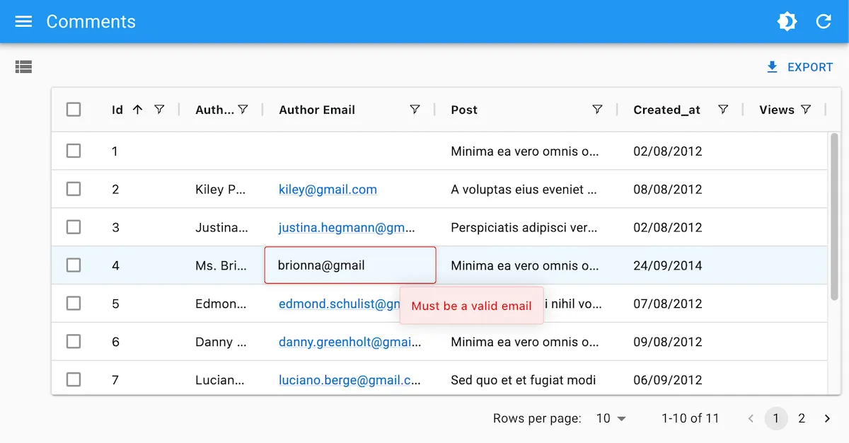
To enable this feature, use react-admin validators in the cellEditor of a field:
import { List, TextInput, ReferenceInput, AutocompleteInput, DateInput, NumberInput, required, minValue } from 'react-admin';import { DatagridAG } from '@react-admin/ra-datagrid-ag';
export const CommentList = () => {    const columnDefs = [        { field: 'id', editable: false },        { field: 'author.name' },        {            field: 'title',            cellEditor: (              <TextInput source="title" validate={required()} />            ),        },        {            field: 'post_id',            cellEditor: (                <ReferenceInput source="post_id" reference="posts">                  <AutocompleteInput validate={required()} />                </ReferenceInput>            ),        },        {            field: 'created_at',            cellRenderer: <DateField source="created_at" />,            cellEditor: <DateInput source="created_at" validate={required()} />,        },        {            field: 'views',            cellEditor: <NumberInput source="views" validate={minValue(5)} />,        },    ];    return (        <List>            <DatagridAG columnDefs={columnDefs} />        </List>    );};
<JsonSchemaForm> Now Supports rjsf v6
<JsonSchemaForm> allows you to build forms out of a JSON object, so you can dynamically build and update forms in your admin.
import { Edit } from 'react-admin';import { JsonSchemaForm } from '@react-admin/ra-json-schema-form';
const CustomerEdit = () => (    <Edit>        <JsonSchemaForm            schema={{                type: 'object',                properties: {                    id: { type: 'number' },                    first_name: { type: 'string', title: 'First name' },                    last_name: { type: 'string', minLength: 3 },                    dob: { type: 'string', format: 'date' },                    sex: { type: 'string', enum: ['male', 'female'] },                    employer_id: { type: 'number' },                    occupations: {                        type: 'array',                        items: {                            type: 'object',                            properties: {                                name: { type: 'string' },                                from: { type: 'string', format: 'date' },                                to: { type: 'string', format: 'date' },                            },                        },                    },                },                required: ['id', 'last_name', 'employer_id'],            }}            uiSchema={{                id: { 'ui:disabled': true },                employer_id: {                    'ui:widget': 'reference',                    'ui:options': {                        reference: 'employers',                        optionText: 'name',                    },                },            }}            onChange={change =>                process.env.NODE_ENV !== 'test' &&                console.log('changed', change)            }            onError={error =>                process.env.NODE_ENV !== 'test' && console.log('error', error)            }        />    </Edit>);
<JsonSchemaForm> uses the react-jsonschema-form library under the hood, and we keep it up to date with the latest version of rjsf. Rjsf v6 supports MUI v7, improves performance, introduces optional data controls, and many more changes.
Note that rjsf v6 introduced breaking changes, so make sure to check out their upgrade guide when upgrading.
<DateTimeInput> Uses MUIX v8
React-admin Enterprise Edition contains date pickers styled with Material UI .
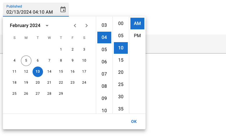
We upgraded the MUIX library used in the <DateTimeInput>, <DateInput>, and <TimeInput> components to version 8. This enables keyboard editing on mobile pickers, accessible DOM structure, clear ownerState for slots, and a new view-switching strategy (learn more in the MUI X Updates page).
The base syntax is unchanged:
import {    DateInput,    DateTimeInput,    TimeInput,} from '@react-admin/ra-form-layout';import { Edit, SimpleForm } from 'react-admin';
export const EventEdit = () => (    <Edit>        <SimpleForm>            <DateInput source="event_date" />            <TimeInput source="event_start_time" />            <DateTimeInput source="published_at" />        </SimpleForm>    </Edit>);
If you were providing a custom LocalizationProvider to either the <DateInput>, <DateTimeInput>, <TimeInput>, or <DateRangeInput> components, you will need to update the import to get the date-fns adapter.
import { AdapterDateFns } from '@mui/x-date-pickers/AdapterDateFnsV3';import { AdapterDateFns } from '@mui/x-date-pickers/AdapterDateFns';Headless Logic
As we were working on react-admin for Shadcn to reach feature parity, we realized that a lot of the logic of react-admin components could be extracted into headless hooks, which can be used to build custom components with alternative UI kits.
So we’re made ra-core, the headless logic package of react-admin, more capable out of the box. This makes ui-specific packages like ra-ui-material-ui and shadcn-admin-kit smaller and easier to maintain.
Here is a quick list of the new additions to the headless logic in ra-core:
useUpdateControllerhookuseBulkUpdateControllerhookuseBulkDeleteControllerhookuseMutationWithMutationModehookuseSupportCreateSuggestionshookuseSavedQuerieshook<ArrayInputBase>component<SimpleFormIteratorBase>component<SimpleFormIteratorItemBase>component
Check out the ra-core documentation for details on how to use these new hooks and components.
In addition, we’ve also extracted the headless logic of some Enterprise Edition packages to make them accessible in Shadcn Admin Kit. This includes:
- RBAC
- History
- Realtime Updates
- Locks
- Soft Delete
- Many-to-many Relationships
- AutopersistInStore
- BulkUpdateForm
Check out the ra-core-ee documentation for more details on the available hooks and components.
More Shadcn Admin Kit Components
During the past months, we’ve kept in mind that all our efforts should benefit both developers using Material Design and developers using Shadcn UI. So a lot has changed in Shadcn Admin Kit, which you can see in the Shadcn Admin Kit 1.5 Changelog.
There are too many changes to be listed here, and we’ll probably publish an article just for that, but here are some of the highlights:
- TanStack router support
- New
<SelectAll>button for bulk actions - New
<ImageField>component - New
<DateTimeInput>component
We’ve also made sure to keep the documentation of Shadcn Admin Kit up to date with all the new components and features, so check it out for more details and examples: https://marmelab.com/shadcn-admin-kit/.
Atomic CRM News
Did you know that we’ve published a full-featured CRM built with react-admin? It’s called Atomic CRM, and it’s open-source. It’s not a demo, it’s a real CRM that you can use in production (as we do in our own company) and modify as you wish, for free. It’s also a great way to learn how to use react-admin in practice.
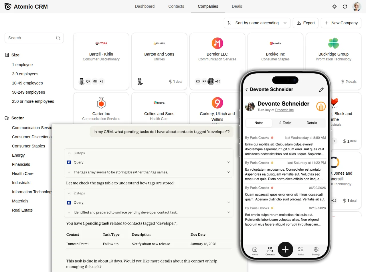
This will get its own blog post, but as an appetizer, here is a quick peek at the latest Atomic CRM news:
- SSO / SAML support
- Mobile UX with offline support
- Data import for migrating from another CRM
- Add ability to merge contacts
- Add ability to export contact to vCard
- MCP server
- Replaced MUI with shadcn-ui
- Support attachments in inbound emails
- Notes now support markdown
- Show only note summary in note list
- Add colored background to contact avatar
- Add ability to select a range of contacts
- Add ability to add OAuth apps to Atomic CRM
- Add registry to ease update
- New documentation (incl. custom fields, MCP server, etc)
- Improve agent experience (skills, agent.md, etc)
Conclusion
As each time we write these updates, we realize we should do it more often to make the article shorter. If you’ve made it this far, thank you for reading! We hope you enjoy all the new features and improvements of react-admin, and that they help you build even better admin interfaces.
See the release notes for 5.12, 5.13 and 5.14 for more details on the changes and bug fixes. You can also check out the recent releases and the Enterprise Edition changelog for more details and full changelogs.
If you have feedback or questions about these new features, please join our Discord community and share your thoughts with us!

Authors
Full-stack web developer at marmelab, loves functional programming and JavaScript.
Marmelab founder and CEO, passionate about web technologies, agile, sustainability, leadership, and open-source. Lead developer of react-admin, founder of GreenFrame.io, and regular speaker at tech conferences.