<DateInput>
Ideal for editing dates, <DateInput> renders an HTML <input type="date"> element, that most browsers display as a date picker.
The appearance of <DateInput> depends on the browser, and falls back to a text input on Safari. The date formatting in this input depends on the user’s locale.
React-admin also proposes a DateInput styled with Material UI documented at the end of this page.
Usage
import { DateInput } from 'react-admin';

<DateInput source="published_at" />
The field value must be a string with the pattern YYYY-MM-DD (ISO 8601), e.g. '2022-04-30'.
Props
<DateInput> accepts the common input props.
Validation
To validate that a date is before or after a given date, use the maxValue and minValue validators with a date string.
import { DateInput, minValue } from 'react-admin';

// requires dates after October 10th, 2022
<DateInput source="published" validate={minValue('2022-10-26')} />
Internationalization
It is not possible to customize the date format. Browsers use the user locale to display the date in the correct format.
If you need to render a UI despite the browser locale, MUI also proposes a Date Picker component, which is more customizable than the native date picker, but requires additional packages.
Material UI
React-admin Enterprise Edition
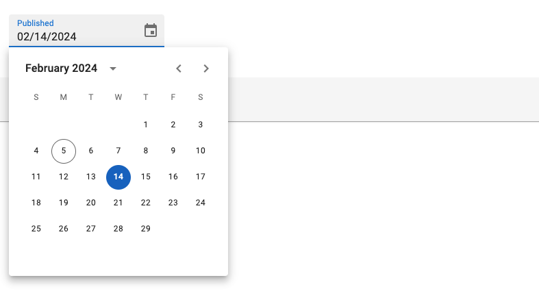
<DateInput> styled with Material UI.

This input also allows to specify the date format and the locale used. It is based on the MUI X Date/Time pickers.
Usage
import { DateInput } from '@react-admin/ra-form-layout';
import { Edit, SimpleForm } from 'react-admin';

export const EventEdit = () => (
    <Edit>
        <SimpleForm>
            <DateInput source="event_date" />
        </SimpleForm>
    </Edit>
);
<DateInput> will accept either a Date object or any string that can be parsed into a Date as value. It will return a Date object, or null if the date is invalid.
Tip: You can use the parse prop to change the format of the returned value. See Parsing the date/time as an ISO string for an example.
Props
| Prop | Required | Type | Default | Description |
|---|---|---|---|---|
fullWidth |
- | boolean | true |
If false, the input will not expand to fill the form width |
helperText |
- | string | - | Text to be displayed under the input |
mask |
- | string | - | Alias for the MUI format prop. Format of the date/time when rendered in the input. Defaults to localized format. |
parse |
- | Function | value => value === '' ? null : value |
Callback taking the input value, and returning the value you want stored in the form state. |
validate |
- | Function or Array | - | Validation rules for the input. See the Validation Documentation for details. |
Except for the format prop (renamed mask), <DateInput> accepts the same props as the MUI X Date/Time pickers. They also accept the common input props.
Providing your own LocalizationProvider
MUI X Pickers need to be wrapped in a LocalizationProvider to work properly. <DateInput> already includes a default <LocalizationProvider> using the date-fns adapter and the enUS locale.
You can change the locale and the date format globally by wrapping the <Admin> with your own <LocalizationProvider>.
Here is how to set up the pickers to use the fr locale:
import { Admin, Resource } from 'react-admin';
import { LocalizationProvider } from '@mui/x-date-pickers';
import { AdapterDateFns } from '@mui/x-date-pickers/AdapterDateFns';
import { fr } from 'date-fns/locale';
import { EventEdit } from './events';

export const App = () => (
    <LocalizationProvider dateAdapter={AdapterDateFns} adapterLocale={fr}>
        <Admin>
            <Resource name="events" edit={EventEdit} />
        </Admin>
    </LocalizationProvider>
);
Note: React Admin only supports the date-fns adapter for now.
Parsing the date/time as an ISO string
By default, <DateInput> stores the date/time as a Date object in the form state. If you wish to store the date/time as an ISO string instead (or any other format), you can use the parse prop.
<DateInput
    source="published"
    parse={(date: Date) => (date ? date.toISOString() : null)}
/>
