
<Admin>
The <Admin> component is the root component of a react-admin app. It allows to configure the application adapters, routes, and UI.
<Admin> creates a series of context providers to allow its children to access the app configuration. It renders the main routes and layout. It delegates the rendering of the content area to its <Resource> children.
Usage
<Admin> requires only a dataProvider prop, and at least one child <Resource> to work. Here is the most basic example:
// in src/App.js
import { Admin, Resource } from 'react-admin';
import simpleRestProvider from 'ra-data-simple-rest';

import { PostList } from './posts';

const App = () => (
    <Admin dataProvider={simpleRestProvider('http://path.to.my.api')}>
        <Resource name="posts" list={PostList} />
    </Admin>
);

export default App;
<Admin> children can be <Resource> and <CustomRoutes> elements.
In most apps, you need to pass more props to <Admin>. Here is a more complete example taken from the e-commerce demo:
// in src/App.js
import { Admin, Resource, CustomRoutes } from 'react-admin';
import { Route } from "react-router-dom";

import { dataProvider, authProvider, i18nProvider } from './providers';
import { Layout } from './layout';
import { Dashboard } from './dashboard';
import { Login } from './login';
import { lightTheme, darkTheme } from './themes';
import { CustomerList, CustomerEdit } from './customers';
import { OrderList, OrderEdit } from './orders';
import { InvoiceList, InvoiceEdit } from './invoices';
import { ProductList, ProductEdit, ProductCreate } from './products';
import { CategoryList, CategoryEdit, CategoryCreate } from './categories';
import { ReviewList } from './reviews';
import { Segments } from './segments';

const App = () => (
    <Admin
        dataProvider={dataProvider}
        authProvider={authProvider}
        i18nProvider={i18nProvider}
        layout={Layout}
        dashboard={Dashboard}
        loginPage={Login}
        theme={lightTheme}
        darkTheme={darkTheme}
        defaultTheme="light"
    >
        <Resource name="customers" list={CustomerList} edit={CustomerEdit} />
        <Resource name="orders" list={OrderList} edit={OrderEdit} options={{ label: 'Orders' }} />
        <Resource name="invoices" list={InvoiceList} edit={InvoiceEdit} />
        <Resource name="products" list={ProductList} edit={ProductEdit} create={ProductCreate} />
        <Resource name="categories" list={CategoryList} edit={CategoryEdit} create={CategoryCreate} />
        <Resource name="reviews" list={ReviewList} />
        <CustomRoutes>
            <Route path="/segments" element={<Segments />} />
        </CustomRoutes>
    </Admin>
);
To make the main app component more concise, a good practice is to move the resources props to separate files. For instance, the previous example can be rewritten as:
// in src/App.js
import { Admin, Resource, CustomRoutes } from 'react-admin';
import { Route } from "react-router-dom";

import { dataProvider, authProvider, i18nProvider } from './providers';
import { Layout } from './layout';
import { Dashboard } from './dashboard';
import { Login } from './login';
import { lightTheme, darkTheme } from './themes';
import customers from './customers';
import orders from './orders';
import invoices from './invoices';
import products from './products';
import categories from './categories';
import reviews from './reviews';
import { Segments } from './segments';


const App = () => (
    <Admin
        dataProvider={dataProvider}
        authProvider={authProvider}
        i18nProvider={i18nProvider}
        dashboard={Dashboard}
        loginPage={Login}
        layout={Layout}
        theme={lightTheme}
        darkTheme={darkTheme}
        defaultTheme="light"
    >
        <Resource {...customers} />
        <Resource {...orders} />
        <Resource {...invoices} />
        <Resource {...products} />
        <Resource {...categories} />
        <Resource {...reviews} />
        <CustomRoutes>
            <Route path="/segments" element={<Segments />} />
        </CustomRoutes>
    </Admin>
);
Props
Three main props lets you configure the core features of the <Admin> component:
dataProviderfor data fetchingauthProviderfor security and permissionsi18nProviderfor translations and internationalization
Here are all the props accepted by the component:
| Prop | Required | Type | Default | Description |
|---|---|---|---|---|
dataProvider |
Required | DataProvider |
- | The data provider for fetching resources |
children |
Required | ReactNode |
- | The routes to render |
authCallbackPage |
Optional | Component |
AuthCallback |
The content of the authentication callback page |
authProvider |
Optional | AuthProvider |
- | The authentication provider for security and permissions |
basename |
Optional | string |
- | The base path for all URLs |
catchAll |
Optional | Component |
NotFound |
The fallback component for unknown routes |
dashboard |
Optional | Component |
- | The content of the dashboard page |
darkTheme |
Optional | object |
default DarkTheme |
The dark theme configuration |
defaultTheme |
Optional | boolean |
false |
Flag to default to the light theme |
disableTelemetry |
Optional | boolean |
false |
Set to true to disable telemetry collection |
error |
Optional | Component |
- | A React component rendered in the content area in case of error |
i18nProvider |
Optional | I18NProvider |
- | The internationalization provider for translations |
layout |
Optional | Component |
Layout |
The content of the layout |
loginPage |
Optional | Component |
LoginPage |
The content of the login page |
notification |
Optional | Component |
Notification |
The notification component |
queryClient |
Optional | QueryClient |
- | The react-query client |
ready |
Optional | Component |
Ready |
The content of the ready page |
requireAuth |
Optional | boolean |
false |
Flag to require authentication for all routes |
store |
Optional | Store |
- | The Store for managing user preferences |
theme |
Optional | object |
default LightTheme |
The main (light) theme configuration |
title |
Optional | string |
- | The error page title |
dataProvider
dataProvider is the only required prop. It must be an object allowing to communicate with the API. React-admin uses the data provider everywhere it needs to fetch or save data.
In many cases, you won’t have to write a data provider, as one of the 50+ existing data providers will probably fit your needs. For instance, if your API is REST-based, you can use the Simple REST Data Provider as follows:
// in src/App.js
import simpleRestProvider from 'ra-data-simple-rest';
import { Admin, Resource } from 'react-admin';

import { PostList } from './posts';

const dataProvider = simpleRestProvider('http://path.to.my.api/');

const App = () => (
    <Admin dataProvider={dataProvider}>
        <Resource name="posts" list={PostList} />
    </Admin>
);
If you need to write your own, the data provider must have the following methods, all returning a promise:
const dataProvider = {
    getList:    (resource, params) => Promise.resolve(),
    getOne:     (resource, params) => Promise.resolve(),
    getMany:    (resource, params) => Promise.resolve(),
    getManyReference: (resource, params) => Promise.resolve(),
    create:     (resource, params) => Promise.resolve(),
    update:     (resource, params) => Promise.resolve(),
    updateMany: (resource, params) => Promise.resolve(),
    delete:     (resource, params) => Promise.resolve(),
    deleteMany: (resource, params) => Promise.resolve(),
}
Check the Writing a Data Provider chapter for detailed instructions on how to write a data provider for your API.
The dataProvider is also the ideal place to add custom HTTP headers, handle file uploads, map resource names to API endpoints, pass credentials to the API, put business logic, reformat API errors, etc. Check the Data Provider documentation for more details.
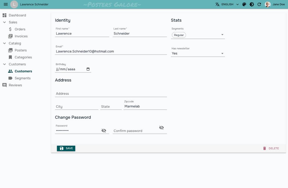
children
The <Admin> component expects to receive <Resource> and <CustomRoutes> elements as children. They define the routes of the application.
For instance:
const App = () => (
    <Admin dataProvider={dataProvider} dashboard={Dashboard}>
        <Resource name="customers" list={CustomerList} edit={CustomerEdit} />
        <Resource name="orders" list={OrderList} edit={OrderEdit} options={{ label: 'Orders' }} />
        <Resource name="invoices" list={InvoiceList} />
        <Resource name="products" list={ProductList} edit={ProductEdit} create={ProductCreate} />
        <Resource name="categories" list={CategoryList} edit={CategoryEdit} create={CategoryCreate} />
        <Resource name="reviews" list={ReviewList} />
        <CustomRoutes>
            <Route path="/segments" element={<Segments />} />
        </CustomRoutes>
    </Admin>
);
With these children, the <Admin> component will generate the following routes:
/: the dashboard/customers: the customer list/customers/:id: the customer edit page/orders: the order list/orders/:id: the order edit page/invoices: the invoice list/products: the product list/products/create: the product creation page/products/:id: the product edit page/categories: the category list/categories/create: the category creation page/categories/:id: the category edit page/reviews: the review list/segments: the segments page
authCallbackPage
React-admin apps contain a special route called /auth-callback to let external authentication providers (like Auth0, Cognito, OIDC servers) redirect users after login. This route renders the AuthCallback component by default, which in turn calls authProvider.handleCallback().
If you need a different behavior for this route, you can render a custom component by passing it as the authCallbackPage prop.
import { Admin } from 'react-admin';
import { dataProvider } from './dataProvider';
import { authProvider } from './authProvider';
import MyAuthCallbackPage from './MyAuthCallbackPage';

const App = () => (
    <Admin
        authCallbackPage={MyAuthCallbackPage}
        authProvider={authProvider}
        dataProvider={dataProvider}
    >
        ...
    </Admin>
);
Note: You should seldom use this option, even when using an external authentication provider. Since you can already define the /auth-callback route controller via authProvider.handleCallback(), the authCallbackPage prop is only useful when you need the user’s feedback after they logged in.
You can also disable the /auth-callback route altogether by passing authCallbackPage={false}.
See The Authentication documentation for more details.
authProvider
The authProvider is responsible for managing authentication and permissions, usually based on an authentication backend. React-admin uses it to check for authentication status, redirect to the login page when the user is not authenticated, check for permissions, display the user identity, and more.
If you use a standard authentication strategy, you can use one of the existing auth providers. For instance, to use Auth0, you can use ra-auth-auth0:
// in src/App.tsx
import React, { useEffect, useRef, useState } from 'react';
import { Admin, Resource } from 'react-admin';
import { Auth0AuthProvider } from 'ra-auth-auth0';
import { Auth0Client } from '@auth0/auth0-spa-js';
import dataProvider from './dataProvider';
import posts from './posts';

const auth0 = new Auth0Client({
    domain: import.meta.env.VITE_AUTH0_DOMAIN,
    clientId: import.meta.env.VITE_AUTH0_CLIENT_ID,
    cacheLocation: 'localstorage',
    authorizationParams: {
        audience: import.meta.env.VITE_AUTH0_AUDIENCE,
    },
});

const authProvider = Auth0AuthProvider(auth0, {
    loginRedirectUri: import.meta.env.VITE_LOGIN_REDIRECT_URL,
    logoutRedirectUri: import.meta.env.VITE_LOGOUT_REDIRECT_URL,
});

const App = () => {
    return (
        <Admin
            authProvider={authProvider}
            dataProvider={dataProvider}
        >
            <Resource name="posts" {...posts} />
        </Admin>
    );
};
export default App;
If your authentication backend isn’t supported, you’ll have to write your own authProvider. It’s an object with 6 methods, each returning a Promise:
const authProvider = {
    login: params => Promise.resolve(),
    logout: params => Promise.resolve(),
    checkAuth: params => Promise.resolve(),
    checkError: error => Promise.resolve(),
    getIdentity: params => Promise.resolve(),
    getPermissions: params => Promise.resolve(),
};

const App = () => (
    <Admin authProvider={authProvider} dataProvider={simpleRestProvider('http://path.to.my.api')}>
        ...
    </Admin>
);
The Auth Provider also lets you configure redirections after login/logout, anonymous access, refresh tokens, roles and user groups. The Auth Provider documentation explains how to implement these functions in detail.
basename
Use this prop to make all routes and links in your Admin relative to a “base” portion of the URL pathname that they all share. This is required when using the BrowserRouter to serve the application under a sub-path of your domain (for example https://marmelab.com/ra-enterprise-demo), or when embedding react-admin inside a single-page app with its own routing.
import { BrowserRouter, Routes, Route } from 'react-router-dom';
import { StoreFront } from './StoreFront';
import { StoreAdmin } from './StoreAdmin';

export const App = () => (
    <BrowserRouter>
        <Routes>
            <Route path="/" element={<StoreFront />} />
            <Route path="/admin/*" element={<StoreAdmin />} />
        </Routes>
    </BrowserRouter>
);
React-admin will have to prefix all the internal links with /admin. Use the <Admin basename> prop for that:
// in src/StoreAdmin.js
import { Admin, Resource } from 'react-admin';

export const StoreAdmin = () => (
    <Admin basename="/admin" dataProvider={...}>
        <Resource name="posts" {...posts} />
    </Admin>
);
See Using React-Admin In A Sub Path for more usage examples.
catchAll
When users type URLs that don’t match any of the children <Resource> components, they see a default “Not Found” page.
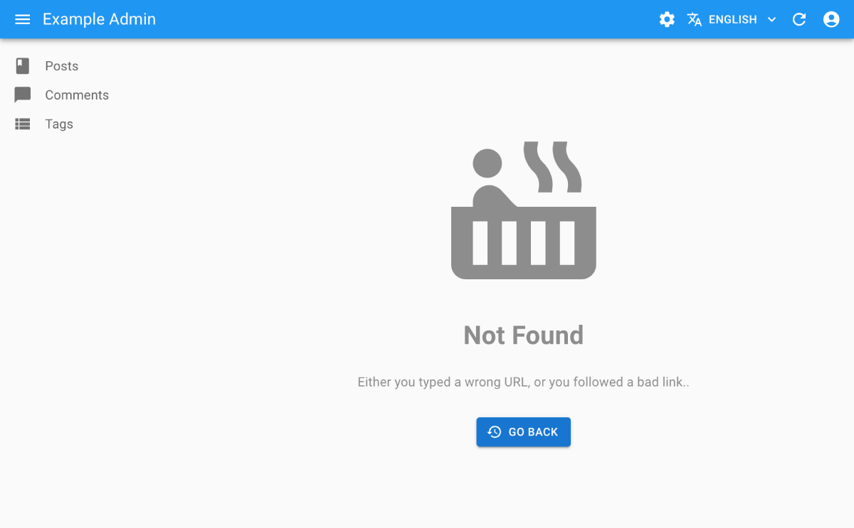
You can customize this page to use the component of your choice by passing it as the catchAll prop. To fit in the general design, use Material UI’s <Card> component, and react-admin’s <Title> component:
// in src/NotFound.js
import * as React from "react";
import Card from '@mui/material/Card';
import CardContent from '@mui/material/CardContent';
import { Title } from 'react-admin';

export default () => (
    <Card>
        <Title title="Not Found" />
        <CardContent>
            <h1>404: Page not found</h1>
        </CardContent>
    </Card>
);
// in src/App.js
import * as React from "react";
import { Admin } from 'react-admin';
import simpleRestProvider from 'ra-data-simple-rest';

import NotFound from './NotFound';

const App = () => (
    <Admin catchAll={NotFound} dataProvider={simpleRestProvider('http://path.to.my.api')}>
        // ...
    </Admin>
);
Tip: If your custom catchAll component contains react-router <Route> components, this allows you to register new routes displayed within the react-admin layout easily. Note that these routes will match after all the react-admin resource routes have been tested. To add custom routes before the react-admin ones, and therefore override the default resource routes, see the custom pages section instead.
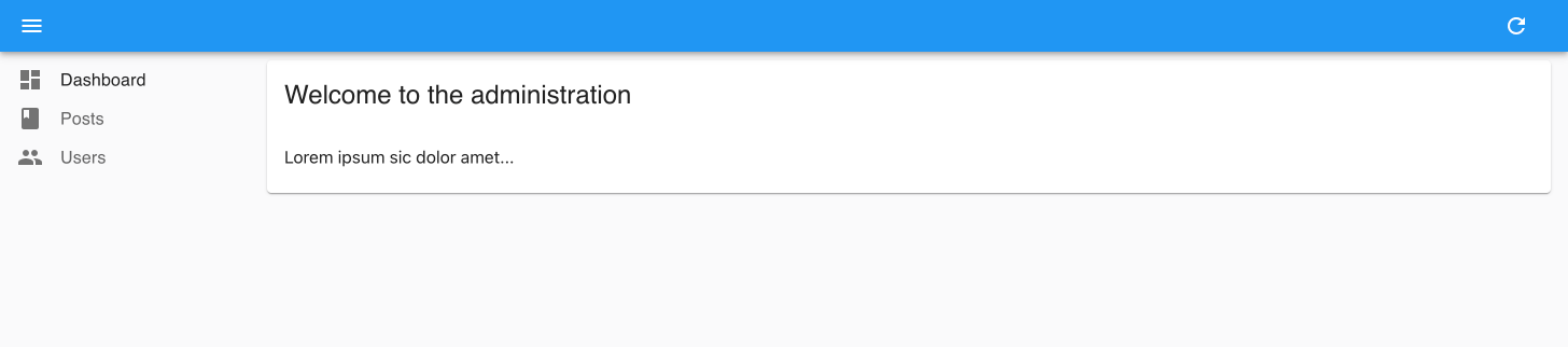
dashboard
By default, the homepage of an admin app is the list of the first child <Resource>. But you can also specify a custom component instead. To fit in the general design, use Material UI’s <Card> component, and react-admin’s <Title> component to set the title in the AppBar:
// in src/Dashboard.js
import * as React from "react";
import Card from '@mui/material/Card';
import CardContent from '@mui/material/CardContent';
import { Title } from 'react-admin';

export const Dashboard = () => (
    <Card>
        <Title title="Welcome to the administration" />
        <CardContent>Lorem ipsum sic dolor amet...</CardContent>
    </Card>
);
// in src/App.js
import * as React from "react";
import { Admin } from 'react-admin';
import simpleRestProvider from 'ra-data-simple-rest';

import { Dashboard } from './Dashboard';

const App = () => (
    <Admin dashboard={Dashboard} dataProvider={simpleRestProvider('http://path.to.my.api')}>
        // ...
    </Admin>
);
The dashboard page requires users to be authenticated and will redirect anonymous users to the login page. If you want to allow anonymous access to the dashboard, edit your authProvider to add an exception to the checkAuth method, as follows:
const authProvider = {
    // ...
    checkAuth: (params) => {
+       if (params?.route === 'dashboard') return Promise.resolve();
        // ...
    },
}
darkTheme
React-admin provides a built-in dark theme. The app will use the darkTheme by default for users who prefer the dark mode at the OS level, and users will be able to switch from light to dark mode using the <ToggleThemeButton> component.
If you want to override it, you can provide your own darkTheme in addition to the theme prop:
import { Admin } from 'react-admin';
import { dataProvider } from './dataProvider';
import { myDarkTheme } from './themes';

const App = () => (
    <Admin
        dataProvider={dataProvider}
        darkTheme={myDarkTheme}
    >
        ...
    </Admin>
);
If you want to remove the user’s ability to switch to dark theme, you can set darkTheme to null, therefore the <ToggleThemeButton> component won’t be shown:
import { Admin } from 'react-admin';
import { dataProvider } from './dataProvider';

const App = () => (
    <Admin
        dataProvider={dataProvider}
        darkTheme={null}
    >
        ...
    </Admin>
);
If the theme prop is provided and the darkTheme prop is not, the dark theme is disabled.
Tip: To disable OS preference detection and always use one theme by default, see the defaultTheme prop.
defaultTheme
If you provide both a lightTheme and a darkTheme, react-admin will choose the default theme to use for each user based on their OS preference. This means that users using dark mode will see the dark theme by default. Users can then switch to the other theme using the <ToggleThemeButton> component.
If you prefer to always default to the light or the dark theme regardless of the user’s OS preference, you can set the defaultTheme prop to either light or dark:
import { Admin } from 'react-admin';

const App = () => (
    <Admin
        dataProvider={dataProvider}
        theme={lightTheme}
        darkTheme={darkTheme}
        defaultTheme="light"
    >
        ...
    </Admin>
);
disableTelemetry
In production, react-admin applications send an anonymous request on mount to a telemetry server operated by marmelab. You can see this request by looking at the Network tab of your browser DevTools:
https://react-admin-telemetry.marmelab.com/react-admin-telemetry
The only data sent to the telemetry server is the admin domain (e.g. “example.com”) - no personal data is ever sent, and no cookie is included in the response. The react-admin team uses these domains to track the usage of the framework.
You can opt out of telemetry by simply adding disableTelemetry to the <Admin> component:
// in src/App.js
import { Admin } from 'react-admin';
import { dataProvider } from './dataProvider';

const App = () => (
    <Admin disableTelemetry dataProvider={dataProvider}>
        // ...
    </Admin>
);
error
React-admin uses React’s Error Boundaries to render a user-friendly error page in case of client-side JavaScript error, using an internal component called <Error>. In production mode, it only displays a generic error message. In development mode, this error page contains the error message and stack trace.
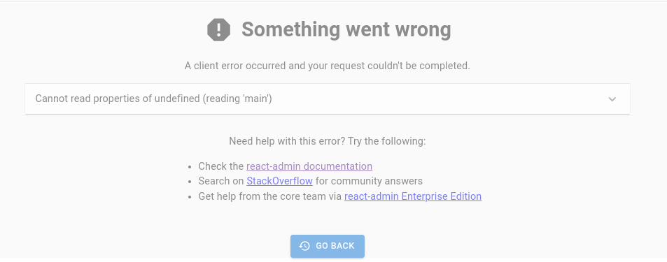
If you want to customize this error page (e.g. to log the error in a monitoring service), create your own error component, set it as the <Admin error> prop, as follows:
// in src/App.js
import { Admin } from 'react-admin';
import { MyError } from './MyError';

export const MyLayout = ({ children }) => (
    <Admin error={MyError}>
        {children}
    </Admin>
);
React-admin relies on the react-error-boundary package for handling error boundaries. So your custom error component will receive the error, the error info, and a resetErrorBoundary function as props. You should call resetErrorBoundary upon navigation to remove the error screen.
Here is an example of a custom error component:
// in src/MyError.js
import Button from '@mui/material/Button';
import { useResetErrorBoundaryOnLocationChange } from 'react-admin';

export const MyError = ({
    error,
    resetErrorBoundary,
    errorInfo,
}) => {
    useResetErrorBoundaryOnLocationChange(errorBoundary);

    return (
        <div>
            <h1>Something Went Wrong </h1>
            <div>A client error occurred and your request couldn't be completed.</div>
            {process.env.NODE_ENV !== 'production' && (
                <details>
                    <h2>{error.message}</h2>
                    {errorInfo.componentStack}
                </details>
            )}
            <div>
                <Button onClick={() => history.go(-1)}>
                    Back
                </Button>
            </div>
        </div>
    );
};
Tip: React-admin uses the default <Error> component as error boundary twice: once in <Admin> for errors happening in the layout, and once in <Layout> for error happening in CRUD views. The reason is that <Layout> renders the navigation menu, giving more possibilities to the user after an error. If you want to customize the error page in the entire app, you should also pass your custom error component to the <Layout error> prop. See the Layout error prop documentation for more details.
i18nProvider
The i18nProvider props let you translate the GUI. For instance, to switch the UI to French instead of the default English:
// in src/i18nProvider.js
import polyglotI18nProvider from 'ra-i18n-polyglot';
import fr from 'ra-language-french';

export const i18nProvider = polyglotI18nProvider(() => fr, 'fr');

// in src/App.js
import { i18nProvider } from './i18nProvider';

const App = () => (
    <Admin
        dataProvider={dataProvider}
        i18nProvider={i18nProvider}
    >
        {/* ... */}
    </Admin>
);
The Translation Documentation details this process.
layout
If you want to deeply customize the app header, the menu, or the notifications, the best way is to provide a custom layout component.
React-admin offers predefined layouts for you to use:
<Layout>: The default layout. It renders a top app bar and the navigation menu in a sidebar.<ContainerLayout>is centered layout with horizontal navigation.<SolarLayout>is a layout with a small icon sidebar, no top bar, and a full-width content area.
For instance, here is how to replace the default Layout with the ContainerLayout:
import { Admin } from 'react-admin';
import { ContainerLayout } from '@react-admin/ra-navigation';

export const App = () => (
    <Admin dataProvider={dataProvider} layout={ContainerLayout}>
        // ...
    </Admin>
);
Layout components can be customized via props. For instance, you can pass a custom menu prop to <Layout> to override the default menu:
// in src/MyLayout.js
import type { ReactNode } from 'react';
import { Layout } from 'react-admin';
import MyMenu from './MyMenu';

export const MyLayout = ({ children }: { children: ReactNode }) => (
    <Layout menu={MyMenu}>
        {children}
    </Layout>
);
Then, pass it to the <Admin> component as the layout prop:
// in src/App.js
import { Admin } from 'react-admin';
import { MyLayout } from './MyLayout';

const App = () => (
    <Admin dataProvider={dataProvider} layout={MyLayout}>
        // ...
    </Admin>
);
Refer to each layout component documentation to understand the props it accepts.
Finally, you can also pass a custom component as the layout prop. Your custom layout will receive the page content as children, so it should render it somewhere.
// in src/MyLayout.js
import type { ReactNode } from 'react';
export const MyLayout = ({ children }: { children: ReactNode }) => (
    <div>
        <h1>My App</h1>
        <main>{children}</main>
    </div>
);

// in src/App.js
import { Admin } from 'react-admin';
import { dataProvider } from './dataProvider';
import { MyLayout } from './MyLayout';

const App = () => (
    <Admin dataProvider={dataProvider} layout={MyLayout}>
        // ...
    </Admin>
);
Check the custom layout documentation for examples, and use the default <Layout> as a starting point.
loginPage
If you want to customize the Login page, or switch to another authentication strategy than a username/password form, pass a component of your own as the loginPage prop. React-admin will display this component whenever the /login route is called.
import { Admin } from 'react-admin';
import { dataProvider } from './dataProvider';
import { authProvider } from './authProvider';
import MyLoginPage from './MyLoginPage';

const App = () => (
    <Admin
        loginPage={MyLoginPage}
        authProvider={authProvider}
        dataProvider={dataProvider}
    >
        ...
    </Admin>
);
See The Authentication documentation for more details.
You can also disable the /login route completely by passing false to this prop. In this case, it’s the authProvider’s responsibility to redirect unauthenticated users to a custom login page, by returning a redirectTo field in response to checkAuth (see authProvider.checkAuth() for details). If you fail to customize the redirection, the app will end up in an infinite loop.
const authProvider = {
    // ...
    async checkAuth() {
        // ...
        if (!authenticated) {
            throw { redirectTo: '/no-access' };
        }
    },
};

const App = () => (
    <Admin authProvider={authProvider} loginPage={false}>
        ...
    </Admin>
);
notification
You can override the notification component, for instance to change the notification duration. A common use case is to change the autoHideDuration, and force the notification to remain on screen longer than the default 4 seconds. For instance, to create a custom Notification component with a 5 seconds default:
// in src/MyNotification.js
import { Notification } from 'react-admin';

const MyNotification = () => <Notification autoHideDuration={5000} />;

export default MyNotification;
To use this custom notification component, pass it to the <Admin> component as the notification prop:
// in src/App.js
import MyNotification from './MyNotification';
import dataProvider from './dataProvider';

const App = () => (
    <Admin notification={MyNotification} dataProvider={dataProvider}>
        // ...
    </Admin>
);
queryClient
React-admin uses React Query to fetch, cache and update data. Internally, the <Admin> component creates a react-query QueryClient on mount, using react-query’s “aggressive but sane” defaults:
- Queries consider cached data as stale
- Stale queries are refetched automatically in the background when:
- New instances of the query mount
- The window is refocused
- The network is reconnected
- The query is optionally configured with a refetch interval
- Query results that are no longer used in the current page are labeled as “inactive” and remain in the cache in case they are used again at a later time.
- By default, “inactive” queries are garbage collected after 5 minutes.
- Queries that fail are silently retried 3 times, with exponential backoff delay before capturing and displaying an error to the UI.
- Query results by default are structurally shared to detect if data have actually changed and if not, the data reference remains unchanged to better help with value stabilization in regard to
useMemoanduseCallback.
If you want to override the react-query default query and mutation default options, or use a specific client or mutation cache, you can create your own QueryClient instance and pass it to the <Admin queryClient> prop:
import { Admin } from 'react-admin';
import { QueryClient } from '@tanstack/react-query';
import { dataProvider } from './dataProvider';

const queryClient = new QueryClient({
    defaultOptions: {
        queries: {
            retry: false,
            structuralSharing: false,
        },
        mutations: {
            retryDelay: 10000,
        },
    },
});

const App = () => (
    <Admin queryClient={queryClient} dataProvider={dataProvider}>
        ...
    </Admin>
);
To know which options you can pass to the QueryClient constructor, check the react-query documentation and the query options and mutation options sections.
The common settings that react-admin developers often overwrite are:
import { QueryClient } from '@tanstack/react-query';

const queryClient = new QueryClient({
    defaultOptions: {
        queries: {
            /**
             * The time in milliseconds after data is considered stale.
             * If set to `Infinity`, the data will never be considered stale.
             */
            staleTime: 10000,
            /**
             * If `false`, failed queries will not retry by default.
             * If `true`, failed queries will retry infinitely., failureCount: num
             * If set to an integer number, e.g. 3, failed queries will retry until the failed query count meets that number.
             * If set to a function `(failureCount, error) => boolean` failed queries will retry until the function returns false.
             */
            retry: false,
            /**
             * If set to `true`, the query will refetch on window focus if the data is stale.
             * If set to `false`, the query will not refetch on window focus.
             * If set to `'always'`, the query will always refetch on window focus.
             * If set to a function, the function will be executed with the latest data and query to compute the value.
             * Defaults to `true`.
             */
            refetchOnWindowFocus: false,
        },
    },
});
ready
When you run an <Admin> with no child <Resource> nor <CustomRoutes>, react-admin displays a “ready” screen:
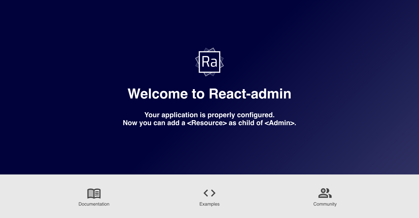
You can replace that “ready” screen by passing a custom component as the ready prop:
import * as React from 'react';
import { Admin } from 'react-admin';

const Ready = () => (
    <div>
        <h1>Admin ready</h1>
        <p>You can now add resources</p>
    </div>
)

const App = () => (
    <Admin ready={Ready}>
        ...
    </Admin>
);
requireAuth
Some pages in react-admin apps may allow anonymous access. For that reason, react-admin starts rendering the page layout before knowing if the user is logged in. If all the pages require authentication, this default behaviour creates an unwanted “flash of UI” for users who never logged in, before the authProvider redirects them to the login page.
If you know your app will never accept anonymous access, you can force the app to wait for the authProvider.checkAuth() to resolve before rendering the page layout, by setting the <Admin requireAuth> prop.
import { Admin } from 'react-admin';
import { dataProvider } from './dataProvider';
import { authProvider } from './authProvider';

const App = () => (
    <Admin
        requireAuth
        authProvider={authProvider}
        dataProvider={dataProvider}
    >
        ...
    </Admin>
);
store
The <Admin> component initializes a Store for user preferences using localStorage as the storage engine. You can override this by passing a custom store prop.
Built-in stores are:
memoryStore: stores data in memorylocalStorageStore: stores data inlocalStorage
For instance, you can store the user preferences in memory, e.g. for tests, or for apps that should not persist user data between sessions:
import { Admin, Resource, memoryStore } from 'react-admin';

const App = () => (
    <Admin dataProvider={dataProvider} store={memoryStore()}>
        <Resource name="posts" />
    </Admin>
);
Check the Preferences documentation for more details.
theme
Material UI supports theming. This lets you customize the look and feel of an admin by overriding fonts, colors, and spacing. You can provide a custom Material UI theme by using the theme prop.
React-admin comes with 4 built-in themes: Default, Nano, Radiant, and House. The e-commerce demo contains a theme switcher, so you can test them in a real application.
For instance, to use the Nano theme instead of the default theme:
import { Admin, nanoLightTheme } from 'react-admin';
import { dataProvider } from './dataProvider';

const App = () => (
    <Admin theme={nanoLightTheme} dataProvider={dataProvider}>
        // ...
    </Admin>
);
You can also write your own theme to fit your company branding. For more details on predefined and custom themes, refer to the Application Theme chapter.
React-admin provides a built-in dark theme by default. If you want to override it, check out the <Admin darkTheme> prop.
title
On error pages, the header of an admin app uses ‘React Admin’ as the main app title. Use the title to customize it.
const App = () => (
    <Admin title="My Custom Admin" dataProvider={simpleRestProvider('http://path.to.my.api')}>
        // ...
    </Admin>
);
If you need to display this application title somewhere in your app, use the useDefaultTitle hook:
import { useDefaultTitle } from 'react-admin';

const MyTitle = () => {
    const defaultTitle = useDefaultTitle();
    return <span>{defaultTitle}</span>; // My Custom Admin
};
Adding Custom Pages
The children prop of the <Admin> component define the routes of the application.
In addition to <Resource> elements for CRUD pages, you can use the <CustomRoutes> component to do add custom routes.
// in src/App.js
import * as React from "react";
import { Route } from 'react-router-dom';
import { Admin, Resource, CustomRoutes } from 'react-admin';
import posts from './posts';
import comments from './comments';
import Settings from './Settings';
import Profile from './Profile';

const App = () => (
    <Admin dataProvider={simpleRestProvider('http://path.to.my.api')}>
        <Resource name="posts" {...posts} />
        <Resource name="comments" {...comments} />
        <CustomRoutes>
            <Route path="/settings" element={<Settings />} />
            <Route path="/profile" element={<Profile />} />
        </CustomRoutes>
    </Admin>
);

export default App;
Using A Custom Router
React-admin uses the react-router library to handle routing, with a HashRouter. This means that the hash portion of the URL (i.e. #/posts/123 in the example) contains the main application route. This strategy has the benefit of working without a server, and with legacy web browsers.
But you may want to use another routing strategy, e.g. to allow server-side rendering of individual pages. React-router offers various Router components to implement such routing strategies. If you want to use a different router, simply wrap it around your app. React-admin will detect that it’s already inside a router, and skip its own router.
import { BrowserRouter } from 'react-router-dom';
import { Admin, Resource } from 'react-admin';
import { dataProvider } from './dataProvider';

const App = () => (
    <BrowserRouter>
        <Admin dataProvider={dataProvider}>
            <Resource name="posts" />
        </Admin>
    </BrowserRouter>
);
Using React-Admin In A Sub Path
React-admin links are absolute (e.g. /posts/123/show). If you serve your admin from a sub path (e.g. /admin), react-admin works seamlessly as it only appends a hash (URLs will look like /admin#/posts/123/show).
However, if you serve your admin from a sub path AND use another Router (like <BrowserRouter> for instance), you need to set the <Admin basename> prop, so that react-admin routes include the basename in all links (e.g. /admin/posts/123/show).
import { Admin, Resource } from 'react-admin';
import { BrowserRouter } from 'react-router-dom';
import { dataProvider } from './dataProvider';

const App = () => (
    <BrowserRouter>
        <Admin basename="/admin" dataProvider={dataProvider}>
            <Resource name="posts" />
        </Admin>
    </BrowserRouter>
);
This makes all links be prefixed with /admin.
Note that it is your responsibility to serve the admin from the sub path, e.g. by setting the base field in vite.config.ts if you use Vite.js, or the homepage field in package.json if you use Create React App.
If you want to use react-admin as a sub path of a larger React application, check the next section for instructions.
Using React-Admin Inside a Route
You can include a react-admin app inside another app, using a react-router <Route>:
import { BrowserRouter, Routes, Route } from 'react-router-dom';
import { StoreFront } from './StoreFront';
import { StoreAdmin } from './StoreAdmin';

export const App = () => (
    <BrowserRouter>
        <Routes>
            <Route path="/" element={<StoreFront />} />
            <Route path="/admin/*" element={<StoreAdmin />} />
        </Routes>
    </BrowserRouter>
);
React-admin will have to prefix all the internal links with /admin. Use the <Admin basename> prop for that:
// in src/StoreAdmin.js
import { Admin, Resource } from 'react-admin';
import { dataProvider } from './dataProvider';
import posts from './posts';

export const StoreAdmin = () => (
    <Admin basename="/admin" dataProvider={dataProvider}>
        <Resource name="posts" {...posts} />
    </Admin>
);
This will let react-admin build absolute URLs including the sub path.
Declaring resources at runtime
You might want to dynamically define the resources when the app starts. To do so, you have two options: using a function as <Admin> child, or unplugging it to use a combination of AdminContext and <AdminUI> instead.
Using a Function As <Admin> Child
The <Admin> component accepts a function as one of its children and this function can return a Promise. If you also defined an authProvider, the child function will receive the result of a call to authProvider.getPermissions() (you can read more about this in the Auth Provider chapter).
For instance, getting the resource from an API might look like:
import * as React from "react";
import { Admin, Resource } from 'react-admin';
import simpleRestProvider from 'ra-data-simple-rest';

import { PostList } from './posts';
import { CommentList } from './comments';

const knownResources = [
    <Resource name="posts" list={PostList} />,
    <Resource name="comments" list={CommentList} />,
];

const fetchResources = (permissions: any) =>
    fetch('https://myapi/resources', {
        method: 'POST',
        headers: {
            'Content-Type': 'application/json'
        },
        body: JSON.stringify(permissions),
    })
    .then(response => response.json())
    .then(json => knownResources.filter(resource => json.resources.includes(resource.props.name)));

const App = () => (
    <Admin dataProvider={simpleRestProvider('http://path.to.my.api')}>
        {fetchResources}
    </Admin>
);
Unplugging the <Admin> using <AdminContext> and <AdminUI>
Setting Resources dynamically using the children-as-function syntax may not be enough in all cases, because this function can’t execute hooks.
So it’s impossible, for instance, to have a dynamic list of resources based on a call to the dataProvider (since the dataProvider is only defined after the <Admin> component renders).
To overcome this limitation, you can build your own <Admin> component using two lower-level components: <AdminContext> (responsible for putting the providers in contexts) and <AdminUI> (responsible for displaying the UI). Through this approach you’ll have to bring your own i18n provider and store. Luckily react-admin provides easy to use defaults for you. Here is an example:
import * as React from "react";
import { useEffect, useState } from "react";
import {
    AdminContext,
    AdminUI,
    DataProvider,
    defaultI18nProvider,
    localStorageStore,
    Resource,
    ListGuesser,
    Loading,
    useDataProvider,
} from "react-admin";
import myDataProvider from "./myDataProvider";

const store = localStorageStore();

function App() {
    return (
        <AdminContext
            dataProvider={myDataProvider}
            i18nProvider={defaultI18nProvider}
            store={store}
        >
            <AsyncResources />
        </AdminContext>
    );
}

interface MyDataProvider extends DataProvider {
    getResources: () => Promise<{ name: string }[]>;
}

function AsyncResources() {
    const [resources, setResources] = useState<Array<{ name: string }>>(
        [] as Array<{ name: string }>
    );
    const dataProvider = useDataProvider<MyDataProvider>();

    useEffect(() => {
        // Note that the `getResources` is not provided by react-admin. You have to implement your own custom verb.
        dataProvider.getResources().then((r) => setResources(r));
    }, []);

    return (
        <AdminUI ready={Loading}>
            {resources.map((resource) => (
                <Resource name={resource.name} key={resource.name} list={ListGuesser} />
            ))}
        </AdminUI>
    );
}
In this example, we override the <AdminUI ready> component to prevent the admin from displaying the ready screen in development while the list of resources is empty.