
Forms in React-admin
React-admin offers a set of hooks and components to help you build fully-featured forms with minimal code. React-admin forms are powered by a powerful third-party form library, react-hook-form.
Usage
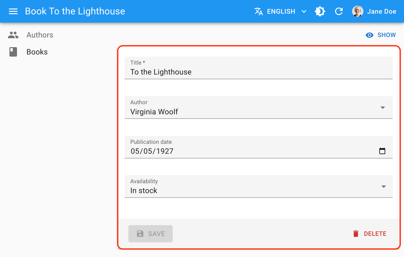
The following example shows a simple book edition page with a few input fields. The central form component is <SimpleForm>:
import {
    DateInput,
    Edit,
    minLength,
    ReferenceInput,
    required,
    SelectInput,
    SimpleForm,
    TextInput,
} from "react-admin";

export const BookEdit = () => (
  <Edit>
    <SimpleForm>
      <TextInput source="title" validate={[required(), minLength(10)]}/>
      <ReferenceInput source="author_id" reference="authors" />
      <DateInput source="publication_date" />
      <SelectInput source="availability" choices={[
        { id: "in_stock", name: "In stock" },
        { id: "out_of_stock", name: "Out of stock" },
        { id: "out_of_print", name: "Out of print" },
      ]} />
    </SimpleForm>
  </Edit>
);
This may look surprisingly simple because <SimpleForm> doesn’t define a submit handler or default values. How does it work?
<Edit>is the page controller component. It callsdataProvider.getOne()to fetch the book record from the API, and stores it in a<RecordContext>. It also creates a submit handler that callsdataProvider.update()when executed, and stores it in a<SaveContext>.<SimpleForm>is the main form component. It manages the form state and validation. It reads the default form values from the<RecordContext>. It wraps its children in a<FormContext>so that input components can read and update the form values. It also renders a save button that triggers the submit handler found in the<SaveContext>.<TextInput>,<ReferenceInput>,<DateInput>, and<SelectInput>are input components. They read the form values from the<FormContext>and update them when the user interacts with them. They can also define validation rules using thevalidateprop.
As you can see, form components aren’t responsible for fetching data or saving it. They only manage the form state and validation. It’s the <Edit> component’s responsibility to call the dataProvider methods.
This separation of concerns allows changing the form layout without affecting the data fetching logic or reusing the same form on different pages (e.g. on a creation page and an edition page).
Form Layouts
React-admin provides several form components to help you build forms with different layouts:
<Form>is a headless form component. It only renders its children - it doesn’t even render a submit button. It’s useful when you need to build a custom form layout.<SimpleForm>is the most common form layout. It renders a form with a single column of inputs, and a submit button at the bottom.<TabbedForm>renders a form with tabs. Each tab contains a group of inputs. It’s useful to organize a form with many fields.<AccordionForm>renders a form with accordion sections. Each section contains a group of inputs.<WizardForm>renders a form with several steps. Each step contains a group of inputs. It’s useful when you need to guide users through a complex form.<LongForm>provides a table of contents on the left side of the form. It’s useful when you have a very long form and want to help users navigate through it.
You can use these forms in creation and edition pages, as well as in dialogs (see e.g. <EditDialog>). If none of these layouts fit your needs, you can build your own layout based on the <Form> component.
Validation
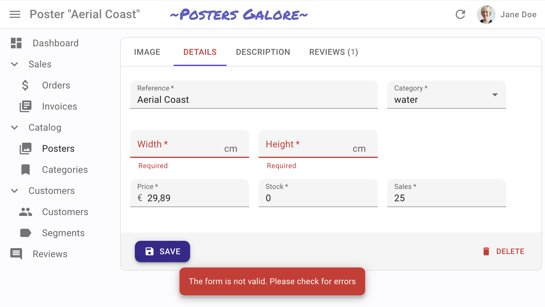
You can add validation rules to your form inputs in several ways:
-
<TextInput source="title" validate={[required(), minLength(10)]}/> -
<SimpleForm validate={validateBookCreation}> ... </SimpleForm> -
Validation schema powered by yup or zod
const schema = yup .object() .shape({ name: yup.string().required(), age: yup.number().required(), }) .required(); const CustomerCreate = () => ( <Create> <SimpleForm resolver={yupResolver(schema)}> ... </SimpleForm> </Create> ); -
Server-side validation by returning an error response from the
dataProvider{ "body": { "errors": { // Global validation error message (optional) "root": { "serverError": "Some of the provided values are not valid. Please fix them and retry." }, // Field validation error messages "title": "An article with this title already exists. The title must be unique.", "date": "The date is required", "tags": { "message": "The tag 'agrriculture' doesn't exist" }, } } }
Form validation deserves a section of its own; check the Validation chapter for more details.
Default Values
React-admin Form components initialize the form based on the current RecordContext values. If the RecordContext is empty, the form will be empty.
You can define default values in two ways:
-
<Form defaultValues>to set default values for the whole form. The expected value is an object, or a function returning an object. For instance:const postDefaultValue = () => ({ id: uuid(), created_at: new Date(), nb_views: 0 }); export const PostCreate = () => ( <Create> <SimpleForm defaultValues={postDefaultValue}> <TextInput source="title" /> <RichTextInput source="body" /> <NumberInput source="nb_views" /> </SimpleForm> </Create> );Tip: You can include properties in the form
defaultValuesthat are not listed as input components, like thecreated_atproperty in the previous example. -
<Input defaultValue>to set default values for individual inputs.export const PostCreate = () => ( <Create> <SimpleForm> <TextInput source="title" /> <RichTextInput source="body" /> <NumberInput source="nb_views" defaultValue={0} /> </SimpleForm> </Create> );React-admin will ignore these default values if the Form already defines a global
defaultValues(form > input).Tip: Per-input default values cannot be functions. For default values computed at render time, set the
defaultValuesat the form level, as explained in the previous section.
Hooks
React-admin relies on another library, react-hook-form, to handle forms. Its API is made of hooks that you can use to build custom forms.
| Hook Name | Usage |
|---|---|
useForm |
Create a form. It returns the props to pass to an HTML <form> element, as well as the form context. React-admin Form components (<Form>, <SimpleForm>, <TabbedForm>, etc.) use this hook internally. You will seldom need to use it directly. |
useController |
Create controlled input components. All react-admin Input components use it. You can use it to create custom input components. |
useWatch |
Subscribe to input changes. It’s useful to create dependencies between inputs. |
useFormContext |
Access the form context (e.g. to alter the form values programmatically). |
useFormState |
Access the form state (e.g. to determine if a form is dirty or invalid). |
React-admin Form components all create a <FormProvider>, so you can use the useController, useWatch, useFormContext, and useFormState hooks in your custom form components.
Note: react-hook-form’s formState is wrapped with a Proxy to improve render performance and skip extra computation if a specific state is not subscribed. So, make sure you deconstruct or read the formState before rendering in order to enable the subscription.
const { isDirty } = useFormState(); // ✅
const formState = useFormState(); // ❌ should deconstruct the formState
Check the react-hook-form documentation for more details.
Linking Two Inputs
Forms often contain linked inputs, e.g. country and city (the choices of the latter depending on the value of the former).
You read and subscribe to the current form values using react-hook-form’s useWatch hook.
import * as React from "react";
import { Edit, SimpleForm, SelectInput } from "react-admin";
import { useWatch } from "react-hook-form";

const countries = ["USA", "UK", "France"];
const cities: Record<string, string[]> = {
    USA: ["New York", "Los Angeles", "Chicago", "Houston", "Phoenix"],
    UK: ["London", "Birmingham", "Glasgow", "Liverpool", "Bristol"],
    France: ["Paris", "Marseille", "Lyon", "Toulouse", "Nice"],
};
const toChoices = (items: string[]) => items.map((item) => ({ id: item, name: item }));

const CityInput = () => {
    const country = useWatch<{ country: string }>({ name: "country" });

    return (
        <SelectInput
            choices={country ? toChoices(cities[country]) : []}
            source="cities"
        />
    );
};

const OrderEdit = () => (
    <Edit>
        <SimpleForm>
            <SelectInput source="country" choices={toChoices(countries)} />
            <CityInput />
        </SimpleForm>
    </Edit>
);

export default OrderEdit;
Alternatively, you can use the react-admin <FormDataConsumer> component, which grabs the form values and passes them to a child function. As <FormDataConsumer> uses the render props pattern, you can avoid creating an intermediate component like the <CityInput> component above:
import * as React from "react";
import { Edit, SimpleForm, SelectInput, FormDataConsumer } from "react-admin";

const countries = ["USA", "UK", "France"];
const cities: Record<string, string[]> = {
    USA: ["New York", "Los Angeles", "Chicago", "Houston", "Phoenix"],
    UK: ["London", "Birmingham", "Glasgow", "Liverpool", "Bristol"],
    France: ["Paris", "Marseille", "Lyon", "Toulouse", "Nice"],
};
const toChoices = (items: string[]) =>
    items.map((item) => ({ id: item, name: item }));

const OrderEdit = () => (
    <Edit>
        <SimpleForm>
            <SelectInput source="country" choices={toChoices(countries)} />
            <FormDataConsumer<{ country: string }>>
                {({ formData, ...rest }) => (
                    <SelectInput
                        source="cities"
                        choices={
                            formData.country ? toChoices(cities[formData.country]) : []
                        }
                        {...rest}
                    />
                )}
            </FormDataConsumer>
        </SimpleForm>
    </Edit>
);
Tip: When used inside an ArrayInput, <FormDataConsumer> provides one additional property to its child function called scopedFormData. It’s an object containing the current values of the currently rendered item. This allows you to create dependencies between inputs inside a <SimpleFormIterator>, as in the following example:
import { FormDataConsumer } from 'react-admin';

const PostEdit = () => (
    <Edit>
        <SimpleForm>
            <ArrayInput source="authors">
                <SimpleFormIterator>
                    <TextInput source="name" />
                    <FormDataConsumer<{ name: string }>>
                        {({
                            formData, // The whole form data
                            scopedFormData, // The data for this item of the ArrayInput
                            ...rest
                        }) =>
                            scopedFormData && scopedFormData.name ? (
                                <SelectInput
                                    source="role" // Will translate to "authors[0].role"
                                    choices={[{ id: 1, name: 'Head Writer' }, { id: 2, name: 'Co-Writer' }]}
                                    {...rest}
                                />
                            ) : null
                        }
                    </FormDataConsumer>
                </SimpleFormIterator>
            </ArrayInput>
        </SimpleForm>
    </Edit>
);
Tip: TypeScript users will notice that scopedFormData is typed as an optional parameter. This is because the <FormDataConsumer> component can be used outside of an <ArrayInput> and in that case, this parameter will be undefined. If you are inside an <ArrayInput>, you can safely assume that this parameter will be defined.
Hiding Inputs Based On Other Inputs
You may want to display or hide inputs based on the value of another input - for instance, show an email input only if the hasEmail boolean input has been ticked to true.
For such cases, you can use the approach described above, using the <FormDataConsumer> component.
import { FormDataConsumer } from 'react-admin';

 const PostEdit = () => (
     <Edit>
         <SimpleForm shouldUnregister>
             <BooleanInput source="hasEmail" />
             <FormDataConsumer<{ hasEmail: boolean }>>
                 {({ formData, ...rest }) => formData.hasEmail
                      ? <TextInput source="email" {...rest} />
                      : null
                 }
             </FormDataConsumer>
         </SimpleForm>
     </Edit>
 );
Note: By default, react-hook-form submits values of unmounted input components. In the above example, the shouldUnregister prop of the <SimpleForm> component prevents that from happening. That way, when end users hide an input, its value isn’t included in the submitted data.
Transforming Form Values Before Submitting
Sometimes, you may want to alter the form values before sending them to the dataProvider. For those cases, use the transform prop either on the view component (<Create> or <Edit>) or on the <SaveButton> component.
In the following example, a create view for a Post displays a form with two submit buttons. Both buttons create a new record, but the ‘save and notify’ button should trigger an email to other admins on the server side. The POST /posts API route only sends the email when the request contains a special HTTP header.
So the save button with ‘save and notify’ will transform the record before react-admin calls the dataProvider.create() method, adding a notify field:
const PostCreateToolbar = () => (
    <Toolbar>
        <SaveButton />
        <SaveButton
            label="post.action.save_and_notify"
            transform={data => ({ ...data, notify: true })}
            type="button"
        />
    </Toolbar>
);

const PostCreate = () => (
    <Create>
        <SimpleForm toolbar={<PostCreateToolbar />}>
            // ...
        </SimpleForm>
    </Create>
);
Then, in the dataProvider.create() code, detect the presence of the notify field in the data, and add the HTTP header if necessary. Something like:
const dataProvider = {
    // ...
    create: (resource, params) => {
        const { notify, ...record } = params.data;
        const headers = new Headers({
            'Content-Type': 'application/json',
        });
        if (notify) {
            headers.set('X-Notify', 'true');
        }
        return httpClient(`${apiUrl}/${resource}`, {
            method: 'POST',
            body: JSON.stringify(record),
            headers,
        }).then(({ json }) => ({
            data: { ...record, id: json.id },
        }));
    },
}
Tip: <Edit>’s transform prop function also gets the previousData in its second argument:
const PostEditToolbar = () => (
    <Toolbar>
        <SaveButton />
        <SaveButton
            label="post.action.save_and_notify"
            transform={(data, { previousData }) => ({
                ...data,
                avoidChangeField: previousData.avoidChangeField
            })}
            type="button"
        />
    </Toolbar>
);

const PostEdit = () => (
    <Edit>
        <SimpleForm toolbar={<PostEditToolbar />}>
            // ...
        </SimpleForm>
    </Edit>
);
Warning About Unsaved Changes
React-admin keeps track of the form state, so it can detect when the user leaves an Edit or Create page with unsaved changes. To avoid data loss, you can use this ability to ask the user to confirm before leaving a page with unsaved changes.
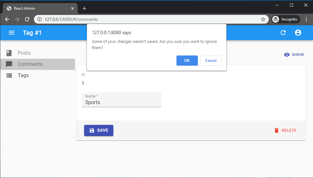
Warning about unsaved changes is an opt-in feature: you must set the warnWhenUnsavedChanges prop in the form component to enable it:
export const TagEdit = () => (
    <Edit>
        <SimpleForm warnWhenUnsavedChanges>
            <TextField source="id" />
            <TextInput source="name" />
            ...
        </SimpleForm>
    </Edit>
);
And that’s all. warnWhenUnsavedChanges works for both <SimpleForm> and <TabbedForm>. In fact, this feature is provided by a custom hook called useWarnWhenUnsavedChanges(), which you can use in your react-hook-form forms.
import { useForm } from 'react-hook-form';
import { useWarnWhenUnsavedChanges } from 'react-admin';

const MyForm = ({ onSubmit }) => {
    const form = useForm();
    return (
        <Form onSubmit={form.handleSubmit(onSubmit)} />
    );
}

const Form = ({ onSubmit }) => {
    // enable the warn when unsaved changes feature
    useWarnWhenUnsavedChanges(true);
    return (
        <form onSubmit={onSubmit}>
            <label id="firstname-label">First Name</label>
            <Field name="firstName" aria-labelledby="firstname-label" component="input" />
            <button type="submit">Submit</button>
        </form>
    );
};
Tip: You can customize the message displayed in the confirm dialog by setting the ra.message.unsaved_changes message in your i18nProvider.
Note: Due to limitations in react-router, this feature only works if you use the default router provided by react-admin, or if you use a Data Router.
Submit On Enter
By default, pressing ENTER in any of the form inputs submits the form - this is the expected behavior in most cases. To disable the automated form submission on enter, set the type prop of the SaveButton component to button.
const MyToolbar = () => (
    <Toolbar>
        <SaveButton type="button" />
        <DeleteButton />
    </Toolbar>
);

export const PostEdit = () => (
    <Edit>
        <SimpleForm toolbar={<MyToolbar/>}>
            ...
        </SimpleForm>
    </Edit>
);
However, some of your custom input components (e.g. Google Maps widget) may have special handlers for the ENTER key. In that case, you should prevent the default handling of the event on those inputs. This would allow other inputs to still submit the form on Enter:
export const PostEdit = () => (
    <Edit>
        <SimpleForm>
            <TextInput
                source="name"
                onKeyUp={event => {
                    if (event.key === 'Enter') {
                        event.stopPropagation();
                    }
                }}
            />
        </SimpleForm>
    </Edit>
);
Tip: <SaveButton type="button"> does not take into account a custom onSubmit prop passed to the enclosing <Form>. If you need to override the default submit callback for a <SaveButton type="button">, you should include an onClick prop in the button.
const MyToolbar = () => {
    const [update] = useUpdate();
    const { getValues } = useFormContext();
    const redirect = useRedirect();

    const handleClick = e => {
        e.preventDefault(); // necessary to prevent default SaveButton submit logic
        const { id, ...data } = getValues();
        update(
            'posts',
            { id, data },
            { onSuccess: () => { redirect('list'); }}
        );
    };

    return (
        <Toolbar>
            <SaveButton type="button" onClick={handleClick} />
            <DeleteButton />
        </Toolbar>
    );
};

export const PostEdit = () => (
    <Edit>
        <SimpleForm toolbar={<MyToolbar/>}>
          ...
        </SimpleForm>
    </Edit>
);
AutoSave
In forms where users may spend a lot of time, it’s a good idea to save the form automatically after a few seconds of inactivity. You can auto save the form content by using the <AutoSave> component.
import { AutoSave } from '@react-admin/ra-form-layout';
import { Edit, SimpleForm, TextInput, DateInput, SelectInput, Toolbar } from 'react-admin';

const AutoSaveToolbar = () => (
    <Toolbar>
        <AutoSave />
    </Toolbar>
);

const PersonEdit = () => (
    <Edit mutationMode="optimistic">
        <SimpleForm
            resetOptions={{ keepDirtyValues: true }}
            toolbar={<AutoSaveToolbar />}
        >
            <TextInput source="first_name" />
            <TextInput source="last_name" />
            <DateInput source="dob" />
            <SelectInput source="sex" choices={[
                { id: 'male', name: 'Male' },
                { id: 'female', name: 'Female' },
            ]}/>
        </SimpleForm>
    </Edit>
);
Note that you must set the <SimpleForm resetOptions> prop to { keepDirtyValues: true }. If you forget that prop, any change entered by the end user after the autosave but before its acknowledgment by the server will be lost.
If you’re using it in an <Edit> page, you must also use a pessimistic or optimistic mutationMode - <AutoSave> doesn’t work with the default mutationMode="undoable".
Check the <AutoSave> component documentation for more details.
Adding Fields With Labels
All react-admin inputs handle the display of their label by wrapping their content inside a <Labeled> component.
You can wrap your own components inside the <Labeled> component too. You can either provide it the label prop directly or leverage the automatic label inference by providing it the source prop:
const IdentifierField = ({ label }) => {
    const record = useRecordContext();
    return (
        <Labeled label={label}>
            <Typography>{record.id}</Typography>
        </Labeled>
    );
};

// Here Labeled will try to translate the label with the translation key `resources.posts.fields.body`
// and with an inferred default of `Body`
const BodyField = () => {
    const record = useRecordContext();
    return (
        <Labeled source="body">
            <Typography>
                {record.body}
            </Typography>
        </Labeled>
    )
};

const PostEdit = () => (
    <Create>
        <SimpleForm>
            <IdentifierField label="Identifier" />
            <TextField source="title" />
            <BodyField />
            <NumberInput source="nb_views" />
        </SimpleForm>
    </Create>
);
Grouping Inputs
Sometimes, you may want to group inputs in order to make a form more approachable. You may use a <TabbedForm>, an <AccordionForm> or you may want to roll your own layout. In this case, you might need to know the state of a group of inputs: whether it’s valid or if the user has changed them (dirty/touched state).
For this, you can use the <FormGroupContextProvider>, which accepts a group name. All inputs rendered inside this context will register to it (thanks to the useInput hook). You may then call the useFormGroup hook to retrieve the status of the group. For example:
import { Edit, SimpleForm, TextInput, FormGroupContextProvider, useFormGroup, minLength } from 'react-admin';
import { Accordion, AccordionDetails, AccordionSummary, Typography } from '@mui/material';
import ExpandMoreIcon from '@mui/icons-material/ExpandMoreIcon';

const PostEdit = () => (
    <Edit>
        <SimpleForm>
            <TextInput source="title" />
            <FormGroupContextProvider name="options">
                <Accordion>
                    <AccordionSummary
                        expandIcon={<ExpandMoreIcon />}
                        aria-controls="options-content"
                        id="options-header"
                    >
                        <AccordionSectionTitle name="options">
                            Options
                        </AccordionSectionTitle>
                    </AccordionSummary>
                    <AccordionDetails
                        id="options-content"
                        aria-labelledby="options-header"
                    >
                        <TextInput source="teaser" validate={minLength(20)} />
                    </AccordionDetails>
                </Accordion>
            </FormGroupContextProvider>
        </SimpleForm>
    </Edit>
);

const AccordionSectionTitle = ({ children, name }) => {
    const formGroupState = useFormGroup(name);

    return (
        <Typography color={
              !formGroupState.isValid
                ? 'error'
                : 'inherit'
          }
        >
            {children}
        </Typography>
    );
};
Redirection After Submission
By default:
- Submitting the form in the
<Create>view redirects to the<Edit>view - Submitting the form in the
<Edit>view redirects to the<List>view
You can customize the redirection by setting the redirect prop on the <Create> or <Edit> components. Possible values are “edit”, “show”, “list”, and false to disable redirection. You may also specify a custom path such as /my-custom-route. For instance, to redirect to the <Show> view after edition:
export const PostEdit = () => (
    <Edit redirect="show">
        <SimpleForm>
            ...
        </SimpleForm>
    </Edit>
);
You can also pass a custom route (e.g. “/home”) or a function as redirect prop value. For example, if you want to redirect to a page related to the current object:
// redirect to the related Author show page
const redirect = (resource, id, data) => `/author/${data.author_id}/show`;

export const PostEdit = () => (
    <Edit redirect={redirect}>
        <SimpleForm>
            // ...
        </SimpleForm>
    </Edit>
);
This affects both the submit button and the form submission when the user presses ENTER in one of the form fields.
Tip: The redirect prop is ignored if you’ve set the onSuccess prop in the <Edit>/<Create> component, or the <SaveButton> component.
Nested Forms
Users often need to edit data from several resources in the same form. React-admin doesn’t support nested forms, but provides ways to edit related data in a user-friendly way:
<EditInDialogButton>lets users open a modal to edit a related record<ReferenceOneInput>lets users edit one related record<ReferenceManyInput>lets users edit a list of related records<ReferenceManyToManyInput>lets users edit a list of related records via an associative table