<TreeWithDetails>
This Enterprise Edition component offers a replacement for the
 <List> component when the records form tree structures like directories, categories, etc. <TreeWithDetails> renders a tree structure and the show view/edition form in the same page.
This component allows users to browse, edit, and rearrange trees.
Usage
// in src/category.js
import {
    Admin,
    Resource,
    Create,
    Edit,
    SimpleForm,
    TextInput,
} from 'react-admin';
import {
    CreateNode,
    EditNode,
    EditNodeToolbar,
    TreeWithDetails,
} from '@react-admin/ra-tree';

// a Create view for a tree uses <CreateNode> instead of the standard <Create>
const CategoriesCreate = () => (
    <CreateNode>
        <SimpleForm>
            <TextInput source="name" />
        </SimpleForm>
    </CreateNode>
);

// an Edit view for a tree uses <EditNode> instead of the standard <Edit>
const CategoriesEdit = () => (
    <EditNode>
        <SimpleForm toolbar={<EditNodeToolbar />}>
            <TextInput source="title" />
        </SimpleForm>
    </EditNode>
);

// a List view for a tree uses <TreeWithDetails>
export const CategoriesList = () => (
    <TreeWithDetails create={CategoriesCreate} edit={CategoriesEdit} />
);

// in src/App.js
import { CategoriesList } from './category';

const App = () => (
    <Admin dataProvider={dataProvider}>
        <Resource list={CategoriesList} />
    </Admin>
);
Check the ra-tree documentation for more details.
Props
| Prop | Required | Type | Default | Description |
|---|---|---|---|---|
addRootButton |
Optional | ReactNode or false |
- | The create button to add a root node |
allowMultipleRoots |
Optional | boolean |
false |
To allow trees with multiple roots |
create |
Required | ReactNode |
- | The create form of your resource |
draggable |
Optional | boolean |
false |
To allow user to reorder nodes |
edit |
Required | ReactNode |
- | The edit form of your resource |
hideRootNodes |
Optional | boolean |
false |
To hide all root nodes |
lazy |
Optional | boolean |
false |
To load children only when they are expanded |
motion |
Optional | boolean |
false |
To enable rc-tree’s <Tree> transitions |
nodeActions |
Optional | ReactNode |
- | To customize the default dropdown action |
show |
Required | ReactNode |
- | The show view of your resource |
showLine |
Optional | boolean |
false |
Shows a connecting line |
sx |
Optional | SxProps |
- | Material UI shortcut for defining custom styles |
title |
Optional | string |
- | The title to display in the <AppBar> |
titleField |
Optional | string |
title |
Set the record field to display in the tree |
<TreeWithDetails> also accepts the rc-tree props.
create / edit / show
If you want to give users access to the create, edit and/or show view. You can create and add them to your <TreeWithDetails>
import {
    EditButton,
    Labeled,
    SimpleForm,
    TextField,
    TextInput,
    TopToolbar,
} from 'react-admin';
import {
    AddChildButton,
    CreateNode,
    EditNode,
    EditNodeToolbar,
    ShowNode,
    TreeWithDetails,
} from '@react-admin/ra-tree';

const NodeShowAction = () => (
    <TopToolbar>
        <EditButton />
        <AddChildButton />
    </TopToolbar>
);

const CategoriesShow = () => (
    <ShowNode actions={<NodeShowAction />}>
        <SimpleForm>
            <Labeled label="Id">
                <TextField source="id" />
            </Labeled>
            <Labeled label="Title">
                <TextField source="title" />
            </Labeled>
        </SimpleForm>
    </ShowNode>
);

const CategoriesEdit = () => (
    <EditNode>
        <SimpleForm toolbar={<EditNodeToolbar />}>
            <TextField source="id" label="id" />
            <TextInput source="title" />
        </SimpleForm>
    </EditNode>
);

const CategoriesCreate = () => (
    <CreateNode>
        <SimpleForm>
            <TextInput source="title" />
        </SimpleForm>
    </CreateNode>
);

export const CategoriesList = () => (
    <TreeWithDetails
        linkTo="show"
        show={CategoriesShow}
        edit={CategoriesEdit}
        create={CategoriesCreate}
    />
);
IMPORTANT: Note that in the Edition view, the <SimpleForm> must use the <EditNodeToolbar>. This toolbar replaces react-admin’s default <DeleteButton> with a ra-tree version that deletes a branch instead of a record.
This also means that if you need to customize the Toolbar and includes a Delete Button, you must import the aternative button from @react-admin/ra-tree:
import { Toolbar, ToolbarProps } from 'react-admin';
import { DeleteBranchButton } from '@react-admin/ra-tree';

import MyCustomButton from './MyCustomButton';

export const MyToolbar = (props: ToolbarProps) => (
    <Toolbar>
        <MyCustomButton />
        <DeleteBranchButton />
    </Toolbar>
);
Tip: CreateNode and EditNode components accept a mutationOptions prop. So you can override the mutationOptions of the main mutation query.
const CategoriesCreate = () => (
    <CreateNode
        mutationOptions={{
            onSuccess: () => {
                console.log('Success!');
            },
            onError: () => {
                console.log('Error');
            },
            meta: { foo: 'bar' }, // The 'meta' object will be passed to the dataProvider methods
        }}
    >
        <SimpleForm>
            <TextInput source="name" />
        </SimpleForm>
    </CreateNode>
);
allowMultipleRoots
By default, this package allows only one root per tree. You can allow trees with multiple roots by setting the allowMultipleRoots prop:
export const CategoriesList = (props: ListProps) => (
    <TreeWithDetails
        create={CategoriesCreate}
        edit={CategoriesEdit}
        allowMultipleRoots
        {...props}
    />
);
addRootButton
When allowMultipleRoots is set to true or there are no root nodes in the tree, a button is displayed to allow the user to add root nodes. You can pass your own button component using addRootButton prop:
// in src/posts.js
import { CreateButton } from 'react-admin';

export const CategoriesList = () => (
    <TreeWithDetails allowMultipleRoots addRootButton={<CreateButton label="Add Categories!" />}>
        ...
    </TreeWithDetails>
);
Tip: You can hide the add root button completely by passing false to addRootButton prop
draggable
If you want to allow user to reorder nodes in the tree, simply add the draggable prop to the <TreeWithDetails> component:
export const CategoriesList = () => <TreeWithDetails draggable />;
hideRootNodes
Sometimes, a tree only has one root node for technical reasons and users should probably not see it at all. Use the hideRootNodes prop to hide all root nodes.
export const CategoriesList = () => <TreeWithDetails hideRootNodes />;
lazy
If you have a tree with a lot of nodes, you may want to only load the root nodes at first and their children when they are expanded. To enable this mode, set the lazy prop to true.
Important: When using the lazy mode, you cannot use the ‘undoable’ mutation mode. Hence, you need to set the mutationMode prop to 'pessimistic' or 'optimistic' on <EditNode>.
import React from 'react';
import { Admin, Resource, SimpleForm, TextField, TextInput } from 'react-admin';

import { EditNode, EditNodeToolbar, TreeWithDetails } from '@react-admin/ra-tree';
import CategoriesCreate from '../CategoriesCreate';
import i18nProvider from '../i18nProvider';
import dataProvider from './dataProvider';

const CategoriesEdit = () => (
    <EditNode mutationMode="pessimistic">
        <SimpleForm toolbar={<EditNodeToolbar />}>
            <TextField source="id" />
            <TextInput source="name" />
        </SimpleForm>
    </EditNode>
);

const CategoriesList = () => (
    <TreeWithDetails
        titleField="name"
        edit={CategoriesEdit}
        create={CategoriesCreate}
        lazy
    />
);

export const App = () => (
    <Admin dataProvider={dataProvider} i18nProvider={i18nProvider}>
        <Resource name="categories" list={CategoriesList} />
    </Admin>
);
motion
rc-tree’s <Tree> allows to customize the transition effect used when expanding or collapsing a node. However, by default, these transition effects are disabled in react-admin, because they are known to cause issues with the expand on click feature.
If you want to enable them, you can pass the motion prop to the <TreeWithDetails> component:
export const CategoriesList = () => <TreeWithDetails motion />;
The motion prop also accepts a transition object, allowing you to customize the transition effect:
import { TreeWithDetails } from '@react-admin/ra-tree';
import { CSSProperties } from 'react';

const myMotion = {
    motionName: 'node-motion',
    motionAppear: false,
    onAppearStart: (): CSSProperties => ({ height: 0, width: 0 }),
    onAppearActive: (node: HTMLElement): CSSProperties => ({
        height: node.scrollHeight,
        width: node.scrollWidth,
    }),
    onLeaveStart: (node: HTMLElement): CSSProperties => ({
        height: node.offsetHeight,
        width: node.scrollWidth,
    }),
    onLeaveActive: (): CSSProperties => ({ height: 0, width: 0 }),
};

export const CategoriesList = () => (
    <TreeWithDetails
        motion={myMotion}
        sx={{
            '& .node-motion': {
                transition: 'all .7s',
                overflowX: 'hidden',
                overflowY: 'hidden',
            },
        }}
    />
);
nodeActions
By default, every node has an action dropdown menu displayed after its name when hovered.
While this menu only has a delete action by default, it’s possible to customize it.
import {
    NodeActions,
    DeleteMenuItem,
    TreeWithDetails,
} from '@react-admin/ra-tree';

const MyCustomActionMenuItem = forwardRef(
    ({ record, resource, parentId }, ref) => {
        const handleClick = () => {
            // Do something with dataProvider ?
        };
        return (
            <MenuItem ref={ref} onClick={handleClick}>
                Do something
            </MenuItem>
        );
    }
);

const MyActions = (props: NodeActionsProps) => (
    <NodeActions {...props}>
        <MyCustomActionMenuItem />
        <DeleteMenuItem />
    </NodeActions>
);

const CategoriesList = () => (
    <TreeWithDetails
        titleField="name"
        edit={CategoriesEdit}
        draggable
        showLine
        nodeActions={<MyActions />}
    />
);
The menu item will receive the current record and the resource.
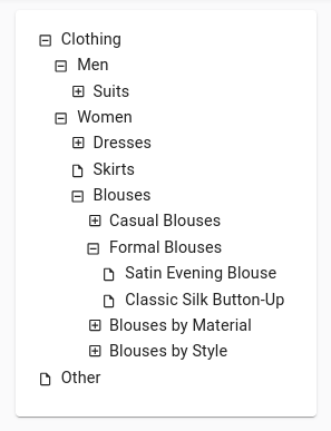
showLine
By default ra-tree applies the react-admin’s style. Setting showLine to true will keep the native icons as follows:
title
The default title for a tree view is “[resource] list” (e.g. “Posts list”). Use the title prop to customize the Tree view title:
// in src/posts.js
export const CategoriesList = () => (
    <TreeWithDetails title="List of categories">...</TreeWithDetails>
);
The title can be either a string or an element of your own.
titleField
Use the titleField prop to specify the name of the field holding the node title:
// in src/posts.js
export const CategoriesList = () => (
    <TreeWithDetails titleField="name">...</TreeWithDetails>
);
Selecting a Node
If you need to let users select a node in a tree, use the <TreeInput> component.
import { Edit, SimpleForm, TextInput } from 'react-admin';
import { TreeInput } from '@react-admin/ra-tree';

export const ProductEdit = () => (
    <Edit>
        <SimpleForm>
            <TextInput source="id" disabled />
            <TextInput source="name" />
            <TreeInput source="category" treeData={[
                { id: 1, title: 'Clothing', isRoot: true, children: [2, 6] },
                { id: 2, title: 'Men', children: [3] },
                { id: 3, title: 'Suits', children: [4, 5] },
                { id: 4, title: 'Slacks', children: [] },
                { id: 5, title: 'Jackets', children: [] },
                { id: 6, title: 'Women', children: [7, 10, 11] },
                { id: 7, title: 'Dresses', children: [8, 9] },
                { id: 8, title: 'Evening Gowns', children: [] },
                { id: 9, title: 'Sun Dresses', children: [] },
                { id: 10, title: 'Skirts', children: [] },
                { id: 11, title: 'Blouses', children: [] },
            ]} />
        </SimpleForm>
    </Edit>
);
Insert as first child
By default, when users add a new child to a node, the child is inserted as the last child of the parent node. You can force new children to be added as first child instead, by setting the insertAsFirstChild prop in the <AddChildButton>, as follows:
// in src/posts.js
import { TopToolbar } from 'react-admin';
import {
    AddChildButton,
    EditNode,
    TreeWithDetails,
} from '@react-admin/ra-tree';

const NodeEditActions = () => (
    <TopToolbar>
        <AddChildButton label="Add child at top" insertAsFirstChild />
    </TopToolbar>
);

const CategoriesEdit = () => (
    <EditNode actions={<NodeEditActions />}>...</EditNode>
);

export const CategoriesList = () => (
    <TreeWithDetails edit={CategoriesEdit}>...</TreeWithDetails>
);
Note: dataProvider.addChildNode() must support the position param for this feature to work. See the dataProvider section for details.