
<ArrayField>
<ArrayField> renders an embedded array of objects.
<ArrayField> creates a ListContext with the field value, and renders its children components - usually iterator components like <Datagrid> or <SingleFieldList>.
Usage
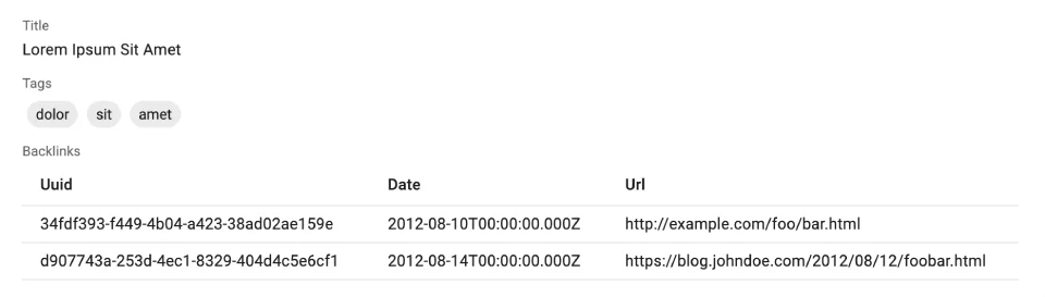
<ArrayField> is ideal for collections of objects, e.g. tags and backlinks in the following post object:
{
    id: 123,
    title: 'Lorem Ipsum Sit Amet',
    tags: [{ name: 'dolor' }, { name: 'sit' }, { name: 'amet' }],
    backlinks: [
        {
            uuid: '34fdf393-f449-4b04-a423-38ad02ae159e',
            date: '2012-08-10T00:00:00.000Z',
            url: 'http://example.com/foo/bar.html',
        },
        {
            uuid: 'd907743a-253d-4ec1-8329-404d4c5e6cf1',
            date: '2012-08-14T00:00:00.000Z',
            url: 'https://blog.johndoe.com/2012/08/12/foobar.html',
        }
    ]
}
Leverage <ArrayField> e.g. in a Show view, to display the tags as a <SingleFieldList> and the backlinks as a <Datagrid>:
import {
    ArrayField,
    ChipField,
    Datagrid,
    Show,
    SimpleShowLayout,
    SingleFieldList,
    TextField
} from 'react-admin';

const PostShow = () => (
    <Show>
        <SimpleShowLayout>
            <TextField source="title" />
            <ArrayField source="tags">
                <SingleFieldList>
                    <ChipField source="name" size="small" />
                </SingleFieldList>
            </ArrayField>
            <ArrayField source="backlinks">
                <Datagrid bulkActionButtons={false}>
                    <TextField source="uuid" />
                    <TextField source="date" />
                    <TextField source="url" />
                </Datagrid>
            </ArrayField>
        </SimpleShowLayout>
    </Show>
)
Props
| Prop | Required | Type | Default | Description |
|---|---|---|---|---|
children |
Required | ReactNode |
The component to render the list. | |
filter |
Optional | object |
The filter to apply to the list. | |
perPage |
Optional | number |
1000 | The number of items to display per page. |
sort |
Optional | { field, order} |
The sort to apply to the list. |
<ArrayField> accepts the common field props, except emptyText (use the child empty prop instead).
<ArrayField> relies on useList to filter, paginate, and sort the data, so it accepts the same props.
children
<ArrayField> renders its children component wrapped in a <ListContextProvider>. Commonly used child components are <Datagrid>, <SingleFieldList>, and <SimpleList>.
{/* using SingleFieldList as child */}
<ArrayField source="tags">
    <SingleFieldList>
        <ChipField source="name" />
    </SingleFieldList>
</ArrayField>

{/* using Datagrid as child */}
<ArrayField source="backlinks">
    <Datagrid>
        <TextField source="uuid" />
        <TextField source="date" />
        <TextField source="url" />
    </Datagrid>
</ArrayField>

{/* using SimpleList as child */}
<ArrayField source="backlinks">
    <SimpleList
        primaryText={record => record.url}
        secondaryText={record => record.date}
    />
</ArrayField>
You can also render custom JSX, leveraging the <WithListContext> component:
<ArrayField source="backlinks">
    <WithListContext render={({ data }) => (
        <ul>
            {data.map(backlink => (
                <li key={backlink.id}>{backlink.url}</li>
            ))}
        </ul>
    )} />
</ArrayField>
Or a custom component, leveraging the useListContext hook:
const Backlinks = () => {
    const { data } = useListContext();
    return (
        <ul>
            {data.map(backlink => (
                <li key={backlink.id}>{backlink.url}</li>
            ))}
        </ul>
    );
};

const PostShow = () => (
    <Show>
        <SimpleShowLayout>
            <TextField source="title" />
            <ArrayField source="backlinks">
                <Backlinks />
            </ArrayField>
        </SimpleShowLayout>
    </Show>
)
filter
You can use the filter prop to display only a subset of the items in the array. For instance, to display only the backlinks for a particular day:
<ArrayField source="backlinks" filter={{ date: '2012-08-10T00:00:00.000Z' }}>
    <Datagrid>
        <TextField source="uuid" />
        <TextField source="date" />
        <TextField source="url" />
    </Datagrid>
</ArrayField>
The filtering capabilities are very limited. For instance, there is no “greater than” or “less than” operator. You can only filter on the equality of a field.
perPage
If the value is a large array, and you don’t need to display all the items, you can use the perPage prop to limit the number of items displayed.
As <ArrayField> creates a ListContext, you can use the <Pagination> component to navigate through the items.
import {
    ArrayField,
    Datagrid,
    Pagination,
    Show,
    SimpleShowLayout,
    TextField
} from 'react-admin';

const PostShow = () => (
    <Show>
        <SimpleShowLayout>
            <TextField source="title" />
            <ArrayField source="backlinks" perPage={5}>
                <Datagrid>
                    <TextField source="uuid" />
                    <TextField source="date" />
                    <TextField source="url" />
                </Datagrid>
                <Pagination />
            </ArrayField>
        </SimpleShowLayout>
    </Show>
);
sort
By default, <ArrayField> displays the items in the order they are stored in the field. You can use the sort prop to change the sort order.
<ArrayField source="tags" sort={{ field: 'name', order: 'ASC' }}>
    <SingleFieldList>
        <ChipField source="name" />
    </SingleFieldList>
</ArrayField>
Using The List Context
<ArrayField> creates a ListContext with the field value, so you can use any of the list context values in its children. This includes callbacks to sort, filter, and select items.
For instance, you can make the chips selectable as follows:
const SelectedChip = () => {
    const { selectedIds, onToggleItem } = useListContext();
    const record = useRecordContext();
    return (
        <ChipField
            source="title"
            clickable
            onClick={() => {
                onToggleItem(record.id);
            }}
            color={selectedIds.includes(record.id) ? 'primary' : 'default'}
        />
    );
};

const PostShow = () => (
    <Show>
        <SimpleShowLayout>
            <TextField source="title" />
            <ArrayField source="tags">
                <SingleFieldList>
                    <SelectedChip />
                </SingleFieldList>
            </ArrayField>
        </SimpleShowLayout>
    </Show>
)
Tip: The selection logic uses the id field for each collection element, so the above example assumes that the tags field contains objects like { id: 123, name: 'bar' }.
Check the useListContext documentation for more information on the list context values.
Rendering An Array Of Strings
If you need to render a custom collection (e.g. an array of tags ['dolor', 'sit', 'amet']), it’s often simpler to write your own component:
import { useRecordContext } from 'react-admin';

const TagsField = () => {
    const record = useRecordContext();
    return (
        <ul>
            {record.tags.map(item => (
                <li key={item.name}>{item.name}</li>
            ))}
        </ul>
    )
};