
The Creation and Edition Pages
React-admin provides many hooks and components to let you build custom user experiences for editing and creating records, leveraging Material UI and react-hook-form.
From Pure React To React-Admin
Edition views are very common in single-page apps. The most usual way to allow a user to update a record is to fetch the record from an API based on the URL parameters, initialize a form with the record, update the inputs as the user changes the values, and call the API to update the record with the new values upon submission.
To better understand how to use the various react-admin hooks and components dedicated to editing and creating, let’s start by building such an edition view by hand.
An Edition View Built By Hand
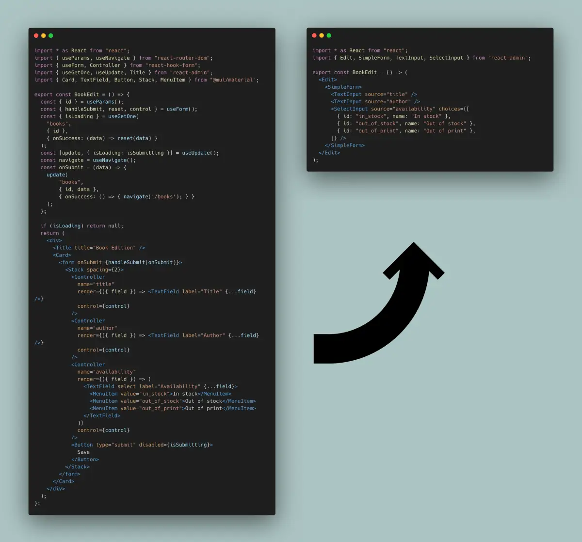
Here is how you could write a book edition view in pure React, leveraging react-admin’s data fetching hooks, and react-hook-form to bind form inputs with a record object:
import * as React from "react";
import { useParams, useNavigate } from "react-router-dom";
import { useForm, Controller } from "react-hook-form";
import { useGetOne, useUpdate, Title } from "react-admin";
import { Card, TextField, Button, Stack, MenuItem } from "@mui/material";

export const BookEdit = () => {
  const { id } = useParams();
  const { handleSubmit, reset, control } = useForm();
  const { isLoading } = useGetOne(
    "books",
    { id },
    { onSuccess: (data) => reset(data) }
  );
  const [update, { isLoading: isSubmitting }] = useUpdate();
  const navigate = useNavigate();
  const onSubmit = (data) => {
    update(
        "books",
        { id, data },
        { onSuccess: () => { navigate('/books'); } }
    );
  };

  if (isLoading) return null;
  return (
    <div>
      <Title title="Book Edition" />
      <Card>
        <form onSubmit={handleSubmit(onSubmit)}>
          <Stack spacing={2}>
            <Controller
              name="title"
              render={({ field }) => <TextField label="Title" {...field} />}
              control={control}
            />
            <Controller
              name="author"
              render={({ field }) => <TextField label="Author" {...field} />}
              control={control}
            />
            <Controller
              name="availability"
              render={({ field }) => (
                <TextField select label="Availability" {...field}>
                  <MenuItem value="in_stock">In stock</MenuItem>
                  <MenuItem value="out_of_stock">Out of stock</MenuItem>
                  <MenuItem value="out_of_print">Out of print</MenuItem>
                </TextField>
              )}
              control={control}
            />
            <Button type="submit" disabled={isSubmitting}>
              Save
            </Button>
          </Stack>
        </form>
      </Card>
    </div>
  );
};
This form displays 3 inputs (two text inputs and one select input), and redirects to the book list view upon successful submission. It doesn’t even contain default values, validation, or dependent inputs. Yet, it’s already quite verbose.
It’s a super common component. In fact, many of its features could be extracted for reuse in other pages. Let’s see how to improve the code and the developer experience in the same process.
<Form>: Form Logic
To use react-hook-form with Material UI inputs, the previous example leverages the <Controller> tag, which expects a control object generated by the useForm hook (see the related react-hook-form doc).
We can avoid the call to useForm by putting its logic inside a custom component. That’s exaclty what react-admin’s <Form> component does. <Form> also creates a react-hook-form <FormProvider>, so we no longer need to pass the control prop to each <Controller> element.
import * as React from "react";
import { useParams, useNavigate } from "react-router-dom";
-import { useForm, Controller } from "react-hook-form";
+import { Controller } from "react-hook-form";
-import { useGetOne, useUpdate, Title } from "react-admin";
+import { useGetOne, useUpdate, Title, Form } from "react-admin";
import { Card, TextField, Stack, MenuItem } from "@mui/material";

export const BookEdit = () => {
  const { id } = useParams();
- const { handleSubmit, reset, control } = useForm();
- const { isLoading } = useGetOne(
+ const { isLoading, data } = useGetOne(
    "books",
    { id },
-   { onSuccess: (data) => reset(data) }
  );
  const [update, { isLoading: isSubmitting }] = useUpdate();
  const navigate = useNavigate();
  const onSubmit = (data) => {
    update(
        "books",
        { id, data },
        { onSuccess: () => { navigate('/books'); } }
    );
  };
  if (isLoading) return null;
  return (
    <div>
      <Title title="Book Edition" />
      <Card>
-       <form onSubmit={handleSubmit(onSubmit)}>
+       <Form record={data} onSubmit={onSubmit}>
          <Stack spacing={2}>
            <Controller
              name="title"
              render={({ field }) => <TextField label="Title" {...field} />}
-             control={control}
            />
            <Controller
              name="author"
              render={({ field }) => <TextField label="Author" {...field} />}
-             control={control}
            />
            <Controller
              name="availability"
              render={({ field }) => (
                <TextField select label="Availability" {...field}>
                  <MenuItem value="in_stock">In stock</MenuItem>
                  <MenuItem value="out_of_stock">Out of stock</MenuItem>
                  <MenuItem value="out_of_print">Out of print</MenuItem>
                </TextField>
              )}
-             control={control}
            />
            <Button type="submit" disabled={isSubmitting}>
              Save
            </Button>
          </Stack>
-       </form>
+       </Form>
      </Card>
    </div>
  );
};
<SimpleForm>: Stacked Layout
Displaying inputs in a Stack is a common UI pattern. The <SimpleForm> component is a convenience wrapper around <Form> that provides this stacked layout. It also includes a submit button, so the BookEdit component code is now more focused on business logic.
import * as React from "react";
import { useParams, useNavigate } from "react-router-dom";
import { Controller } from "react-hook-form";
-import { useGetOne, useUpdate, Title, Form } from "react-admin";
+import { useGetOne, useUpdate, Title, SimpleForm } from "react-admin";
-import { Card, TextField, Stack, MenuItem } from "@mui/material";
+import { Card, TextField, MenuItem } from "@mui/material";

export const BookEdit = () => {
  const { id } = useParams();
  const { isLoading, data } = useGetOne("books", { id });
  const [update, { isLoading: isSubmitting }] = useUpdate();
  const navigate = useNavigate();
  const onSubmit = (data) => {
    update(
        "books",
        { id, data },
        { onSuccess: () => { navigate('/books'); } }
    );
  };
  if (isLoading) return null;
  return (
    <div>
      <Title title="Book Edition" />
      <Card>
-       <Form record={data} onSubmit={onSubmit}>
+       <SimpleForm record={data} onSubmit={onSubmit}>
-         <Stack spacing={2}>
          <Controller
            name="title"
            render={({ field }) => <TextField label="Title" {...field} />}
          />
          <Controller
            name="author"
            render={({ field }) => <TextField label="Author" {...field} />}
          />
          <Controller
            name="availability"
            render={({ field }) => (
              <TextField select label="Availability" {...field}>
                <MenuItem value="in_stock">In stock</MenuItem>
                <MenuItem value="out_of_stock">Out of stock</MenuItem>
                <MenuItem value="out_of_print">Out of print</MenuItem>
              </TextField>
            )}
          />
-         <Button type="submit" disabled={isSubmitting}>
-           Save
-         </Button>
-       </Stack>
-       </Form>
+       </SimpleForm>
      </Card>
    </div>
  );
};
React-admin proposes alternative form layouts (<TabbedForm>, <AccordionForm>, <WizardForm>, <CreateDialog>, <EditDialog> & <ShowDialog> as well as a headless <Form> component.
Using Input Components
Wrapping form inputs with a <Controller> tag is a common pattern, so react-admin provides a shortcut for all the common input types: Input components. This means the BookEdit component doesn’t need to use react-hook-form’s <Controller> directly:
import * as React from "react";
import { useParams, useNavigate } from "react-router-dom";
-import { Controller } from "react-hook-form";
-import { useGetOne, useUpdate, Title, SimpleForm } from "react-admin";
+import { useGetOne, useUpdate, Title, SimpleForm, TextInput, SelectInput } from "react-admin";
-import { Card, TextField, MenuItem } from "@mui/material";
+import { Card } from "@mui/material";

export const BookEdit = () => {
  const { id } = useParams();
  const { isLoading, data } = useGetOne("books", { id });
  const [update, { isLoading: isSubmitting }] = useUpdate();
  const navigate = useNavigate();
  const onSubmit = (data) => {
    update(
        "books",
        { id, data },
        { onSuccess: () => { navigate('/books'); } }
    );
  };
  if (isLoading) return null;
  return (
    <div>
      <Title title="Book Edition" />
      <Card>
        <SimpleForm record={data} onSubmit={onSubmit}>
-         <Controller
-           name="title"
-           render={({ field }) => <TextField label="Title" {...field} />}
-         />
+         <TextInput source="title" />
-         <Controller
-           name="author"
-           render={({ field }) => <TextField label="Author" {...field} />}
-         />
+         <TextInput source="author" />
-         <Controller
-           name="availability"
-           render={({ field }) => (
-             <TextField select label="Availability" {...field}>
-               <MenuItem value="in_stock">In stock</MenuItem>
-               <MenuItem value="out_of_stock">Out of stock</MenuItem>
-               <MenuItem value="out_of_print">Out of print</MenuItem>
-             </TextField>
-           )}
-         />
+         <SelectInput source="availability" choices={[
+           { id: "in_stock", name: "In stock" },
+           { id: "out_of_stock", name: "Out of stock" },
+           { id: "out_of_print", name: "Out of print" },
+         ]} />
        </SimpleForm>
      </Card>
    </div>
  );
};
<EditContext> Exposes Data And Callbacks
Instead of passing the record and onSubmit callback to the <SimpleForm> element, react-admin prefers putting them in an <EditContext> context. This allows any descendant element to “pull” the data and callback from the context.
import * as React from "react";
import { useParams, useNavigate } from "react-router-dom";
-import { useGetOne, useUpdate, Title, SimpleForm, TextInput, SelectInput } from "react-admin";
+import { useGetOne, useUpdate, Title, EditContextProvider, SimpleForm, TextInput, SelectInput } from "react-admin";
import { Card } from "@mui/material";

export const BookEdit = () => {
  const { id } = useParams();
  const { isLoading, data } = useGetOne("books", { id });
  const [update, { isLoading: isSubmitting }] = useUpdate();
  const navigate = useNavigate();
  const onSubmit = (data) => {
    update(
        "books",
        { id, data },
        { onSuccess: () => { navigate('/books'); } }
    );
  };
  if (isLoading) return null;
  return (
+   <EditContextProvider value={{
+     record: data,
+     isLoading,
+     save: onSubmit,
+     saving: isSubmitting,
+   }}>
      <div>
        <Title title="Book Edition" />
        <Card>
-         <SimpleForm record={data} onSubmit={onSubmit}>
+         <SimpleForm>
            <TextInput source="title" />
            <TextInput source="author" />
            <SelectInput source="availability" choices={[
              { id: "in_stock", name: "In stock" },
              { id: "out_of_stock", name: "Out of stock" },
              { id: "out_of_print", name: "Out of print" },
            ]} />
          </SimpleForm>
        </Card>
      </div>
+   </EditContextProvider>
  );
};
Thanks to <EditContextProvider>, the <SimpleForm> component no longer needs explicit props. This may look a bit more verbose, but standardizing the EditContext value gives react-admin components a simplified API. And it enables further simplifications, explained below.
useEditController: The Controller Logic
The initial logic that grabs the id from the location, fetches the record from the API, and prepares the save callback is also common, and react-admin exposes the useEditController hook to do it:
import * as React from "react";
-import { useParams, useNavigate } from "react-router-dom";
-import { useGetOne, useUpdate, Title, EditContextProvider, SimpleForm, TextInput, SelectInput } from "react-admin";
+import { useEditController, Title, EditContextProvider, SimpleForm, TextInput, SelectInput } from "react-admin";
import { Card } from "@mui/material";

export const BookEdit = () => {
- const { id } = useParams();
- const { isLoading, data } = useGetOne("books", { id });
- const [update, { isLoading: isSubmitting }] = useUpdate();
- const navigate = useNavigate();
- const onSubmit = (data) => {
-   update(
-       "books",
-       { id, data },
-       { onSuccess: () => { navigate('/books'); } }
-   );
- };
+ const editContext = useEditController();
- if (isLoading) return null;
+ if (editContext.isLoading) return null;
  return (
-   <EditContextProvider value={{
-     record: data,
-     isLoading,
-     save: onSubmit,
-     saving: isSubmitting,
-   }}>
+   <EditContextProvider value={editContext}>
      <div>
        <Title title="Book Edition" />
        <Card>
          <SimpleForm>
            <TextInput source="title" />
            <TextInput source="author" />
            <SelectInput source="availability" choices={[
              { id: "in_stock", name: "In stock" },
              { id: "out_of_stock", name: "Out of stock" },
              { id: "out_of_print", name: "Out of print" },
            ]} />
          </SimpleForm>
        </Card>
      </div>
    </EditContextProvider>
  );
};
Notice that useEditController doesn’t need the ‘books’ resource name - it relies on the ResourceContext, set by the <Resource> component, to guess it.
<EditBase>: Component Version Of The Controller
As calling the useEditController hook and putting its result into a context is also common, react-admin provides the <EditBase> component to do it. So the example can be further simplified to the following:
import * as React from "react";
-import { useEditController, Title, EditContextProvider, SimpleForm, TextInput, SelectInput } from "react-admin";
+import { EditBase, Title, SimpleForm, TextInput, SelectInput } from "react-admin";
import { Card } from "@mui/material";

export const BookEdit = () => {
- const editContext = useEditController();
- if (editContext.isLoading) return null;
  return (
-   <EditContextProvider value={editContext}>
+   <EditBase>
      <div>
        <Title title="Book Edition" />
        <Card>
          <SimpleForm>
            <TextInput source="title" />
            <TextInput source="author" />
            <SelectInput source="availability" choices={[
              { id: "in_stock", name: "In stock" },
              { id: "out_of_stock", name: "Out of stock" },
              { id: "out_of_print", name: "Out of print" },
            ]} />
          </SimpleForm>
        </Card>
      </div>
-   </EditContextProvider>
+   </EditBase>
  );
};
<Edit> Renders Title, Fields, And Actions
<EditBase> is a headless component: it renders only its children. But almost every edition view needs a wrapping <div>, a title, and a <Card>. That’s why react-admin provides the <Edit> component, which includes the <EditBase> component, a title built from the resource name, and even a “Show” button if the resource has a show component:
import * as React from "react";
-import { EditBase, Title, SimpleForm, TextInput, SelectInput } from "react-admin";
+import { Edit, SimpleForm, TextInput, SelectInput } from "react-admin";

export const BookEdit = () => (
- <EditBase>
-   <div>
-     <Title title="Book Edition" />
-     <Card>
+ <Edit>
    <SimpleForm>
      <TextInput source="title" />
      <TextInput source="author" />
      <SelectInput source="availability" choices={[
        { id: "in_stock", name: "In stock" },
        { id: "out_of_stock", name: "Out of stock" },
        { id: "out_of_print", name: "Out of print" },
      ]} />
    </SimpleForm>
-     </Card>
-   </div>
- </EditBase>
+ </Edit>
);
And that’s it! Now, the code is concise, expressive, and easier to maintain.
A Typical React-Admin Edit View
The react example had almost 60 lines of code, the react-admin one only has a quarter of that:
import * as React from "react";
import { Edit, SimpleForm, TextInput, SelectInput } from "react-admin";

export const BookEdit = () => (
  <Edit>
    <SimpleForm>
      <TextInput source="title" />
      <TextInput source="author" />
      <SelectInput source="availability" choices={[
        { id: "in_stock", name: "In stock" },
        { id: "out_of_stock", name: "Out of stock" },
        { id: "out_of_print", name: "Out of print" },
      ]} />
    </SimpleForm>
  </Edit>
);
React-admin components are not magic, they are React components designed to let you focus on the business logic and avoid repetitive tasks.
Tip: Actually, <Edit> does more than the code it replaces in the previous example: it handles notification and redirection upon submission, it sets the page title, and handles the error logic.
Setting Default Values
It’s the Form and Input component’s responsibility to define default values.
To define default values, you can add a defaultValues prop to form components (<SimpleForm>, <TabbedForm>, etc.), or add a defaultValue to individual input components. Let’s see each of these options.
Global Default Value
You can set the defaultValues at the form level. The expected value is an object, or a function returning an object, specifying default values for the created record. For instance:
const postDefaultValue = () => ({ id: uuid(), created_at: new Date(), nb_views: 0 });

export const PostCreate = () => (
    <Create>
        <SimpleForm defaultValues={postDefaultValue}>
            <TextInput source="title" />
            <RichTextInput source="body" />
            <NumberInput source="nb_views" />
        </SimpleForm>
    </Create>
);
Tip: You can include properties in the form defaultValues that are not listed as input components, like the created_at property in the previous example.
Per Input Default Value
Alternatively, you can specify a defaultValue prop directly in <Input> components. React-admin will ignore these default values if the Form already defines a global defaultValues (form > input):
export const PostCreate = () => (
    <Create>
        <SimpleForm>
            <TextInput source="title" />
            <RichTextInput source="body" />
            <NumberInput source="nb_views" defaultValue={0} />
        </SimpleForm>
    </Create>
);
Tip: Per-input default values cannot be functions. For default values computed at render time, set the defaultValues at the form level, as explained in the previous section.
Validating User Input
React-admin supports the most common validation strategies:
- per field validators,
- form validation,
- validation schema powered by yup or zod,
- server-side validation.
Form validation deserves a section of its own ; check the Validation chapter for more details.
Altering the Form Values Before Submitting
Sometimes, you may want to alter the form values before sending them to the dataProvider. For those cases, use the transform prop either on the view component (<Create> or <Edit>) or on the <SaveButton> component.
In the following example, a create view for a Post displays a form with two submit buttons. Both buttons create a new record, but the ‘save and notify’ button should trigger an email to other admins on the server side. The POST /posts API route only sends the email when the request contains a special HTTP header.
So the save button with ‘save and notify’ will transform the record before react-admin calls the dataProvier.create() method, adding a notify field:
const PostCreateToolbar = props => (
    <Toolbar {...props}>
        <SaveButton />
        <SaveButton
            label="post.action.save_and_notify"
            transform={data => ({ ...data, notify: true })}
            type="button"
        />
    </Toolbar>
);

const PostCreate = () => (
    <Create>
        <SimpleForm toolbar={<PostCreateToolbar />}>
            // ...
        </SimpleForm>
    </Create>
);
Then, in the dataProvider.create() code, detect the presence of the notify field in the data, and add the HTTP header if necessary. Something like:
const dataProvider = {
    // ...
    create: (resource, params) => {
        const { notify, ...record } = params.data;
        const headers = new Headers({
            'Content-Type': 'application/json',
        });
        if (notify) {
            headers.set('X-Notify', 'true');
        }
        return httpClient(`${apiUrl}/${resource}`, {
            method: 'POST',
            body: JSON.stringify(record),
            headers,
        }).then(({ json }) => ({
            data: { ...record, id: json.id },
        }));
    },
}
Tip: <Edit>’s transform prop function also get the previousData in its second argument:
const PostEditToolbar = props => (
    <Toolbar {...props}>
        <SaveButton />
        <SaveButton
            label="post.action.save_and_notify"
            transform={(data, { previousData }) => ({
                ...data,
                avoidChangeField: previousData.avoidChangeField
            })}
            type="button"
        />
    </Toolbar>
);

const PostEdit = () => (
    <Edit>
        <SimpleForm toolbar={<PostEditToolbar />}>
            // ...
        </SimpleForm>
    </Edit>
);
Warning About Unsaved Changes
React-admin keeps track of the form state, so it can detect when the user leaves an Edit or Create page with unsaved changes. To avoid data loss, you can use this ability to ask the user to confirm before leaving a page with unsaved changes.
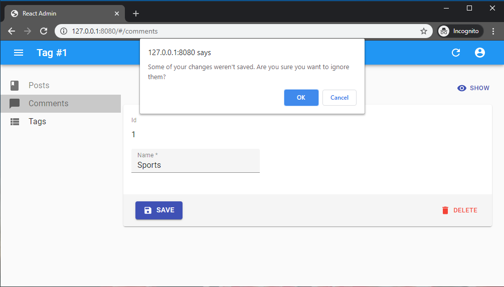
Warning about unsaved changes is an opt-in feature: you must set the warnWhenUnsavedChanges prop in the form component to enable it:
export const TagEdit = () => (
    <Edit>
        <SimpleForm warnWhenUnsavedChanges>
            <TextField source="id" />
            <TextInput source="name" />
            ...
        </SimpleForm>
    </Edit>
);
And that’s all. warnWhenUnsavedChanges works for both <SimpleForm> and <TabbedForm>. In fact, this feature is provided by a custom hook called useWarnWhenUnsavedChanges(), which you can use in your own react-hook-form forms.
import { useForm } from 'react-hook-form';
import { useWarnWhenUnsavedChanges } from 'react-admin';

const MyForm = ({ onSubmit }) => {
    const form = useForm();
    return (
        <Form onSubmit={form.handleSubmit(onSubmit)} />
    );
}

const Form = ({ onSubmit }) => {
    // enable the warn when unsaved changes feature
    useWarnWhenUnsavedChanges(true);
    return (
        <form onSubmit={onSubmit}>
            <label id="firstname-label">First Name</label>
            <Field name="firstName" aria-labelledby="firstname-label" component="input" />
            <button type="submit">Submit</button>
        </form>
    );
};
Tip: You can customize the message displayed in the confirm dialog by setting the ra.message.unsaved_changes message in your i18nProvider.
Warning: This feature only works if you have a dependency on react-router 6.3.0 at most. The react-router team disabled this possibility in react-router 6.4, so warnWhenUnsavedChanges will silently fail with react-router 6.4 or later.
Submit On Enter
By default, pressing ENTER in any of the form inputs submits the form - this is the expected behavior in most cases. To disable the automated form submission on enter, set the type prop of the SaveButton component to button.
const MyToolbar = () => (
    <Toolbar>
        <SaveButton type="button" />
        <DeleteButton />
    </Toolbar>
);

export const PostEdit = () => (
    <Edit>
        <SimpleForm toolbar={<MyToolbar/>}>
            ...
        </SimpleForm>
    </Edit>
);
However, some of your custom input components (e.g. Google Maps widget) may have special handlers for the ENTER key. In that case, you should prevent the default handling of the event on those inputs. This would allow other inputs to still submit the form on Enter:
export const PostEdit = () => (
    <Edit>
        <SimpleForm>
            <TextInput
                source="name"
                onKeyUp={event => {
                    if (event.key === 'Enter') {
                        event.stopPropagation();
                    }
                }}
            />
        </SimpleForm>
    </Edit>
);
Tip: <SaveButton type="button"> does not take into account a custom onSubmit prop passed to the enclosing <Form>. If you need to override the default submit callback for a <SaveButton type="button">, you should include an onClick prop in the button.
const MyToolbar = () => {
    const [update] = useUpdate();
    const { getValues } = useFormContext();
    const redirect = useRedirect();

    const handleClick = e => {
        e.preventDefault(); // necessary to prevent default SaveButton submit logic
        const { id, ...data } = getValues();
        update(
            'posts',
            { id, data },
            { onSuccess: () => { redirect('list'); }}
        );
    };

    return (
        <Toolbar>
            <SaveButton type="button" onClick={handleClick} />
            <DeleteButton />
        </Toolbar>
    );
};

export const PostEdit = () => (
    <Edit>
        <SimpleForm toolbar={<MyToolbar/>}>
          ...
        </SimpleForm>
    </Edit>
);
AutoSave
In forms where users may spend a lot of time, it’s a good idea to save the form automatically after a few seconds of inactivity. You can auto save the form content by using the <AutoSave> component.
import { AutoSave } from '@react-admin/ra-form-layout';
import { Edit, SimpleForm, TextInput, DateInput, SelectInput, Toolbar } from 'react-admin';

const AutoSaveToolbar = () => (
    <Toolbar>
        <AutoSave />
    </Toolbar>
);

const PersonEdit = () => (
    <Edit mutationMode="optimistic">
        <SimpleForm
            resetOptions={{ keepDirtyValues: true }}
            toolbar={AutoSaveToolbar}
        >
            <TextInput source="first_name" />
            <TextInput source="last_name" />
            <DateInput source="dob" />
            <SelectInput source="sex" choices={[
                { id: 'male', name: 'Male' },
                { id: 'female', name: 'Female' },
            ]}/>
        </SimpleForm>
    </Edit>
);
Note that you must set the <SimpleForm resetOptions> prop to { keepDirtyValues: true }. If you forget that prop, any change entered by the end user after the autosave but before its acknowledgement by the server will be lost.
If you’re using it in an <Edit> page, you must also use a pessimistic or optimistic mutationMode - <AutoSave> doesn’t work with the default mutationMode="undoable".
Check the <AutoSave> component documentation for more details.
Adding Fields With Labels
All react-admin inputs handle the display of their label by wrapping their content inside a <Labeled> component.
You can wrap your own components inside the <Labeled> component too. You can either provide it the label prop directly or leverage the automatic label inference by providing it the source prop:
const IdentifierField = ({ label }) => {
    const record = useRecordContext();
    return (
        <Labeled label={label}>
            <Typography>{record.id}</Typography>
        </Labeled>
    );
};

// Here Labeled will try to translate the label with the translation key `resources.posts.fields.body`
// and with an inferred default of `Body`
const BodyField = () => {
    const record = useRecordContext();
    return (
        <Labeled source="body">
            <Typography>
                {record.body}
            </Typography>
        </Labeled>
    )
};

const PostEdit = () => (
    <Create>
        <SimpleForm>
            <IdentifierField label="Identifier" />
            <TextField source="title" />
            <BodyField />
            <NumberInput source="nb_views" />
        </SimpleForm>
    </Create>
);
Grouping Inputs
Sometimes, you may want to group inputs in order to make a form more approachable. You may use a <TabbedForm>, an <AccordionForm> or you may want to roll your own layout. In this case, you might need to know the state of a group of inputs: whether it’s valid or if the user has changed them (dirty/touched state).
For this, you can use the <FormGroupContextProvider>, which accepts a group name. All inputs rendered inside this context will register to it (thanks to the useInput hook). You may then call the useFormGroup hook to retrieve the status of the group. For example:
import { Edit, SimpleForm, TextInput, FormGroupContextProvider, useFormGroup, minLength } from 'react-admin';
import { Accordion, AccordionDetails, AccordionSummary, Typography } from '@mui/material';
import ExpandMoreIcon from '@mui/icons-material/ExpandMoreIcon';

const PostEdit = () => (
    <Edit>
        <SimpleForm>
            <TextInput source="title" />
            <FormGroupContextProvider name="options">
                <Accordion>
                    <AccordionSummary
                        expandIcon={<ExpandMoreIcon />}
                        aria-controls="options-content"
                        id="options-header"
                    >
                        <AccordionSectionTitle name="options">
                            Options
                        </AccordionSectionTitle>
                    </AccordionSummary>
                    <AccordionDetails
                        id="options-content"
                        aria-labelledby="options-header"
                    >
                        <TextInput source="teaser" validate={minLength(20)} />
                    </AccordionDetails>
                </Accordion>
            </FormGroupContextProvider>
        </SimpleForm>
    </Edit>
);

const AccordionSectionTitle = ({ children, name }) => {
    const formGroupState = useFormGroup(name);

    return (
        <Typography color={
              !formGroupState.isValid && formGroupState.isDirty
                ? 'error'
                : 'inherit'
          }
        >
            {children}
        </Typography>
    );
};
Redirection After Submission
By default:
- Submitting the form in the
<Create>view redirects to the<Edit>view - Submitting the form in the
<Edit>view redirects to the<List>view
You can customize the redirection by setting the redirect prop on the <Create> or <Edit> components. Possible values are “edit”, “show”, “list”, and false to disable redirection. You may also specify a custom path such as /my-custom-route. For instance, to redirect to the <Show> view after edition:
export const PostEdit = () => (
    <Edit redirect="show">
        <SimpleForm>
            ...
        </SimpleForm>
    </Edit>
);
You can also pass a custom route (e.g. “/home”) or a function as redirect prop value. For example, if you want to redirect to a page related to the current object:
// redirect to the related Author show page
const redirect = (resource, id, data) => `/author/${data.author_id}/show`;

export const PostEdit = () => (
    <Edit redirect={redirect}>
        <SimpleForm>
            // ...
        </SimpleForm>
    </Edit>
);
This affects both the submit button, and the form submission when the user presses ENTER in one of the form fields.
Tip: The redirect prop is ignored if you’ve set the onSuccess prop in the <Edit>/<Create> component, or in the <SaveButton> component.
Nested Forms
Users often need to edit data from several resources in the same form. React-admin doesn’t support nested forms, but provides ways to edit related data in a user-friendly way:
<EditInDialogButton>lets users open a modal to edit a related record<ReferenceOneInput>lets users edit one related record<ReferenceManyInput>lets users edit a list of related records<ReferenceManyToManyInput>lets users edit a list of related records via an associative table