<WizardForm>
This Enterprise Edition component offers an alternative layout for large Create forms, allowing users to enter data step-by-step.
<WizardForm> renders one step at a time. The form is submitted when the user clicks on the Save button of the last step.
Usage
Use <WizardForm> as the child of <Create>. It expects <WizardForm.Step> elements as children.
import { Create, TextInput, required } from 'react-admin';
import { WizardForm } from '@react-admin/ra-form-layout';

const PostCreate = () => (
    <Create>
        <WizardForm>
            <WizardForm.Step label="First step">
                <TextInput source="title" validate={required()} />
            </WizardForm.Step>
            <WizardForm.Step label="Second step">
                <TextInput source="description" />
            </WizardForm.Step>
            <WizardForm.Step label="Third step">
                <TextInput source="fullDescription" validate={required()} />
            </WizardForm.Step>
        </WizardForm>
    </Create>
);
Note: You can also use the <WizardForm> as child of <Edit> but it’s considered as a bad practice to provide a wizard form for existing resources.
Tip: You can use the <AutoSave> component to automatically save the form after a few seconds of inactivity. See the AutoSave documentation for details.
Props
The <WizardForm> component accepts the following props:
| Prop | Required | Type | Default | Description |
|---|---|---|---|---|
children |
Required | ReactNode |
- | A list of <WizardForm.Step> elements. |
defaultValues |
Optional | object|function |
- | The default values of the record. |
id |
Optional | string |
- | The id of the underlying <form> tag. |
noValidate |
Optional | boolean |
- | Set to true to disable the browser’s default validation. |
onSubmit |
Optional | function |
save |
A callback to call when the form is submitted. |
progress |
Optional | ReactElement |
- | A custom progress stepper element. |
sanitize EmptyValues |
Optional | boolean |
- | Set to true to remove empty values from the form state. |
toolbar |
Optional | ReactElement |
- | A custom toolbar element. |
validate |
Optional | function |
- | A function to validate the form values. |
warnWhen UnsavedChanges |
Optional | boolean |
- | Set to true to warn the user when leaving the form with unsaved changes. |
Additional props are passed to react-hook-form’s useForm hook.
children
The children of <WizardForm> must be <WizardForm.Step> elements.
const PostCreate = () => (
    <Create>
        <WizardForm>
            <WizardForm.Step label="First step">
                ...
            </WizardForm.Step>
            <WizardForm.Step label="Second step">
                ...
            </WizardForm.Step>
            <WizardForm.Step label="Third step">
                ...
            </WizardForm.Step>
        </WizardForm>
    </Create>
);
defaultValues
The value of the form defaultValues prop is an object, or a function returning an object, specifying default values for the created record. For instance:
const postDefaultValue = () => ({ id: uuid(), created_at: new Date(), nb_views: 0 });

export const PostCreate = () => (
    <Create>
        <WizardForm defaultValues={postDefaultValue}>
            <WizardForm.Step>
                <TextInput source="title" />
                <RichTextInput source="body" />
                <NumberInput source="nb_views" />
                <SaveButton />
            </WizardForm.Step>
        </WizardForm>
    </Create>
);
Tip: You can include properties in the form defaultValues that are not listed as input components, like the created_at property in the previous example.
Tip: React-admin also allows to define default values at the input level. See the Setting default Values section.
id
Normally, a submit button only works when placed inside a <form> tag. However, you can place a submit button outside the form if the submit button form matches the form id.
Set this form id via the id prop.
export const PostCreate = () => (
    <Create>
        <WizardForm defaultValues={postDefaultValue} id="post_create_form">
            <WizardForm.Step>
                <TextInput source="title" />
                <RichTextInput source="body" />
                <NumberInput source="nb_views" />
            </WizardForm.Step>
        </WizardForm>
        <SaveButton form="post_create_form" />
    </Create>
);
noValidate
The <form novalidate> attribute prevents the browser from validating the form. This is useful if you don’t want to use the browser’s default validation, or if you want to customize the error messages. To set this attribute on the underlying <form> tag, set the noValidate prop to true.
const PostCreate = () => (
    <Create>
        <WizardForm noValidate>
            ...
        </WizardForm>
    </Create>
);
onSubmit
By default, the <Form> calls the save callback passed to it by the edit or create controller, via the SaveContext. You can override this behavior by setting a callback as the onSubmit prop manually.
export const PostCreate = () => {
    const [create] = useCreate();
    const postSave = (data) => {
        create('posts', { data });
    };
    return (
        <Create>
            <WizardForm onSubmit={postSave}>
                ...
            </WizardForm>
        </Create>
    );
};
progress
You can also customize the progress stepper by passing a custom component in the progress prop.
import React from 'react';
import { Create, TextInput, required } from 'react-admin';
import { WizardForm, WizardForm.Step } from '@react-admin/ra-form-layout';

const MyProgress = ({ currentStep, onStepClick, steps }) => (
    <ul>
        {steps.map((step, index) => {
            const label = React.cloneElement(step, { intent: 'label' });

            return (
                <li key={`step_${index}`}>
                    {!onStepClick ? (
                        <span
                            className={
                                currentStep === index ? 'active' : undefined
                            }
                        >
                            {label}
                        </span>
                    ) : (
                        <button onClick={() => onStepClick(index)}>
                            {label}
                        </button>
                    )}
                </li>
            );
        })}
    </ul>
);

const PostCreate = () => (
    <Create>
        <WizardForm progress={MyProgress}>
            <WizardForm.Step label="First step">
                <TextInput source="title" validate={required()} />
            </WizardForm.Step>
            <WizardForm.Step label="Second step">
                <TextInput source="description" />
            </WizardForm.Step>
            <WizardForm.Step label="Third step">
                <TextInput source="fullDescription" validate={required()} />
            </WizardForm.Step>
        </WizardForm>
    </Create>
);
Any additional props will be passed to the <Progress> component.
sanitizeEmptyValues
In HTML, the value of empty form inputs is the empty string (''). React-admin inputs (like <TextInput>, <NumberInput>, etc.) automatically transform these empty values into null.
But for your own input components based on react-hook-form, this is not the default. React-hook-form doesn’t transform empty values by default. This leads to unexpected create and update payloads like:
{
    id: 1234,
    title: 'Lorem Ipsum',
    is_published: '',
    body: '',
    // etc.
}
If you prefer to omit the keys for empty values, set the sanitizeEmptyValues prop to true. This will sanitize the form data before passing it to the dataProvider, i.e. remove empty strings from the form state, unless the record actually had a value for that field before edition.
const PostCreate = () =>  (
    <Create>
        <WizardForm sanitizeEmptyValues>
            ...
        </WizardForm>
    </Create>
);
For the previous example, the data sent to the dataProvider will be:
{
    id: 1234,
    title: 'Lorem Ipsum',
}
Note: Setting the sanitizeEmptyValues prop to true will also have a (minor) impact on react-admin inputs (like <TextInput>, <NumberInput>, etc.): empty values (i.e. values equal to null) will be removed from the form state on submit, unless the record actually had a value for that field.
If you need a more fine-grained control over the sanitization, you can use the transform prop of <Edit> or <Create> components, or the parse prop of individual inputs.
toolbar
You can customize the form toolbar by passing a custom component in the toolbar prop.
import { Button } from '@mui/material';
import React from 'react';
import { Create, required, TextInput, useSaveContext } from 'react-admin';
import { useFormState } from 'react-hook-form';
import { useWizardFormContext, WizardForm } from '@react-admin/ra-form-layout';

const MyToolbar = () => {
    const { hasNextStep, hasPreviousStep, goToNextStep, goToPreviousStep } =
        useWizardFormContext();
    const { save } = useSaveContext();
    const { isValidating } = useFormState();

    return (
        <ul>
            {hasPreviousStep ? (
                <li>
                    <Button onClick={() => goToPreviousStep()}>PREVIOUS</Button>
                </li>
            ) : null}
            {hasNextStep ? (
                <li>
                    <Button
                        disabled={isValidating}
                        onClick={() => goToNextStep()}
                    >
                        NEXT
                    </Button>
                </li>
            ) : (
                <li>
                    <Button disabled={isValidating} onClick={save}>
                        SAVE
                    </Button>
                </li>
            )}
        </ul>
    );
};

const PostCreate = () => (
    <Create>
        <WizardForm toolbar={<MyToolbar />}>
            <WizardForm.Step label="First step">
                <TextInput source="title" validate={required()} />
            </WizardForm.Step>
            <WizardForm.Step label="Second step">
                <TextInput source="description" />
            </WizardForm.Step>
            <WizardForm.Step label="Third step">
                <TextInput source="fullDescription" validate={required()} />
            </WizardForm.Step>
        </WizardForm>
    </Create>
);
validate
The value of the form validate prop must be a function taking the record as input, and returning an object with error messages indexed by field. For instance:
const validateUserCreation = (values) => {
    const errors = {};
    if (!values.firstName) {
        errors.firstName = 'The firstName is required';
    }
    if (!values.age) {
        // You can return translation keys
        errors.age = 'ra.validation.required';
    } else if (values.age < 18) {
        // Or an object if the translation messages need parameters
        errors.age = {
            message: 'ra.validation.minValue',
            args: { min: 18 }
        };
    }
    return errors
};

export const UserCreate = () => (
    <Create>
        <WizardForm validate={validateUserCreation}>
            <WizardForm.Step>
                <TextInput label="First Name" source="firstName" />
                <TextInput label="Age" source="age" />
            </WizardForm.Step>
        </WizardForm>
    </Create>
);
Tip: The validate function can return a promise for asynchronous validation. See the Server-Side Validation section in the Validation documentation.
Tip: React-admin also allows to define validation rules at the input level. See the Validation chapter for details.
warnWhenUnsavedChanges
React-admin keeps track of the form state, so it can detect when the user leaves an Edit or Create page with unsaved changes. To avoid data loss, you can use this ability to ask the user to confirm before leaving a page with unsaved changes.
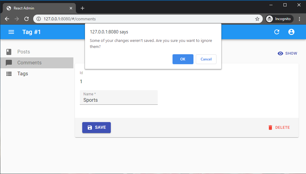
Warning about unsaved changes is an opt-in feature: you must set the warnWhenUnsavedChanges prop in the form component to enable it:
export const TagEdit = () => (
    <Edit>
        <WizardForm warnWhenUnsavedChanges>
            ...
        </WizardForm>
    </Edit>
);
Warning: This feature only works if you have a dependency on react-router 6.3.0 at most. The react-router team disabled this possibility in react-router 6.4, so warnWhenUnsavedChanges will silently fail with react-router 6.4 or later.
<WizardForm.Step>
The label prop of the <WizardForm.Step> component accepts a translation key:
import React from 'react';
import { Create, TextInput, required } from 'react-admin';
import { WizardForm } from '@react-admin/ra-form-layout';

const PostCreate = () => (
    <Create>
        <WizardForm>
            <WizardForm.Step label="myapp.posts.steps.general">
                <TextInput source="title" validate={required()} />
            </WizardForm.Step>
            <WizardForm.Step label="myapp.posts.steps.description">
                <TextInput source="description" />
            </WizardForm.Step>
            <WizardForm.Step label="myapp.posts.steps.misc">
                <TextInput source="fullDescription" validate={required()} />
            </WizardForm.Step>
        </WizardForm>
    </Create>
);
Adding a Summary Final Step
In order to add a final step with a summary of the form values before submit, you can leverage react-hook-form useWatch hook:
const FinalStepContent = () => {
    const values = useWatch({
        name: ['title', 'description', 'fullDescription'],
    });

    return values?.length > 0 ? (
        <>
            <Typography>title: {values[0]}</Typography>
            <Typography>description: {values[1]}</Typography>
            <Typography>fullDescription: {values[2]}</Typography>
        </>
    ) : null;
};

const PostCreate = () => (
    <Create>
        <WizardForm>
            <WizardForm.Step label="First step">
                <TextInput source="title" validate={required()} />
            </WizardForm.Step>
            <WizardForm.Step label="Second step">
                <TextInput source="description" />
            </WizardForm.Step>
            <WizardForm.Step label="Third step">
                <TextInput source="fullDescription" validate={required()} />
            </WizardForm.Step>
            <WizardForm.Step label="">
                <FinalStepContent />
            </WizardForm.Step>
        </WizardForm>
    </Create>
);
Role-Based Access Control (RBAC)
Fine-grained permissions control can be added by using the <WizardForm> and <WizardFormStep> components provided by the @react-admin/ra-enterprise package.
import { WizardForm } from '@react-admin/ra-enterprise';

const authProvider = {
    checkAuth: () => Promise.resolve(),
    login: () => Promise.resolve(),
    logout: () => Promise.resolve(),
    checkError: () => Promise.resolve(),
    getPermissions: () =>Promise.resolve([
        // 'delete' is missing
        { action: ['list', 'edit'], resource: 'products' },
        { action: 'write', resource: 'products.reference' },
        { action: 'write', resource: 'products.width' },
        { action: 'write', resource: 'products.height' },
        // 'products.description' is missing
        { action: 'write', resource: 'products.thumbnail' },
        // 'products.image' is missing
        { action: 'write', resource: 'products.step.description' },
        { action: 'write', resource: 'products.step.images' },
        // 'products.step.stock' is missing
    ]),
};

const ProductCreate = () => (
    <Create>
        <WizardForm>
            <WizardForm.Step name="description" label="Description">
                <TextInput source="reference" />
                <TextInput source="width" />
                <TextInput source="height" />
                {/* Won't be displayed */}
                <TextInput source="description" />
            </WizardForm.Step>
            <WizardForm.Step name="images" label="Images">
                {/* Won't be displayed */}
                <TextInput source="image" />
                <TextInput source="thumbnail" />
            </WizardForm.Step>
            {/* Won't be displayed */}
            <WizardForm.Step name="stock" label="Stock">
                <TextInput source="stock" />
            </WizardForm.Step>
        </WizardForm>
    </Create>
);
Check the RBAC <WizardForm> documentation for more details.