
<ImageInput>
<ImageInput> allows editing and uploading images (png, jpg, gif, etc.). It is powered by react-dropzone.
Usage
import { ImageInput, ImageField } from 'react-admin';
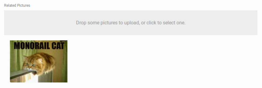
<ImageInput source="pictures" label="Related pictures">
<ImageField source="src" title="title" />
</ImageInput>
<ImageInput> uses its child component to give a preview of the files. <ImageInput> renders it child once per file, inside a <RecordContext>, so the child can be a Field component. The default <ImageField> renders a thumbnail for the current image(s).
The input value must be an object or an array of objects with a title and a src property, e.g.:
{
    id: 123,
    attachments: [
        {
            title: 'cat.png',
            src: 'https://example.com/uploads/cat1234.png',
        },
        {
            title: 'dog.png',
            src: 'https://example.com/uploads/dog5678.png',
        },
    ],
}
After modification by the user, the value is stored as an array of objects with 3 properties:
title: the file name with extension, e.g. ‘Invoice-2929-01-06.pdf’,src: An object URL for theFile, e.g. ‘blob:https://example.com/1e67e00e-860d-40a5-89ae-6ab0cbee6273’rawFile: TheFileobject itself
It is the responsibility of your dataProvider to send the file to the server (encoded in Base64, or using multipart upload) and to transform the src property. See the Data Provider documentation for an example.
Files are accepted or rejected based on the accept, multiple, minSize and maxSize props.
Props
| Prop | Required | Type | Default | Description |
|---|---|---|---|---|
accept |
Optional | string | string[] |
- | Accepted file type(s). When empty, all file types are accepted. |
children |
Optional | ReactNode |
- | Element used to preview file(s) |
minSize |
Optional | number |
0 | Minimum file size (in bytes), e.g. 5000 for 5KB |
maxSize |
Optional | number |
Infinity |
Maximum file size (in bytes), e.g. 5000000 for 5MB |
multiple |
Optional | boolean |
false |
Whether the inputs can accept multiple files. |
options |
Optional | Object |
{} |
Additional options passed to react-dropzone’s useDropzone() hook. |
placeholder |
Optional | ReactNode |
- | Invite displayed in the drop zone |
removeIcon |
Optional | ReactNode |
MUI’s RemoveCircle icon | The clickable icon for removing images |
validateFile Removal |
Optional | function |
- | Allows to cancel the removal of files |
<ImageInput> also accepts the common input props.
accept
Equivalent of the accept attribute of an <input type="file">. accept must be a valid MIME type, according to input element specification.
<ImageInput source="pictures" accept="image/*">
    <ImageField source="src" title="title" />
</ImageInput>
Examples of valid accept values:
- ‘image/png,image/svg+xml,image/jpg,image/jpeg’
- ‘image/*’
If left empty, all file types are accepted (even non-image types).
children
<ImageInput> delegates the preview of currently selected images to its child. <ImageInput> clones its child component once per file, inside a <RecordContext>, so the child can be a Field component. The default <ImageField> renders a thumbnail for the current image(s).
<ImageInput source="pictures">
    <ImageField source="src" title="title" />
</ImageInput>
Writing a custom preview component is quite straightforward: it’s a standard field.
minSize
Minimum file size (in bytes), e.g. 5000 for 5KB. Defaults to 0.
<ImageInput source="pictures" minSize={5000}>
    <ImageField source="src" title="title" />
</ImageInput>
maxSize
Maximum file size (in bytes), e.g. 5000000 for 5MB. Defaults to Infinity.
<ImageInput source="pictures" maxSize={5000000}>
    <ImageField source="src" title="title" />
</ImageInput>
multiple
Set to true if the input should accept a list of files, false if it should only accept one file. Defaults to false.
If multiple is set to false and additional files are dropped, all files besides the first will be rejected. Any file which does not have a size in the [minSize, maxSize] range, will be rejected as well.
<ImageInput source="pictures" multiple>
    <ImageField source="src" title="title" />
</ImageInput>
options
<ImageInput> accepts an options prop into which you can pass all the react-dropzone properties.
placeholder
The default droppable area renders the following text:
- ‘Drop a picture to upload, or click to select it.’ for single file inputs
- ‘Drop some pictures to upload, or click to select one.’ for multiple file inputs
You can customize these labels using the followinf translation keys:
ra.input.image.upload_singlera.input.image.upload_several
If that’s not enough, you can pass a placeholder prop to overwrite it. The value can be anything React can render:
<ImageInput source="files" placeholder={<p>Drop your file here</p>}>
    <ImageField source="src" title="title" />
</ImageInput>
removeIcon
Use the removeIcon prop to change the icon displayed as the remove button:
<ImageInput source="pictures" removeIcon={CustomSvgIcon}>
    <ImageField source="src" title="title" />
</ImageInput>
sx: CSS API
The <ImageInput> component accepts the usual className prop. You can also override many styles of the inner components thanks to the sx property (as most Material UI components, see their documentation about it). This property accepts the following subclasses:
| Rule name | Description |
|---|---|
& .RaFileInput-dropZone |
Styles pass to the underlying FileInput component |
& .RaFileInput-removeButton |
Styles pass to the underlying FileInput component |
To override the style of all instances of <ImageInput> using the Material UI style overrides, use the RaImageInput key.