Buttons
React-Admin provides button components for all the common uses.
Navigation Buttons
These buttons allow users to navigate between the various react-admin views.
<EditButton>
Opens the Edit view of the current record:
import { EditButton } from 'react-admin';

const CommentEditButton = () => <EditButton label="Edit comment" />;
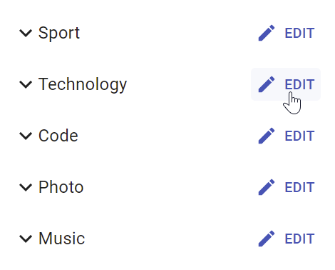
<EditButton> is based on react-admin’s base <Button>, so it’s responsive, accessible, and the label is translatable.
| Prop | Required | Type | Default | Description |
|---|---|---|---|---|
resource |
Optional | string |
- | Resource to link to, e.g. ‘posts’ |
record |
Optional | Object |
- | Record to link to, e.g. { id: 12, foo: 'bar' } |
label |
Optional | string |
‘ra.action.edit’ | Label or translation message to use |
icon |
Optional | ReactElement |
- | Icon element, e.g. <CommentIcon /> |
scrollToTop |
Optional | boolean |
true |
Scroll to top after link |
It also supports all the other <Button> props.
Tip: You can use it as <Datagrid> child, too. However, you should use the <Datagrid rowClick="edit"> prop instead to avoid using one column for the Edit button.
Tip: If you want to link to the Edit view manually, use the /{resource}/{record.id} location.
<ShowButton>
Opens the Show view of the current record:
import { ShowButton } from 'react-admin';

const CommentShowButton = () => <ShowButton label="Show comment" />;
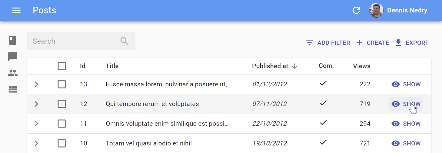
<ShowButton> is based on react-admin’s base <Button>, so it’s responsive, accessible, and the label is translatable.
| Prop | Required | Type | Default | Description |
|---|---|---|---|---|
resource |
Optional | string |
- | The target resource, e.g. ‘posts’ |
record |
Optional | Object |
- | Record to link to, e.g. { id: 12, foo: 'bar' } |
component |
Optional | ReactElement |
- | Base path to resource, e.g. ‘/posts’ |
label |
Optional | string |
‘ra.action.show’ | Label or translation message to use |
icon |
Optional | ReactElement |
- | Icon element, e.g. <CommentIcon /> |
scrollToTop |
Optional | boolean |
true |
Scroll to top after link |
It also supports all the other <Button> props.
Tip: You can use it as <Datagrid> child with no props too. However, you should use the <Datagrid rowClick="show"> prop instead to avoid using one column for the Edit button.
Tip: If you want to link to the Show view manually, use the /{resource}/{record.id}/show location.
<CreateButton>
Opens the Create view of the current resource:
import { CreateButton } from 'react-admin';

const CommentCreateButton = () => <CreateButton label="Create comment" />;

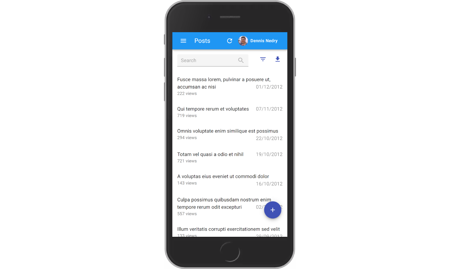
<CreateButton> is based on react-admin’s base <Button>, so it’s responsive, accessible, and the label is translatable. On mobile, it turns into a “Floating Action Button”.
| Prop | Required | Type | Default | Description |
|---|---|---|---|---|
resource |
Optional | string |
- | Target resource, e.g. ‘posts’ |
label |
Optional | string |
‘ra.action.create’ | label or translation message to use |
icon |
Optional | ReactElement |
- | iconElement, e.g. <CommentIcon /> |
scrollToTop |
Optional | boolean |
true |
Scroll to top after link |
It also supports all the other <Button> props.
Tip: If you want to link to the Create view manually, use the /{resource}/create location.
sx: CSS API
| Rule name | Description |
|---|---|
&.RaCreateButton-floating |
Applied to the underlying MuiFab component used in small screens |
To override the style of all instances of <CreateButton> using the Material UI style overrides, use the RaCreateButton key.
<ListButton>
Opens the List view of a given resource:
import { ListButton } from 'react-admin';

const CommentListButton = () => <ListButton label="Comments" />;

<ListButton> is based on react-admin’s base <Button>, so it’s responsive, accessible, and the label is translatable.
By default, react-admin doesn’t display a <ListButton> in Edit and Show views action toolbar. This saves visual clutter, and users can always use the back button. You can add it by specifying your own actions:
// linking back to the list from the Edit view
import { TopToolbar, ListButton, ShowButton, Edit } from 'react-admin';

const PostEditActions = () => (
    <TopToolbar>
        <ListButton />
        <ShowButton />
    </TopToolbar>
);

export const PostEdit = () => (
    <Edit actions={<PostEditActions />}>
        ...
    </Edit>
);
| Prop | Required | Type | Default | Description |
|---|---|---|---|---|
resource |
Optional | string |
- | target resource, e.g. ‘posts’ |
label |
Optional | string |
‘ra.action.list’ | label or translation message to use |
icon |
Optional | ReactElement |
- | iconElement, e.g. <CommentIcon /> |
It also supports all the other <Button> props.
Tip: If you want to link to the List view manually, use the /{resource} location.
List Buttons
The following buttons are designed to be used in List views.
<ExportButton>
Exports the current list, with filters applied, but without pagination. It relies on the exporter function passed to the <List> component, via the ListContext. It’s disabled for empty lists.
By default, the <ExportButton> is included in the List actions.
import { CreateButton, ExportButton, TopToolbar } from 'react-admin';

const PostListActions = () => (
    <TopToolbar>
        <PostFilter context="button" />
        <CreateButton />
        <ExportButton />
    </TopToolbar>
);

export const PostList = () => (
    <List actions={<PostListActions />}>
        ...
    </List>
);

| Prop | Required | Type | Default | Description |
|---|---|---|---|---|
maxResults |
Optional | number |
1000 | Maximum number of records to export |
label |
Optional | string |
‘ra.action.export’ | label or translation message to use |
icon |
Optional | ReactElement |
<DownloadIcon> |
iconElement, e.g. <CommentIcon /> |
exporter |
Optional | Function |
- | Override the List exporter function |
meta |
Optional | any |
undefined | Metadata passed to the dataProvider |
<BulkExportButton>
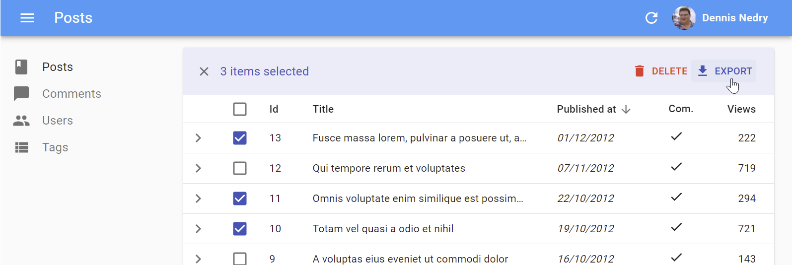
Same as <ExportButton>, except it only exports the selected rows instead of the entire list. To be used inside the <Datagrid bulkActionButtons> prop.
import * as React from 'react';
import { Fragment } from 'react';
import { BulkDeleteButton, BulkExportButton } from 'react-admin';

const PostBulkActionButtons = () => (
    <Fragment>
        <BulkExportButton />
        <BulkDeleteButton />
    </Fragment>
);

export const PostList = () => (
    <List>
        <Datagrid bulkActionButtons={<PostBulkActionButtons />}>
            ...
        </Datagrid>
    </List>
);
| Prop | Required | Type | Default | Description |
|---|---|---|---|---|
label |
Optional | string |
‘ra.action.export’ | label or translation message to use |
icon |
Optional | ReactElement |
<DownloadIcon> |
iconElement, e.g. <CommentIcon /> |
exporter |
Optional | Function |
- | Override the List exporter function |
meta |
Optional | any |
undefined | Metadata passed to the dataProvider |
<BulkDeleteButton>
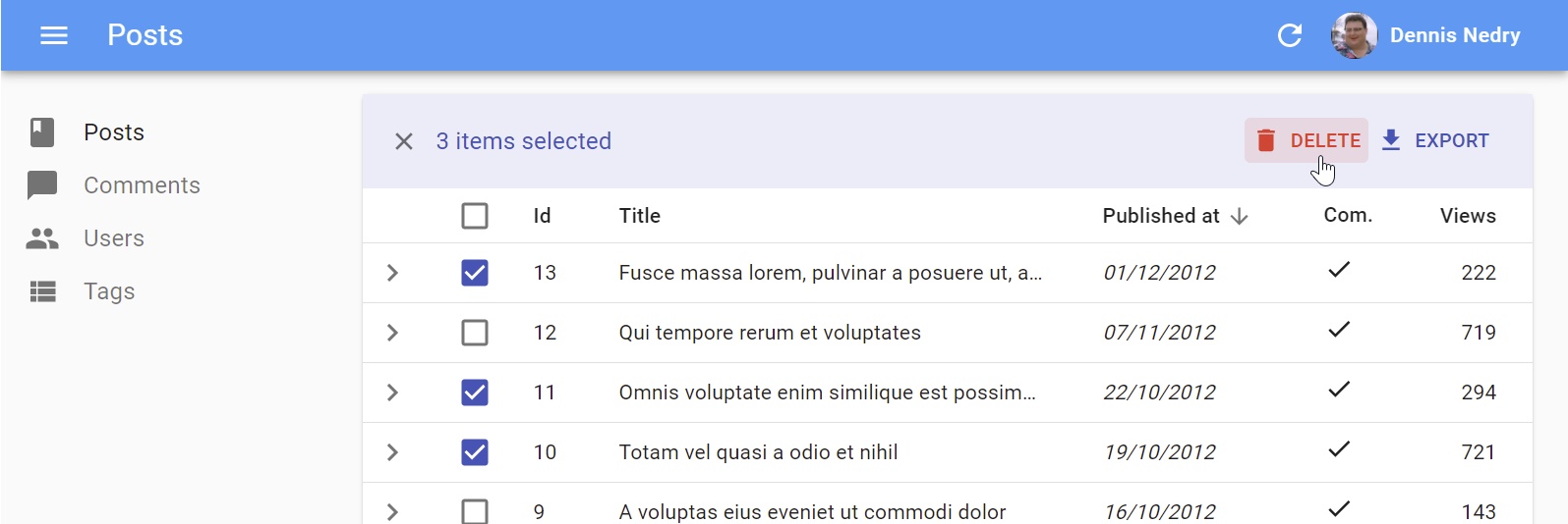
Deletes the selected rows. To be used inside the <Datagrid bulkActionButtons> prop (where it’s enabled by default).
import * as React from 'react';
import { Fragment } from 'react';
import { BulkDeleteButton, BulkExportButton } from 'react-admin';

const PostBulkActionButtons = () => (
    <Fragment>
        <BulkExportButton />
        <BulkDeleteButton />
    </Fragment>
);

export const PostList = () => (
    <List>
        <Datagrid bulkActionButtons={<PostBulkActionButtons />}>
            ...
        </Datagrid>
    </List>
);
| Prop | Required | Type | Default | Description |
|---|---|---|---|---|
label |
Optional | string |
‘ra.action.delete’ | label or translation message to use |
icon |
Optional | ReactElement |
<DeleteIcon> |
iconElement, e.g. <CommentIcon /> |
mutationOptions |
Optional | object |
null | options for react-query useMutation hook |
<FilterButton>
This button is an internal component used by react-admin in the Filter button/form combo.
sx: CSS API
To override the style of all instances of <FilterButton> using the Material UI style overrides, use the RaFilterButton key.
Record Buttons
<DeleteButton>
<DeleteWithConfirmButton>
Delete the current record after a confirm dialog has been accepted. To be used inside a <Toolbar/> component.
| Prop | Required | Type | Default | Description |
|---|---|---|---|---|
className |
Optional | string |
- | Class name to customize the look and feel of the button element itself |
label |
Optional | string |
‘ra.action.delete’ | label or translation message to use |
icon |
Optional | ReactElement |
<DeleteIcon> |
iconElement, e.g. <CommentIcon /> |
confirmTitle |
Optional | string |
‘ra.message.delete_title’ | Title of the confirm dialog |
confirmContent |
Optional | ReactNode |
‘ra.message.delete_content’ | Message or React component to be used as the body of the confirm dialog |
redirect |
Optional | string | false | Function |
‘list’ | Custom redirection after success side effect |
translateOptions |
Optional | { id?: string, name?: string } |
{} | Custom id and name to be used in the confirm dialog’s title |
mutationOptions |
Optional | null | options for react-query useMutation hook |
import * as React from 'react';
import { DeleteWithConfirmButton, Toolbar, Edit, SaveButton,useRecordContext } from 'react-admin';

const EditToolbar = props => {
    const record = useRecordContext();

    <Toolbar {...props}>
        <SaveButton/>
        <DeleteWithConfirmButton
            confirmContent="You will not be able to recover this record. Are you sure?"
            translateOptions={{ name: record.name }}
        />
    </Toolbar>
};

const MyEdit = () => (
    <Edit>
        <SimpleForm toolbar={<EditToolbar />}>
            ...
        </SimpleForm>
    </Edit>
);
<CloneButton>
Performance
disableRipple
The ripple effect can cause performance issues for large datagrids. It’s possible to remove the ripple effect from within your Material UI theme. The Material UI docs provide instructions on how to do this.
It’s worth noting that removing the ripple will cause accessibility issues, including a lack of focus states during tab navigating for components like BooleanInput and CheckboxGroupInput.
Note: The disableRipple was set to true in React Admin for a time, but was reimplemented due to accessibility concerns. If you’d like to reimplement the static ripple colour effect, you can use the React Admin’s previous implementation as a starting point. The Material UI docs also gives details on how to reimplement focus styles using the Mui-focusVisible class.
Miscellaneous
<Button>
Base component for most react-admin buttons. Responsive (displays only the icon with a tooltip on mobile) and accessible.
| Prop | Required | Type | Default | Description |
|---|---|---|---|---|
alignIcon |
Optional | 'left' | 'right |
'left' |
Icon position relative to the label |
children |
Optional | ReactElement |
- | icon to use |
className |
Optional | string |
- | Class name to customize the look and feel of the button element itself |
color |
Optional | 'default' | 'inherit'| 'primary' | 'secondary' |
'primary' |
Label and icon color |
disabled |
Optional | boolean |
false |
If true, the button will be disabled |
size |
Optional | 'large' | 'medium' | 'small' |
'small' |
Button size |
Other props are passed down to the underlying Material UI <Button>.
sx: CSS API
| Rule name | Description |
|---|---|
& .RaButton-button |
Applied to the underlying MuiButton component |
& .RaButton-label |
Applied to the Button’s label when alignIcon prop is ‘left’ |
& .RaButton-labelRightIcon |
Applied to the Button’s label when alignIcon prop is ‘left’ |
& .RaButton-smallIcon |
Applied to the Button’s children when size prop is small and alignIcon prop is ‘right’ |
& .RaButton-mediumIcon |
Applied to the Button’s children when size prop is medium and alignIcon prop is ‘right’ |
& .RaButton-largeIcon |
Applied to the Button’s children when size prop is large and alignIcon prop is ‘right’ |
To override the style of all instances of <Button> using the Material UI style overrides, use the RaButton key.
<RefreshButton>
<SkipNavigationButton>
sx: CSS API
| Rule name | Description |
|---|---|
&.RaSkipNavigationButton-skipToContentButton |
Applied to the underlying MuiButton component |
To override the style of all instances of <SkipNavigationButton> using the Material UI style overrides, use the RaSkipNavigationButton key.
<MenuItemLink>
The <MenuItemLink> component displays a menu item with a label and an icon - or only the icon with a tooltip when the sidebar is minimized. It also handles the automatic closing of the menu on tap on mobile.
| Prop | Required | Type | Default | Description |
|---|---|---|---|---|
to |
Required | string | location |
- | The menu item’s target. It is passed to a React Router NavLink component. |
primaryText |
Required | ReactNode |
- | The menu content, displayed when the menu isn’t minimized. |
leftIcon |
Optional | ReactNode |
- | The menu icon |
Additional props are passed down to the underling Material UI <MenuItem> component.
You can create a custom menu component using the <DashboardMenuItem> and <MenuItemLink> components:
// in src/Menu.js
import * as React from 'react';
import { DashboardMenuItem, Menu, MenuItemLink } from 'react-admin';
import BookIcon from '@mui/icons-material/Book';
import ChatBubbleIcon from '@mui/icons-material/ChatBubble';
import PeopleIcon from '@mui/icons-material/People';
import LabelIcon from '@mui/icons-material/Label';

export const Menu = (props) => (
    <Menu {...props}>
        <DashboardMenuItem />
        <MenuItemLink to="/posts" primaryText="Posts" leftIcon={<BookIcon />}/>
        <MenuItemLink to="/comments" primaryText="Comments" leftIcon={<ChatBubbleIcon />}/>
        <MenuItemLink to="/users" primaryText="Users" leftIcon={<PeopleIcon />}/>
        <MenuItemLink to="/custom-route" primaryText="Miscellaneous" leftIcon={<LabelIcon />}/>
    </Menu>
);
To use this custom menu component, pass it to a custom Layout:
// in src/Layout.js
import { Layout } from 'react-admin';
import { Menu } from './Menu';

export const Layout = (props) => <Layout {...props} menu={Menu} />;
Then, use this layout in the <Admin> layout prop:
// in src/App.js
import { Layout }  from './Layout';

const App = () => (
    <Admin layout={Layout} dataProvider={simpleRestProvider('http://path.to.my.api')}>
        // ...
    </Admin>
);
See The theming documentation for more details.
Tip: If you need a multi-level menu, or a Mega Menu opening panels with custom content, check out the ra-navigation
sx: CSS API
| Rule name | Description |
|---|---|
&.RaMenuItemLink-active |
Applied to the underlying MuiMenuItem’s activeClassName prop |
& .RaMenuItemLink-icon |
Applied to the ListItemIcon component when leftIcon prop is set |
To override the style of all instances of <MenuItemLink> using the Material UI style overrides, use the RaMenuItemLink key.
<UserMenu>
| Prop | Required | Type | Default | Description |
|---|---|---|---|---|
children |
Optional | ReactElement |
- | elements to use as menu items |
label |
Required | string |
‘ra.auth.user_menu’ | label or translation message to use |
icon |
Optional | ReactElement |
<AccountCircle> |
iconElement, e.g. <CommentIcon /> |
sx: CSS API
| Rule name | Description |
|---|---|
& .RaUserMenu-userButton |
Applied to the underlying MuiButton component when useGetIdentity().loaded is true and useGetIdentity().identity.fullName is set |
& .RaUserMenu-avatar |
Applied to the underlying MuiAvatar component when useGetIdentity().avatar is true |
To override the style of all instances of <UserMenu> using the Material UI style overrides, use the RaUserMenu key.
See The theming documentation for more details.
